
Pluimen Tested A Landing Page To Increase Its Revenue Using A/B Testing
VWO and Pluimen
Pluimen.nl is a Dutch company selling gift vouchers that can be redeemed in exchange for services such as sauna, paintball, dining, and other options.
Pluimen collaborated with QualityTraffic, a certified VWO partner, to improve conversions to drive revenue. This success story draws upon what was originally written by Carlos Romero of QualityTraffic.
Goals
Pluimen used its home page as the landing page for people who searched on Google for the term “gift voucher” and other closely related keywords. Pluimen’s marketing team wanted to explore ways to improve conversion to drive higher revenue. It wanted to increase revenue by boosting purchases.
Tests run
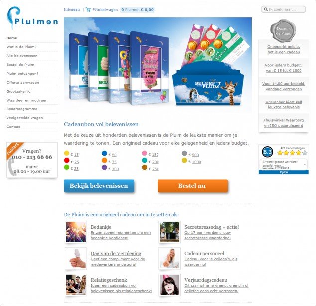
The original landing page had 2 call to action (CTA) buttons—one reading Buy Now and the other Check Experiences.
This is what it looked like:
To reach their goal, Pluimen’s team decided to modify the home page/landing page by minimizing the number of distractions on it. The intent was to draw more visitors into the sales funnel and then make them follow a straight path to look at the experiences that a Pluimen gift voucher offered.
Their hypothesis was that the original home page offered visitors too many choices, leading to confusion. The company hypothesized that reducing the number of CTA buttons and the number of links would lower the bounce rate and get more visitors into the sales funnel.
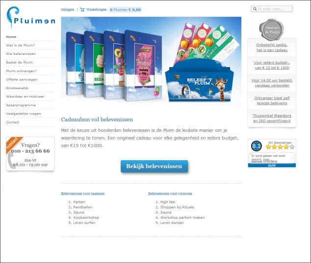
To test the hypothesis, a new landing page variation was created, with only 1 call-to-action button, that is, Check Experiences. The variation also had a significantly reduced number of links.
This is what the variation looked like:
QualityTraffic used the VWO platform to set up and conduct an A/B test. The A/B test ran for 47 days before it was concluded that the variation did beat the original landing page.
Conclusion
The hypothesis that reducing distractions would reduce the bounce rate was proved right. The test generated the following statistically significant results:
- Bounce rate: –8.5%
- Conversions: +10.9%
- Transactions: +11.4%
- Revenue: +19.7%
So, why did the variation deliver such a significant improvement?
By reducing the number of CTAs and links, visitors had fewer things on the landing page to focus on. They easily got to the Check Experiences CTA and on clicking this button, they got the social proof that gave the site credibility and encouraged them to finish their purchases.
According to the research conducted by Iyengar & Lepper (When Choice is Demotivating: Can One Desire Too Much of a Good Thing?), it was found that more people would likely take a desired action if they are given lesser choices.
The average landing page has an attention ratio of 20:1. This means that there are 19 links that can potentially draw a visitor’s attention away from the one link or CTA button that has the highest priority for you (because it needs to lead to conversion).
The ultimate attention ratio is, of course, 1:1. Barry Schwartz, the author of The Paradox of Choice – Why More is Less, explains why fewer choices lead to faster decisions.

Location
Rotterdam, Netherlands
Industry
Retail
Impact
19% increase in Revenue


