Lyyti Redesigned Its Pricing Page And Generated Lead Conversions Using VWO
VWO and Lyyti
Lyyti.com is a Finland-based software company that specializes in providing SaaS-based event management solutions. It uses VWO solutions to test optimization opportunities for its website.
Goals
The main objective for Lyyti.com to employ A/B testing was to increase the number of visitors clicking the Free Trial CTA button.
Tests run
The pricing page is one of the most critical pages for any website selling products or services. This is especially so for a SaaS business such as Lyyti, because this page is where serious buyers are likely to spend a lot of time.
This is what the original page looked like:
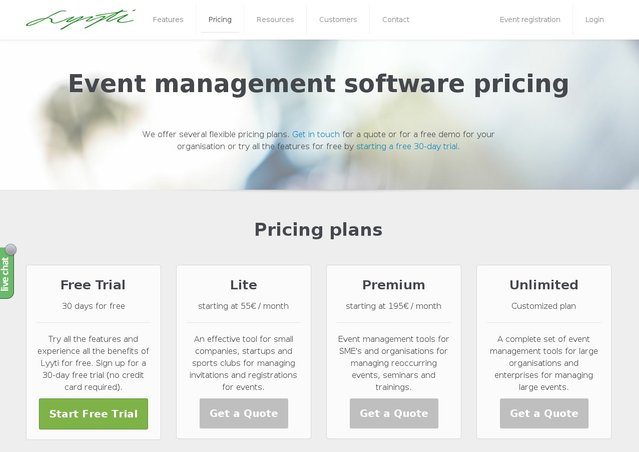
Analysis of the website by using VWO heatmaps and clickmaps indicated that users frequently moved between the pricing and the features page. Feedback from the sales team suggested that the short descriptions provided on the pricing page did not clearly convey the features offered in various plans.
Based on the above information, Sampsa Vainio, conversion optimization expert, concluded that the original pricing page was not very user-friendly and needed to be redesigned.
The team decided to run an A/B test to test the hypothesis that prominently displaying the features of all plans and having multiple CTA buttons would increase visits to the free trial sign-up page and consequently, increase sign-ups.
Two different variations of the pricing page were created and served evenly to visitors. The test was run for a period of over 5 months.
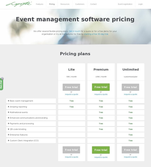
This is what the variation looked like:
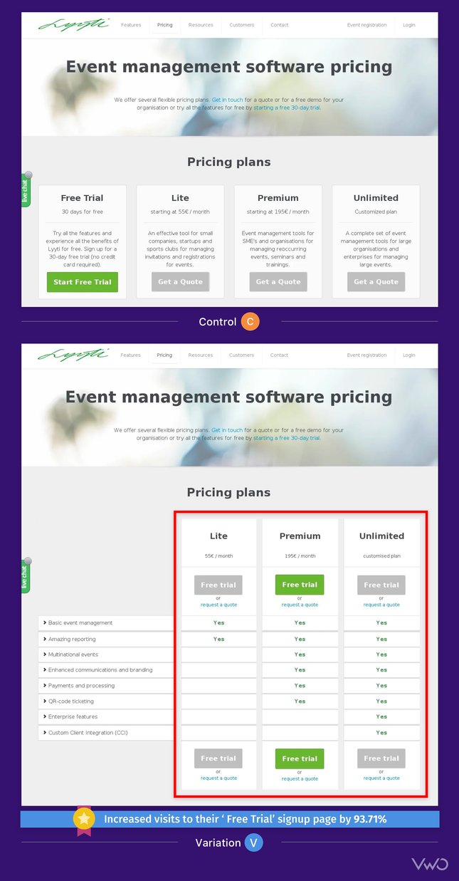
Conclusion: 93% increase in click-throughs
The variation won, increasing visits to the lead generation page by 93.71%, with a statistical significance of 96%.
Here’s a quick comparison of the original and the challenger:
The variation clearly showed features offered in each plan.
The optimization of pricing pages can give an immediate lift to your revenue. As Sampsa explained: “The LTV (Lifetime Value) of a single user who converts into a paid customer is pretty high for us, normally in the thousands of dollars. Also, the value is high since users who purchase a license usually stay with us for several years. All in all, the 94% increase will definitely be seen in our sales and we’ll do our best in converting those free users into paying customers.”
It is useful to understand why the variation performed better. The variation beat the original, because it included at least 3 elements that were missing in the original:
1) Features clearly tabulated in the pricing plan
The new design clearly mentioned the features of each plan. Since the features were mentioned right next to the pricing, it was easier for the prospects to make a decision. Also, the variation clearly presented the additional features associated with higher plans—something that was missing in the original design.
2) Multiple CTAs were saying the same thing
The variation had 5 more CTA buttons than the original, asking visitors to sign up for a free trial. In the original design, the message, “Try all the features and experience all the benefits of Lyyti for free” was buried in the plan description and thus not immediately noticeable. On the other hand, each plan in the variation had a free trial CTA button above and below it. Thus, the message that visitors were offered all the features in the free trial period became even more prominent.
3) Shifting the focus of the page to one purpose
In the old design, there were 4 CTA buttons of the same size, giving 2 different messages. In the challenger, there were 6 CTA buttons, all giving out a single message. The other CTA message—Request a Quote was made into a link and moved below the main CTA buttons.
Now the page had just one purpose – ask visitors to sign up for a free trial.
We soon realized that asking for a quote might be asking too much since our company is not that known outside of Finland (which is our main market at the moment).That’s why we shifted the focus of the main goal of the page —> sign up for a free trial.

Sampsa Vainio
Conversion Optimization Expert
Key Takeaways
1) One page, one purpose. There should be absolutely no element of distraction or point of conflict between choices for visitors. Having multiple goals confuses visitors and can lead to a drop in conversions.
2) Learn about your visitors from all mediums possible. Studying their behavior from your analytics tool, discussions with your sales and support teams, or even speaking directly to them will give you valuable insights.
3) Don’t shy away from making tough changes, even redesigning a page. (See how CrazyEgg redesigned their homepage to improve conversion rate by 363%)
4) Absolutely never, ever, forget to test!

Location
Turku, Finland
Industry
Software
Impact
93.71% increase in Conversion