Us improved checkout rates for e5 by adding a cart confirmation pop-up
About Us
Based in Belgium, Us specializes in full-funnel digital marketing, including performance marketing, branding, UX/UI design, content creation, and data analytics.
Recently, they optimized the website of e5, a Belgium-based eCommerce client, using VWO to enhance conversions.
Why VWO
VWO offers me all the tools as a CRO expert to hypothesize, implement, and analyze AB tests.

Vasco Carpentero
eCommerce consultant
Goals
The goal was to encourage more users to initiate and proceed through the checkout stage from the product pages by clearly confirming that their chosen items had been added to their carts. This approach could also reduce bounce rates from product pages, ensuring a smoother shopping experience.
Observations
Vasco and his team conducted a thorough quantitative analysis to pinpoint specific struggles on e5’s website by examining data in GA4. They then compared the drop-off rate from product pages to checkout with similar webshops and found it notably high on e5’s site.
Next, they turned to user behavior analysis and reviewed session recordings. They noticed that customers frequently added items to their carts but left without completing their purchases. Naturally, they wanted to figure out why this was happening.
Hypothesis
It was believed that visitors who added items to their carts were not informed correctly because the displayed confirmation box was too small.
They hypothesized that implementing a more prominent popup confirmation for the add-to-cart action would improve visibility and encourage checkout.
Tests run
The control product page displayed a small confirmation box after users added items to their carts.
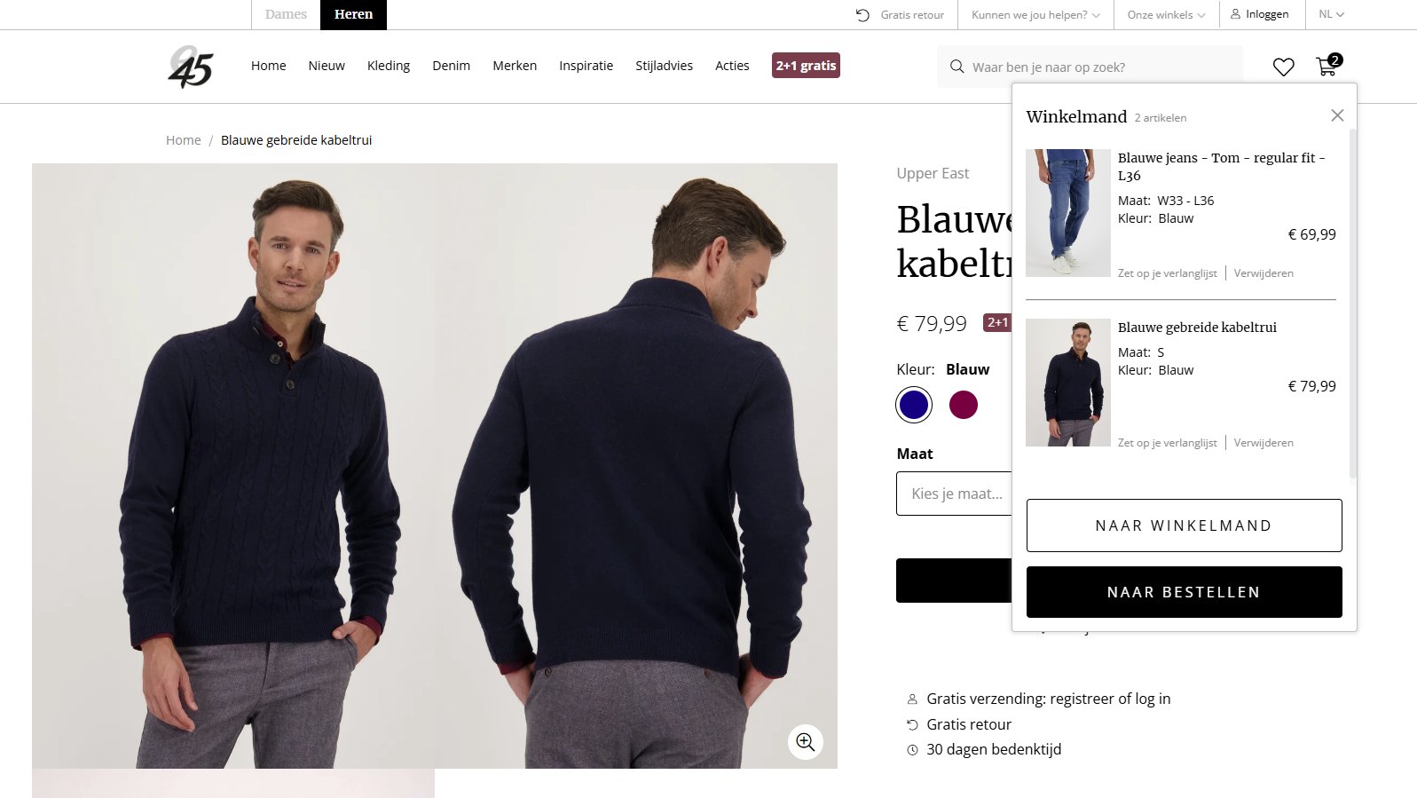
In contrast, the variation was designed to show a pop-up confirmation when users added items to their carts. The two were pitted against one another in an A/B test, leveraging VWO.
The test ran for 14 days, and the results were promising.
Here is how the control and variation looked:
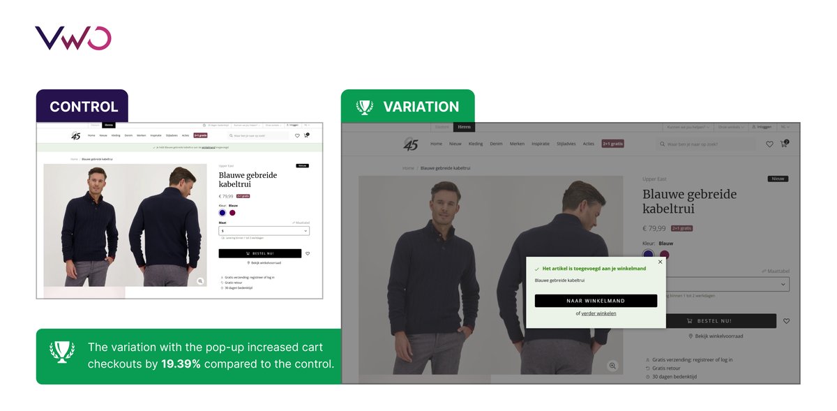
Us (e5) Control Variation
Test results
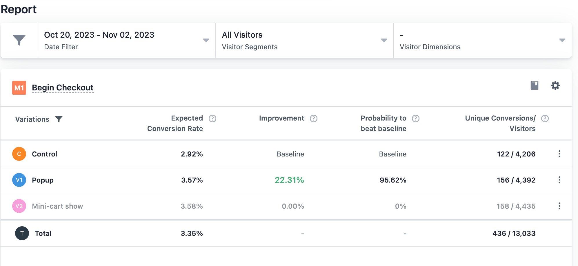
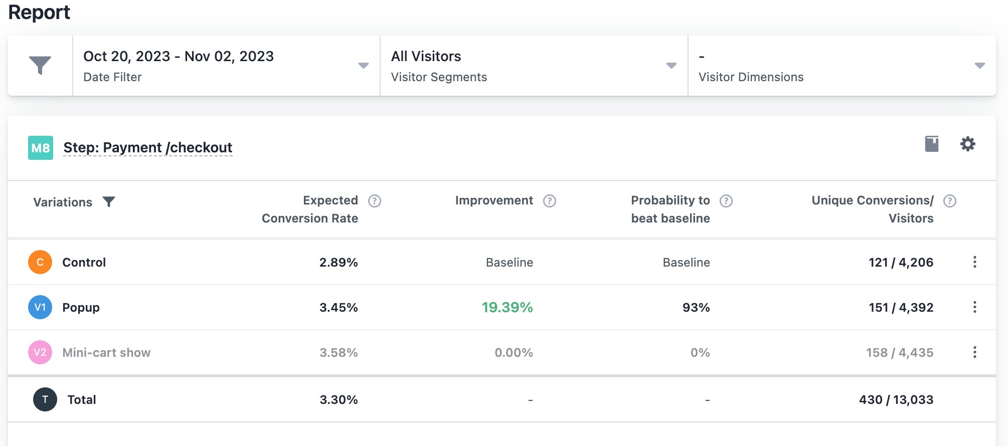
Adding the pop-up increased the number of users proceeding to the checkout process by 22.31%. The conversion rate from the first checkout page to the next improved by 32.57%, and the completion rate for the payment step increased by 19.39%.
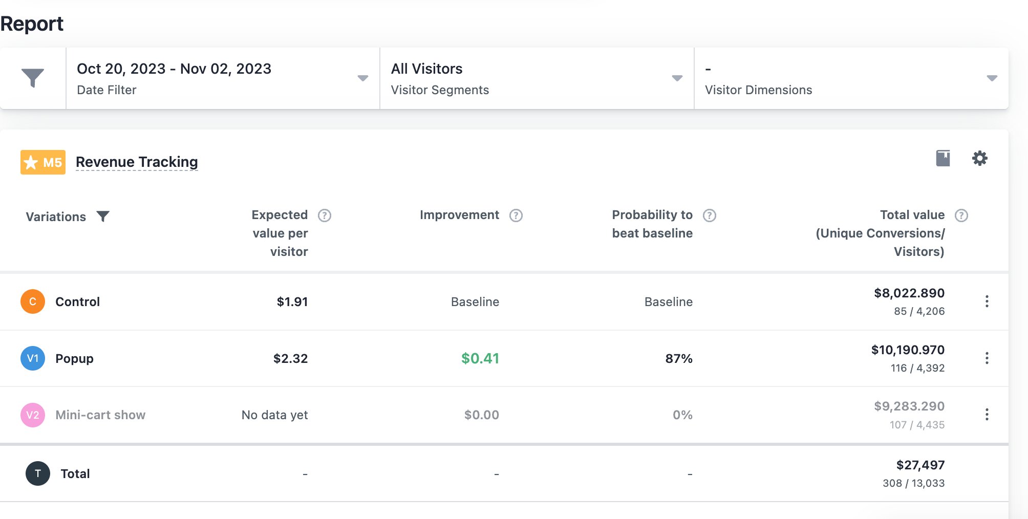
Additionally, the expected value per visitor rose from $1.91 to $2.32, reflecting an improvement of $0.41.
Further tests and learnings
The team also created additional tests, including one where a mini-cart replaced the pop-up. The mini-cart test showed decent results, with a significant increase in conversion rates.
However, it also led to a decrease in the average order value, as users tended to remove more items from their mini-carts.
Moreover, the team tested the popup separately on mobile and desktop devices. On mobile, the main button on the popup that led directly to checkout performed the best. In contrast, on desktop, users converted more effectively when the main button directed them to their cart.
Mini-cart show:
Conclusion
If used correctly, pop-ups can effectively encourage users to take desired actions. For e5, adding a pop-up on the website motivated users to advance to the checkout stage from product pages, helping the business achieve its goal.
Therefore, instead of simply adhering to widely circulated best practices, it’s crucial to test elements within the specific context of your website. This allows you to evaluate their impact on your audience’s behavior and essential business metrics.
Us iterated further by testing a mini-cart against the pop-up, but when they noticed it impacted e5’s AOV, they decided to stick with the latter. This just goes to show that what we think works might not be what our users actually experience. That’s why testing is so important!
You can easily run tests on a variety of widgets from VWO’s extensive library. Thanks to VWO’s Visual Editor, client-side testing is a breeze, with no need to rely on your tech team! So, why not explore the possibilities? Sign up for a free trial today and see what you can create!

Location
Mechelen, Belgium
Industry
Agency
Experiment goals
Increase the number of users moving through the checkout process.
Impact
19.39% increase in completion of cart checkouts


