
Follow us and stay on top of everything CRO
Read summarized version with
“This is a game-changer!”
You must have felt this sense of discovery upon encountering heatmaps and their ability to visually represent datasets. Heatmaps enhance your data analysis by providing visual insights that help you quickly grasp patterns and trends in your dataset, enabling informed, data-driven decisions.
However, understanding the power of heatmaps is one thing; interpreting them correctly to uncover key insights is another. This guide will help you read and interpret different types of heat maps. Let’s dive in!
Learning the basics: How to read a heatmap?
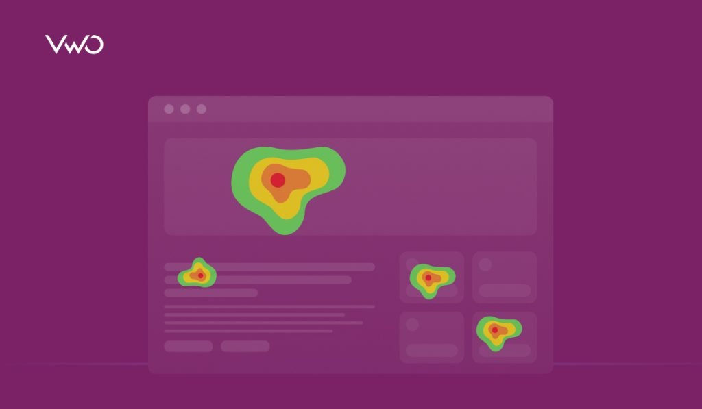
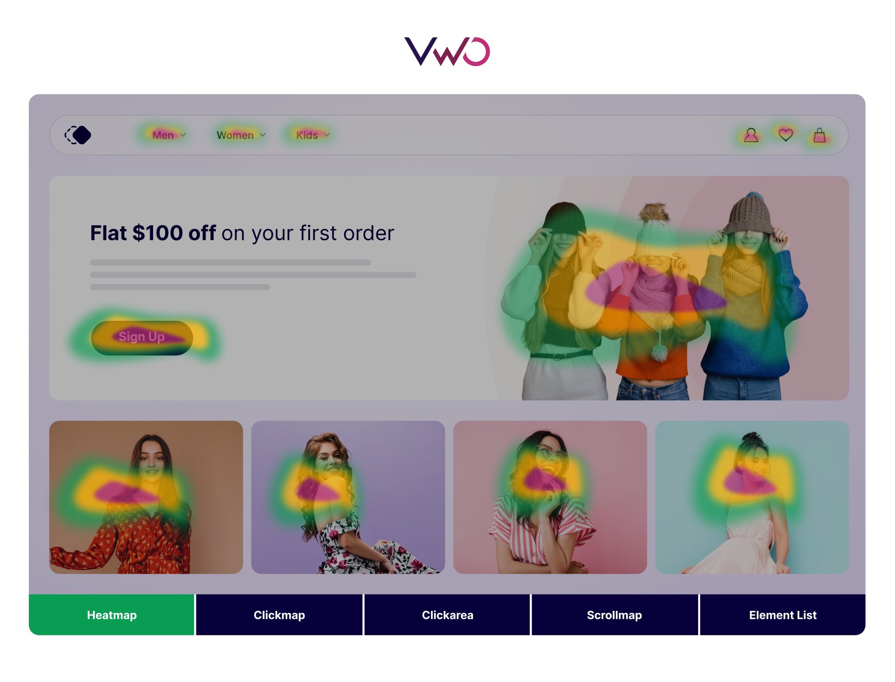
Reading a heat map is straightforward, as it uses a color scale to represent values in the dataset. Typically, vibrant colors like red and orange indicate high values, while cooler colors like blue and green signify low values. For example, in the following website heatmap, areas shaded in red highlight the most clicked sections, whereas the green and its shades point to the least clicked parts. This visual representation makes it easy to identify hotspots and areas needing improvement.
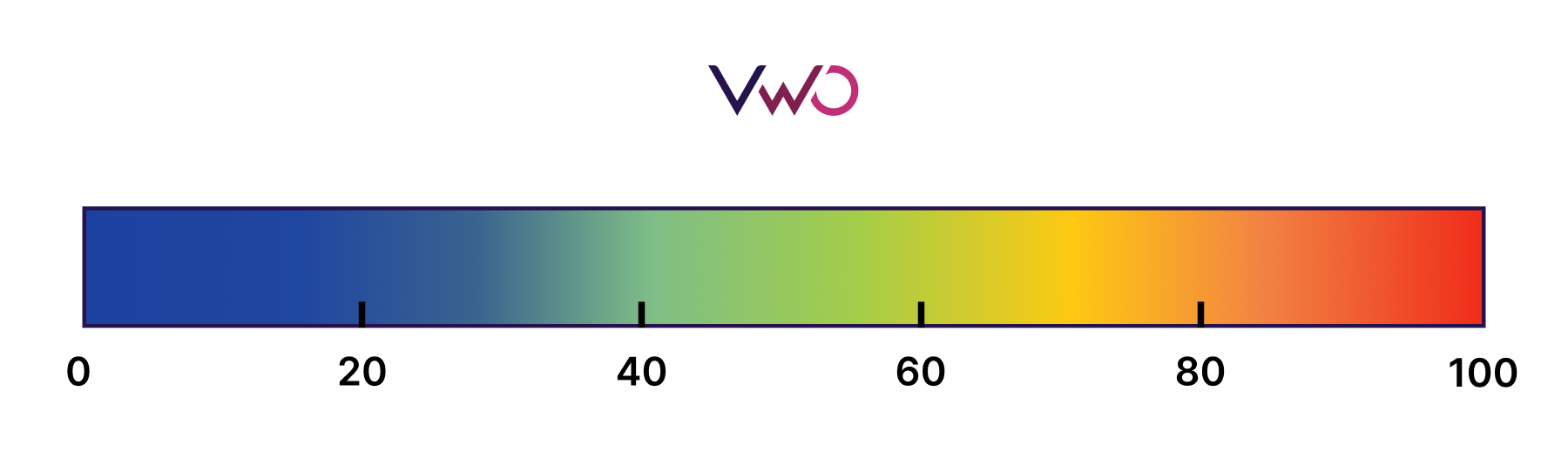
However, it’s important to note that color choices in heatmaps can vary and aren’t universally standardized. Therefore, heatmaps often include a color scale that specifies which colors represent high and low-intensity values.
Additionally, some heatmaps display numerical data to provide precise values and indicate their intensity within the color scale.
With that, we have covered the fundamentals of the heatmap. Now let’s take a look at different types of heatmaps and how to interpret them. You can refer to the information in this section while going through different heat maps.
Understanding and interpreting different types of heatmaps
a. Clustered heatmap
A clustered heatmap offers a visual representation of trends in a dataset, helping you understand the underlying relationships between data points. For example, consider a clustered heatmap showing the average age in different cities around the world for the 2021-2023 period. This heatmap illustrates age distribution patterns across various cities, making it easy to identify which cities have younger or older populations.
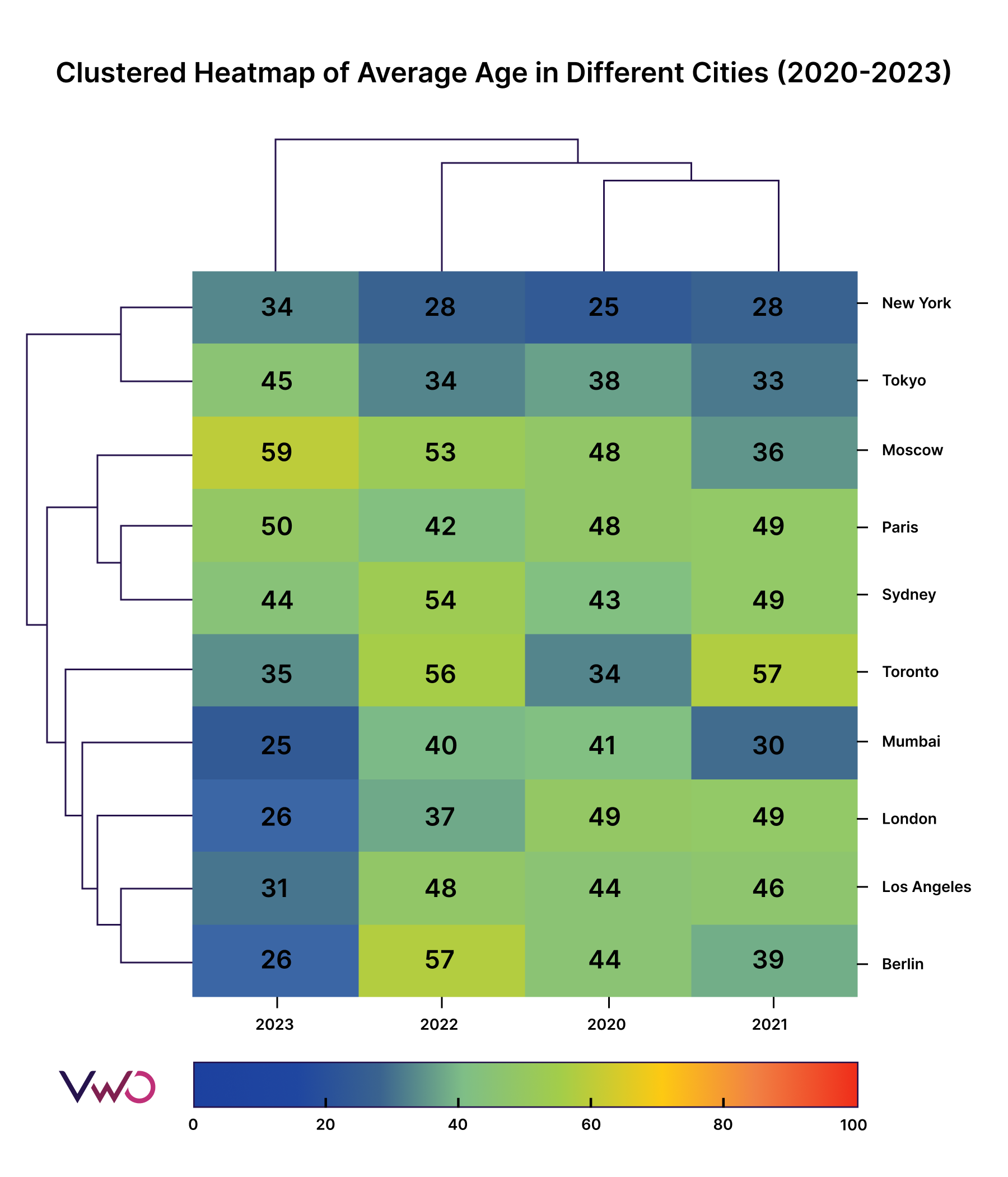
As you can see, the columns represent the average age group for different cities in a particular year, while the rows show the average age group between 2021-2023 for a city. The colors of the heatmap allow you to quickly understand the age profile of any city. For example, you can immediately see that New York has the youngest population between 2021-2023, as the color scale indicates young age in blue and old age in red. Additionally, dendrograms on the left and top cluster cities and years with similar average age profiles, provide a clear visual representation of patterns and trends.
You can leverage a clustered heatmap when you have multiple datasets to compare. It helps identify common links, uncover trends, and make clusters within the data.
b. Correlation heatmap
Correlation heatmaps help visualize the relationships between multiple variables in a dataset. Let’s break down how to interpret one using an example from an eCommerce store dataset, with variables like bounce rate, conversion rate, and more.
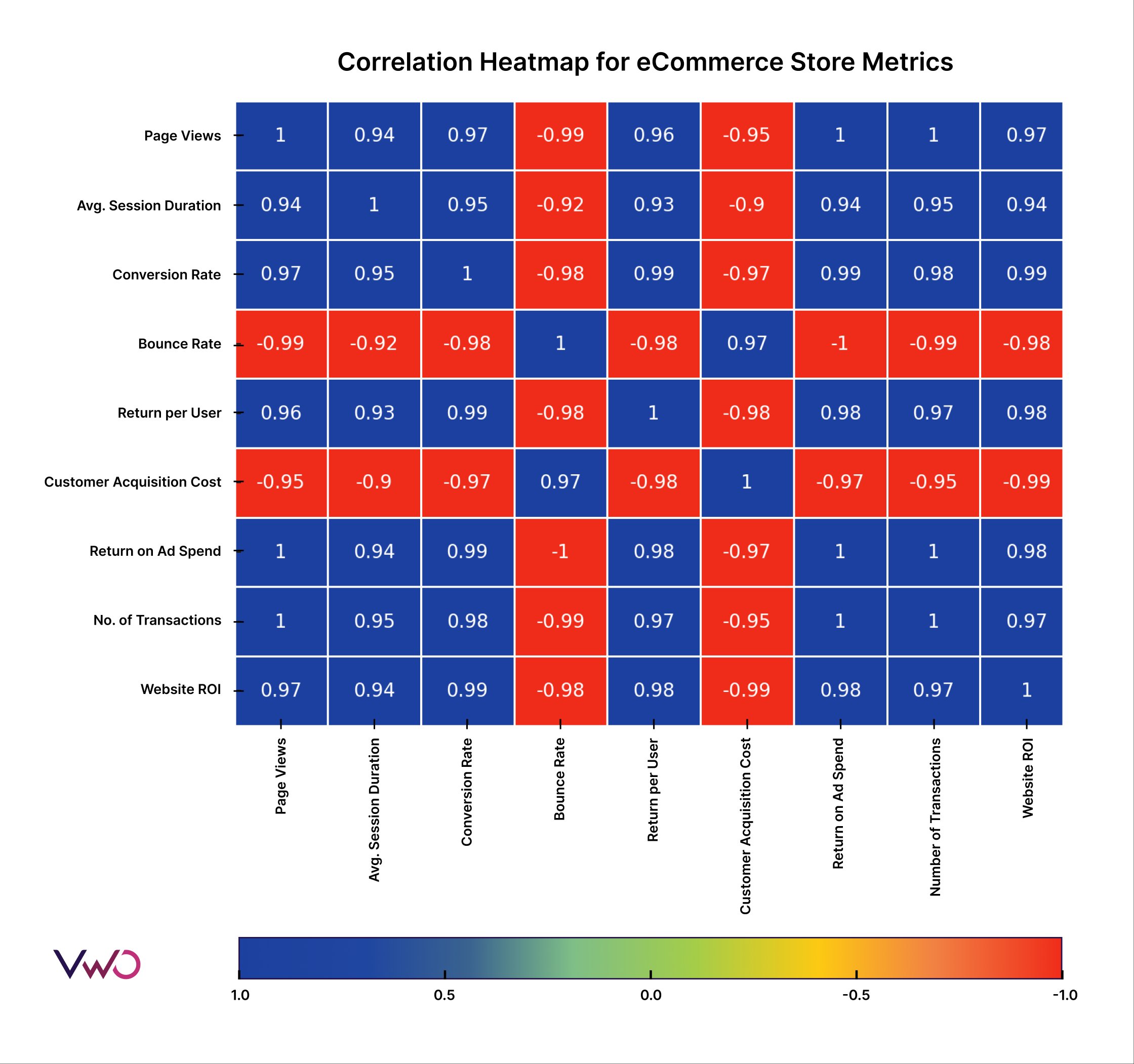
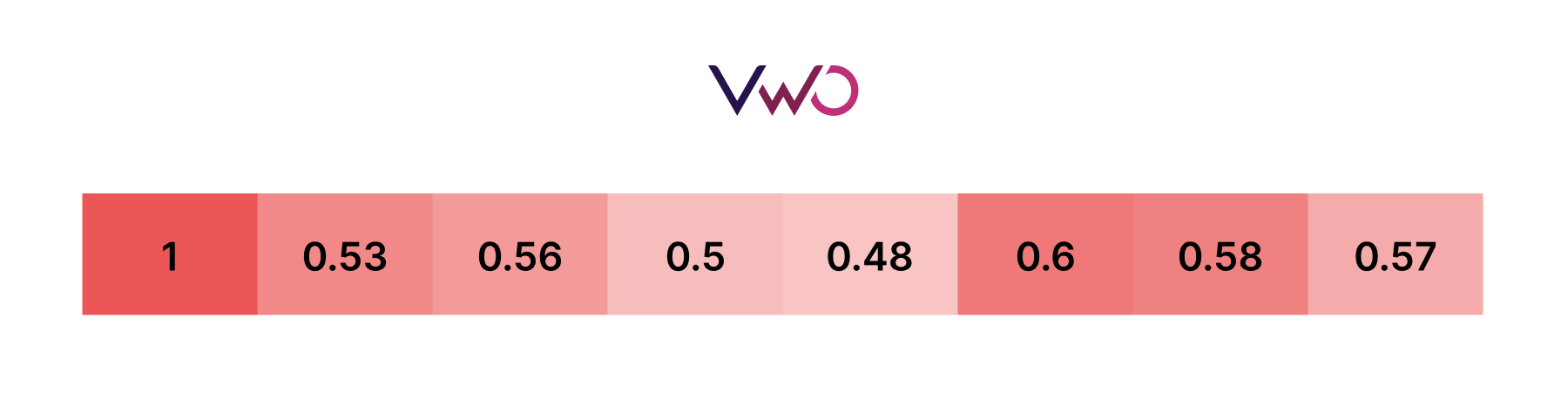
Here you can see the correlation matrix with variables on both the X-axis and Y-axis. A color scale indicates the relationship between the variables with correlation values.
A value of 1 indicates a perfect positive correlation (as one variable increases, the other also increases), while -1 indicates a perfect negative correlation (as one variable increases, the other decreases). To find the relationship, check the intersection block between two variables. For example, if we look at the intersection block of the X-axis Website ROI and the Y-axis Bounce Rate, it shows a red color with a correlation value of -0.98. This means the bounce rate has a negative impact on website ROI.
The advantage of a correlation heatmap is that you can quickly identify extreme inverse or direct relations. In this case, a red intersection block with a -0.98 value indicates that the bounce rate is significantly affecting the website ROI. Thus, it helps to take pinpoint measures to reduce the bounce rate.
This heatmap is beneficial for quickly identifying and showcasing how variables affect each other effectively, allowing you to pinpoint crucial relationships at a glance.
c. Time series heatmap
Time series heatmaps are a fantastic way to visualize data variation over time. Let’s dive into an example to see how to interpret them.
In this heatmap, we’re looking at social media engagement over a week. The x-axis represents the hours of the day, while the y-axis represents the days of the week. The color scale ranges from blue (indicating low engagement) to red (indicating high engagement).
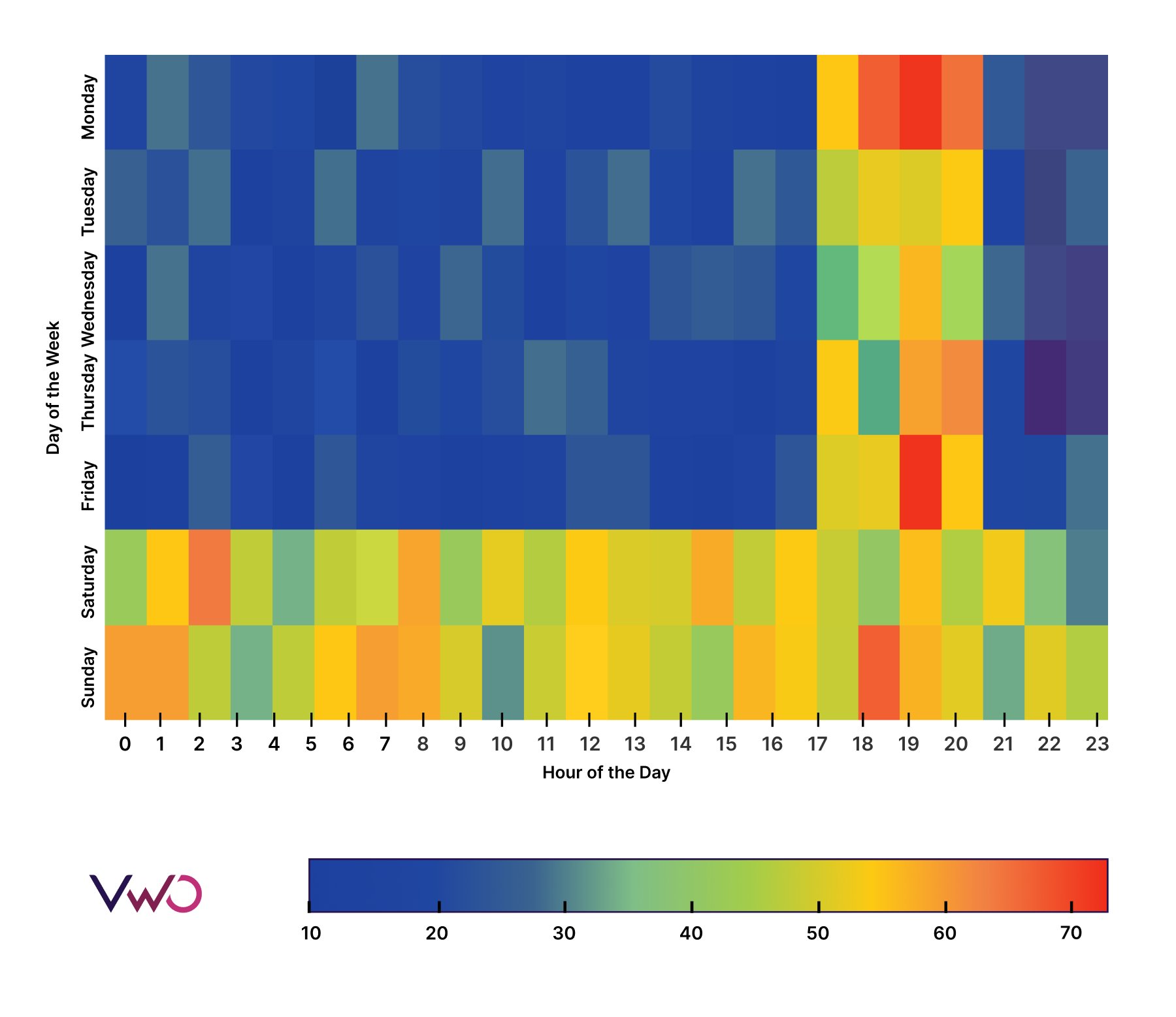
With a time series heatmap, you can easily spot engagement trends throughout the week and day. For instance, you can see that engagement rates peak in the evenings on weekdays and remain high throughout Saturdays and Sundays. This insight can be invaluable for planning social media strategies, such as scheduling key posts for Friday and Monday evenings.
Time series heatmaps are incredibly useful when you need to analyze the impact of time, day, and month on key performance indicators (KPIs). This visual tool can help you optimize your strategy based on temporal patterns.
d. Cohort analysis heatmap
Cohort analysis heatmaps help study trends and patterns within specific groups of data. Let’s delve into cohort analysis with an example:
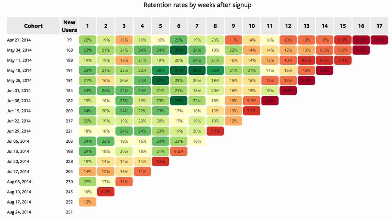
Here, we have a user retention cohort heatmap. Each row represents a cohort, defined here by the day users signed up. For instance, 79 users signed up on April 27, 2014, forming one cohort. Each column represents a time period (e.g., days, weeks, months) after the cohort was formed; in this case, it’s weeks.
To interpret this heatmap, start from the left of the cohort. On April 27, 2014, 79 users signed up. Moving horizontally, you can see the user retention percentage on a weekly basis. The colors provide a quick visual reference: green indicates good retention, while red indicates low retention. For example, you might find that by the 17th week after signup, most users have left. This insight can help you strategize initiatives to improve retention.
Cohort analysis is useful for tracking user retention, product performance, and other metrics over time.
e. Website behavior heatmaps
i. Scrollmap
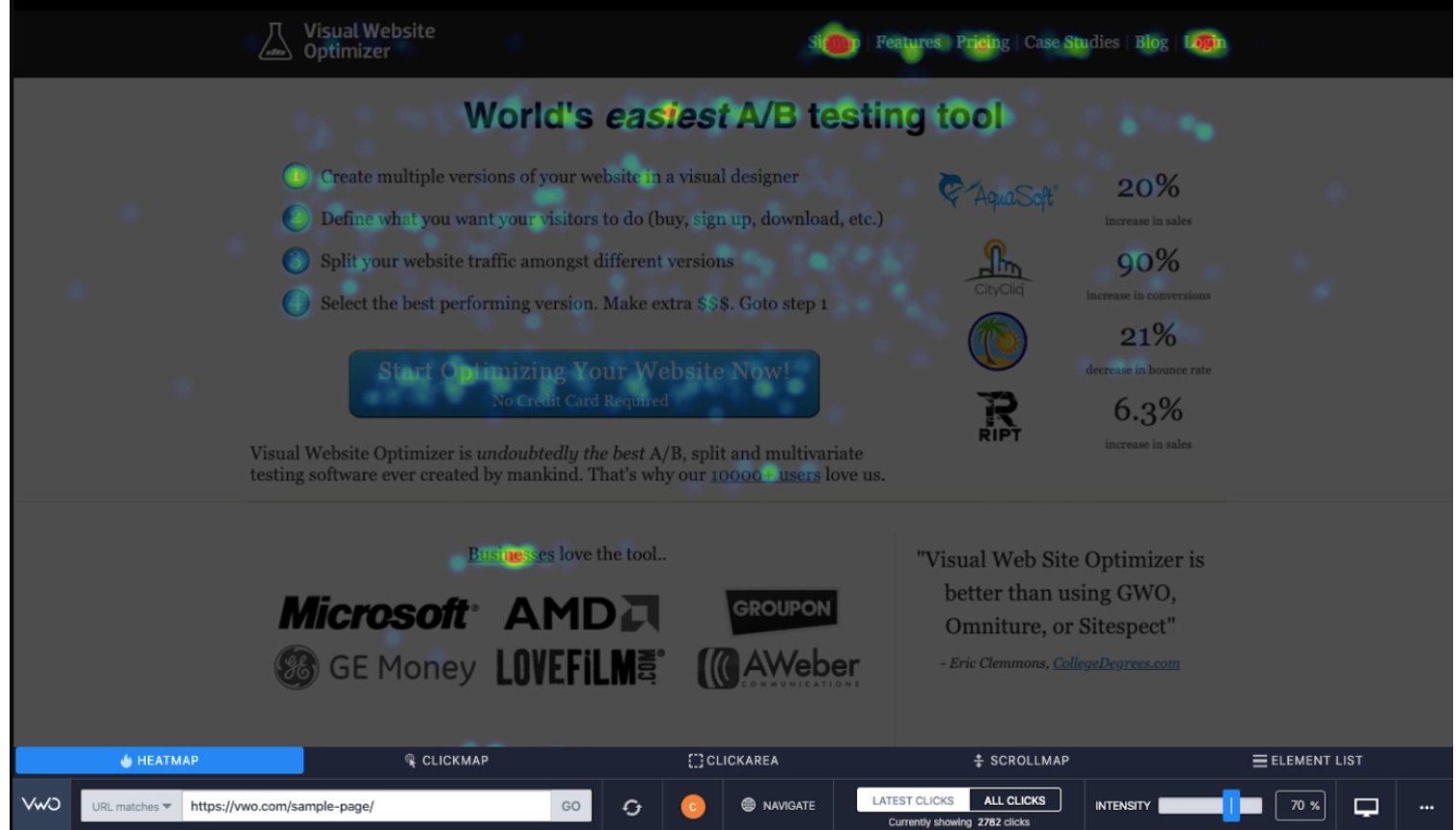
Scrollmaps help you understand how engaging visitors find your webpage. Let’s take a scrollmap analysis of an online store:
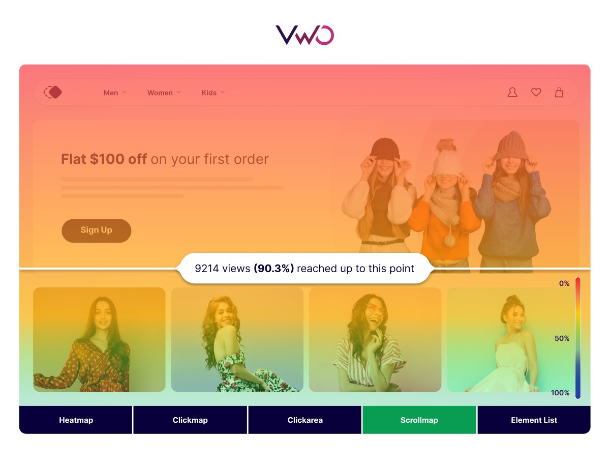
On the right corner of the scrollmap, you can see the color scale that denotes changes in color relative to the percentage of scrolling. The horizontal lines indicate how many visitors viewed up to each scroll point.
Scrollmaps can identify crucial points on the webpage, such as the scroll depth percentage at which half of visitors drop off. This information can be invaluable for redesigning your page to add engaging elements precisely where they’re needed most.
Use VWO Scrollmap to see % scroll depth for different devices (mobile, tablet, desktop) from a single interface. This will help you make an informed hypothesis without switching context.
ii. Clickmap
Clickmaps elevate your visitor behavior research by showing the click performance of each clickable element on your webpage.
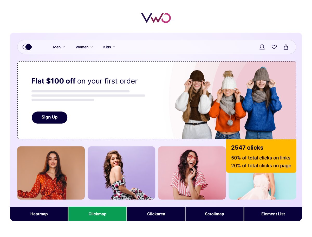
When you hover over different clickable elements, the clickmap displays the number of clicks and the associated percentage of overall clicks on the page. This insight helps you understand which elements are attracting the most attention and interaction, guiding you to optimize your page effectively.
iii. Mouse tracking heatmap
Mouse tracking heatmaps visually represent the data of mouse movements from all visitors. Here is an example:
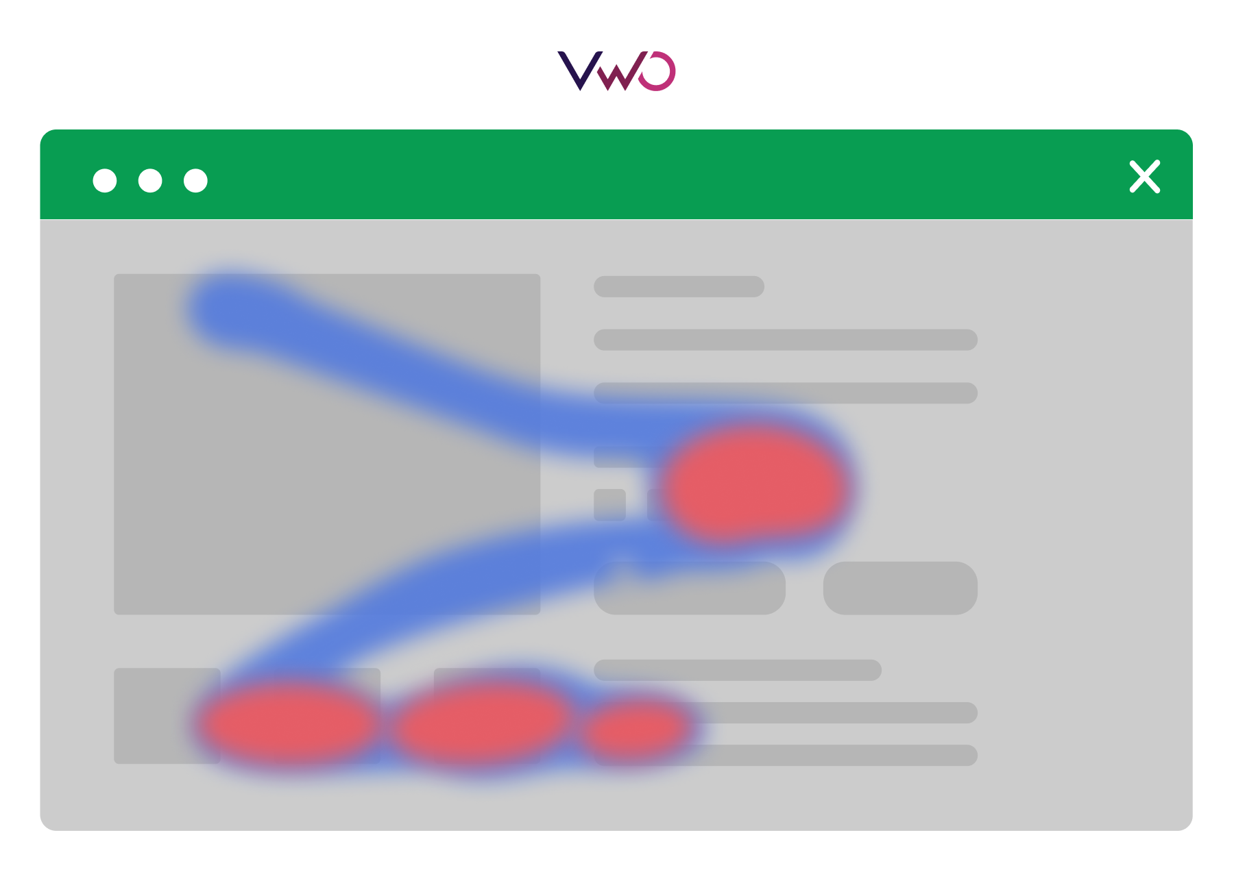
The red spots indicate where visitors typically rest their cursors, while the blue spots show the mouse trails. This heatmap helps you identify crucial areas on your webpage where users tend to pause, suggesting these spots should feature important web page elements.
iv. Click area heatmap
Click area heatmaps are an advanced tool for analyzing visitor behavior, allowing you to interact with the heatmap report. By selecting a specific area on your webpage, you can see the number of clicks within that zone. Here is an example:
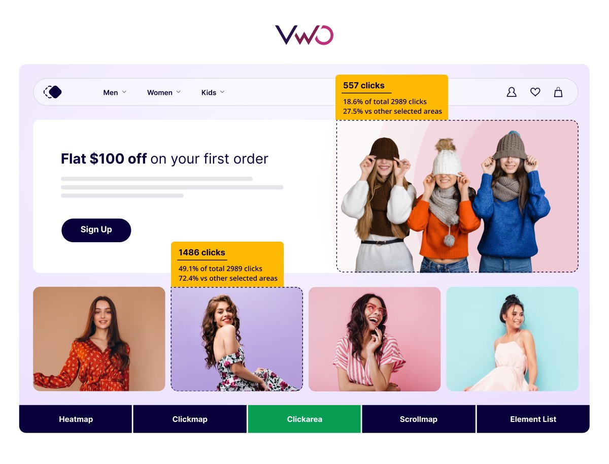
By clicking and selecting an area on the webpage, you can view the number of clicks along with other stats like the percentage of total clicks on the webpage and the percentage relative to other zones.
This helps identify both attractive and less attractive areas on your webpage, providing valuable insights for redesign efforts.
v. Rage click heatmap
A rage-click heatmap helps you identify friction points on your website. Here’s an example:
In this heatmap, you can see spots where users have rage-clicked, mistakenly thinking plain text or non-clickable elements were interactive. These frequent, frustrated clicks highlight areas of user confusion and frustration.
Some heatmaps allow you to filter by rage clicks, making it easier to pinpoint these problem areas. By analyzing this heatmap data, you can make informed decisions to fine-tune the user experience on your webpage, ensuring a smoother and more intuitive navigation for your visitors.
That wraps it up!
The information provided helps you visualize various data types using different heatmaps, allowing you to quickly grasp underlying insights and patterns.
If you’re looking to utilize website heatmaps to understand visitor behavior, you must explore VWO Insights – Web Heatmaps. Here’s why you shouldn’t miss out:
Benefits of choosing VWO Insights – Web for heatmap analysis
VWO Insights – Web’s Heatmap is one of the most versatile and sophisticated tools available in the market. Choosing it means you’re tapping into these incredible benefits:
Effortless setup
Setting up VWO Insights – Web is a breeze. Just add a small code snippet to your website, and you’ll be ready to start collecting valuable insights. It’s a one-time activity that gets you up and running in minutes.
Comprehensive features
VWO Insights – Web heatmap offers a complete picture of visitor behavior with different types of heatmaps like clickmaps, scrollmaps, click areas, rage clicks, dead clicks, and first-click filters, all accessible through a dashboard.
End-to-end optimization
Not only can you gain insights from heatmap analysis, but you can also act on them by deploying new designs, running A/B tests, or personalizing the website, all from the VWO platform.
Proven success
Companies like Ubisoft leverage VWO Insights – Web Heatmap. Here’s what they have to say:
We ran a series of A/B tests based on the data we gathered by using Heatmaps, Scrollmaps, and Surveys available on the VWO Platform. It helped us identify key elements on our websites that needed a deeper look. – Jenny Hughes, Digital Marketing at Ubisoft.
Enterprise-grade security
The VWO Platform is built with our commitment to security. We honor users’ right to data privacy and protection. VWO is GDPR, PCI DSS, CCPA, CPRA and HIPAA compliant and also holds certifications such as ISO 27001:2022 ISMS, ISO 27701:2019 PIMS, ISO 27017 Cloud Security, ISO 27018 Cloud Privacy & SOC 2 Type II. We undertake security audits, penetration testing, and data backups regularly to ensure the security of our servers worldwide. With VWO, you can completely focus on building better digital experiences while we take care of all security and compliance issues.
Try before you buy
We understand that investing in a tool is a big decision. That’s why we offer a full-featured 30-day free trial to help you gauge its potential. Don’t miss out on uplifting your website experience with VWO Insights – Web Heatmaps.
Final thoughts
Understanding how to read and interpret different types of heatmaps can significantly enhance your data analysis capabilities. By leveraging the visual power of heatmaps, both businesses and individuals can gain valuable insights from their data.
For websites, heatmaps can reveal various aspects of visitor behavior, providing a snapshot of how users interact with your site. However, mature organizations don’t stop at heatmaps. They also utilize other tools like session recordings, surveys, and form analytics to get a 360-degree view of visitor behavior.
So, don’t limit your analysis to heatmaps alone. Explore these additional tools for a more comprehensive understanding and robust data analysis. This holistic approach ensures you capture the full picture and make data-driven decisions that truly enhance your website’s performance and user experience.
Frequently asked questions
Heatmap analysis is a two-dimensional graphical representation of data where individual values are depicted by color. The intensity of the color varies according to the value, allowing for a quick visual summary of information.
Evaluate a heatmap by analyzing the color patterns that represent the values. These patterns can reveal hidden insights like user behavior. For instance, in a time series heatmap, the color patterns can indicate the time slots with the highest engagement rates.
Heatmaps convey meaning by showcasing gradients and patterns in data through colors, making it easier to interpret complex information at a glance.
From a heatmap, we can infer the distribution or intensity of a value, which helps in identifying patterns or trends within the raw data points.


