Medienreich Training Improved Customer Focus To Increase Engagement Using VWO
VWO and Medienreich Training
Medienreich Training is a German company that provides software training for participants from the same company or for a mixed audience drawn from across companies.
The company used the VWO platform to run a Split URL test.
Goals: Increase engagement
The overarching goal of the company was to increase conversions. But as a prelude to boosting conversions, Medienreich wanted to increase engagement with company offerings on the website.
Tests run
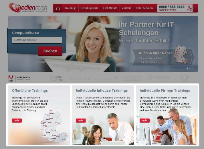
On its home page, Medienreich showcased its training services under 3 broad categories:
- Open training: Training participants from different companies.
- Individual in-house training: Customized training for employees of one company conducted at the company’s premises.
- Individual company training: These are also tailored to the client’s needs but held at Medienreich’s own training centers.
This is how the original home page looked:

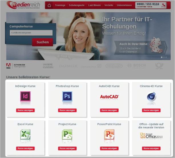
Medienreich’s online marketing team decided to replace the 3 broad training categories with 8 best-selling courses such as Photoshop, InDesign, AutoCAD, Excel, PowerPoint, Project, and others.
Before implementing the change on a permanent basis, MedienReich used VWO to run a Split URL test. Tracking “engagement” was the primary goal of the test.
This was the variation used:

Medienreich ran the test for around 20 days.
Conclusion
The variation displaying the 8 most popular courses beat the control, increasing engagement by 40.87%. The statistical significance was 99.9%, which meant that the variation could be expected to beat the original 999 times out of 1000.
Marc Stenzel, Medienreich’s SEM manager, estimated that as a result of the change, the year-on-year value of the home page increased by a phenomenal 106.42% (from $2,149.72 to $4,436.41).
Marc Stenzel said, “My hypothesis was that we could decrease the bounce rate when we display our bestselling training topics as it would reduce the effort the visitor has to put into looking for them. I was happy to see that the hypothesis was true.”
So what are the key takeaways from the results of this test?
1) Provide Right Information in Right Order
Your website is like a story. Like all well-written stories, your website must convey facts in a logical sequence for them to make sense to visitors. In this case, that meant making it easy for visitors to find out easily if Medienreich offered the kind of training they were looking for. Only if it did would it make sense for visitors move forward to figure out if individual or in-house company training made more sense.
As Marc explained, “It is crucial when in the conversion funnel you provide which information. The visitors wanted to know if we provide training for their desired topic in the first place. The information about the different training types (as seen in the control) is information the customer is interested in after getting to know whether we provide their topic. So, the right information at the right time is important.”
2) Think from the User’s Perspective
Identify your buyer personas and then put yourself in their shoes to understand what they are looking for and how they might approach their search on your website. As Marc put it, “To create the test, I was trying to think more like the user and how I could make it easier to find what he was probably looking for.”
3) Display Your Best on the Home Page
Your home page should contain information that is useful and relevant to visitors and easy for them to find. Avoid cluttering the home page with what is important to you (but not to potential visitors). Remember that your home page is the entrance to your store, so you must make it attractive for prospects to step in. You may find these tips on how to make your home page a conversion magnet handy.

Location
Germany
Industry
eLearning
Impact
40% increase in engagement


