Loft Resumes Used VWO To Test Improved Messaging and Increased Purchases
VWO and Loft Resumes
Using information from its customers’ resumes, Loft Resumes makes the documents more visually appealing.
To help improve website conversion rates, the company hired Conversionlove.com, which uses VWO for its optimization requirements.
Goals: Increasing Conversions
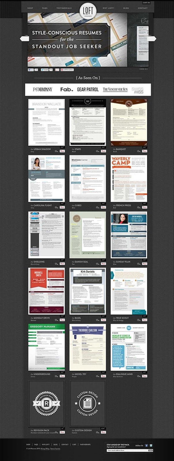
This is what the original home page looked like:

To understand possible impediments to conversion, the team conducted some usability tests that revealed that:
- In the initial few seconds, visitors did not understand what the site offered.
- Many visitors confused it with a resume-writing service.
- Users mentally categorized resumes into different buckets, such as resumes with photo, resumes without photo, conservative resumes, and so on.
Next, they proceeded with a product/market fit survey (created by Sean Ellis). The survey too threw up critical insights about Loft Resumes’ customers:
- Although their blog was the main source of traffic, customers also mentioned names of some other websites (Fab.com, Fast Company, and others) from where they heard about Loft Resumes. (These sites can be used later for media buys and display advertising.)
- Their biggest competitors were people who hired designers.
- Many individuals preferred to design their own resumes.
- They understood how customers perceived the value they received from Loft Resumes’ service—that it helped customers’ resumes stand out.
- Their service was ideal for designers, people in creative industries, and marketing professionals.
A short survey on Qualaroo revealed that some people felt that the prices of their services were too high.
Tests run: Redesigning the Home Page for Enhanced Messaging Clarity
Armed with the data and above insights, the team decided that the page needed to be overhauled to improve messaging clarity around its services and benefits. The test hypothesis was that communicating the benefits of their service in a way that would make it easier for prospects to perceive would increase website sales.
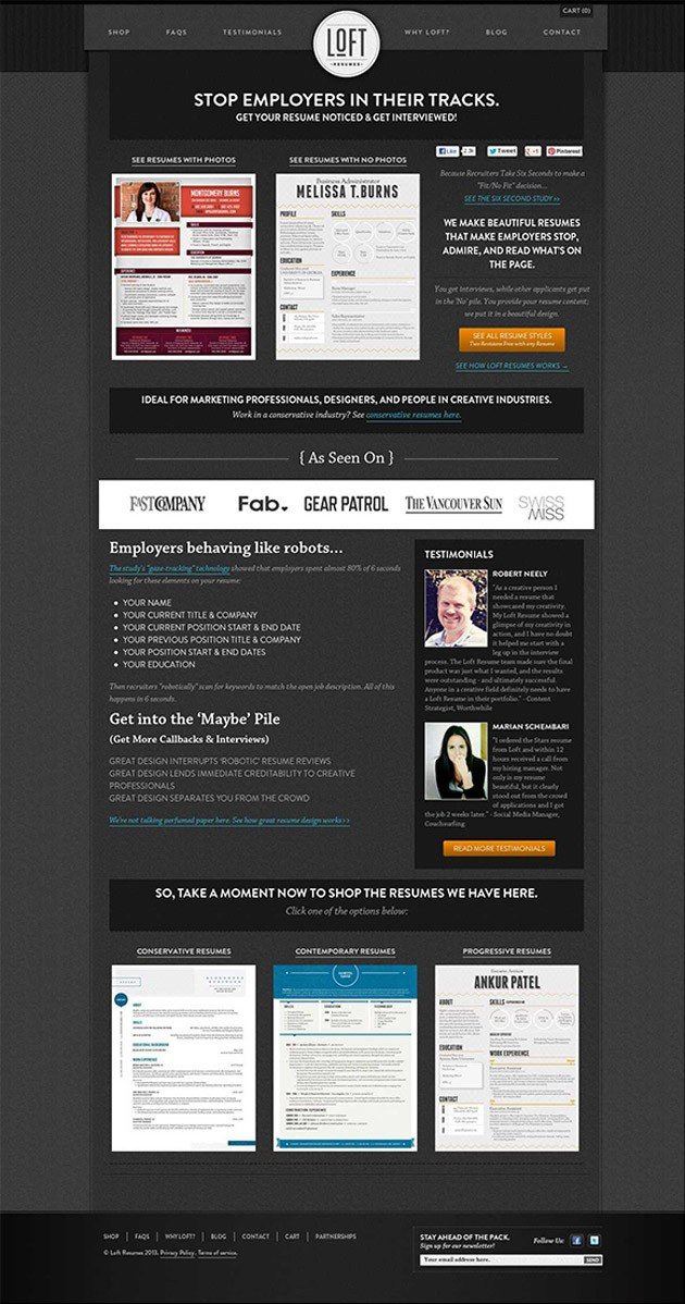
They created a redesigned home page that looked like this:

VWO was used to run a Split URL test between the original and the variation. The objective of the redesigned page was to align the design and message better with how prospects think about resumes. The following changes were made:
- Resumes were categorized as those with photo and without photo.
- The headline emphasized the value proposition with clarity. (The control page didn’t have any headline.) This made it easy for even new visitors to the page to understand what the site was all about.
- The second call-to-action above-the-fold directly addressed Loft Resumes’ ideal customer profiles (marketing professionals, designers, and other people in creative industries).
- The 6-second study was used to emphasize the challenge that with so many other candidates applying for jobs, there’s a high possibility that the prospect’s resume may not get enough attention from prospective employers. By making the users more aware of the problem, their desire to distinguish their resume from the rest was increased.
- Loft Resumes’ ability to help their customers’ resumes stand out was then shown as a solution to this problem. Users perhaps saw this service as a “need” than a frill or an optional service. This increased the perceived value of the service and narrowed down the gap with the perception of “high price.”
- The conversion team used the popular AIDA (Attention, Interest, Desire, Action) model to rewrite the copy. Words and phrases that customers had used in the survey to describe the benefits were included.
- To add credibility to the service and make for a more compelling case, the below-the-fold section listed customer testimonials with pictures.
Conclusion: 64.8% Increase in Purchases
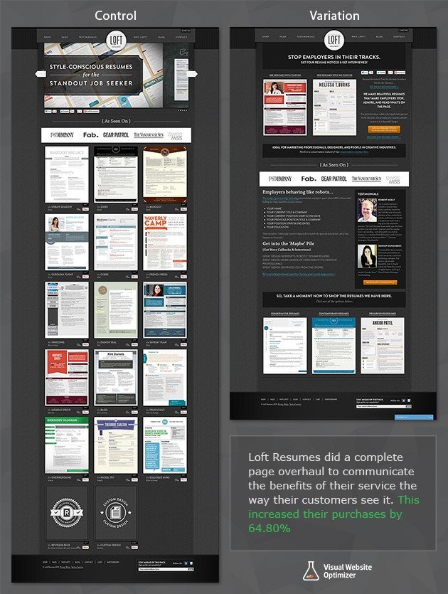
The newly-designed page beat the original, increasing purchases by 64.8%.
Here’s the comparison image showing both the original home page and the winning variation:

Understanding customers and their needs does pay. Many businesses think they know their customers well and base their marketing plans on this “knowledge.”
A good practice is to periodically capture the voice of the customer through surveys and other avenues. Also, the feedback should not be limited to asking what customers like or dislike about your brand/service.
The more you let customers speak, the better insights you will have and the more effective your A/B test ideas will be. After all, the key is to make sure that your marketing messages match the thoughts of your prospects when they are thinking about buying your product and give them the required answers. Do this well, and you make a sale!

Location
US
Industry
Universities
Experiment goals
Increase in number of purchases
Impact
64.8% increase in Purchases


