How Klickkonzept Helped Its Client Improve UX & Boost Revenue Using A/B Testing
About Klickkonzept
Klickkonzept is a Germany-based, online-marketing-performance agency. It excels in services like SEO, SEA, CRO, social media, and e-mail marketing. With the vision of building a 360-degree online marketing concept, it helps its clients in boosting their website KPIs. Klickkonzept firmly believes that all online marketing practices go hand in hand.
This success story is with reference to one of its eCommerce clients, point-rouge.
Klickkonzept made a couple of important observations per the data collected from Google Analytics and a usability test done by them. The data highlighted a high cart abandonment rate and a high bounce rate contributing to a low conversion rate.
All these observations helped Klickkonzept understand where the leakage was happening in point-rouge’s conversion funnel. It used these insights and observations to craft the absolute conversion rate optimization (CRO) approach and test it with the VWO Experimentation Platform™.
With AdWords and price comparison websites being the major traffic sources, point-rouge’s conversion rate was lower than expected. As Klickkonzept team digged in deeper, it noticed:
- A high number of abandoned carts
- A high bounce rate on product pages
The data from Google Analytics also highlighted that visitors with higher session duration tend to convert more.
Goals
Based on the observations and the current conversion rate, the Klickkonzept team was able to identify the following challenges they needed to address:
- Not having a clear proposition on the website
- Less understanding about website visitors
- Giving more preference to assumption over data and missing out on CRO as a
data-driven process
The primary goal was to build a comprehensive understanding around the website visitors, their onsite behavior, and the pattern they follow to convert. It was necessary to identify the elements that were preventing the visitors from purchasing a product.
As point-rouge is an eCommerce store, Klickkonzept decided to focus on improving user experience on high-potential pages, that is, the home page, product pages, and the checkout page.
The Klickkonzept team also wanted to leverage this information to improve point-rouge’s KPIs such as the bounce rate, session duration, and conversion rate.
Tests run
Klickkonzept conducted a “Usability-Testessen” (Testessen= Testdinner) test where they asked a bunch of people to purchase a product from point-rouge’s website and share inputs regarding their experience as a new visitor.
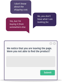
Besides, they ran an on-site survey targeting all the website visitors. This survey was conducted across all the website pages.

After consolidating all the responses, it was clear that point-rouge had low brand awareness. Visitors did not have sufficient information about point-rouge and its products. The proposition was not being clearly communicated.
Though the following 3 USPs were mentioned at some places, but these did not have the right positioning to engage the visitors:
- 90-day return policy
- Free gift wrap
- Free shipping after the second order
The team outlined the solution as follows:
- A “Usability Testessen” (Testessen= Testdinner) test to understand a new visitor’s experience while making a purchase.
- Leverage VWO to identify the best position for brand’s USPs, and then ensure that visitors get to access the relevant information faster.
Hypothesis
To increase awareness and build trust for the brand, it was necessary to have clear communication around point-rouge’s propositions.
After compiling all the observations from their research, Maurice and his team drilled down to the below hypothesis:
“If we put the 3 most important USPs and highlight that visitors can avail free shipping after their second order, the conversion rate will increase by 10%.”
The team created this hypothesis on its VWO dashboard and based on the relevancy score, began the test.
Test
To find out the best position for the USPs, the team tried a different variation with VWO as its CRO platform. They decided to have this information on the Header bar to ensure that visitors get to access the relevant information faster.
The test was run for 3 weeks for all desktop visitors.
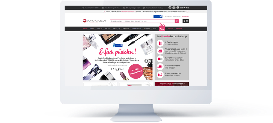
Here’s the original home page screen:

Here’s the screenshot (close-up) of the Control:

Here’s the screenshot (close-up) of the Variation. Note the USPs added to the header bar:

Conclusion
The variation performed better than the control across majority of visitor types. As a result, it facilitated to increase the conversions rate for point-rouge by 7.12%, contributing towards the revenue boost by 19.24%.
Klickkonzept believes that the variation won because visitors got all the relevant information they needed to make a purchase.

Location
Frankfurt, Germany
Industry
Agency
Experiment goals
Increase in revenue
Impact
19.24% increase in Revenue


