Hubstaff’s Homepage Redesign Test Led to a Staggering Increase in Visitor-to-Trial Conversion
Hubstaff and VWO
Hubstaff was born out of a desire to help distributed teams work more efficiently. Founded in 2012, Hubstaff offers time tracking and project management software for companies with growing remote, in-office, and field teams.
Its three flagship products (Hubstaff Time, Hubstaff Desk, and Hubstaff Field) give teams smarter time tracking, location-based automation, proof of work features, invoicing, payroll, and more. The Hubstaff suite is designed as a complete workforce management platform, including an Agile PM tool called Hubstaff Tasks and a remote work talent platform called Hubstaff Talent.
Today, co-founders Dave Nevogt and Jared Brown lead Hubstaff’s team of more than 90 people across the world as a remote-first (and only) company.
We spoke with Hubstaff Marketing Manager, Peter Gratale, to hear about how the company uses VWO. Peter is one of the many folks at Hubstaff who work with A/B tests since 2019. Dave Nevogt, one of the Co-Founders of Hubstaff, has been using VWO since 2015.

The testing and experimentation journey at Hubstaff has greatly evolved since 2015. In the beginning, the team was mainly testing solo elements such as headlines or buttons. In recent times, they’ve run both small and advanced, high-risk tests on their websites. The Hubstaff homepage redesign test is one such high-risk example that we will discuss in detail.
Goals
Dave is a true believer in the power of experimentation because of the business impact it can have. At any time, at least five different experiments are running on the Hubstaff website. Running these tests for strategic changes to the marketing and product experience gives the team confidence in any change.
Hubstaff’s former homepage (the control) had the same design with only small modifications. This time, Dave and his team decided to go for a complete overhaul. They wanted Hubstaff’s growth and expanded positioning front-and-center on the website. They also hypothesized that showcasing the most recent and relevant features would likely drive more conversions, for example, visitor-to-trial and trial-to-paid conversions.
Observations
The thought process
For Hubstaff, traffic, trials, and revenue are key performance indicators of marketing efforts.
When hundreds of thousands of visitors are involved, dropping a couple of percentage points means thousands of dollars in lost revenue. Thus, the team puts a lot of thought into every single test.
Traffic to the Hubstaff homepage leads directly to trials and paid plans, so SEO best practices were a priority in order to draw the right kind of organic traffic. The homepage update had to ensure an optimal conversion rate through a smart hierarchy of copy and visuals that highlighted all the right features.
Homepage redesign
- Among all pages of their website, Hubstaff’s homepage draws the largest number of visits, so Dave and his team did not want to risk losing conversions and traffic. The biggest fear was that they would set up the test and launch it, but conversions wouldn’t happen. Though only 50% of the audience would see the variation, any dips in conversions could have a trickle effect.
- They also wanted to ensure that the results from the test justified the time and effort that the team invested in creating the new design.
- If this test proved successful, the team would then roll out the new design to the remainder of the site. In other words, the future of the marketing site rested on making sure this test was created and tracked accurately.
- When testing such a critical page’s redesign, the team at Hubstaff had to keep an eye on multiple factors, including tracking the on-page conversion rate and using heatmaps to view visitor behavior.
Tests run
Test: Homepage redesign Split URL Test
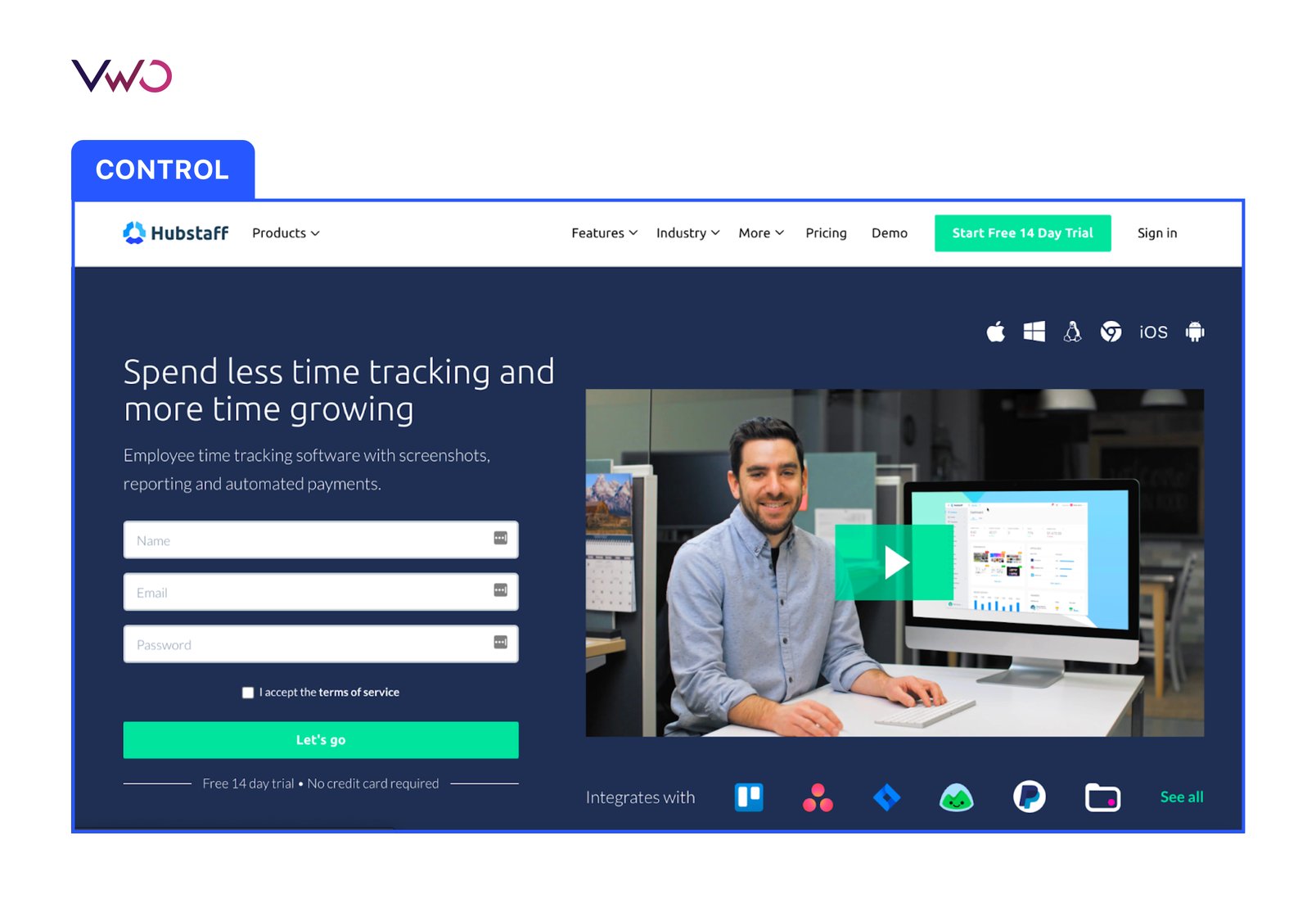
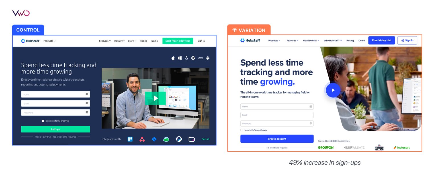
Hubstaff followed a thorough process for creating and designing pages on the website. Following that, the redesigned page launched as a Split URL test. This is what the old homepage (the control) looked like:

Due to the potential impact of this test, the team tracked multiple metrics through VWO:
- Visitor-to-trial conversion: This metric would confirm whether the new page is driving more visitors to start a trial.
- Hero form submission: Number of visitors submitting their emails on the homepage by filling out a form and clicking “Create Account” vs. clicking on the “Free 14-day trial” CTA button.
- On-page engagement: The total number of clicks to indicate the level of visitor engagement with the homepage.
- Pricing page views: The number of visitors clicking through to the pricing page.
- Full funnel journey: Tracking visitors who converted from free trials to paid customers further down the funnel. This metric was tracked to understand that if conversion to paid customers was lower, was it due to the new homepage design or an experience in the app itself? Within the app, the experience is the same for both the homepage versions.
Result
More than 10 team members were involved in the whole process, from ideation to design to execution. It took three months for the test to be ready, with design taking the most time. The test ran for three months. A total of 259k visitors were a part of it (across the two pages that were running).

The variation won with a 49% increase in sign-ups. Here are the final results:
- Visitor-to-trial conversion: This was one of the key metrics that the team at Hubstaff was chasing, and it saw a 49% increase.
- Hero form submission: There was a 34% increase in visitors entering their emails on the homepage.
- On-page engagement: The number of clicks decreased by 6%. However, connecting that to the sign-up data suggested that the new page was performing better in sign-ups, reducing the number of clicks.
- Pricing page views: There was a 3% decrease in pricing page views.
- Full funnel journey: VWO reporting showed a 7% drop in free trial-to-paid conversions. But as mentioned above, considering that the in-app experience was the same for both homepage versions, this drop could not be attributed to the new design alone. The team also conducted more in-depth research using additional analytics tools, which corroborated that paid subscriptions were not affected.

VWO was essential in understanding which landing pages and variants were performing and which were not. In our early days, this really helped us understand the types of copy our audience was responding to and helped shape our marketing efforts ever since.

Dave Nevogt
Co-founder & CMO
Conclusion
With the homepage test successfully wrapped up, the Hubstaff team will continue to A/B test smaller pieces of the homepage, such as copy. (VWO’s powerful visual editor is backed by OpenAI’s GPT-3.5 Turbo and offers effective copy alternatives for existing text on your page. Take a free trial to see how it works!)
Now that we’ve switched to the new design, it’s going to all be about optimizing from here.

Peter Gratale
Marketing Manager
Today, at any given time, the team at Hubstaff runs at least 5 tests with an average of 3 tests per month. Through regular and rigorous experimentation like this, folks at Hubstaff know that they are always on the growth path. VWO makes A/B testing easy for you and helps you improve your testing velocity. Take a free trial to explore the power of its features.

Location
US
Industry
Software
Experiment goals
Increase form submissions, increase pricing page CTR, optimize visitor journey
Impact
49% increase in visitor-to-trial conversion


