GoodwillFinds Increases Clicks On The Add-To-Cart Button By A/B Testing The Product Page
About GoodwillFinds
GoodwillFinds is an online e-commerce thrift store where people can shop for donated goods like jewelry, electronics, furniture, and clothing. Every purchase made at GoodwillFinds provides support to Goodwill career centers and social enterprises across North America. By selling donated items, GoodwillFinds prevents them from going into landfills and promotes a sustainable environment.
Why VWO
This was the first experiment we made live with VWO and we find the platform to have a broad range of capabilities and relatively easy to use for non-technical staff.

Jim Davis
Chief Revenue Officer
With its powerful no-code visual editor, VWO makes testing super easy for the non-techies. You can easily modify your website or add new elements without involving the development team.
Goals
GoodwillFinds offers a wide range of products for its consumers and the product detail page (PDP) is a crucial part of the conversion funnel. The company website is available for both mobile and desktop users, and the primary CTA on both these versions is the ‘Add-To-Bag’ button. GoodwillFinds wanted to improve the click activity on the CTA button, especially for the mobile website.
Observations
While analyzing the user behavior on the PDP, the team noticed that the number of CTA clicks on the desktop experience was much higher than the mobile experience.
The team also noted that the same content was being shown to users on both versions. However, since the mobile screen displays limited information at a time, users had to scroll down quite a bit to click on the ‘Add-To-Bag’ button. The page also had a few other sections that provided additional information to the user about shipping, returns, and authentication.
Hypothesis
Based on this crucial insight, the GoodwillFinds team hypothesized that decluttering the PDP page for mobile, removing these additional sections, and placing the ‘Add-To-Bag’ button just after the product images would improve its visibility, thus increasing the number of clicks it receives.
Tests run
Armed with a strong hypothesis, GoodwillFinds ran an A/B test on the mobile product detail page (PDP) using VWO Testing.
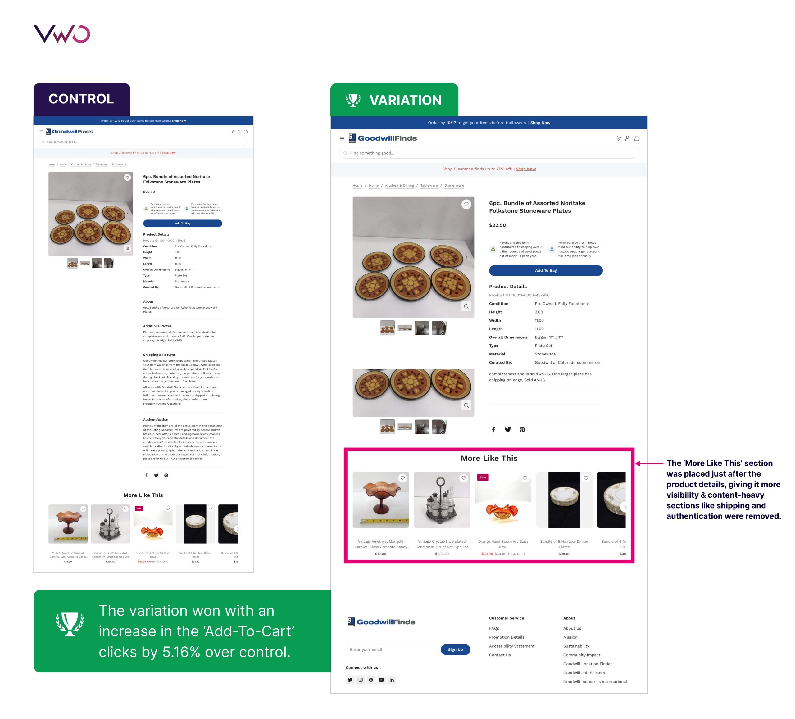
A new version of the PDP was created for the variation of this test with the following changes:
- Relevant information like product details and the ‘Add-To-Bag’ button were left unchanged
- Content-heavy sections like shipping and authentication were removed
- The ‘More Like This’ section was placed just after the product details, giving it more visibility
Here’s how the control and variation looked during the test.

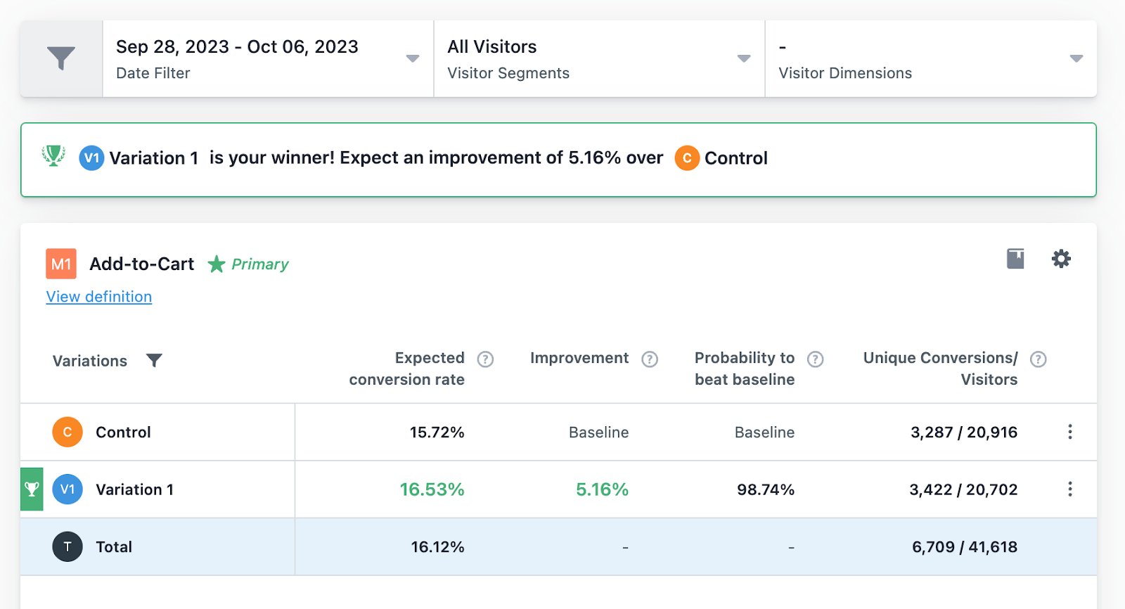
This was a quick win for the team. After running the A/B test for merely 8 days, the variation emerged as the clear winner with a 5.16% increase in clicks on the ‘Add-To-Bag’ button.

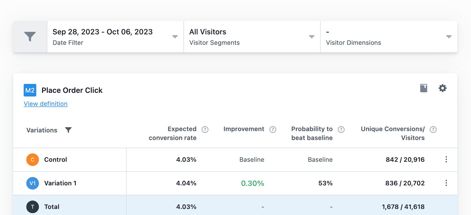
Another crucial metric being tracked by GoodwillFinds was the ‘Place Order’ button that appeared after the product detail page (PDP). The team wanted to ensure that changes to the PDP had no negative impact on the performance of the ‘Place Order’ metric.
After the conclusion of the test, a slight improvement was observed for this metric too.

Conclusion
The team at GoodwillFinds learned that decluttering the product detail page (PDP) is key to optimizing the website experience for mobile users. Also, they observed that implementing changes on the mobile version had virtually no impact on the ‘Add-To-Bag’ clicks or purchase rates of desktop users.
VWO is a comprehensive platform that empowers you to optimize digital experiences and maximize conversions. Try VWO for free to identify roadblocks in user journeys and deliver exactly what your customers want.

Location
United States
Industry
eCommerce
Experiment goals
Increase CTA clicks on the mobile version of the product page
Impact
5.16% increase in add-to-cart clicks


