Critique Jeu Improved Inter-page Navigation by Testing Blue Underlined Hyperlinks
About Critiquejeu
Critique Jeu is a French consulting company offering expert guidance and advice for individuals interested in playing online casino games. The in-house experts answer your questions, providing you with all the information you need, whether you’re a beginner or an experienced player. They guide you through casino rankings to help you avoid unreliable platforms, ensuring you play safely.
They meticulously assess each online casino for trustworthiness, and those that meet their criteria earn a spot on their site. As a leader in the field, they stay updated on the latest news, casino bonuses, and flash offers.
Why VWO
After saying farewell to Google Optimize it was crucial for us to find a new simple solution for our A/B Tests. And it seems like we have found in VWO the perfect replacement : almost as easy to start your first test, but then way more potential beyond this.

Paul Lenglet
Marketing Operation Manager
Goals
In today’s digital landscape, how users interact on a website holds great importance for search engine algorithms, particularly Google, as it directly impacts rankings. Hence, the Critique Jeu team wanted to improve the user journey and on-site navigation.
The question was, could they do it by optimizing the in-text hyperlinks? They believed that experimenting with colors, background, underlining, and bold formatting could improve inter-page navigation for visitors and potentially improve the website’s ranking on search engines.
Observations
Firstly, by checking external sources and looking at other sites in Critiquejeu’s network, the team found the advice of ‘contrast is key’ prevalent. They also deduced that some colors might be more effective in catching visitors’s attention.
Another important aspect of this test was realizing that people still remember the classic blue underlined hyperlink. Even though it’s a bit old-fashioned now, it’s widely used internationally. They aimed to leverage this shared memory effect to improve inter-page navigation on their website.
Hypothesis
The team hypothesized that changing the color of the anchor text in the copy to a unique shade that stands out from the common color scheme on the website would increase clicks on internal links, such as PayPal.
By doing so, they also revived the use of blue underlined hyperlinks in the copy, which they thought would help improve the said metric.
Tests run
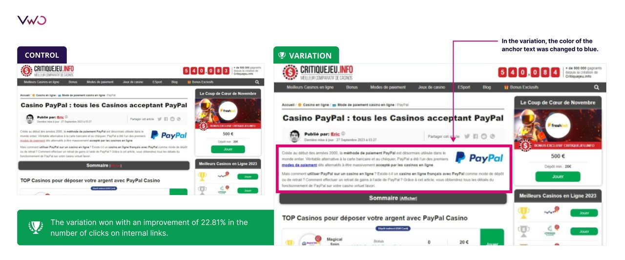
In the control version of the payment method page, the anchor text in the body copy is in red, fitting well with the color scheme of the page. However, in the variation, the color of the anchor text was changed to blue.
Here are the control and variation images of the A/B test:

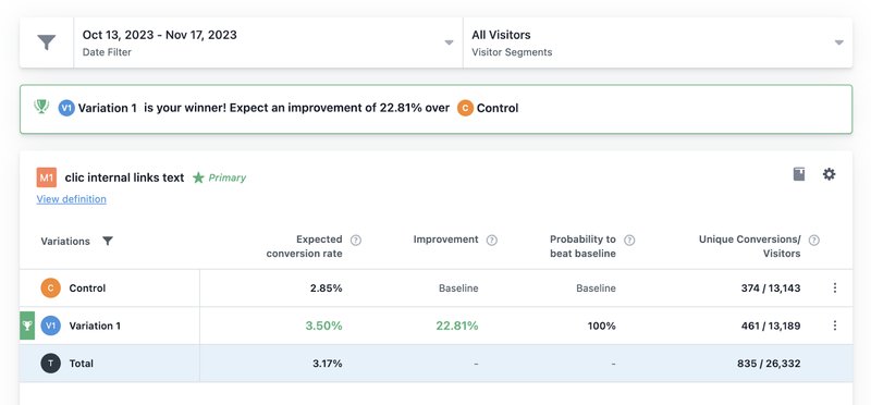
The test was run for a little over a month and the variation emerged as the winner improving the number of clicks on internal links by 22.81%.

Conclusion
Sometimes, it’s surprising to see an idea that you thought might not fit into an overarching picture work well without causing any major disruptions. In this test, the team might have initially believed that using a color slightly different from the established color scheme would look out of place.
However, they went ahead and tested it to let the data speak for itself.
They reintroduced the practice of using blue hyperlinks as the test proved they worked, and although different, they were not completely in contrast to their brand identity.
With VWO, setting up the test was easy because of the user-friendly and intuitive visual editor. So, although the team was used to Google Optimize, running this test was no major feat, not to mention the incredible results that showed up within a month. As a Google Optimize user, if you haven’t migrated to VWO, you can do so right away. Start with our free testing plan or take a free trial to explore all capabilities.

Industry
Gaming & Sports
Experiment goals
Improve inter-page navigation by changing the color of internal text links
Impact
22.8% increase in clicks on internal text links


