AssessmentDay Tested Landing Page Content For Increased Conversions
About AssessmentDay
Does more content convert better or less content? The short and sweet answer to this question is that there is no eternal truth. You must A/B test your way to more conversions.
AssessmentDay is a leading supplier of practice aptitude tests to graduates and job seekers. They help candidates prepare for their assessment centers and psychometric tests by showing them what to expect.
They used VWO as the A/B testing tool for the tests mentioned in this case study.
Goals
Based on the recommendation by their affiliate partner WikiJob (who were also VWO users, and had increased their sales by 34%), AssessmentDay ran an A/B split URL test on their co-branded landing page.
The traffic on the landing page was entirely referred traffic from the affiliate’s website. The affiliate’s traffic was all organic, and they had banners and text links sending visitors to the landing page.
Tests run
Their original landing page had a Screenshots section and an FAQs section.
Here’s how it looked:
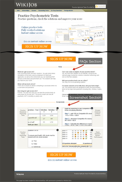
Original page
The variations we tried were simply removing each of these sections in turn and then removing both sections together, so there were three variations in total.
In the first variation, they removed the FAQs section.
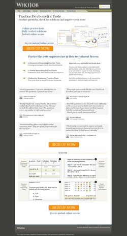
Without FAQs: 62% increase in Sales
Split-testing is always surprising! That’s half the fun of it. The result was a 62% improvement by just removing the FAQ section.
In the second variation, they removed the screenshots section.
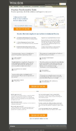
Without Screenshots: 56% increase in Sales
However, what happens if you remove too much content from the landing page?
Out of curiosity, AssessmentDay then went one step further and deleted both sections of the page, but this proved too much and the conversion rate actually dropped by about 3%.
Here’s how this variation looked like:
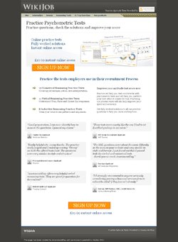
Without FAQs and Screenshot: 3% Decrease in Sales
Conclusion
When we asked if there were any lessons that AssessmentDay learnt from this test, here’s what they said:
- Less is more, up to a point. It’s surprising how you can spend so much time deliberating over the content of a sales page when in fact that section of content actually puts people off and you’re better without it.
- Split URL testing wins out over gut feel almost every time.
They also had great things to say about the split URL testing tool they used:
“VWO has been extremely valuable, not to mention fun to use. The service has paid for itself several times over.“
This was an exciting test with unexpected results. A classic case of trying bold changes and finally getting a much deserved increase in conversions.
If you have any comments or feedback on this success story, please let us know!

Location
Chelmsford (UK)
Industry
eLearning
Impact
62% increase in Conversion


