Open Mile Tested Page Elements To Increase Conversions
VWO and Open Mile
Open Mile (now acquired by Echo Global Logistics) was a startup that used technology and process automation to provide superior broking services around trucking services. Using OpenMile.com, its web platform as well as mobile technology, the company allowed customers to find the best quotes offered by qualified carriers. This created a win-win for both providers and consumers of truck-based freight services.
The company used VWO to test optimization possibilities on its website.
Goals: Increase Leads Generated by the Home Page
The home page received a good number of visitors. But only about 4% of visitors to its primary lead generation page (which displayed freight rates) converted to leads. This was a relatively small proportion and the company wanted to increase this percentage.
Tests run: Redesign Lead Generation Page to Enhance Effectiveness
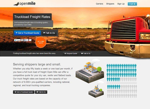
This is what the lead generation page originally looked like:

The company felt that the existing page masthead was too cluttered and hence distracted visitors. It hypothesized that by improving legibility of the masthead copy and allowing the masthead to occupy a large part of the page, the lead conversion rate from the page would increase.
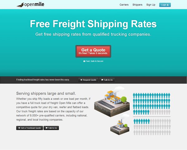
This was the variation page created:

The variation page was A/B tested against the original by using VWO.
Conclusion: 232% Increase in the Leads Generated
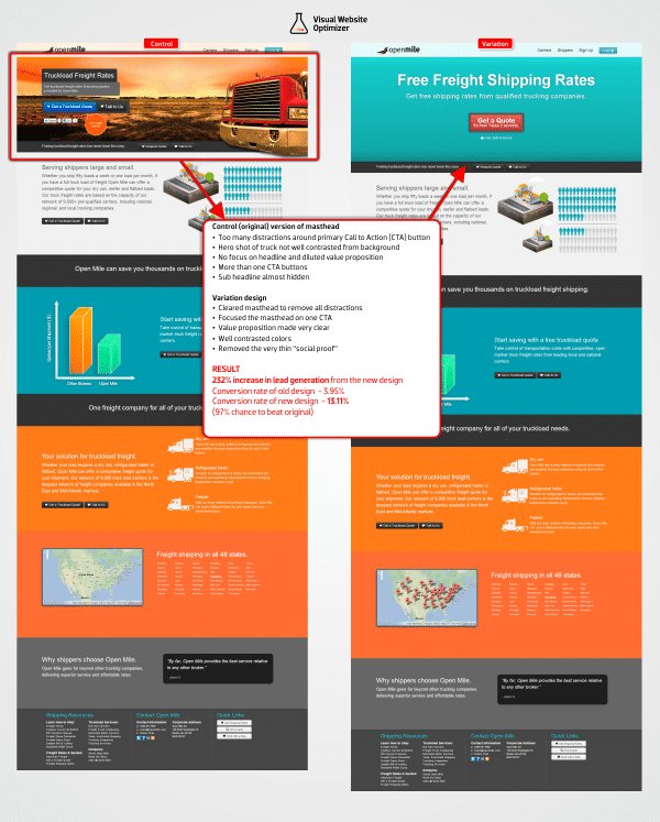
The variation beat the original in the test. Lead generation increased from 3.95% to 13.11%—a whopping 232% jump. The test results had near-perfect statistical confidence of 99.99%.
Here’s an image that compares the original and variation and highlights what changes were made:

The higher conversion rate recorded in the test was clearly the net result of the many changes made by the team. It is instructive to analyze what changes may have contributed to the boost in conversion rates and why.
Stronger Value Proposition
The headline on the control page was weak. Even visitors who wanted what the page was offering (such as getting a quote), were not able to figure out what was being offered. As a result, most of them just passed up on the option.
The headline on the variation page did a better job of conveying what data visitors could get, and that it was free and fast.
Distractions Removed
The original page had too many distractions surrounding the primary CTA that would generate leads. From headlines that didn’t communicate the desired call to action to the social media buttons, the distractions were ruining the page’s ability to generate leads.
The variation made it clear to the visitors what value they would get and what action they needed to take. The social media buttons were removed, and the Talk to Us button was no longer near the main CTA button.
Masthead Changed
The original masthead was designed on the premise that the image of a truck would instantly communicate to visitors what the site offered, and this in turn would improve the lead generation rate of the page.
The redesigned masthead was based on the thinking that the image either stole the thunder and thus eclipsed the CTA or that the image of the red truck escaped visitors’ attention because it blended with the orange background. The masthead on the variation page had no image. Also, the red call to action button stood out clearly against the blue background. This made it easier for visitors to see it, read it, and click it.
Changes Based on Previous Tests
The decision makers at Open Mile had previously tested some other minor but important elements on the page. The winning variation reflected the results of those A/B tests as well:
- The red CTA button color emerged as a clear winner over blue, gray, and green.
- The CTA button text Get a Quote beat Get Rates and Get a Truckload Quote.
A/B test your important CTAs easily with VWO. Start your free trial today!

Location
US
Industry
Services
Impact
232% increase in Conversion


