How Tom’s Planner Boosted Their Sign-ups Using VWO
About Tom’s Planner
Tom’s Planner is web-based project planning software that allows users to create and share Gantt Charts and project plans easily. Individuals can sign up for a free account on their website and begin using the planner right away to create and manage online planning schedules.
The company used VWO tools to increase conversions from its website home page.
Goals: Increase the Number of Visitors Signing Up for the Account
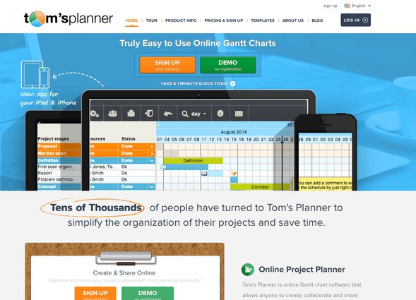
Tom, the company’s founder, was keen to increase the number of conversions from the home page. The website’s home page originally had 2 CTA buttons above the fold – 1 each to sign up for an account and to watch a demo of the software.
This is how the original home page of the website looked:

Tests run: A/B Test to Increase Conversions through Suggested Changes on the Home Page
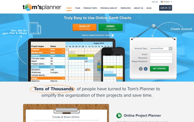
To improve conversions from the home page, it was decided to add a sign-up form on the home page, above the fold. The form had just 4 fields, which made it easy to fill. A directional cue was added to direct visitors’ attention to the form and direct visitors to the CTA.
A variation was created using VWO, and it was tested against the original home page.
Here’s how the new home page looked:

Close to 3,000 visitors became a part of this A/B test, and the result was in favor of the variation.
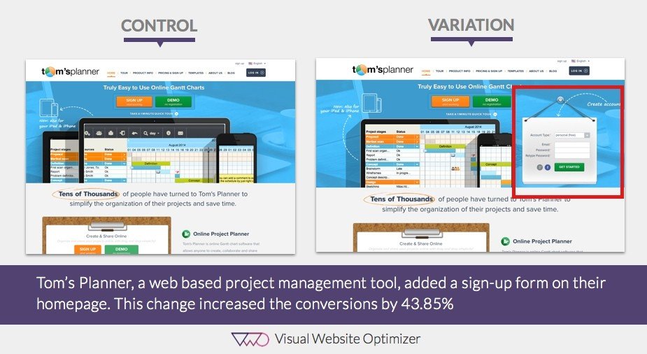
Here’s a quick comparison image showing the original home page and the variation:

Conclusion: 44% Increase in Home Page Sign-Ups
The hypothesis that a simple CTA would attract attention was proved right. The new home page with the sign-up form recorded 44% more conversions.
We believe 3 key factors contributed to the improvement in conversions with the variation:
1) The sign-up form was placed above the fold
For visitors to sign up, the original home page had one CTA button above the fold. Adding a form to the page increased the likelihood of visitors signing up, as they could see the form right on the home page, above the fold. Also, they didn’t have to click through a CTA button or reach a different page to create an account. Signing up became easier.
2) Short form with just 4 fields
As the sign-up form had only 4 fields, it reduced the friction to signing up for an account. The form asked only for the visitor’s email address; they did not have to share any other personal details to create the account. This helped build trust.
3) Adding a directional cue
It has been proven in multiple eye-tracking studies that directional cues get immediate attention, because visitors can’t help but notice in the direction they point. The arrow pointing toward the sign-up form not only increased the form’s visibility, but also gave users a clear path of action that moved them to the next stage of the funnel.

Location
Curacao, Netherlands Antilles
Industry
Software
Impact
44% increase in sign-ups


