Continuous Testing Improved Demo Requests For Restroworks Using VWO
About Restroworks
Restroworks is a leading SaaS-based restaurant management platform with more than 5,000 customers at over 100 locations across 6 countries. We spoke with Ashish Tulsian, co-founder and CEO of Restroworks, to understand how VWO solved their pain points.
The marketing team at Restroworks extensively used VWO over 12 weeks to run several tests on Restrowork’s website. This success story highlights the process they followed and the impact these tests generated for Restroworks.
Goals
Being a SaaS player in a niche restaurant industry, Restroworks’ primary objective was to improve the number of sign-ups for a demo of their platform. Restroworks’ website home page and Contact Us page serve as the two most important pages in their website funnel, so the marketing team at Restroworks wanted to figure out ways to reduce the drop-off on these two pages.
The first objective was to improve the visits from the home page to the Contact Us page and then improve the number of sign-ups generated from the Contact Us page. On researching about tools that could help them achieve these objectives, they signed up for VWO and kickstarted their conversion optimization journey.
Tests run
To improve the conversion rates, the marketing team at Restroworks decided to take an iterative approach to their testing. They A/B tested two versions of the home page, and then further hypothesized improvements in the winning version. Then, they ran another test between this new variant and the winner from the previous test. Similarly, they followed this approach for the Contact Us page. Here are the details of the tests that they had set up:
Test 1: Home Page Test—Control vs. Variation 1
At the beginning of their conversion optimization journey, Ashish came up with the hypothesis that adding more relevant and conversion-focused content to the website will improve user experience, resulting in higher conversions. They decided to do this by:
- Including effective headlines, highlighting their USP, and clear CTA on the hero image of the home page.
- Reducing the scroll length of the home page by removing the not-so-important sections. (They figured out this by analyzing heatmaps and visitor recordings while using VWO’s Visual Behavior Analytics capability. Discover the power of VWO Insights to derive actionable insights and measure the performance of your website elements. Take a free trial today!)
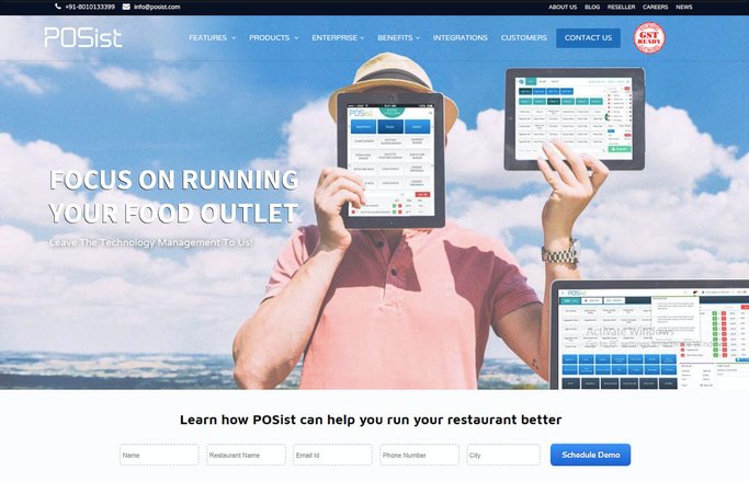
In addition to these, Restroworks further optimized the page load time and overall performance of their website so that it loads faster on all devices and platforms. They decided to prepare mock-ups of the new variant and then run split URL tests by using VWO. This is how the control and variation looked like:
Control
Variation 1
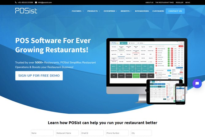
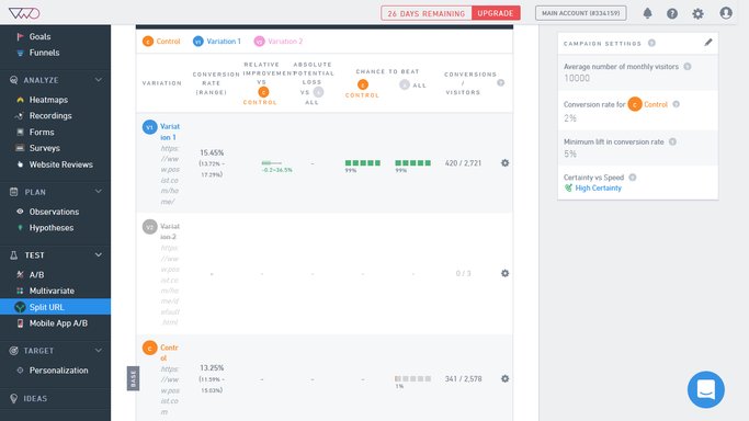
The goal for this test was to track visits to the Contact Us page from the home page. Variation 1 produced a conversion rate of 15.45% compared to 13.25% for the control, increasing the conversion rate by more than 16%.
Test 2: Home Page Test—Variation 1 vs. Variation 2
To further boost the conversion rates on the home page, the marketing team at Restroworks decided to customize their website in a way which would establish more trust and credibility among their target audience. So they decided to include prominent customer logos and testimonials on the home page and a section called “Why POSist?” (as that was the company name then) to improve relevance.
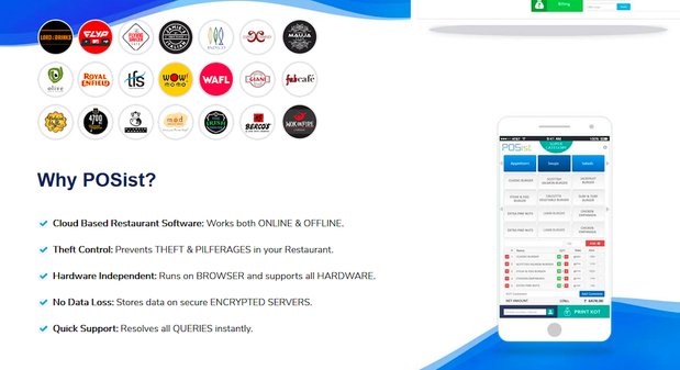
Moreover, with the information that most of their prospects want to switch from an existing software to their platform, they bifurcated their website visitors into two categories—one for prospects who are looking to switch to a point-of-sale (POS) software application and the other for prospects who are buying it for the first time.
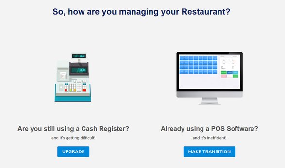
After the new home page layout design was ready, the marketing team at Restroworks decided to test it against the winner from their previous test to validate their hypothesis. This is how the two variations of the test looked like:
Variation 1

Variation 2
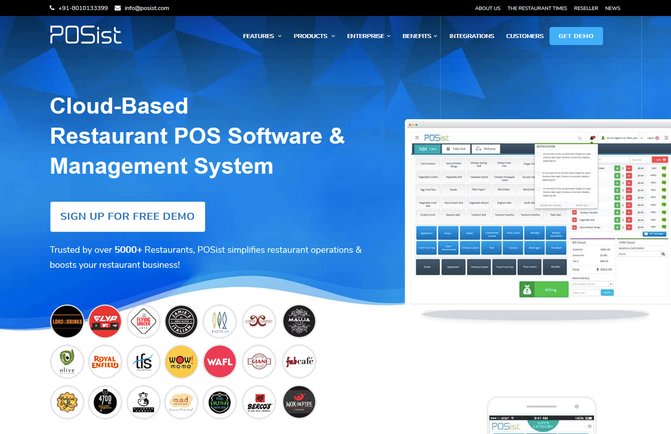
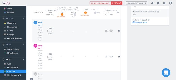
The new variation increased the Contact Us page visits from the home page by about 5% in just one week of running the test. Restroworks ended up making this variation of their home page live on their website.
Test 3: Contact Us Page Test—Control vs. Variation 1
For the Contact Us page, which is the most critical stage in Restroworks’ website funnel, Ashish and his team decided to look into qualitative data from VWO’s Form Analytics. They hypothesized that reducing the width of the form, adding content about what the prospect will get, and including trust signals such as logos and testimonials will improve their sign-up conversion rate. VWO Form Analytics helps you uncover friction points in your forms. Take a free trial to explore its features.
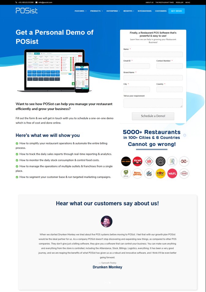
Here is a look at the control and the variation:
Control
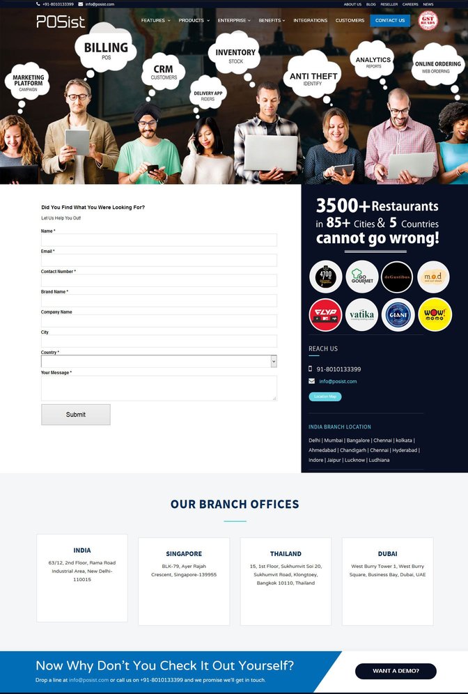
Variation 1
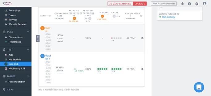
Variation 1 produced a conversion rate of 11.26%, compared to 9.37% for the Control version, giving a conversion uplift of about 20%.
Test 4: Contact Us Page Test—Variation 1 vs. Variation 2
As they did for the home page, the marketing team at Restroworks decided to try further improvements with the winning variation to come up with the best version possible. They analyzed the heatmaps and recordings for the winner variation, and figured out that the new optimized contact page has a lot of exit points in the header and footer menu options.
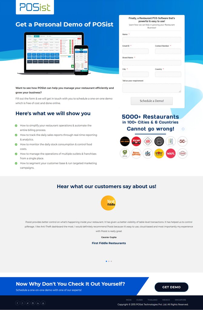
So they designed a second contact page, which was conversion-focused, and tested it against Variation 1. This is how the two versions looked like:
Variation 1

Variation 2
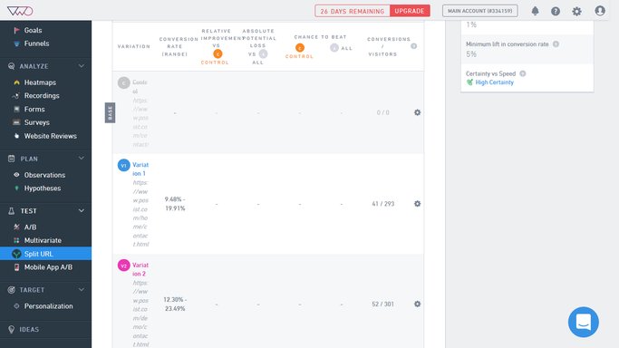
This test led to a conversion lift of 7%, and the two tests on the Contact Us page combined improved Restroworks’ conversion rates by 12%.
Conclusion
By following a continuous, iterative approach to their testing, Restroworks was able to fuel subsequent optimization efforts basis the learnings from the previous tests. They ran follow-up experiments after a win, ensuring that critical insights were implemented as action items.
Restroworks was able to generate 52% more leads in a single month, which lifted their website conversion rate to 3.4%, an overall increase of 25%. Based on these results, it can be concluded that the clarity and relevance of website content, coupled with its trust and credibility signals, can largely influence its performance.
Every A/B testing process aims to bring a significant raise in the conversion rates, and for a SaaS website like POSist which targets niche restaurant industry, this was a 4 month long journey. After months of rigorous testing in between multiple variations of our website with VWO’s Split URL testing campaigns, we were able to register a 50% growth in our organic leads.

Ashish Tulsian
Cofounder and CEO

Location
Delhi, India
Industry
Software
Impact
52% increase in demo requests


