What is UX friction?
UX friction, or user experience friction, refers to design, interface, functionality, or content issues on a website or app that disrupt the user journey and prevent smooth progression through the sales funnel.
Some common instances of UX Friction are as follows:
- Invisible CTAs – A primary call-to-action (CTA) blends into the background due to poor contrast, making it hard to spot.
- Complicated forms – Forms with unclear labels or no distinction between mandatory and optional fields confuse users.
- Technical glitches – Backend bugs prevent interactive elements from loading or cause CTAs to malfunction.
- Unclear content – Vague or unconvincing content fails to address user concerns, leading to hesitation.
UX friction directly impacts conversions and ROI. If users struggle to navigate or complete actions, they are more likely to drop off. Identifying and resolving these issues should be a top priority to maintain an optimal conversion rate.
Example of UX friction
One example of a travel aggregator has UX friction across multiple pages, making it difficult for users to navigate the website.
a. Homepage
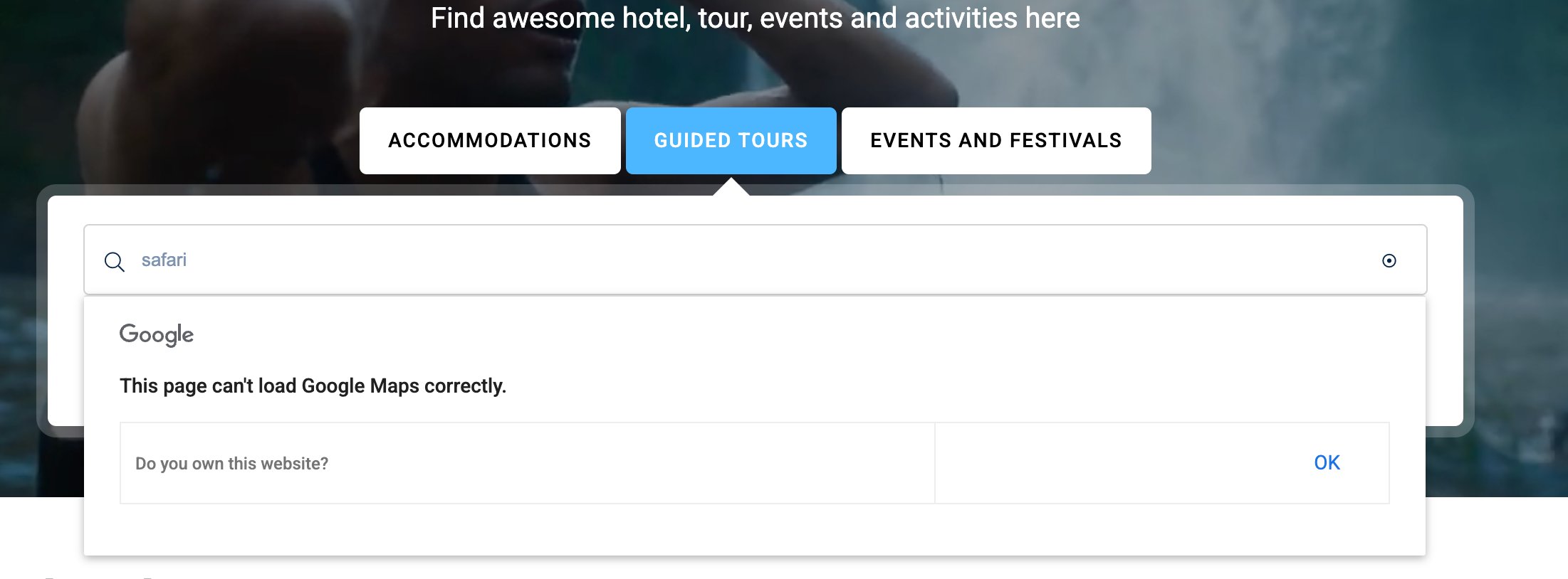
On the homepage, the search bar is broken and fails to load properly. Additionally, the lack of search suggestions while typing adds to the frustration. Instead of integrating Google Maps to display locations directly, the visitor flow should guide visitors to dedicated search result pages. This flawed design creates a frustrating user experience.
b. Vendor registration page
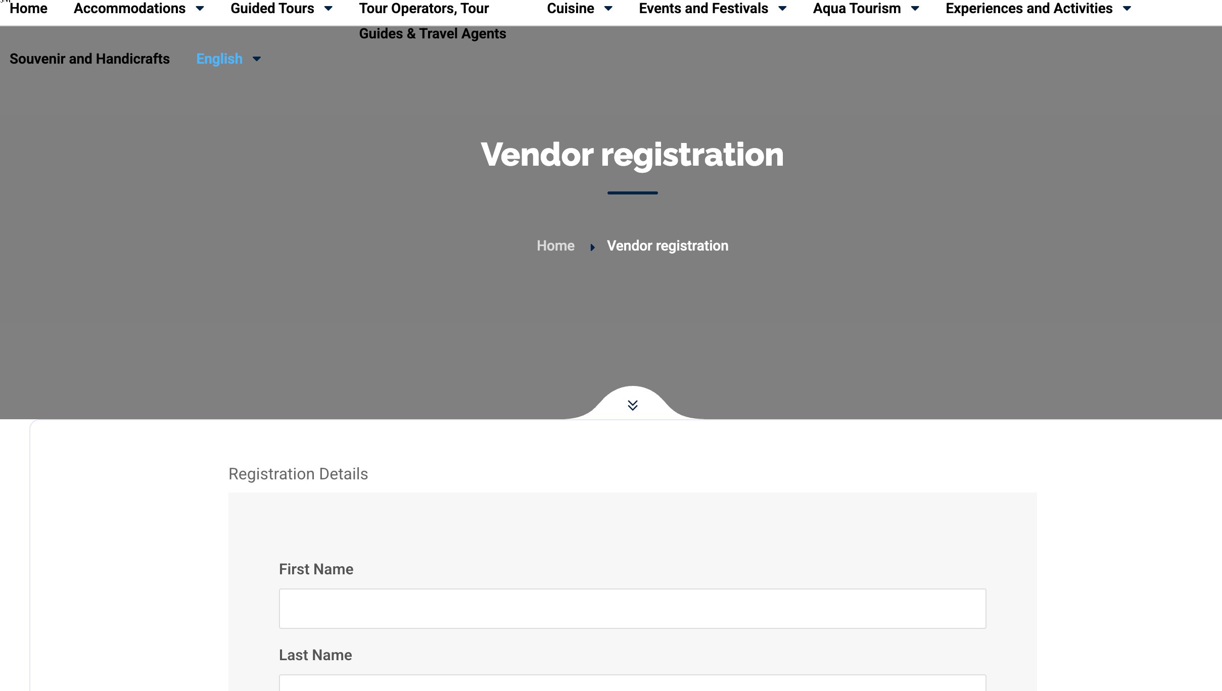
The vendor registration page is poorly designed, with large empty spaces wasting valuable real estate. Overlapping navigation and the absence of color differentiation between sections make the page visually unappealing and cause friction while using the navigation bar. This lack of structure discourages visitors from engaging and completing the registration form.
Utilizing UX friction for improving user experience
Although UX friction often disrupts user flow and lowers conversions, strategic friction can sometimes enhance the user experience. Here’s an example:
a. Adding exit-intent pop-up
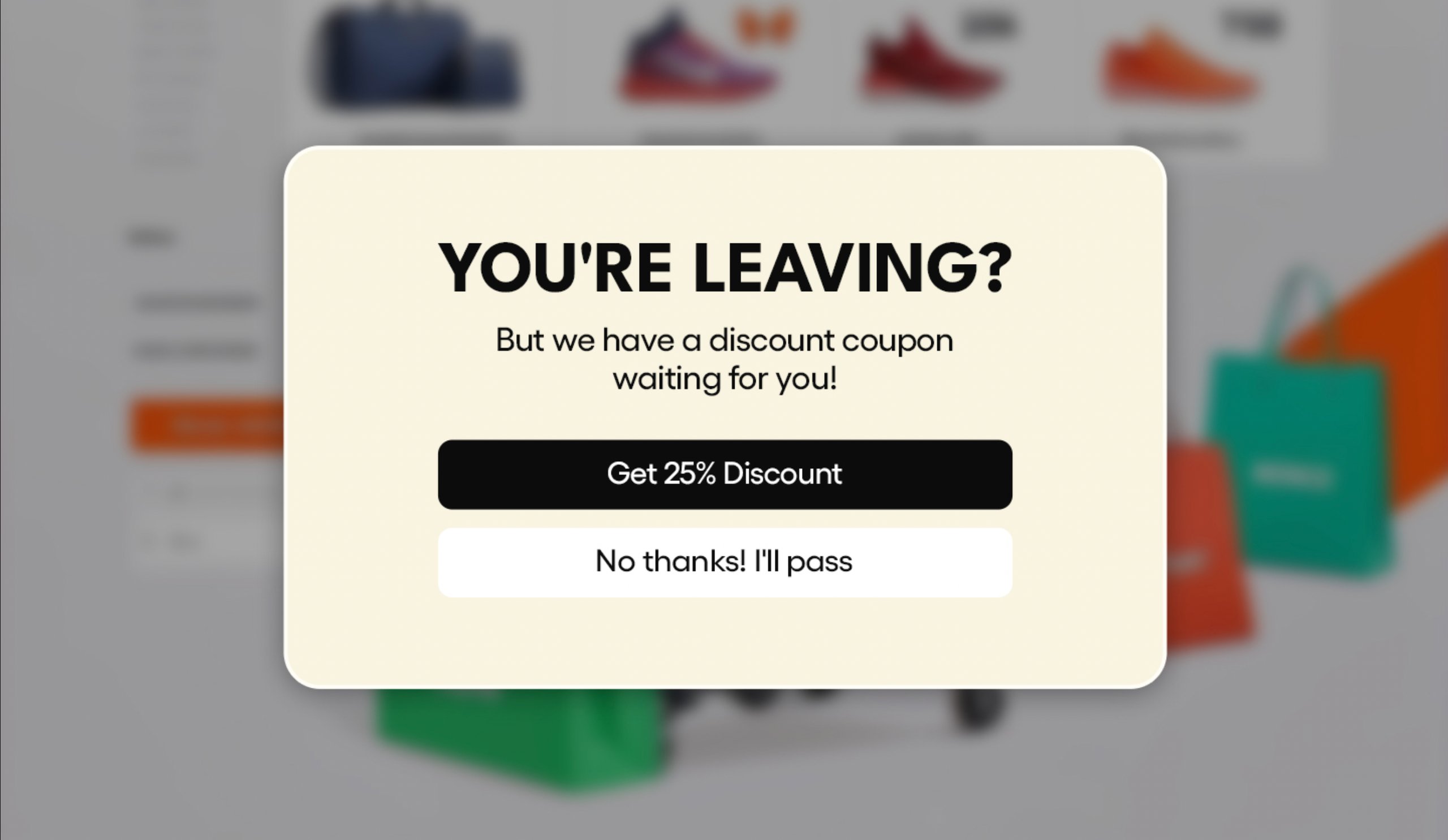
Many online stores use exit-intent pop-ups to retain visitors. As a user attempts to leave, a pop-up appears offering an exclusive discount. While this momentarily interrupts their journey, it adds value by informing them of a deal they might have otherwise missed, potentially encouraging them to stay and complete a purchase.
b. Confirming abandonment or deletion event
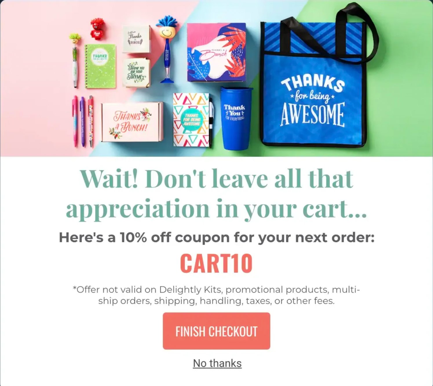
Many websites intentionally add friction when users attempt to abandon an action, such as deleting a campaign or wishlist. This friction often comes in the form of a confirmation prompt or a subtle reminder. Sometimes, it’s paired with an offer or persuasive copy to create a sense of loss.
If a visitor tries to leave the checkout process after adding an item to their cart, a pop-up may appear. This pop-up confirms their decision to leave. It also offers a discount on the next purchase. This nudges them to complete the purchase.
How to identify UX friction with VWO?
VWO, a comprehensive experience optimization platform, offers VWO Insights, a powerful tool for analyzing user behavior across digital touchpoints and identifying UX friction. Here’s how its features help:
- Heatmaps: Identify high-engagement areas and CTAs while spotting non-clickable elements that attract unintended clicks due to confusion.
- Session recordings: Track visitor mouse movements and navigation patterns to uncover usability issues.
- Form analytics: Analyze form performance with insights on hesitation time, refilled and ignored fields, and other friction points.
- On-page surveys: Collect direct visitor feedback on their experience and pain points.
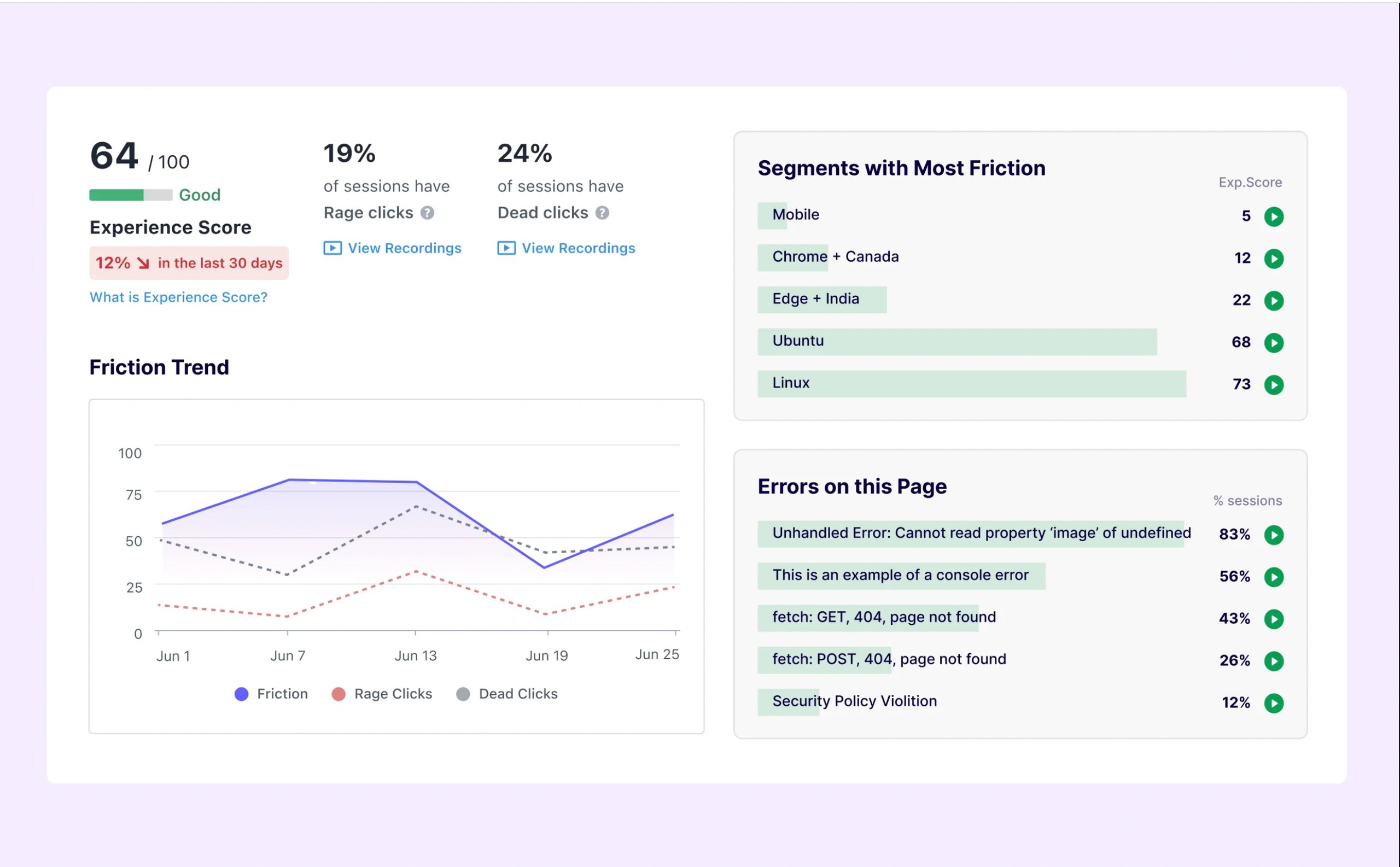
These features provide a 360-degree view of visitor behavior and the obstacles they encounter. What makes VWO Insights even more powerful is its Insights Dashboard, which assigns a user experience score (0-100) to each page, helping teams prioritize improvements for low-scoring pages.
How Encyclopedia Britannica Group used VWO Insights
Encyclopedia Britannica Group, a globally recognized institution with over 250 years of knowledge leadership, used VWO Session Recordings to analyze user interactions, including click behavior and mouse flow.
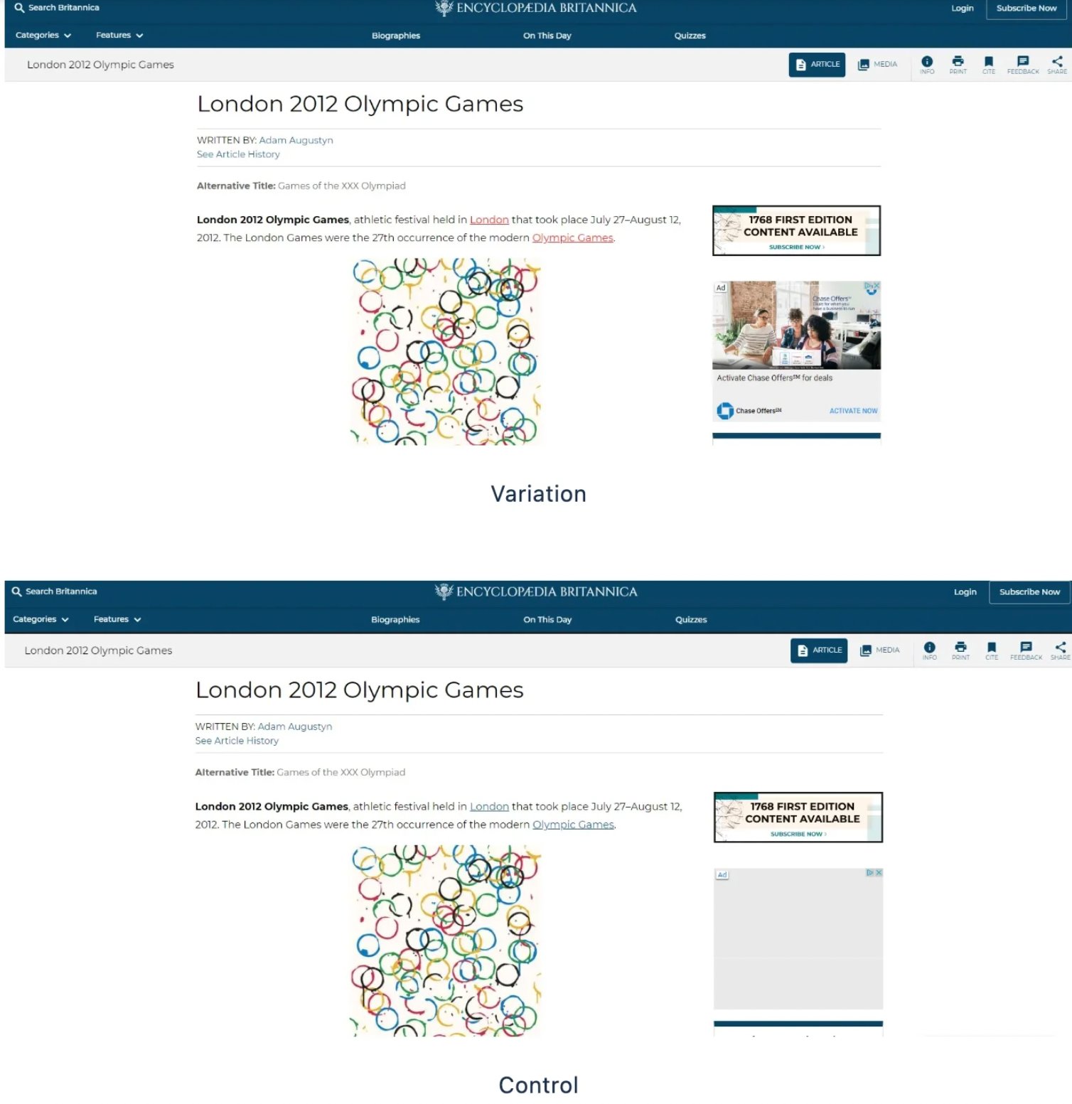
During the analysis, they discovered that many users attempted to click on blue-highlighted words, even though they weren’t actual links. Based on this insight, the team ran an A/B test in VWO, comparing a variation where blue was used for actual links against their original red-colored links.
The result? A 10% increase in click-through rate (CTR) after switching to blue links.
Optimize UX with VWO
VWO not only helps identify UX friction but also enables teams to run A/B tests to validate and optimize new experiences. If you want to improve your website’s user experience, you can start with a 30-day free trial. Also, visit the plans & pricing page for more details.


