WorkZone Increased Leads Through Its Testimonials Page using VWO
VWO and WorkZone
WorkZone is a web-based project management and documentation collaboration tool.
The company uses VWO for their testing needs.
Goals
The goal of this campaign was to increase the number of demo requests by reducing distracting elements on the form page.
Tests run
Like most SaaS companies, WorkZone’s lead generation page offered demos to help convince people to buy their tool. Prospects submitted a short form to request a demo. The page also had customer reviews by authority figures and an arrow pointing to the form acting as a direction cue.
This is what the original page looked like:
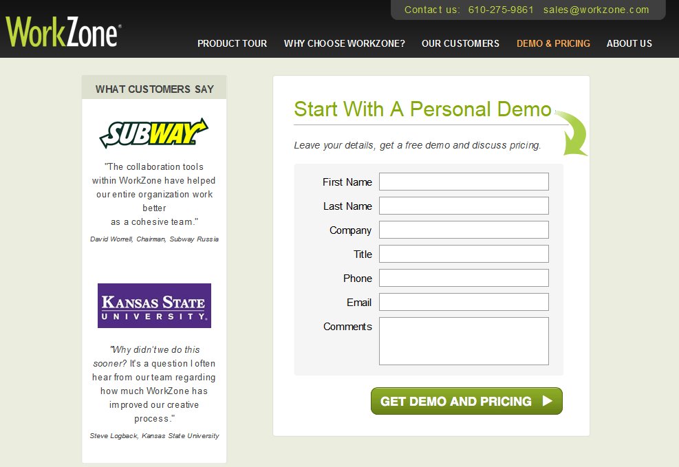
Steven Macdonald of WorkZone thought the colored logos used in the customer testimonials overshadowed the form and distracted visitors. He wanted to test the hypothesis that testimonials with customer logos in black and white would help increase the number of demo requests.
To test his hypothesis, Steven used VWO, an a/b testing software, to create and then run a quick A/B test. He created a variation with black and white logos and tested it against the original. The test was run only on new visitors coming to the website – this was possible thanks to the behavioral targeting feature of VWO. The goal was to track the number of form submissions.
Here’s how the variation looked:
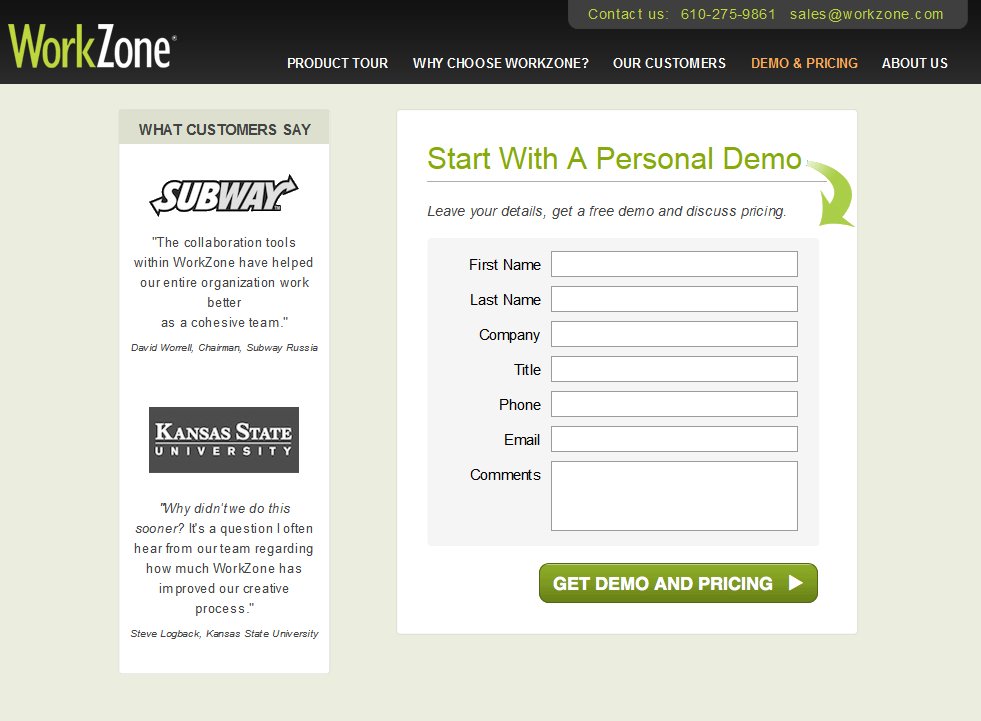
The variation was pitted against the original (control) in an A/B test that ran for a duration of 22 days.
Conclusion
The variation outperformed the control with a 34% increase in form submissions and a statistical significance of 99%. Not surprisingly, Steven decided to implement the change to the WorkZone website.
It is fascinating to try and understand what caused buyer behaviour to change. The key, in our view, is to understand behavioural nuances and ensure that the website reflects them effectively. For instance, that the use of social proof is extremely powerful is already known. But not everyone knows how to apply the concept effectively in harmony with web design principles.
Here’s why the variation beat the control:
1) The coloured logos were overshadowing the form.
The demo request page has a lot of white space and mostly subdued background colors. Eye-tracking studies have proved that pictures get immediate attention. Per visual hierarchy also, the colors of the logos were in contrast with the rest of the page. The coloured logos thus clearly stood out, – but overshadowed the form, which was the website element WorkZone needed visitors to focus on. By using black-and-white customer logos, WorkZone ensured that while they served to trigger recognition and provide credibility for the tool/service, they did not subvert the web form- the hero of the page.
2) The colored logos looked like clickable entities.
Clickmap and heatmap reports generated by VWO clearly showed that there were mouse movement and clicks on the testimonial bar. This reinforced the view that colored logos distracted visitors. Besides, this design flouted the rule of one page, one purpose.
Gain important insights into visitor behavior, formulate effective hypotheses, and run A/B tests to optimize your lead generating landing pages. Take an all-inclusive, 30-day free trial with VWO!

Location
Philadelphia, US
Industry
Software
Impact
34% increase in Form submissions