How EzLandlord Forms Increased Its Paid Conversions Using VWO
About EzLandlord Forms and VWO
Kevin Kiene, the founder, was a landlord back in 2005. Tired of the hassles he faced in creating the right lease, he launched the EzLandlordForms website. Since 2006, he and his team have helped more than half a million landlords manage their properties with great ease.
EzLandlordForms provides forms for a range of leases – residential, vacation, company, subleases etc. They have hundreds of free lease forms in printable format.
Brian, Vice President at EzLandlordForms, signed up for a VWO subscription to explore ways in which they could get more revenue from their online business. He set up and ran a number of tests on different elements of the website’s homepage.
Goals
The primary objective of the test was to establish which version of the homepage was most effective in getting visitors to purchase the paid product. The test tracked 3 goals:
- Revenue per visitor
- Purchase conversion rate
- Free account signup conversion rate
Tests run
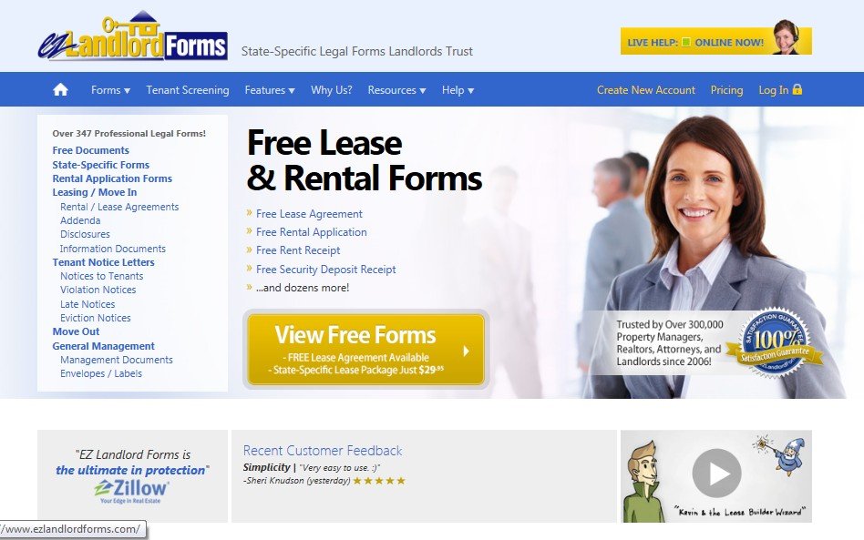
On the original homepage, the CTA button read “View Free Forms”. EZ Landlord Forms offered a lot of printable free forms on their website, so the CTA text was pretty clear. But the problem was that it wasn’t helping them get paid conversions and account sign-up was a micro-conversion for them.
This is how the original page looked:

Brian said, “We were concerned the CTA was too indirect, and failed to push users to where they were most likely to convert.”
The hypothesis was that taking visitors directly to a paid goal from the CTA button would be more valuable (to the company) than if it took a step-by-step approach in which visitors were first shown the forms for “free” sign up and from there to the purchase CTA. To test this hypothesis, two variations of the homepage were created and pitted against the original homepage.
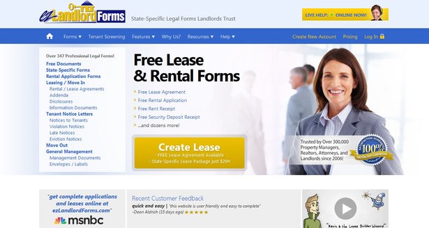
The first variation took visitors to the intermediate page, where they could sign-up for a free account and browse the free forms. This was the same same as the control, except that the CTA button text was changed to “Create Lease”. This, they believed was a more direct way to get visitors to buy state-specific leases than asking them to first browse through the free leases.
This is how the variation looked:

In the second variation, the CTA text still said “Create Lease”. However, it dropped the intermediate page (where visitors could browse free leases), taking visitors directly to the lease wizard.
The test was run for a duration of 2 weeks over 6000 visitors.
Result: The second variation, in which the intermediate step of taking visitors to browse free forms was dropped, emerged as the winner. The number of people who purchased the paid version went up by 32.2%. Revenue per visitor also increased by 20.4%.
Conclusion
So what helped prove the admittedly counter-intuitive hypothesis?
The value proposition offered by the variation was different from what was articulated in the control. The CTA text on the control simply invited visitors to “view free forms”. Keep in mind that visitors were likely looking to get lease documents relevant to them; therefore, the CTA text on variation, which invited visitors to “Create Lease” was more in line with what visitors perceived as valuable to them.
The variation dropped an intermediate step of taking visitors through the free forms. This solved two problems:
- It did not distract (or confuse) people who wanted to buy a state- or property-specific lease by just showing them free forms
- It eliminated one step in the process towards the final purchase goal. This reduced friction resulted in a higher conversion rate.
What worked for one company may not work for another. A/B tests sometimes disprove hypotheses that seem right based on gut. Here is a success story where adding the word “free” increased the button CTR for a company by 99.42%. That’s the power of A/B testing. Use it wisely!

Location
New Jersey, USA
Industry
Real Estate
Impact
32.2% increase in Purchases


