How Dutch Online Seller Overtoom Increased Its Conversions Using VWO
VWO and Overtoom
Goals
The aim of this campaign was to improve conversion rates which in the case of Giuseppe Hentenaar meant increasing the number of visitors clicking Add to basket.
Tests run
Giuseppe Hentenaar, Webshop Marketer at Overtoom, felt that adding some information near the call to action (CTA) on the product pages would push more visitors to click the Add to Basket button.
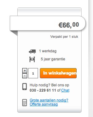
Here’s how the original page and CTA looked. The Dutch In Winkelwagen translates to Add to Basket.

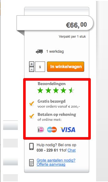
Giuseppe created a variation page on which he added the following 3 pieces of information just below the CTA:
- Beoordelingen (Star ratings from customers)
- Gratis bezorgd, voor orders vanaf EUR 200 (Free delivery for orders above Euro 200)
- Betalen op rekening of online met (Pay by invoice or online with Visa or MasterCard)
Here’s a screenshot of the variation:

The variation was A/B tested against the original by using the VWO platform.
Overtoom ran the test for around 10 days before the variation achieved an almost 25% increase in conversions with a 99.9% statistical significance.
Conclusion
The variation beat the control, delivering almost 25% higher conversions.
An understandably thrilled Giuseppe said, “VWO showed us that we had 25% higher conversion with the variation on the product page. Awesome improvement!”
As always, it is useful to understand why the variation worked. In this case, 3 changes were made, but Giuseppe had chosen each of them with care. Each element played an important psychological role in pushing customers to the next stage of the funnel.
- The presence of the Star Ratings served to assure visitors
- The free shipping threshold served to lure visitors
- The multiple payment options nudged visitors gently to make the payment
1) Star Ratings (Assure)
Customer rating was the first weapon in Overtoom’s conversion arsenal. Its objective? To eliminate fear and assure the customers that they are dealing with a trusted name. Giuseppe placed the ratings right below the Add to basket button to give it maximum visibility.
According to an Infas survey, 65% of online consumers in Europe say that star reviews are important for them when choosing a website. Another study by Nielsen shows that 70% online consumers trust customer reviews on websites.
As Giuseppe said, “We thought we should give our customers some kind of assurance. We wanted to let them know it’s safe to buy from us. The test worked because the customers are convinced about buying the product after seeing other customers give us a 4.5/5 star ratings.”
2) Free shipping threshold (Lure)
After a potential customer’s fears had been allayed by building trust through display of customer ratings, the next step was to give them an incentive to move forward with the purchase.
The word “free” is a powerful motivator. To know more about the virtues of the word “free,” we suggest you read behavioral economist Dan Ariely’s book Predictably Irrational or at least his post on why people tend to buy things they don’t want in the first place, just because they are free.
But it’s not just the word “free” that tempts here. It’s free shipping for orders valued at more than Euro 200.
According to a Deloitte study, 40% of online consumers are willing to buy more items if they qualify for free shipping. Another study by UPS reveals that 39% of customers often purchase enough to qualify for free shipping. For the seller, this means a higher average order value.
3) Payment Options (Gentle Push)
After assuaging the buyer’s fears and tempting them with an incentive, the variation gently pushed prospects to take the final step of making the purchase by giving them payment options.
Giuseppe Hentenaar had this to say about VWO: “The tool (VWO) really helped us with this A/B test, and gave us the perfect insights.”

Location
The Netherlands
Industry
Retail
Impact
24% increase in Conversion


