PayPanther used VWO To Increase Their Sign-Up Rates
About PayPanther (now PracticePanther)
PayPanther, or PracticePanther, as it is now known, is an all-in-one solution for free Online Invoicing, CRM, Time Tracking, & Project Management software for freelancers & businesses. The company was looking to A/B test changes to their website in order to increase conversions and selected the VWO platform.
Please note: The company has changed its name and website design since the time of publishing this case study.
Goals
PayPanther’s main goal for undertaking A/B testing was to increase signups from the website.
Tests run
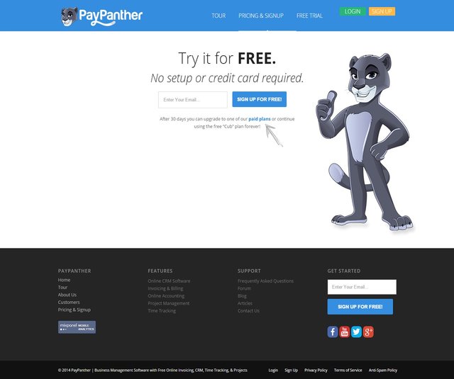
PayPanther’s original site was based on the belief that less information was better as it would not distract visitors. So their “Pricing and Signup” page was short and barebones functional. But conversions from their website were lower than what they expected. It was felt that perhaps visitors needed more education about the service, and therefore, adding more content on the page would boost conversions.
This is what the original page looked like:

Note: The company has changed its name and website design since the time of publishing the case study.
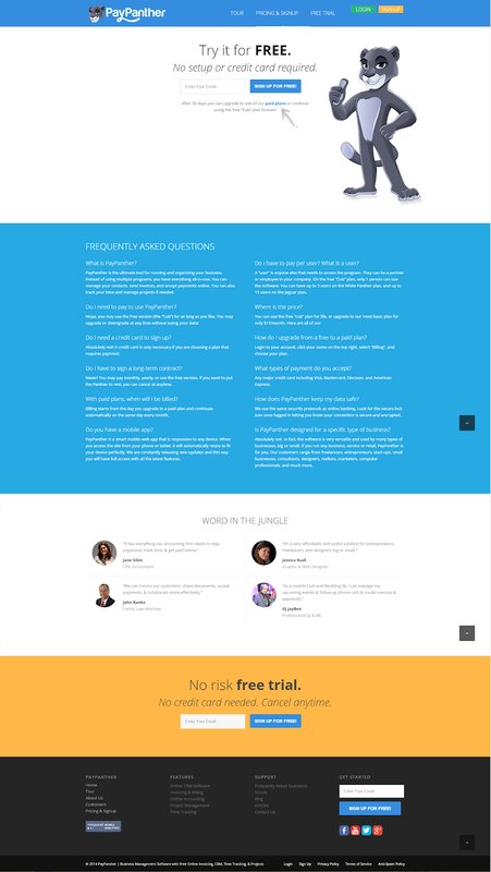
A/B tests were the only way to objectively and conclusively determine if more content would indeed give them more conversions. PayPanther developed a variation of the “Pricing and Signup” page that had three more elements on it: FAQs about pricing, testimonials, and another call to action button asking people to sign up.
This is what the variation looked like:

Note: The company has changed its name and website design since the time of publishing the case study.
This variation was tested against the control for a month on about 1000 visitors. The goal was to measure signups.
Result: The variation won, delivering a 372.62% increase in signups over the original page. Thrilled by the results, PayPanther has implemented the longer page as their default “pricing and signup” page. They have planned to perform further tests to identify the optimum headlines and CTA texts.
Conclusion
So what did the trick? All three changes played a role. By providing answers to the typical doubts and concerns visitors had, the FAQs section added to PayPanther’s credibility and built trust with prospects. Testimonials by others who have used the service served to provide “social proof”- which, as Robert Cialdini explained, is one of the six principles of persuasion.
The new CTA highlighted that it was a “no risk” trial; this made it more attractive to prospective customers- after all, they could cancel anytime.
Less is not always more- especially when you have to educate prospects about your offering & build credibility and trust.

Location
Miami, USA
Industry
Software
Impact
372.6% increase in sign-ups


