VWO Services Helped Paltalk Increase Revenue By Delivering Optimized Website Experiences
VWO and Paltalk
Goals
The optimization team at Paltalk aims to increase revenue by making the website more effective. The broad revenue goal is broken down into three objectives:
- Reducing cognitive load and increasing purchases
- Improving Average Order Value (AOV)
- Increasing Average Revenue Per User (ARPU)
Observations
With the aim to achieve an increase in revenue, Paltalk, in collaboration with VWO Services, made a few observations on their website:
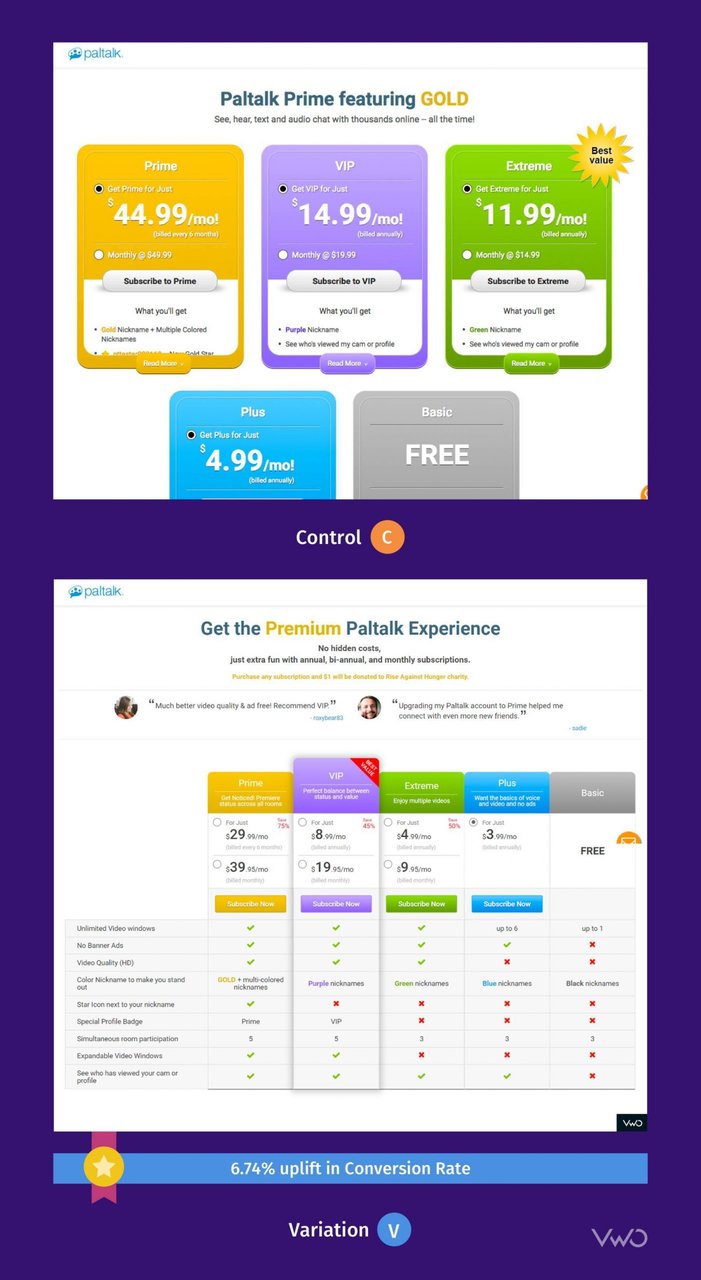
- The subscription page did not display all the options in one fold. It was difficult to compare the different subscription features across the available options. There was also no social proof on the page, and the main CTA did not stand out.
- Paltalk offers 8 different virtual credit packs and users were often unsure which pack they wanted to buy. Virtual credits can be used to send virtual gifts from one user to another within the Paltalk community.
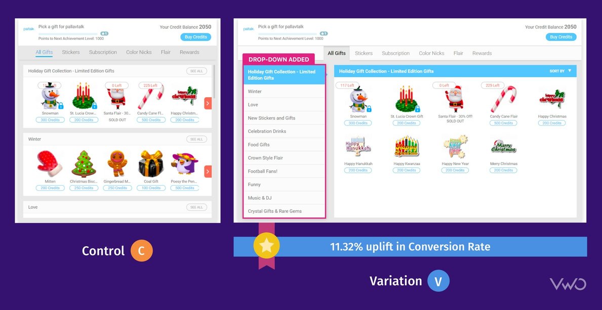
- After looking into heatmaps and session recordings generated using VWO Insights, it was observed that users were not able to effectively view the different categories of Virtual Gifts (or VGifts). Even within a particular category, users had to scroll to the right to see all the different gift options available.
Tests run
Each of the above observations was tackled through three different tests, each with a different objective:
Test 1:
Since the subscription page was a little difficult to process, the team set out to reduce cognitive load, with an aim to make the purchase process smoother. They hypothesized that displaying all the subscription offerings above the fold in a tabular format with features listed would ease the process of comparison. At the same time, adding a few customer testimonials would act as social proof.
An entirely new design was created and was tested against the existing design as an A/B test:

The A/B test ran for 53 days with all incoming traffic participating in the test. Traffic was split equally between the control and the variation. The variation won with a 6.74% increase in successful purchases. An associated revenue increase of more than USD 2000 was also registered. The variation is now live for all users.
Take a free trial to see how A/B testing works.
Test 2:
The objective for this test was to improve the Average Order Value (AOV) and hence overall revenue. With 8 different virtual credit packs being offered, users were often unsure which pack they wanted to buy.
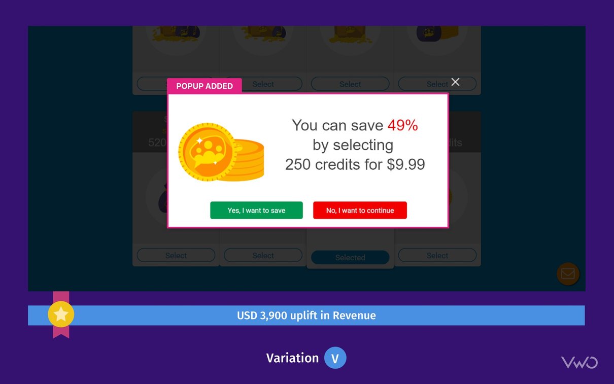
They hypothesized that offering users an incentive would push them to choose a higher value pack.
A variation was created in which, every time a user selected one credit pack, a pop-up would be shown asking if they would like to purchase a higher value pack to help them increase their savings. This is what the pop up variation looked like:

The variation was run against the control as an A/B test which ran for 40 days, with traffic being equally split between the control and variation (all incoming traffic participating in the test). The variation won with a revenue uplift of USD 3,900. The variation is now live for all users.
Test 3:
The objective of this test was to increase Average Revenue Per User (ARPU). Qualitative analysis showed that users were not able to effectively view the different categories of Virtual Gifts (or VGifts).
They hypothesized that creating a cleaner, distraction-free design would reduce cognitive load, thereby increasing conversion rates, and hence ARPU.
A variation was created which had a drop-down of all the Vgift categories on the left-hand side of the screen; clicking on a category would display all Vgifts of that category. This change improved the visibility of different categories and also individual gifts within each category.

The A/B test ran for 30 days with traffic being equally split between the control and the variation, with entire traffic participating in the test. The variation won with an 11.32% jump in conversion rate and a staggering 57.32% increase in Average Revenue Per User (ARPU), leading to a total revenue uplift of around USD 21,000. The variation is now live for all users.
Conclusion
The winning variations running on the website have made it more effective than before. The team is also more confident about the website’s performance since the changes have been made through testing, and the impact of each is better known.
Needless to say, having made a significant impact on the website experience, conversion rates, as well as revenue, the Paltalk team has a lot of faith in VWO Services. Their aim is to increase their testing velocity and be more data-driven, and for this, they intend to work closely with VWO Services.
Start your free trial with VWO today.

Industry
Media and Entertainment
Experiment goals
Increase number of transactions, Increase AOV, Increase ARPU
Impact
11.32% increase in Conversion


