GSM.nl Reduced Bounce Rate Through Improved User Engagement
About GSM.nl
GSM.nl is one of the Netherlands’ largest eCommerce shops selling mobile phones, GSM plans, and other mobile accessories.
They used VWO for their A/B tests.
Goals
GSM.nl had Buy Now buttons all over their website—product pages, catalog pages, special offers pages, and others. The requirement and challenge for this particular A/B test was that they had to vary all buttons on the site at once.
Tests run
A lot of pages (such as the home page) contained multiple instances of the order button, one for each featured product. This seemed complicated, but with VWO, the GSM.nl team designed it in a matter of minutes.
They created an alternative CSS stylesheet, and ran the A/B test on different stylesheets. The stylesheet defined how the Buy Now buttons looked like, so if they would do a split test of stylesheet, it would automatically split test ALL the buttons on the website.
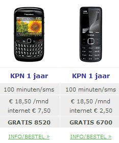
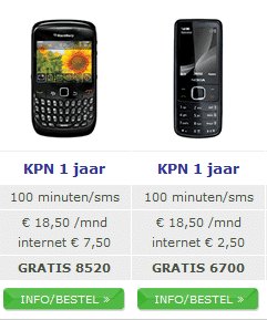
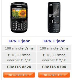
Here are different variations that were tested:

With Text Buttons

With Green Buttons

With Red Buttons
Conclusion
The test results showed that the red (well, technically orange) buttons increased overall website engagement by 5% (statistically significant). Engagement is defined as click on any link on the page, so an increase in engagement means a reduction in bounce rate.
Sales were also measured as one of the goals, which showed an increase too, but due to the relatively short test period, were not proved as statistically significant.
As a follow-up, of course, this test will be run long enough to determine if the button color has any effect on the actual sales. We are guessing that it would have made a small contribution to increased sales, as more people used the site actively; but considering that a decision to purchase a product involves numerous variables such as product cost, shipping costs, discounts, and others, it is hard to measure if the change in color can be the determining factor.
The case suggests that it’s safe to say to that a bright button color works well for catching attention and reducing bounce rate, and might even help actual sales.
No matter how strong your gut feelings are, ultimately data tells the truth.
In the case of GSM.nl, it proved that VWO could easily test difficult questions, and provide answers in a matter of days.

Location
Netherlands
Industry
Retail
Impact
5% increase in engagement


