
Shirtinator Uses VWO For A Successful Split Test Leading to Revenue Growth
VWO and Shirtinator
Shirtinator is one of Europe’s leading online providers of customized textiles and personalized gifts such as custom t-shirts, hoodies, personalized mugs, and more. The company uses the VWO platform for its website optimization efforts.
Goals
The goal of this test was to increase sales for tablet users thereby increasing Shirtinator’s revenue.
Tests run
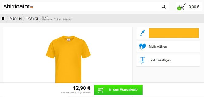
The company directed traffic from desktop and laptop users to one website; traffic coming from mobile devices, including tablets, was redirected to a mobile website. However, the mobile website had been created keeping in mind the small screen of phones; it was thus not optimized for tablet devices.
This is how a product page from the mobile website looked:
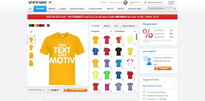
Simon at Shirtinator wanted to try directing traffic originating from tablets to the new HTML5-based desktop website that they were developing.
Here’s how a product page from their new HTML5 website looked:
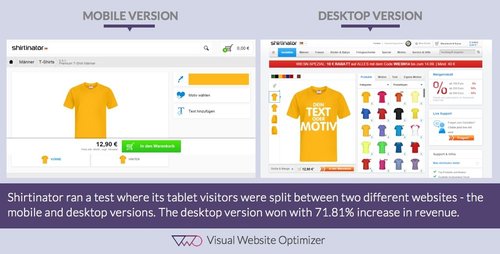
The team at Shirtinator set up a split URL test by using VWO for traffic originating from android-based tablets. [You may read this article from our Knowledge Base on how to perform traffic segmentation tests].
Visitors who became part of the test were split equally between the existing mobile version of the website and the new HTML5-based desktop version. To be sure of the business impact of the test, they set up revenue tracking in VWO for this test. In other words, the goal of the test was to test if the new HTML5 website was better for driving sales for tablet users and to track revenue.
Here’s an image showing a comparison of how the 2 websites looked:
Conclusion
The new HTML5-based website outperformed the mobile website for tablet users by a stellar 71.81% in terms of absolute revenue. The number of orders completed went up by 32%.
Mobile experience cannot always be scaled up to an optimum tablet experience. Mobile websites and apps are made such that there is no left or right content and design demarcation. Users need to scroll vertically through the content. If we scale this design up for a bigger and wider tablet screen, it will lead to a lot of space being wasted. Also, there will be no proper eye-path for visitors.
Shirtinator’s mobile website was clearly not a good way to engage traffic originating from tablet devices. The company, therefore, gained by directing such traffic to the desktop website.
If you have an eCommerce website, you should look at this built-in report in Google Analytics to find out the percentage of traffic coming from desktop, mobile, and tablet. And if you have a sizeable percentage of traffic coming from tablets, it makes sense to optimize UX for them. You may read this blog to know what to avoid when creating a tablet experience for customers.
A usability study by the NNGroup has confirmed that one of the primary uses of tablet devices is web browsing and that regular websites work fairly well on tablets even with few modifications. You may also want to read a similar case-study by Smashing Magazine, which resulted in the mobile website being abandoned altogether.
A new, responsive design was adopted to give users the best-possible experience consistently across device types.

Location
Munich, Germany
Industry
Retail
Impact
72% increase in Revenue