How Muc-Off Used VWO To Increase Purchases
About Muc-Off
Muc-Off offers a broad range of cleaning products for bicycles, motorcycles, and other motor vehicles, and electronic goods. Its products are sold through major retailers around the world as well as through its website.
To improve the conversion rate of their website, the company hired Spot Studio, a digital agency focused on developing web solutions for generating profits.
Goals
The main goal of this A/B test campaign was to increase Muc-Off’s sales by reducing user drop-off from the home page.
Tests run
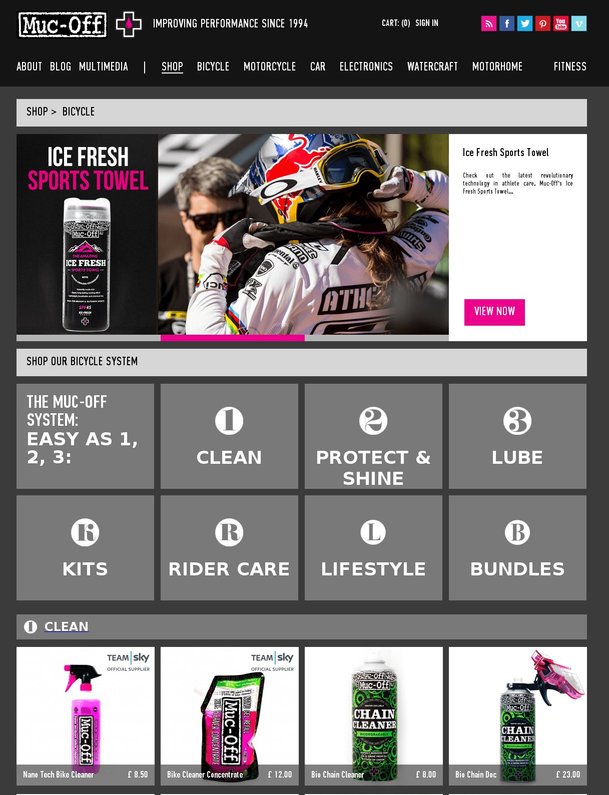
The original web design featured information about Muc-Off at the user’s eye level. The purpose of this design was to engage users with the submenus that offered product use guides as well as links to buy them.
This is what control looked like:

The Spot Studio team felt that this design caused incongruity in user experience. Visitors came there to purchase products; but after landing on the page, they were finding information resources instead of a shop front.
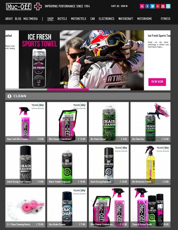
Spot Studio decided to tweak the design of the category page of Muc-Off’s online store to increase product views and maximize sales (conversion rate). The redesign was based on the hypothesis that by moving products above the fold, users would be encouraged to buy.
This is what variation looked like:

Employing heatmaps, analytic tools, and scientific statistical testing facilitated by VWO, user behavior and interaction were monitored on the original design as well as the new design in which above the fold content was replaced with eye-catching images of their products, complete with a slider. The test monitored aspects such as where users hovered, where they clicked and how far down the sales funnel they went.
Conclusion
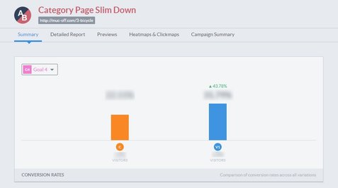
Having rearranged the departments page, Muc-Off saw a dramatic increase in closed sales as well as product views. Moving product images to above the fold increased product views by 43.78% with a concurrent increase of 106.26% in sales.

“We all know that user drop-off from the home page is a big issue suffered by a lot of businesses, with the bounce rate also taken into consideration as a SERP. The key is to make sure that your users are engaged as a lead as soon as they land on your website, ensuring that those who are there to purchase are immediately directed towards a sale. Utilizing striking imagery, which reinforced Muc-Off’s brand identity, was also a must. Just replacing the top of the page with products would have only alienated the user, thus creating incongruity in branding, which would in turn diminish trust. It’s that fine line between a push and a pull that we believe works so effectively in this case as we were not only selling a product, but a brand and a lifestyle.”

Sebastian Paszek
SpotStudio

Location
UK
Industry
Retail
Experiment goals
Reduce drop-off rate, increase sales
Impact
106% increase in Purchases


