
Masters ITC Software Changed User Focus To Improve Conversions Using A/B Testing
VWO and Scanitto (product of Masters ITC Software)
Goals: Increasing the Number of Software Downloads
On its landing page, the company offered visitors the choice of a free trial download as well as purchasing a paid version of the software.
This is what the original landing page looked like:
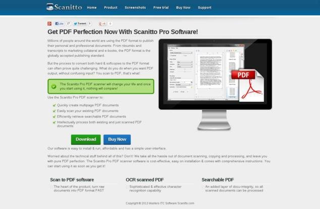
There were two CTA buttons right next to each other. The company wanted to increase the number of visitors who purchased the paid version, that is, click-throughs to the Buy Now button.
Tests run: Removing the Buy Now Button to Encourage Use of Free Version
The Scanitto team thought it would be easier to convince people to buy the product if they could first get them to try it for free. As an exploratory test, they wanted to track change in visitor behavior if the Buy Now button was removed from the Scanitto Pro landing page.
They thus created the following variation page in which the Buy Now button was removed:
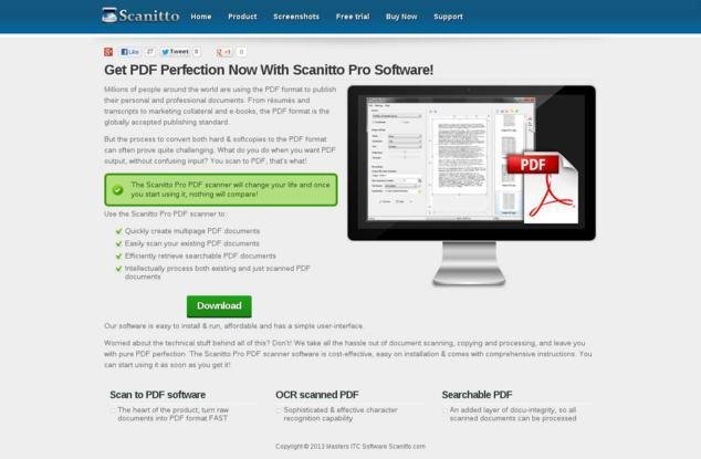
This variation was A/B tested against the original (control) by using the VWO platform.
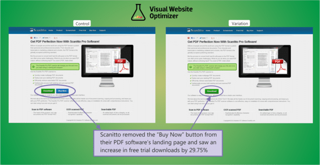
Conclusion: 29.75% Increase in Free Downloads
The team’s hypothesis was proved right. Removing the Buy Now button increased the number of visitors downloading the free version of Scanitto Pro by 29.75%. The statistical confidence associated with the results was 97%.
The image below shows a comparison of the 2 versions and highlights the change that was made:
Most of us assume that the more closely a call-to-action button directly relates to the topline or bottomline of the company, the higher it should rank on the priority list. But a closer analysis will reveal that the primary call to action button must reflect the business model of the company- after all, unless potential customers buy the product or service, there will be no top line (or bottom line).
The trend of placing 2 call-to-action (CTA) buttons together is catching on, with many websites using this design. The idea behind this is that if visitors are not yet ready to take action with the primary call-to-action, the secondary CTA may pique their interest enough to know more about the product/service. The expectation is that these prospects will convert after they get to know the product better.
But placing the 2 CTAs together does not always work. By providing visitors a choice of 2 buttons, they are making their customers think. This completely contradicts the basic website usability principle of not making your visitors think too much. Don’t Make Me Think by Steve Crug is an interesting book that explores how you can increase conversion rates of your website by reducing the thinking effort of site visitors.
That’s why Scanitto’s single CTA approach worked. It reduced the decision-making visitors had to do. After users had downloaded the free version and found how easy to use, convenient, and useful the product was, they came back to buy the paid version.

Location
Russia
Industry
Software
Experiment goals
Increase in CTR on the primary CTA (Buy Now)
Impact
29.75% increase in Click-through rate


