Harvard Business Services Uses VWO To Increase Purchases
About Harvard Business Services
Harvard Business Services is a Delaware-registered business formation agent that assists with company incorporation and LLC formation in Delaware.
The company’s marketing team uses VWO tools to optimize its website.
Goals: Increase purchases
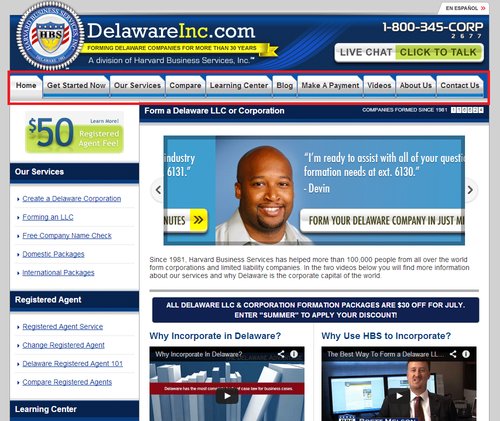
Korin from Harvard Business Services looked at ways to encourage more people to purchase their services. She decided to redo the navigation bar on their home page by tweaking certain tabs, eliminating some and adding new tabs.
This is how the website originally looked:

Tests run: Improve engagement through better CTA text and reduced distractions
There were 10 tabs on the original home page. This, Korin felt, was too high a number and would distract visitors. To get more people to buy, it was essential that more visitors engaged with the website by clicking the tabs, getting to know what services they offered and how these were different.
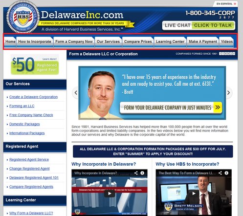
Korin hypothesized that making the following changes to the navigation bar would help:
- Rename the “Compare” tab to “Compare Prices.”
- Rename “Get Started Now” to “Form a Company Now.”
- Add a new tab titled “How to Incorporate” (this was present as a link in the left pane of the original home page).
- Remove the tabs “Blog,” “About Us,” and “Contact Us.”
Here’s how the variation looked:

The A/B test pitting the variation against the original (control) was run on the VWO platform on almost 32,000 visitors. The goals tracked were actual sales (completed orders) and visits to the “Compare Price” and “How to Incorporate” pages.
Conclusion: 15.68% increase in the orders completed (sales)
The variation emerged as a winner, recording a 15.68% increase in the total orders completed. The variation did well in terms of the secondary goals as well: visits to the “compare prices” page and “How to Incorporate” page increased by 66.26% and 382.45% respectively.
Buoyed by the success of the test, Korin continued to use VWO to regularly test further improvements to the website.
It is useful to look at how and why the changes drove engagement and sales:
Renaming the “Compare” tab to “Compare Prices” made the CTA absolutely directed. The word “Compare” by itself didn’t give users a clear understanding of what they would see if they click the tab. This was an important change, as it quickly conveyed to visitors the cost savings offered by Harvard Business Services.
Explaining the importance of this change, Korin, who set up and ran this A/B test said: “This (visits to the comparison page) is especially important for us because we work in a competitive industry and our prices are an obvious way that we stand out from the competition. We’re thrilled that this small change has enticed visitors on our site to click through to a page that compares us with the competition, so that they can be more confident of their purchase.”
Changing “Get Started Now” to “Form a Company” resonated with visitors by articulating for them what they were looking to do. The new CTA text guided visitors and gave them a sense of confidence that they were indeed getting started on what they had come for.
The new tab “How to Incorporate,” which was originally present as a link, got them an astounding 382% more visits to the page. Website analytics revealed that many visitors moved directly from this page to the final purchase. This proved that prospects wanted to be educated about the process of business formation before they decided to buy the incorporation service.

Location
Delaware, US
Industry
Services
Impact
15.68% increase in Purchases


