Body Ecology Improved User Experience To Increase Its Revenue
VWO and BodyEcology
BodyEcology is an eCommerce store for health products that support the company’s unique “back-to-basics” Body Ecology Diet.
To improve website conversion, the company hired digital agency Frictionless Commerce, which uses VWO for its optimization work.
Goals: Increase Revenue
BodyEcology’s product range is quite complicated, comprising categories such as Fermented Foods, Probiotic Culture Starters, Body Ecology Core Programs, and others.
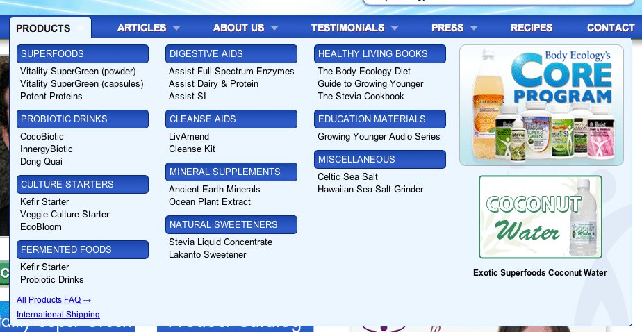
As shown in the image below, the drop-down menu on the original page displayed only the product categories and specific product names.

Frictionless Commerce realized that this design impeded conversions because the drop-down only contained links. Visitors to the site would find it difficult to identify specific products of interest especially if they had no idea about what these products are about.
Tests run: Make It Easier for Visitors to Find What They Need
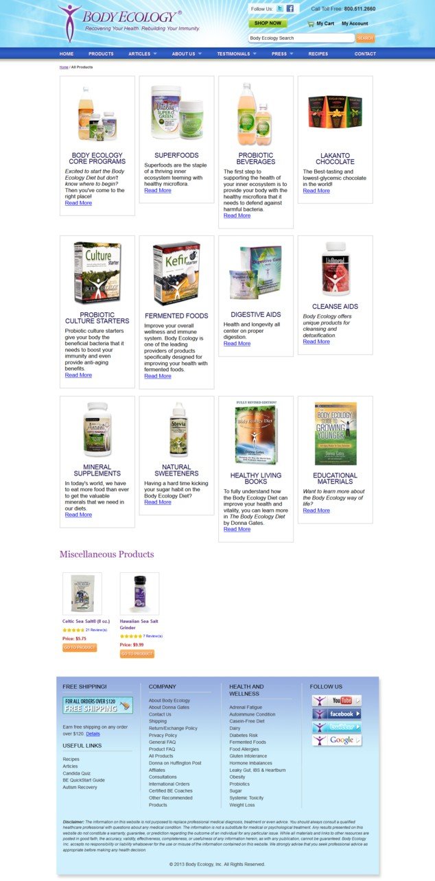
The test hypothesis was that reducing friction at the first step of selection by replacing the drop-down in the control with the complete product category page (which provided a brief introduction for every product category) will increase the revenue by encouraging more interested visitors to buy.
They created a variation in which clicking the Products option on the top navigation bar on the home page would take visitors to the page below:

From the usability perspective, this definitely made a lot of sense, although other basic design updates also needed to be addressed. The variation was A/B tested against the original by using the VWO platform.
The image below shows the 2 versions (control and variation) tested:

The test ran for 2 weeks.
Conclusion: 56.43% Increase in Revenue per Visitor
The variation beat the control by generating 56.43% higher revenue per visitor. The statistical significance of the results was 96%. Over the 2 weeks that the test ran, Body Ecology generated an incremental revenue of $8,880—a projected annual increase of $230,880, assuming the same run rate.
As can be seen from the results in our tool, the average revenue per conversion during the test period increased to $143.61 from the earlier figure of $100.33.

The use of drop-downs is a well-established practice, so changing a design element like that very counter-intuitive. The takeaway is not to blindly do away with drop-downs but to test a good hypothesis that reflects the underlying business and its customers and how the drop-down fits into the conversion cycle.
Mega drop-downs have proven to work well in usability tests. But like any conversion tactic, there’s no absolute; it’s all about coming up with good hypotheses and testing them robustly with the relevant set of visitors before implementing any changes.
Another important (but often ignored) takeaway from this test is the importance of making clear offers to improve conversions. It’s not the visitors’ job to find out all that they need to make the purchase- it is the website owner’s responsibility to provide a design that intuitively guides visitors, eases their pain points, provided answers to their questions and thus nudge them along the journey to make the purchase.
While the winning variation was great for new visitors (who are probably in “research mode”), it is taxing for repeat customers. For the latter segment, the addition of the new page meant an additional step in the purchase process.
Aware of this miss and its possible impact on sustaining conversion, Frictionless Commerce is looking at additional follow-up tests that will allow Body Ecology address the needs of both fresh and repeat visitors.

Location
US
Industry
Retail
Impact
56.43% increase in Revenue


