JellyTelly Revamped Its Home Page To Double The Click-throughs To Sign-up Page
VWO and JellyTelly
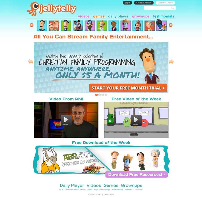
JellyTelly is an Internet-based television network for Christian families. They stream original videos and provide some children’s games.
To improve website conversions, the company hired Never Settle, a digital agency that regularly uses the VWO platform for its client work.
Goals: Increasing Number of Visits to the Sign-Up Page
JellyTelly is a membership-based site and thus its home page plays an important role in pushing prospects into the conversion funnel.
This is what JellyTelly’s original home page looked like:
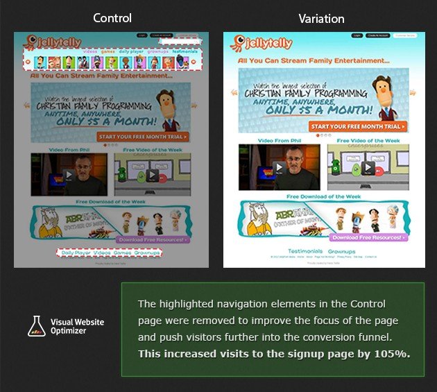
Tests run: Eliminating Navigation Elements That Distract Visitors
The Never Settle team felt that there were too many elements on the home page site. So, they hypothesized that retaining only the content relevant for encouraging visitors to move into the funnel would be increasing visits to the sign-ups page.
Accordingly, they created a variation of the home page with fewer elements. Specifically, the variation did away with 3 main elements that were on the original page:
- Navigation and character images on the top
- Search box on the top-right
- Links in the footer
Because a majority of visitors returning to the site were usually existing customers of JellyTelly, the conversion team at Never Settle used the segmentation feature in VWO to run this test only for new visitors.
Conclusion: 105% Increase in Visitors to the Sign-Up Page; Actual Sign-Ups Up by 5%
The variation with fewer distractions beat the original and sent 105% more visitors to the sign-up page. Kenn from Never Settle reported that this improved total sign-ups for JellyTelly by 5%.
Here is the comparison image for easy reference:
The 105% increase is definitely valuable. However, considering that the number of people visiting the sign-up page from the home page doubled, the increase in sign-ups seemed relatively small. Therefore, the team planned its next round of tests to figure out what more could be changed to achieve a higher number of sign-ups.
It is important to get the navigation design of the site right. For some businesses, providing visitors with all options so they can explore the site based on their preferences works. But for others, doing so distracts visitors and lowers conversion rates. For these, leading prospects one step at a time is a better option.
And there lies the key learning: Just because a certain A/B test improved conversions for one website does not mean it will do the same for every website.

Location
US
Industry
Media and Entertainment
Impact
105% increase in Click-through rate