Zwitserleven Updated CTA Text To Increase Sign-Up Page Click-Throughs
VWO and Zwitserleven
For over 100 years, Zwitserleven has been providing financial advice and services aimed at enabling its clients to strive for a relaxed life after retirement and a financially secure old age. Its clients include employers and employees of Directors-Major Shareholders (DMSs), Small and Medium Enterprises (SMEs), and various large companies.
The company uses VWO’s Visual Editor for its website optimization requirements.
Goals
The company’s landing page attracted a high volume of traffic from AdWords, but its inability to push visitors further into the conversion funnel was a cause of concern. They knew that if they could get visitors to click beyond this page to the next step, that is, the sign-up page, they could increase their number of leads. So taking the increase of click-throughs to the sign-up page as their goal, Zwitserleven kick-started their testing campaign.
Tests run
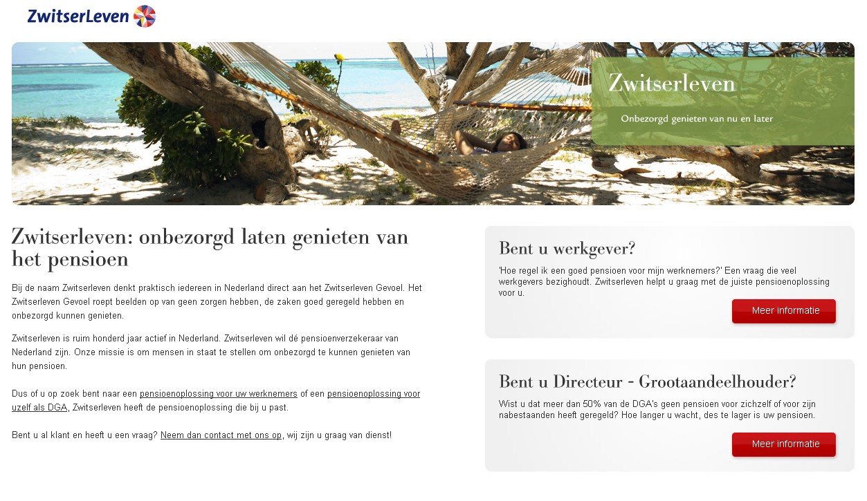
This was the control page they were trying to improve:

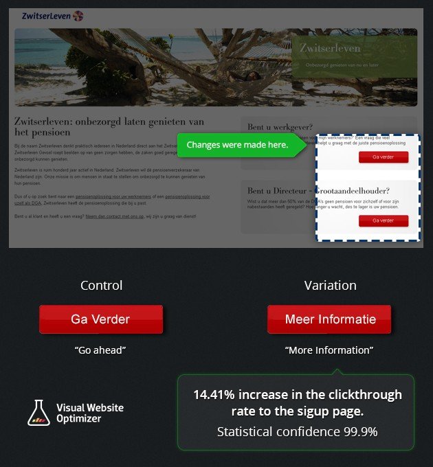
The team felt that the existing call-to-action text was vague. They hypothesized that changing it from Ga Verder (Go Further) to a more specific Meer Informatie (More Information) would give people a better idea about the company’s services. In turn, that, they believed, would increase the click-through rate from the landing page.
They created the following variation with a modified call-to-action text:

The A/B test pitted the variation against the original. The test was run on the VWO platform.
Here’s the Comparison Image that shows the changes that were made:

Conclusion
The variation beat the original, increasing click-throughs to the sign-up page by 14.41%. The result had a statistical confidence of 99.9%. Based on the historical average conversion rate, this translated to a 5% projected increase in the number of annual leads generated by the website for the company.
So why did such a minor change work?
The CTA buttons on a website serve as signposts that guide visitors. If the CTA text on your website do not clearly guide prospects on their journey to purchasing your products or services, they can feel lost. Most will respond by just moving to another website.
The original CTA text said Go further, referring perhaps to the prospect’s post-retirement life. But most visitors probably did not make the connection. The revised CTA button text More information was direct and simple to understand. Not surprisingly, it performed better than the Control and improved conversions for Zwitserleven.

Location
Netherlands
Industry
Finance
Experiment goals
Increase in CTR on sign-up page
Impact
14.41% increase in Click-through rate


