
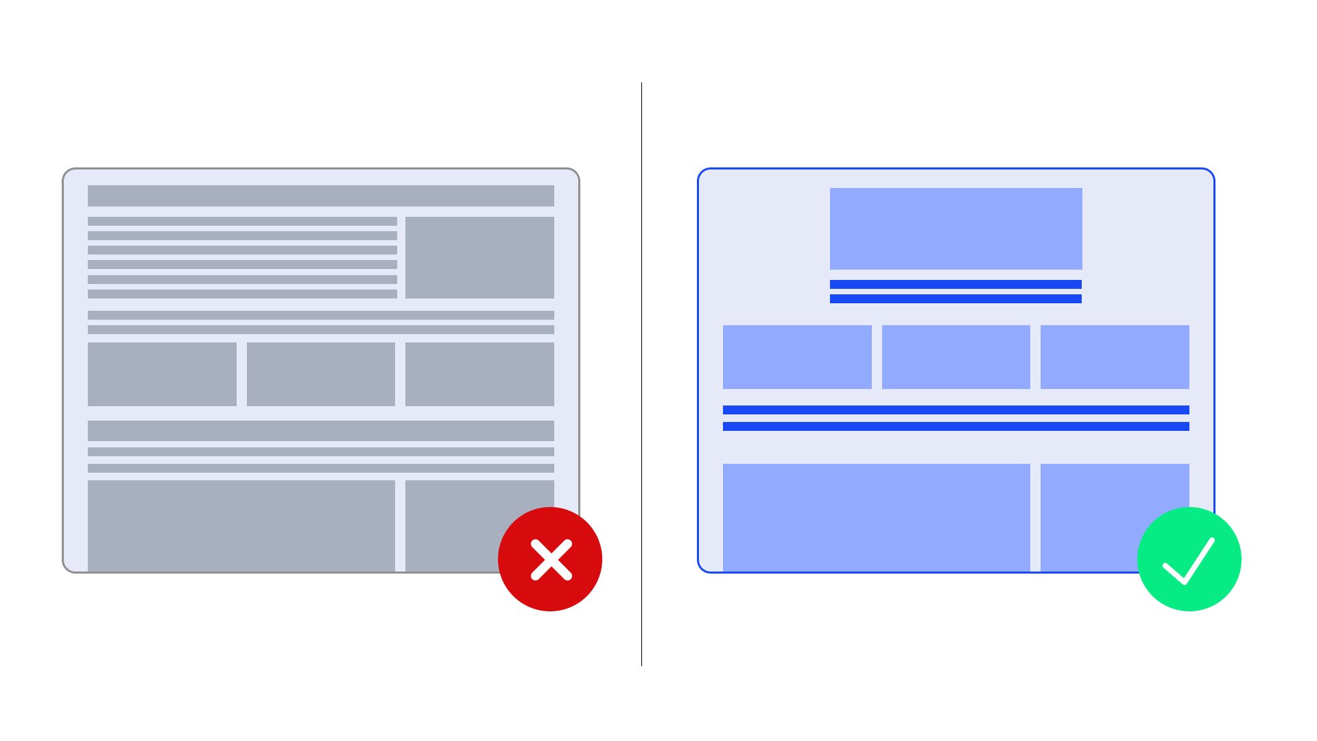
Whitespace is the clear space around elements on a webpage. It is not necessarily white, but any background that gives content room to breathe and stand out. It reduces clutter and improves focus, which brings clarity to a design.
That’s why the timeless principle of “less is more” is particularly relevant in web design. Whitespace is a core design element that directly influences user experience, enhances readability, and can even improve SEO performance.
Types of whitespace in design
Understanding the different scales of whitespace helps designers make informed decisions about spacing:
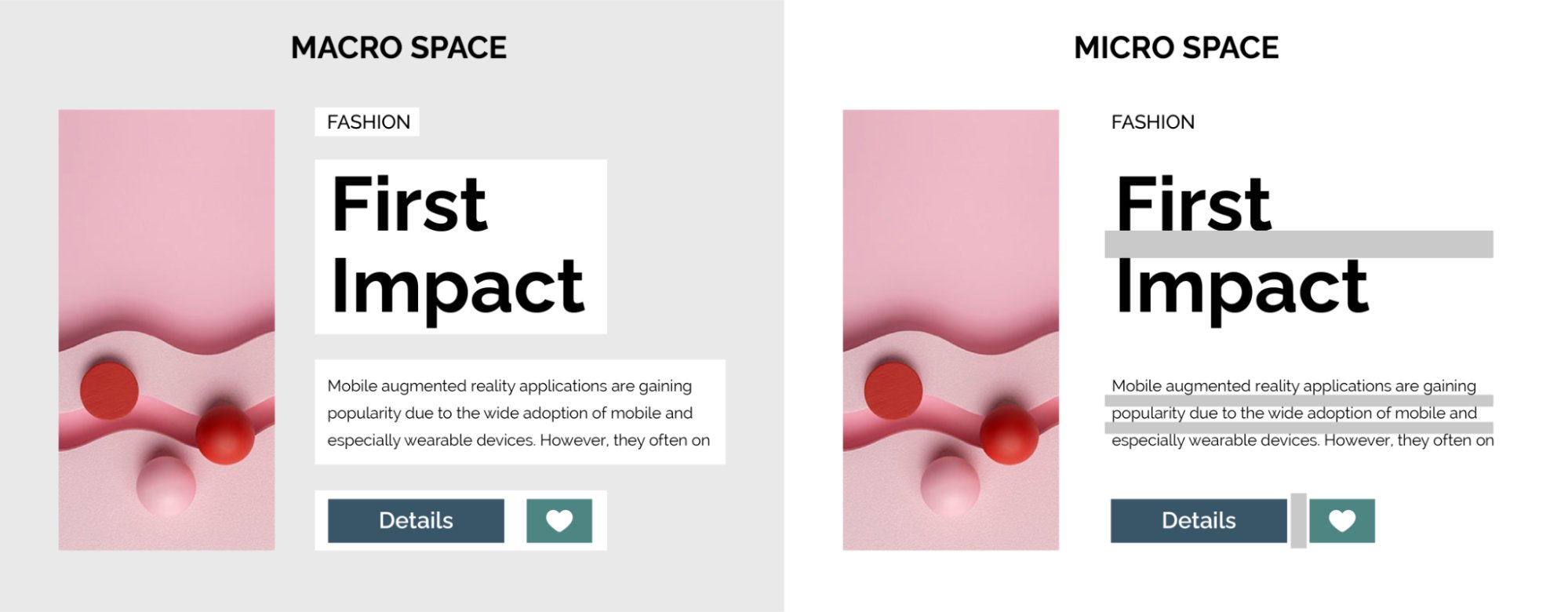
Macro whitespace
Macro whitespace creates the fundamental rhythm and flow of your layout. It involves large-scale spacing decisions that shape the overall structure of your page. This includes the generous margins around your hero sections, the padding between major content blocks, the space separating columns, and the breathing room around navigation elements.
Notice how a homepage’s generous margins and spacious headline areas create space that immediately signals professional design. These wide, purposeful spaces help direct the user’s attention and create a sense of balance and openness on the page.
Micro whitespace
Micro whitespace refers to the small-scale spacing details that influence readability and visual comfort. This includes line spacing, letter spacing, gaps between navigation links, padding around icons, and the space between paragraphs. Although subtle, these elements play a crucial role in how effectively users can engage with and absorb your content.
For example, the space between each line of text you’re reading right now, the space around a button label, and the tiny gaps between individual menu items are all forms of micro whitespace. These details help determine whether your content feels cramped or comfortably readable.
Whitespace by purpose and function
Whitespace also serves different functional purposes:
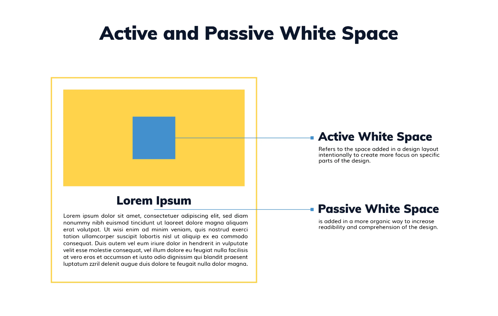
Active whitespace
It is intentionally used to serve specific design objectives. It guides user attention, creates emphasis around call-to-action buttons, isolates important headings, and establishes clear visual hierarchies. This whitespace is intentionally added to influence what you notice and click.
Think about how a “Sign Up” button gains prominence through surrounding space, or how product pricing commands attention when isolated from other elements.
Passive whitespace
It emerges naturally from your layout’s default spacing and margins. It is less intentional, but still contributes to overall readability and visual comfort. It provides the baseline spacing that makes content approachable and scannable.
For example, the automatic spacing that appears between paragraphs in a blog post, the default margins around images, or the standard line height in body text. While unintentional, this spacing still enhances content digestibility.
Why whitespace matters in user experience design
Whitespace provides measurable benefits that extend beyond aesthetics to impact user experience:
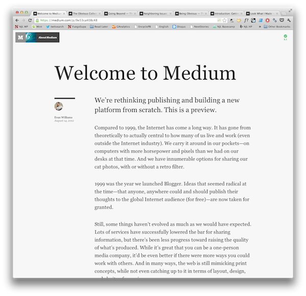
1. Establish visual rhythm and scanability
Strategic vertical and horizontal spacing creates a natural reading rhythm that guides users through content hierarchies. This pacing prevents information overload and allows complex content to be absorbed progressively, much like paragraph breaks in written text.
For example, Medium’s article layout employs generous line spacing and paragraph breaks to prevent reader burnout during lengthy articles.
2. Reduce friction, both visually and behaviorally
Whitespace actively removes friction from both how users think and how they act on your site. Thoughtful spacing improves mental clarity by reducing cognitive load and visual noise. At the same time, it enhances interaction precision, making it easier to tap, click, and navigate, especially on mobile.
When users don’t have to fight visual clutter or struggle with tiny clickable areas, they move more confidently through the experience. That sense of ease directly contributes to better decision-making, fewer errors, and ultimately, higher conversions.
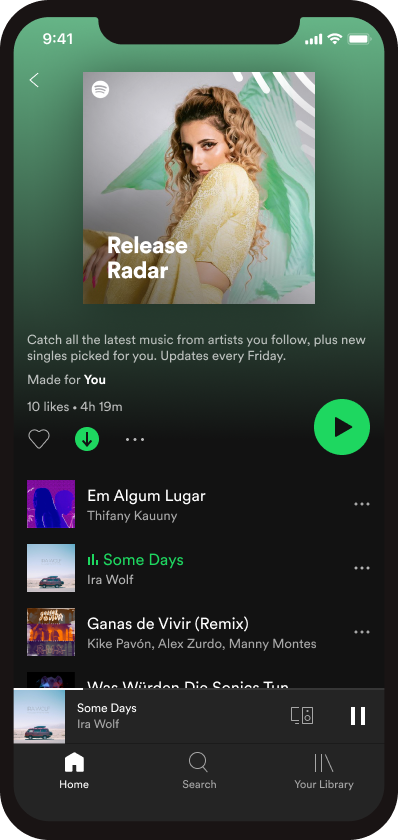
For instance, Spotify’s mobile UI uses ample whitespace around key controls like “play,” playlists, and navigation tabs. The spacing allows users to navigate and interact with the app smoothly and without friction.
3. Use proximity to instantly clarify element relationships
According to the Gestalt Principle of Proximity, when items are close together, users perceive them as related without explicit indicators. Whitespace makes this possible. When elements are spatially close, users automatically perceive them as related, reducing cognitive load and eliminating the need for visual separators like borders or dividers.
For instance, in a checkout form, placing the credit card number field close to the expiration date and CVV creates an implicit “card details” group, while spacing it away from billing address fields creates a clear mental separation between payment and shipping information.
4. Focus attention where it matters most
Whitespace not only draws attention but also improves how users interact with your interface. Intentional spacing creates clear visual hierarchies, guiding the eye toward key elements like headlines, CTAs, and important messaging. Simultaneously, generous breathing room around buttons, links, and forms reduces frustration and helps users take action with confidence.
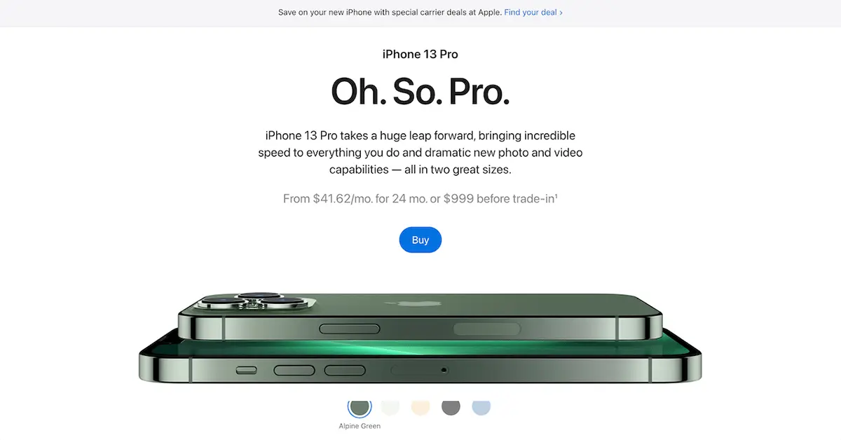
For example, on Apple’s product pages, the use of whitespace directs focus to a single product feature at a time, with ample space around CTAs like “Buy” or “Learn more.” This not only helps users absorb information quickly but also makes tapping or clicking effortless.
5. Elevate brand perception with space
Deliberate whitespace placement shapes how users perceive your brand. Generous spacing suggests confidence, professionalism, and premium positioning. These traits are often associated with luxury brands and high-end services. Clean, spacious layouts suggest credibility, competence, and attention to detail, helping establish trust at first glance.
For instance, luxury brands use extensive whitespace in their digital catalogs to mirror their physical retail environments, creating a sense of exclusivity and quality that supports premium pricing.
6. Improve SEO with engagement-driven design
Clean, readable layouts encourage users to stay longer, scroll more, and engage better, all of which search engines track. When whitespace enhances readability and reduces bounce rates, search engines interpret these positive signals as indicators of content quality and relevance. Increased dwell time and reduced bounce rates gradually contribute to improved search engine rankings.
For instance, a content-heavy page with cramped spacing may drive users away quickly. But by introducing more whitespace through improved line spacing and clearer content separation, users are more likely to stay longer. They engage more with the content, which can positively impact search rankings over time.
7. Support accessibility and inclusive design
Whitespace plays a critical role in accessible design. It improves accessibility for users with visual impairments, dyslexia, or attention disorders by reducing visual clutter and enhancing content legibility. It also supports mobile accessibility by ensuring proper touch target sizing, making it easier for users with physical impairments to engage with touch elements.
For example, Government websites use substantial whitespace and clear content separation to ensure information is accessible to all citizens, regardless of their technical literacy or physical capabilities.
3 Websites using whitespace effectively
These specific examples demonstrate masterful whitespace implementation across different industries:
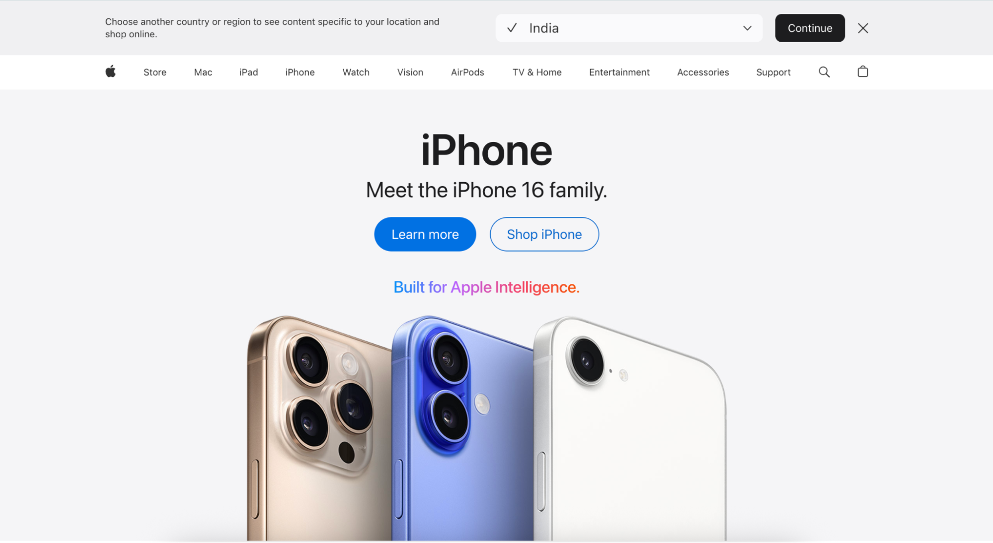
1. Apple
Apple’s homepage serves as a strong example of luxury minimalism, utilizing ample macro whitespace to spotlight product visuals and reinforce a premium brand perception. The generous spacing around product announcements and the strategic use of negative space make each element feel important and considered.
Key implementation strategies:
- Generous product isolation: Each iPhone, Mac, or iPad announcement receives abundant surrounding space, making products feel exclusive and important
- Strategic content hierarchy: Vast whitespace guides attention naturally from hero products to secondary offerings without competing elements
- Breathing room around CTAs: “Buy” and “Learn more” buttons are given substantial padding, reducing decision fatigue and increasing conversion rates
Key takeaway:
Whitespace can be a luxury signal that justifies premium pricing. When you give your most important elements generous space, users perceive higher value and quality. This approach works particularly well for brands positioning themselves as premium or exclusive.
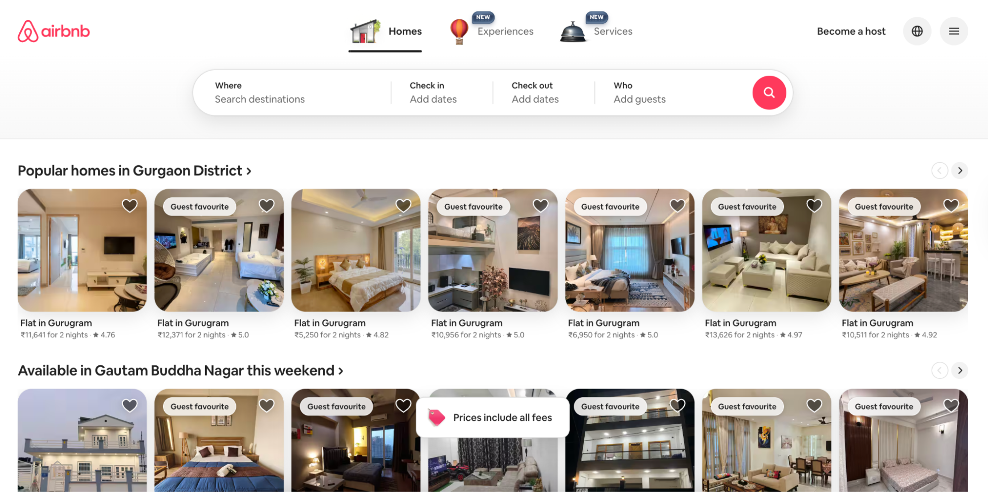
2. Airbnb
Airbnb uses strategic whitespace around search functionality and property listings to create an aspirational browsing experience. The spacing between destination cards allows users to focus on individual options while maintaining a visual connection between related elements.
Key implementation strategies:
- Property card spacing: Each listing receives optimal spacing that allows comparison without overwhelming choice paralysis
- Search functionality breathing room: The prominent search bar uses generous whitespace to establish it as the primary conversion point
- Destination imagery isolation: Travel photos are given space to “breathe,” creating emotional connection and wanderlust
Key takeaway:
Whitespace can create emotional experiences and reduce decision fatigue. When users aren’t overwhelmed by choices, they’re more likely to engage and convert. This is especially powerful for eCommerce and marketplace platforms where choice paralysis is common.
3. Slack
Slack’s marketing site shows how a thoughtful balance of macro and micro whitespace can make complex software appear more user-friendly and easy to understand. Purposeful spacing around feature explanations and testimonials guides visitors naturally through the conversion funnel without overwhelming them with information density.
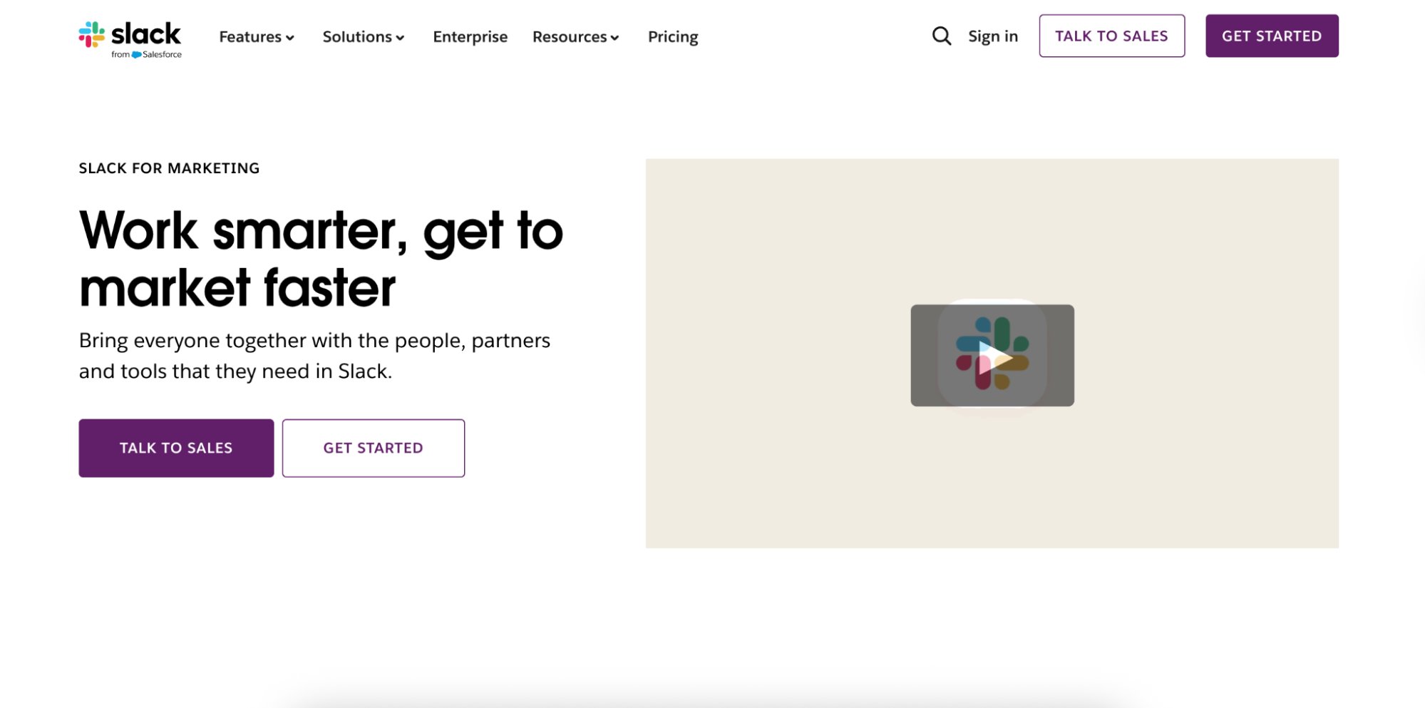
Key implementation strategies:
- Feature explanation spacing: Each function is given its own space, helping to avoid overwhelming the user with too much information at once.
- Testimonial isolation: Customer quotes are given generous padding, increasing credibility and readability
- Conversion funnel breathing room: Strategic spacing guides visitors naturally through awareness, consideration, and decision stages
Key takeaway:
Whitespace can make complex products feel simple and approachable. When features aren’t competing for attention, users can better understand value propositions and are more likely to convert. This is essential for SaaS and enterprise software marketing.
Conclusion
Whitespace is a deliberate design element that guides attention, improves navigation, and elevates brand perception. To make the most of it, continuously test, measure, and refine your layouts.
With VWO, you can analyze user behavior, run A/B tests, and optimize spacing across devices—all in one place. Start your free trial today!


