Are you obsessed with building a relevant customer experience on every device your end-user uses to browse your website? In that case, you will love our new responsive website editor for device-specific testing and the control and flexibility it gives you. It empowers you to test campaign pages aimed at a definite device type for responsive and adaptive websites as part of your multi-device experimentation program.
How does VWO’s responsive website editor for device-specific testing help you?
Let’s first talk about where you can use it. Say, for example, for your eCommerce store, mobile conversion rates drop a particular season, and you want to run a mobile-only promotion. Additionally, you want to re-design your website navigation to make it user-friendly for both desktop and mobile users. So, you want to test a few design layouts and optimize them for mobile before taking them live.
In addition, your analytics platform shows you data that a higher percentage of your visitors use a specific device like a mobile or a tablet to browse your website. You can drill this data deeper to see the device types used by them too. You therefore want to build a campaign page with a discount banner optimized for a specific device type like the Samsung series and run this campaign on mobile users only to build an optimal experience. Similarly, you want to create a campaign page showing your navigation, optimized for a specific device type like iPad Pro series users, and target it to Tablet traffic on your website only.
Doing this is very simple using VWO responsive mobile editor.
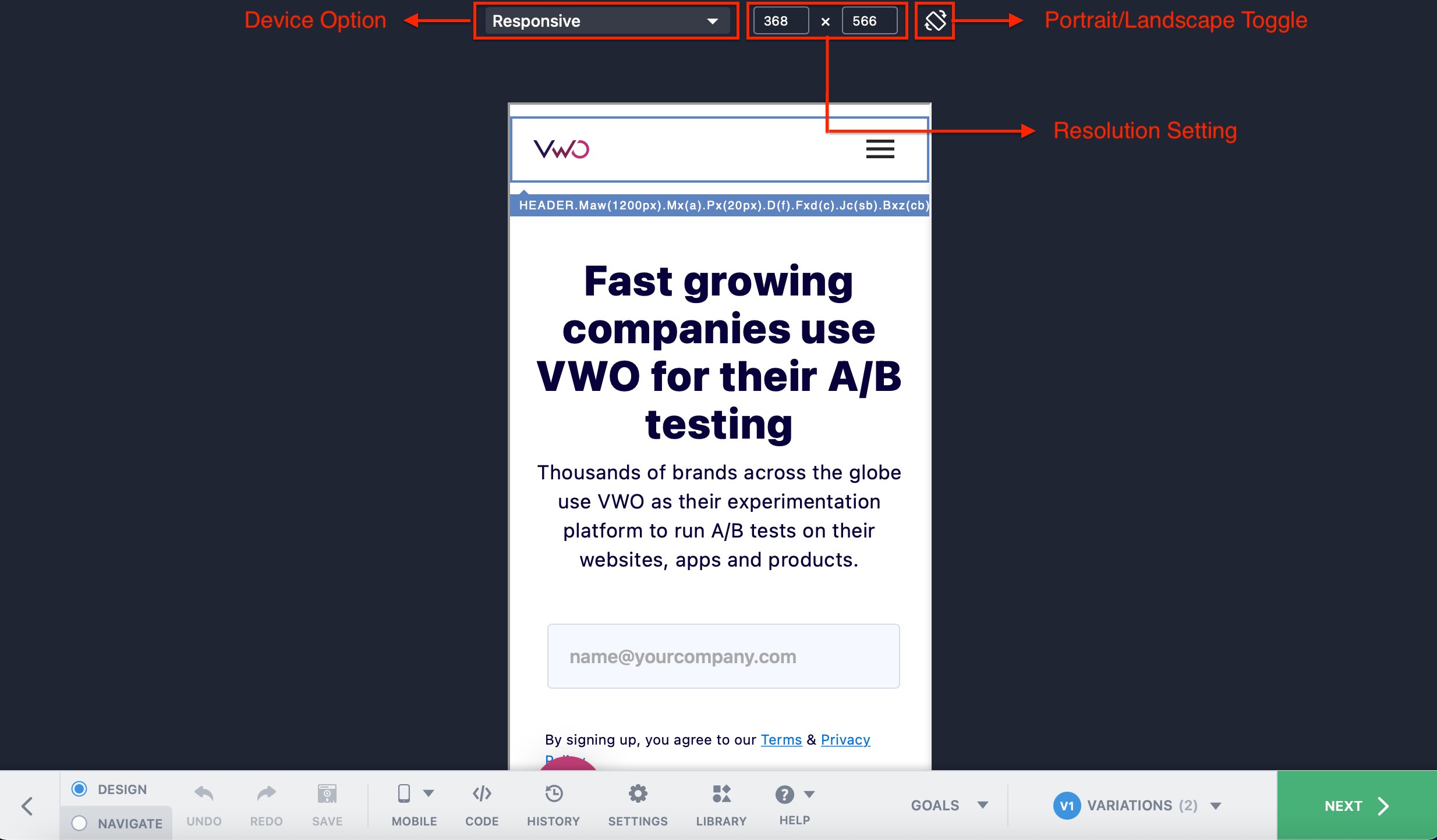
#1 Get campaign page preview in specific device types
Our new feature simulates your pages corresponding to specific mobile or tablet devices so that you can view the changes you are making to the campaign page before you apply them in your campaigns. For adaptive websites, you can use the pre-defined set of resolutions from a list of widely used mobile and tablet devices. For responsive websites, you can define a custom resolution of the webpage using the responsive mode, which is available for both mobile and tablet devices. In both cases, you have the option to toggle between portrait and landscape mode too to check the look and feel of the campaign page changes.
#2 Target relevant audience specific to your campaign page
Once your campaign pages are ready, you can target a particular campaign specific to your desired cohorts, like device traffic, to test and understand end-user behavior.
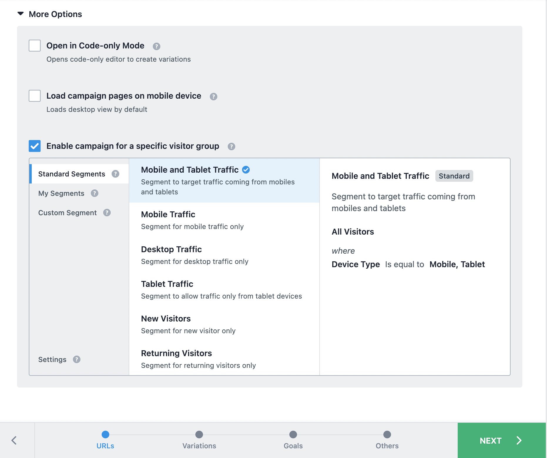
In case of our example, if you are running a discount banner for mobile users, optimized for a specific device type to see how they react to it, this is what your test would look like with our new responsive website editor:
Suppose you have made a campaign page specifically for mobile, and the campaign pages for desktops or tablets users are different. In that case, you can enable the same in the ‘Applicability of Modification’ settings in the responsive website editor so that you can define changes for each device’s version of the page individually.
Excited and want to know more?
This feature is available to all our existing VWO Pro and Enterprise customers for Testing and Web Rollouts products. To learn more about configuring and how to use the responsive mobile editor, visit our Knowledge Base. For more questions/concerns, please feel free to reach out to support@vwo.com.