Visitors browse your website on different devices- from handhelds with small screens that people keep in their pockets to oversized monitors used with desktop computers. Through the years, smartphones have been packing more pixels in their screens with every iteration- a trend that looks to continue. Modern websites are not designed for a single screen size- they respond and adapt based on the screen of the visitor’s device.

Regarding how images are shown on different screens, having a single largest possible image is not an optimal way to do things. A high-quality image looks great on a high-resolution screen, but this may not be needed for low-resolution screens. A smaller image can do the job and load much faster on these devices.
Enter ‘srcset’ for images
If not a single large image, but a set of images of different sizes is made available for every image on the website, the most optimal ones can be used for each situation. This is what an image’s srcset helps achieve.
The srcset is an image attribute that defines which image (from the set) is to be selected for each scenario (based on the screen size). So when the page loads, the browser selects the image as per this condition for that device’s screen size. When the page has many images, the impact adds up to load the page as quickly as possible for that device.
How srcset works
For any image, the srcset attribute lets you define a list of images along with size descriptions for each. It is also mandatory to define the src attribute- this is needed for browsers that do not have srcset support (which means things will work conventionally here- based on a single image). Treat this as the default image size in situations where the entire set is unavailable.
The markup should be something like this for four responsive image sizes in the set:
<img
   srcset="
      url size,
      url size,
      url size,
      url size"
   src="default url"
>
Using responsive images in VWO
When you are testing or rolling out changes, it is important to retain the page’s responsive properties. This means that when you change images for a variation, the new image should also have the srcset defined correctly. It cannot be a single large image that kills how quickly the page has been designed to load.
When creating the experience using the Visual Editor, select the image to change and click ‘Change Image’. You should be able to change the default image source in the following dialogue. Just below that option, ‘Responsive sizes’ shows the different sizes for which the old image’s srcset has been defined. You need to replace each image in the set with the new image for that size. ‘1x’ represents the normal size and ‘2x’ is usually defined for the image that is twice the size of the normal image. The set for the image on your website could be different.
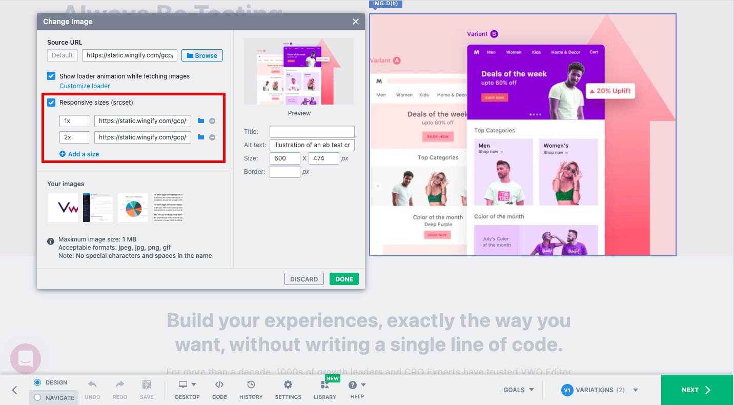
While making this change, it is important that only new images are present in the srcset. As a result, the srcset of the original image will be removed completely. There is no chance that the browser can select an older image. If you wish to add responsive sizes for the new image, you can go ahead and add them. For detailed walkthrough of how to modify the srcset of an image, do check out this article.
If you do not see the ‘responsive sizes’ option, it means that the original image did not have an srcset. We recommend that you reach out to your website developer and have the srcset defined for it. Once this is done, you can modify it to add more image sizes in the set using VWO. Ideally, every image on your website should have a srcset defined.
Pro Tip: If you just have a single large image and want to generate images of different sizes to create a set, you can use this tool.
Thus by properly defining the srcset for images, you can ensure that AB testing does impact how quickly your pages load owing to image changes that you are experimenting with.