Getting started with a web analytics tool might seem straightforward at first glance. You may jump in with the most popular free option. But is that the best approach?
As the digital world moves toward a cookieless future, privacy is becoming a core concern for users. Plus, basic web analytics often falls short in today’s competitive landscape. Businesses now need advanced features like A/B testing reports, effort analysis, and more. Factors like these deserve careful consideration before you commit to a tool.
That’s why it’s crucial to take the time to research and evaluate options thoroughly rather than simply opting for the most popular tool.
In this blog, we explore the top 10 web analytics tools, highlighting their dashboards, features, and pricing, to help you assess each tool’s potential for modern business needs.
We also discuss why traditional analytics is just the starting point and how behavior analytics tools can add depth to your digital strategy.

What is a web analytics tool?
A web analytics tool lets you analyze the quantitative aspects of your website traffic. Key metrics like pageviews, session duration, pages per session, bounce rate, and conversion rates are tracked and analyzed through the tool.
It helps you understand how your website and its pages are performing, pinpoint exactly where users drop off or abandon their journey, and make data-driven decisions to fix those issues.
“You’re on that yellow brick road heading to where you want to go. Walking through this, I think a good starting point for research is analytics. That’s what I recommend to clients all the time. Tools for analytics include Google Analytics, GA4, Amplitude, Heap, Adobe Analytics, and Mixpanel.”
– Haley Carpenter,
Founder at Chirpy
Source: VWO Webinar
10 Best web analytics tools – A quick look
- Google Analytics
- Adobe Analytics
- Kissmetrics
- Matomo
- Heap
- Woopra
- HubSpot
- Plausible Analytics
- Fathom Analytics
- Semrush
10 Best web analytics tools
Web analytics tools: A quick comparison table
| Sr No | Tool name | Noteworthy features | Key pros | Pricing and plans |
| 1 | Google Analytics | Predictive analytics; Third-party ad data integration; Cookieless tracking | Free with Google product integration; Real-time tracking; Natural language search bar | Free; GA 360 (custom) |
| 2 | Adobe Analytics | Excel Report Builder; Real-time segmentation; Predictive analysis | Real-time data tracking; Multi-channel attribution; Predictive trend forecasting | Select, Prime, Ultimate (on request) |
| 3 | Kissmetrics | A/B testing tracking; Industry-specific metrics; 24+ integrations (VWO, HubSpot, Shopify) | User-friendly charts; SQL support for advanced reporting; Excellent customer support | $299/month, $499/month, Custom |
| 4 | Matomo | Heatmaps & session recordings; A/B testing reports; 100+ CMS integrations | Complete data ownership; Cookieless tracking; Open-source | Free (on-premise), $23/month, Custom |
| 5 | Heap | AI copilot; Heatmaps & session recordings; User effort analysis | AI-powered deep insights; High-speed query performance; Pre-built templates | Free (10K sessions), Growth, Pro, Premium |
| 6 | Woopra | Analytics copilot; 40+ platform integrations; Real-time triggers/automation | Real-time customer interaction view; Visitor identification by name/email; Complete journey mapping | Free (10K events), $49/month, $999/month, Custom |
| 7 | HubSpot | Lead nurturing; Attribution reports; Integrated CRM | User-friendly interface; Integrated marketing tools; Helpful community support | Free, $15-$3,600/month |
| 8 | Plausible Analytics | No visitor data collection; Cookieless tracking; Lightweight script | Quick learning curve; GDPR/CCPA compliant; Minimal speed impact | $19/month, $39/month, Custom |
| 9 | Fathom Analytics | Google Analytics importer; 20+ CMS integrations; Forever data retention | 50 websites per account; Privacy-focused; Simple setup | Single dashboard for all marketing, Comprehensive SEO package; Customizable options |
| 10 | Semrush | Competitor research; Gen AI for conversions; Market analysis | Single dashboard for all marketing, Comprehensive SEO package, Customizable options | Free (limited), $139.95/month, $249.95/month, $5,000+/month |
1. Google Analytics
Launched in November 2005, Google Analytics is the most commonly used web analytics platform. Millions of websites and apps globally rely on it to track and analyze visitor activity. In July 2023, Google officially transitioned from Universal Analytics to Google Analytics 4 (GA4) as the primary analytics platform.
Dashboard overview
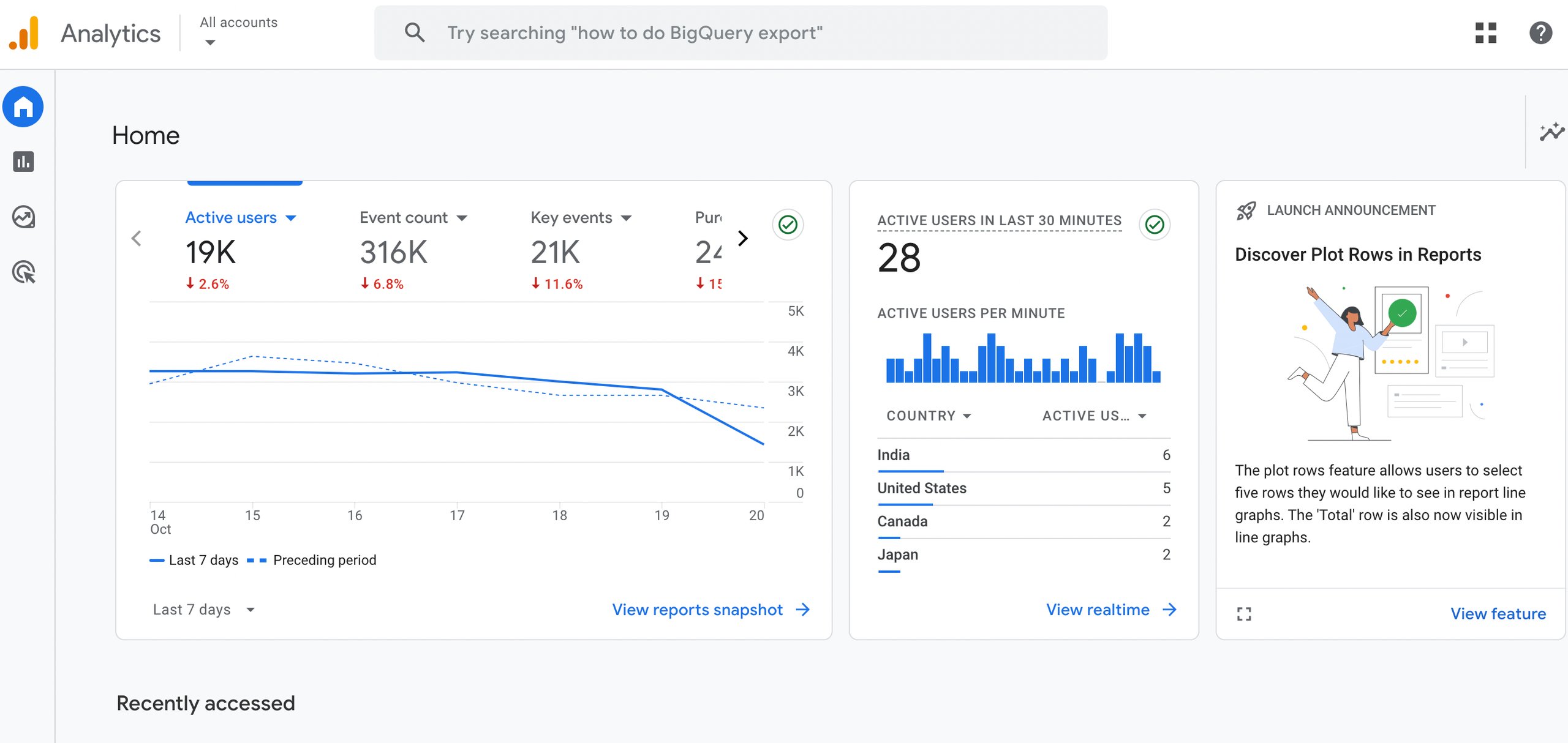
Once GA4 starts collecting data, it provides two types of reports: an overview report and a detailed report.
The overview report offers a comprehensive snapshot of key metrics, such as new user acquisition, conversion rates, engagement, monetization, user behaviors like page scroll depth and event triggers, and user demographics.
The detailed report allows users to dive deeper into these metrics by selecting dimensions such as location, source, or medium. Users can further refine the data using components like date range, filters, comparisons, and data quality insights.
GA4 also harnesses machine learning to offer valuable insights, helping users slice and dice the web analytics data for more granular analysis.
Noteworthy features
Google Analytics provides actionable insights and predictive analytics through advanced data analysis. It also integrates third-party advertising data, enables cross-channel ad budget tracking, and supports cookieless tracking with Chrome’s Privacy Sandbox API.
| Pros | Cons |
| It’s a free tool that seamlessly integrates with other Google products like Google Ads and major third-party platforms, making it ideal for small businesses just starting out. | Limited customization options for non-technical users. |
| Offers real-time tracking of data and website traffic spikes. | No option to migrate existing data from Universal Analytics to GA4. |
| Allows for easy creation of custom reports tailored to user needs. | Customer support response times in community channels can be delayed. |
| A convenient search bar allows one to easily obtain data insights by typing in natural language. | Google Tag Manager has a steep learning curve, and managing containers and tags can be confusing at times. |
| The dashboard provides comprehensive insights into website visitors, including demographics, behavior, and interactions. | User-level data can be retained for only 14 months. |
Pricing
Google Analytics offers a forever-free plan, making it accessible to businesses of all sizes. For enterprises needing more advanced features and deeper insights, there is a premium option called Google Analytics 360.
Expert quote on Google Analytics 4 usage:
“To maximize the value of GA4, businesses should focus on optimizing event tracking, as GA4 is an event-based analytics platform. Defining the right key events is crucial for obtaining meaningful insights.
Another best practice is to use BigQuery for advanced analysis, since GA4’s UI has limitations. Exporting data to BigQuery allows for more detailed and customized analysis.”
– Jihee Yoo,
Senior Analytics Manager at Jellyfish
Source: VWO Blog
Quick note: Your experiments are generating data goldmines, but are you mining them correctly? Learn how to leverage GA4’s advanced metrics like scroll depth, bounce rates, and days to purchase to extract insights that directly impact your bottom line. Download the ebook now.
2. Adobe Analytics
Adobe Analytics is a robust web analytics platform tailored for enterprise-level needs. It enables businesses to gather and analyze vast amounts of customer data from various sources, including Adobe’s suite of products, providing actionable insights. Users can perform web analytics, marketing analysis, predictive analysis, and attribution all in one place.
Dashboard overview
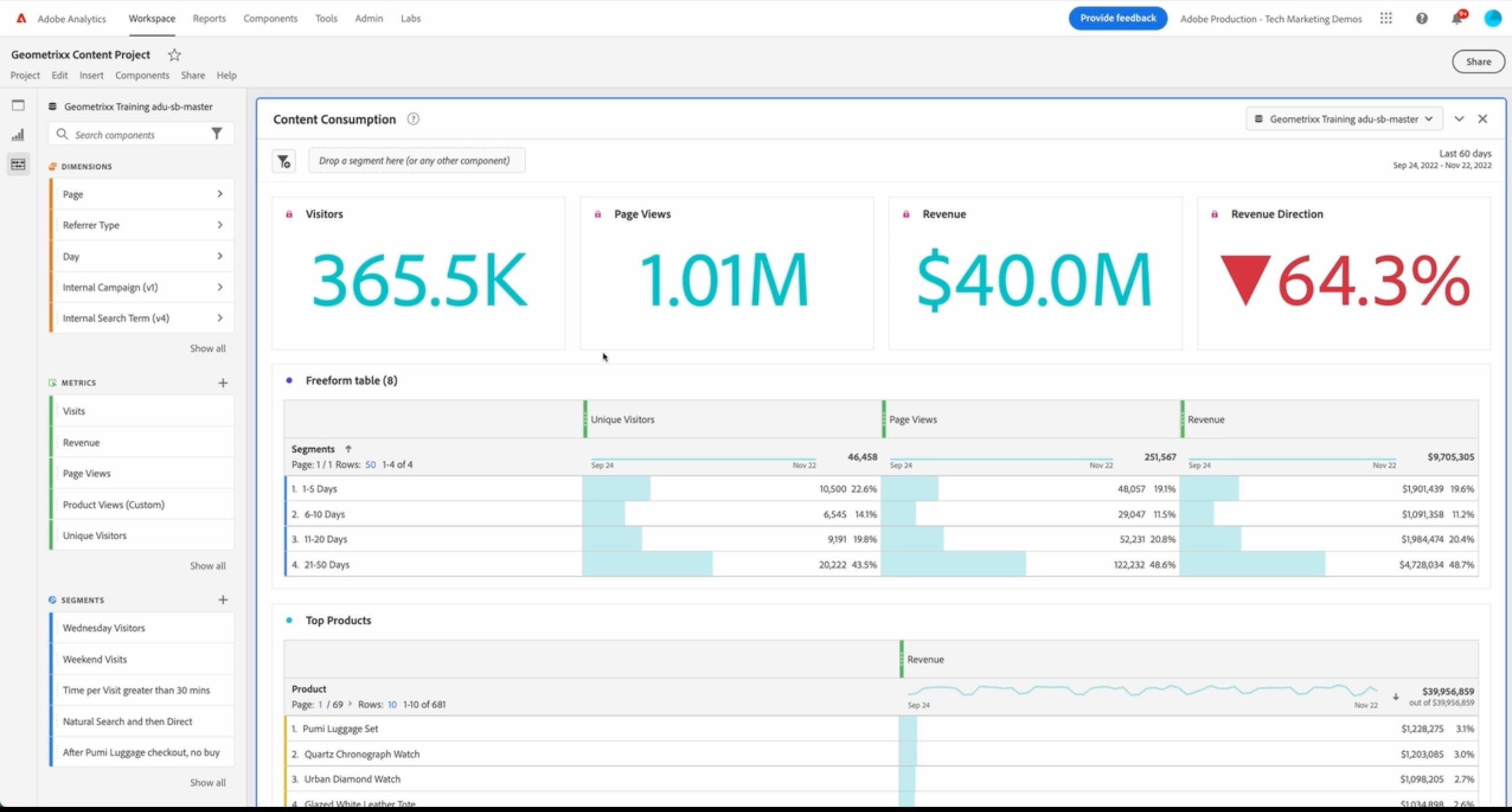
Adobe Analytics offers an intuitive dashboard, which can be customized through a drag-and-drop editor. A typical dashboard includes:
- Panels – Manage multiple projects and display different visualizations and funnels.
- Visualizations – Use line and bar charts to perform analyses like cohort analysis, user flow, and more.
- Components – These include dimensions (like day or page), metrics, segments, and date ranges to refine data insights and comparisons.
This flexible setup allows users to track key performance indicators and comprehensively view their data easily.
Noteworthy features
Report Builder with support for Microsoft Excel on Mac, Windows, and web browsers, real-time segmentation of all online data, ad-hoc and cohort analysis, and Predictive analysis.
| Pros | Cons |
| Real-time data tracking and user interaction analysis. Easy-to-create audience or behavior segments for optimization campaigns, especially when paired with Adobe Target for A/B testing. | The pricing can be steep for startups and early-stage businesses. |
| Multi-channel attribution enables marketers to make informed decisions when managing multiple platforms. Predictive analytics helps forecast trends and anticipate future needs. | The tool can be overwhelming for beginners, requiring extensive training and support to fully utilize its features and capabilities. It has complex setup and integration processes. |
Pricing
Adobe Analytics offers three pricing plans: Select, Prime, and Ultimate. The Select plan provides the most basic features, while the Ultimate plan includes the most advanced options. Pricing for each plan is available upon request.
Customer experience based on G2 reviews:
“Adobe Analytics is easy to use and implement, making it accessible for teams of all sizes. It offers a wide range of features, including real-time tracking and advanced segmentation.” – Sainath Vagdale, Advanced Analyst at EY
3. Kissmetrics
Kissmetrics provides both tech and non-tech users with an easy way to gain valuable insights from website data, such as conversion rates, drop-offs, and customer retention across multiple websites and products.
Dashboard overview
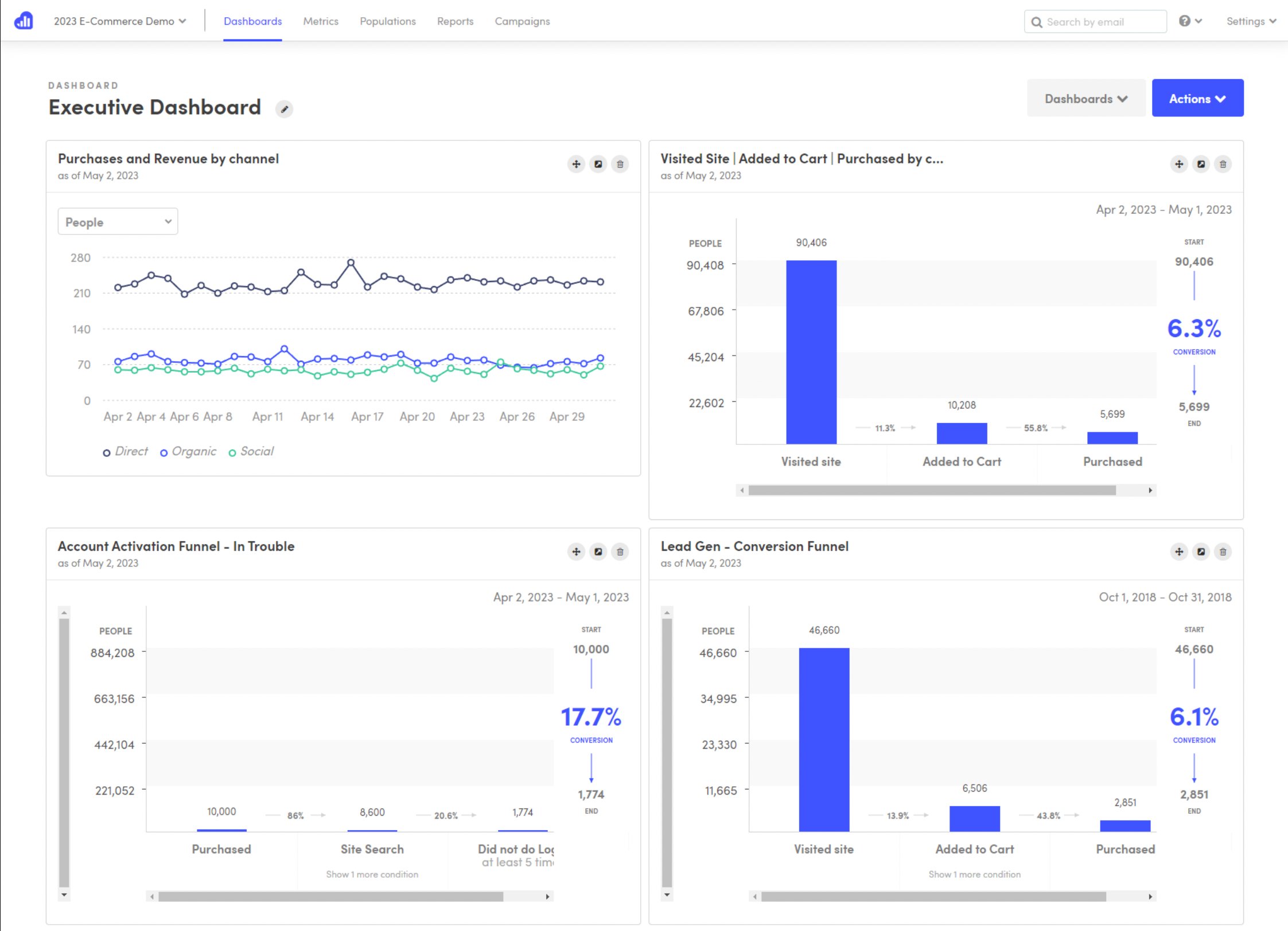
The dashboard offers a comprehensive view of website activity, making it simple to understand key audience engagement metrics.
Users can quickly access insights on important indicators like churn rates, visualize sales funnels and more. The platform enables tracking and analysis of data for advanced insights, such as feature usage and active user counts.
Kissmetrics supports generating a wide range of reports, such as user cohort reports, revenue reports, A/B testing reports, user activity reports, and SQL-based reports, allowing businesses to make data-driven decisions.
Noteworthy features
Kissmetrics provides robust A/B testing tracking, it offers industry-specific metrics like SaaS businesses can monitor key KPIs like core feature usage, while eCommerce companies can track every stage of the checkout process.
The platform seamlessly integrates with over 24 third-party tools, including VWO, HubSpot, WordPress, and Shopify, making it versatile for a wide range of business needs.
| Pros | Cons |
| The platform is user-friendly, with well-designed charts and visualizations that simplify complex data analysis. | A steep learning curve for beginners, especially those without prior experience in tracking or analytics tools. Configuration and customization can be challenging. |
| It offers advanced business reporting features, such as exploring raw data using SQL, tracking daily active users (DAU) versus monthly active users (MAU), and calculating customer lifetime value. It also monitors churn rates and customer counts and identifies revenue-driving products. | Data analysis can be slow for large datasets or reports covering long timeframes. |
| Excellent customer support, including prompt and thorough onboarding to help non-technical users quickly become familiar with the platform. | Heavy reliance on customized tracking codes to generate actionable insights. |
Pricing
Kissmetrics offers straightforward and transparent pricing:
- $299/month for small teams,
- $499/month for medium businesses,
- Custom plans for enterprises upon request
Additionally, the platform offers flexibility to create a limited plan based on unique business requirements.
Customer experience based on G2 reviews:
“Kissmetrics excels in its features. The ability to track, analyze, and segment our customers’ online behavior is unparalleled. Additionally, it is extremely helpful that Kissmetrics allows us to integrate data from multiple platforms, making it a one-stop shop for all our analytics needs.”- Matt Saricicek, Founder and CEO at Biyo
4. Matomo
Matomo, (formerly known as Piwik) is an open-source web analytics tool that has grown from a community-led project into a popular alternative to Google Analytics. It’s trusted by over a million websites worldwide.
Dashboard overview
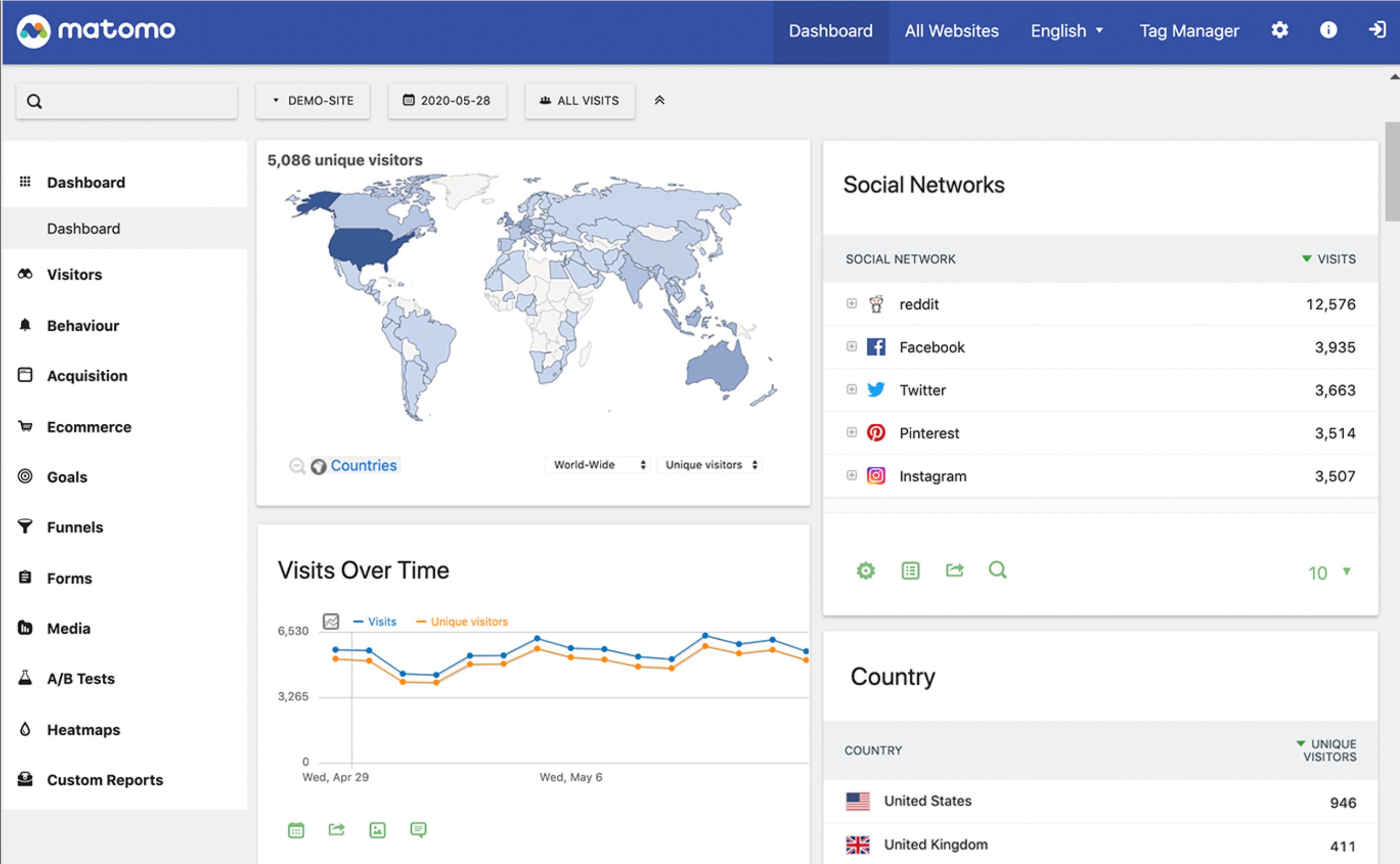
Matomo’s dashboard is user-friendly and intuitive. On the left-hand side, users will find a navigation menu that allows quick access to various reporting sections such as Acquisition, Visitors, Forms, and Funnels.
Each reporting section is populated with useful widgets. For instance, in the dashboard section, users can view widgets displaying data like unique visitors from different regions and insights from social media platforms.
In addition to these core analytics, the dashboard gives behavioral data with features like heatmaps and user session recordings. Users can also track the performance of A/B tests conducted on the website, providing a well-rounded view of visitor behavior.
Noteworthy features
Qualitative analysis with heatmaps, session recordings, form analytics, A/B testing reports, media analytics, search engine keyword performance, and integration with CMS like WordPress, Magento, Drupal, and 100+ other software.
| Pros | Cons |
| Easy to set up, open-source, and user-friendly, giving full control over the data. Complete data ownership with no third-party platforms accessing data for marketing purposes. | Many ad blockers prevent Matomo’s tracking code from functioning. |
| Flexible hosting options: Users can choose between Matomo Cloud or Matomo On-Premise for full control. | Requires a steep learning curve to fully understand all metrics and features. |
| Cookieless tracking. Tracks users using a config_id without relying on third-party cookies, machine learning, or data gap-filling methods. | Does not integrate with Google’s marketing platforms. |
Pricing
Matomo offers clear and transparent pricing, with two options depending on user hosting preference: cloud-based or self-hosted (on-premise).
For on-premise solutions, Matomo is completely free, making it an attractive option for those with their own servers.
For cloud-based services, there are two pricing plans:
- Business Plan: Starting at $23/month for up to 50,000 website hits.
- Enterprise Plan: Tailored to larger needs, with pricing available upon request.
This flexibility allows businesses to choose the model that best suits their needs and budget.
Customer experience based on G2 reviews:
“Matomo is a much more precise tool than Google Analytics; it is also very simple to use.”- Alessandro Creazzo, Marketing Consultant at HANGAR Copy
5. Heap
Heap, a digital insights platform by Contentsquare, provides users with a comprehensive 360-degree view of their data. It’s a one-stop solution for data collection, analysis, insight generation, and managing large datasets.
Dashboard overview
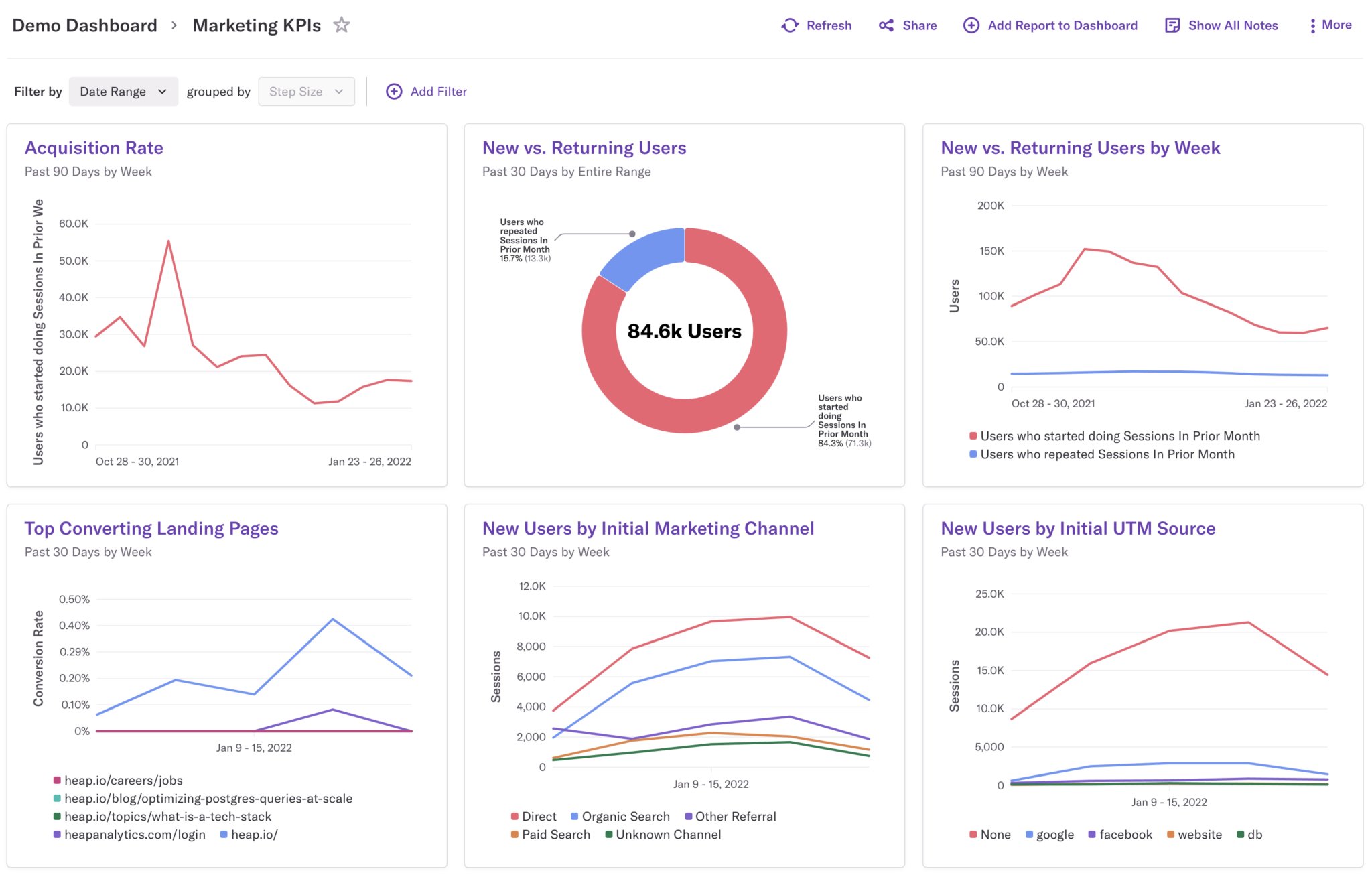
Heap’s dashboard is intuitive and user-friendly. Users can easily create custom dashboards by adding charts such as usage over time, funnels, and more with a simple drag-and-drop interface.
The platform allows for up to 100 charts per dashboard, offering users a comprehensive view of their data. Charts can be rearranged and prioritized by dragging them into the desired order, providing flexibility in how users view insights.
In addition, users can choose from pre-built templates, like acquisition reports, to quickly generate dashboards with relevant charts without having to build from scratch.
Noteworthy features
AI copilot, qualitative analysis with heatmap and session recording, integration with A/B tools like VWO to retrieve experiment data, user effort analysis, and auto user segment identification.
| Pros | Cons |
| An extensive feature set, including AI-powered tools and qualitative analysis, allows for deep, granular insights into user data. | Steep initial learning curve to fully grasp the platform and all its features. |
| High-speed query performance on event streams, with the ability to track past sessions efficiently. | Interpreting data from third-party integrations can be challenging. |
| Pre-built templates simplify dashboard setup, saving time and effort. | Some users may find navigation and setting up new tracking features complex. |
Pricing
Heap offers four pricing plans, starting with a free plan that includes a monthly quota of 10,000 sessions. The three paid plans—Growth, Pro, and Premium—are designed to cater to various business needs. For the Growth plan, you can install a free snippet to get a usage estimate, while Pro and Premium have custom session pricing.
Customer experience based on G2 reviews:
“The auto-capture feature is extremely useful. It automatically tracks all user interactions, so I don’t have to manually set up event tracking for every single action. This has saved me a ton of time and helps me gain a more complete picture of user behavior.” – Parrott Ramon, Fleet Data Analyst
6. Woopra
Woopra, launched in 2008, is an all-in-one customer journey analytics platform with its own proprietary tracking system. It enables businesses to map customer journeys, analyze key metrics over time, track user retention, and gain granular insights into visitor behavior.
Dashboard Overview
Woopra’s dashboard offers various types of reports for deeper insights into user behavior:
- Customer Journey Reports: Users can create funnels to track how visitors interact at each stage of the customer journey.
- Metric Trend Reports: These reports visualize how key metrics have performed over a specific period, helping users spot trends.
- Cohort Reports: This feature allows users to analyze growth by tracking specific user groups (cohorts) over time.
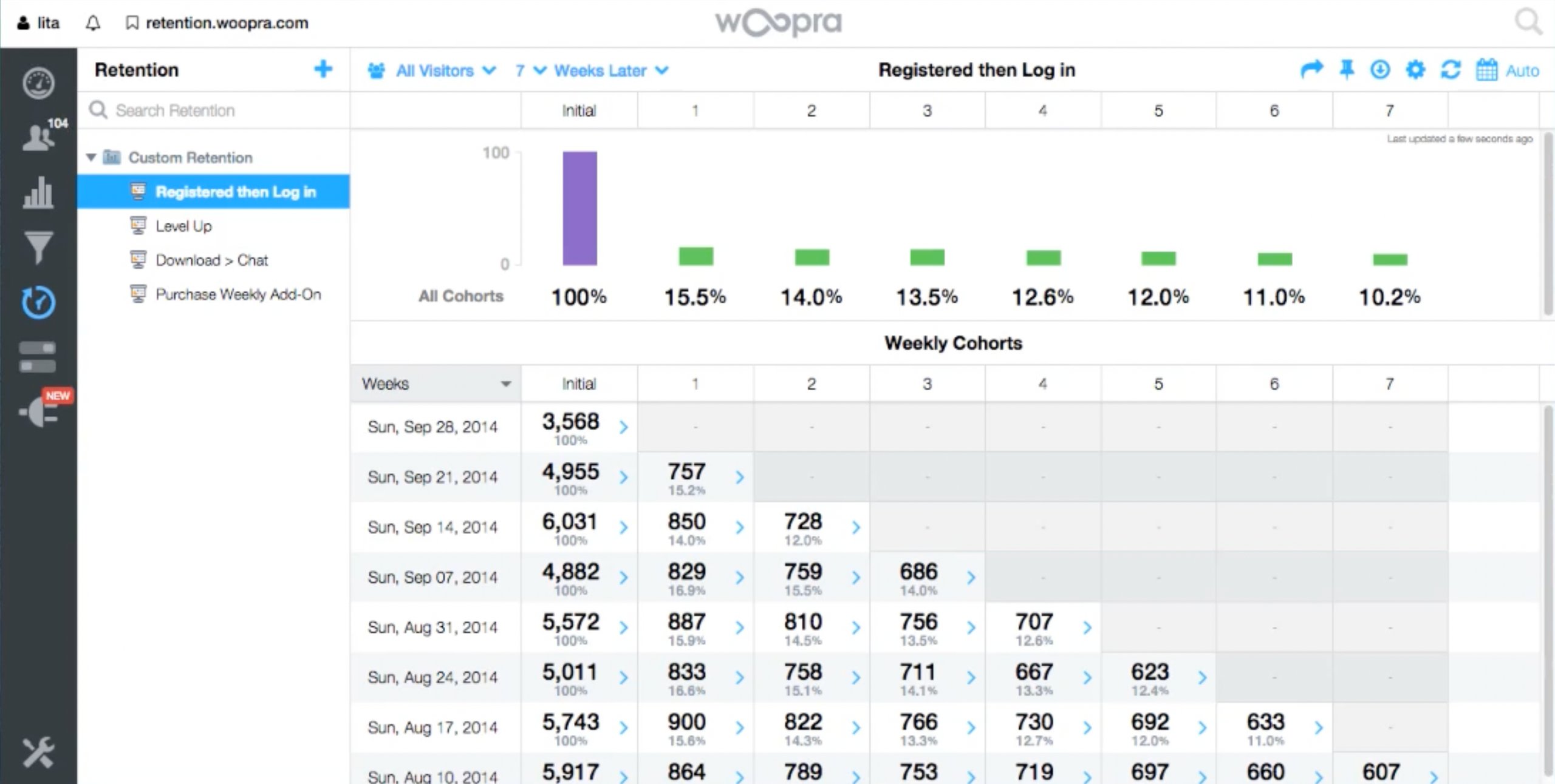
- Retention Reports: Users can track how well they’ve retained visitors during a set period, providing essential insight into long-term engagement.
Here’s a quick look at how Woopra’s retention report provides essential data on user retention.
In addition to its analytics dashboard, Woopra enables the creation of individual customer profiles. These profiles capture details of each user’s interaction with the website, offering a granular view of behavior and engagement.
Noteworthy features
Analytics copilot, one-click integration with 40+ platforms, individual-level event tracking, real-time triggers/automation, behavior segmentation, and user retention reports.
| Pros | Cons |
| Provides a unified view of real-time customer interactions. | The lack of seamless integration with marketing automation platforms can be a drawback for businesses heavily reliant on such tools. |
| Allows users to identify visitors by name or email, making it easier to map out the complete user journey and gain detailed insights into individual behavior. | Support services are only offered with the Pro and Enterprise plans, making them less accessible and more costly for small businesses that need assistance. |
Pricing
Woopra provides straightforward and transparent pricing for four different plans. The Core Plan is free and includes 10,000 events per month. The Starter Plan, priced at $49 per month, supports over 50,000 actions per month. For larger organizations, the Pro Plan, priced at $999 per month, accommodates up to 5 million events per month. Finally, the Enterprise Plan is available with custom pricing upon request.
Customer experience based on G2 reviews:
“The platform is intuitive to use and includes rich analytical features while continuously optimizing functions such as integration with AIQUA Segment. It is supported by customer success and engineering teams that deliver solutions based on customer needs.”- Vicky Fang, Marketing Specialist at ezTravel Co., Ltd.
7. HubSpot
HubSpot, a well-known and comprehensive CRM platform, includes analytics as part of its marketing solution. This tool allows users to map the entire customer lifecycle journey, track website KPIs, and measure the performance of online marketing campaigns.
Dashboard overview
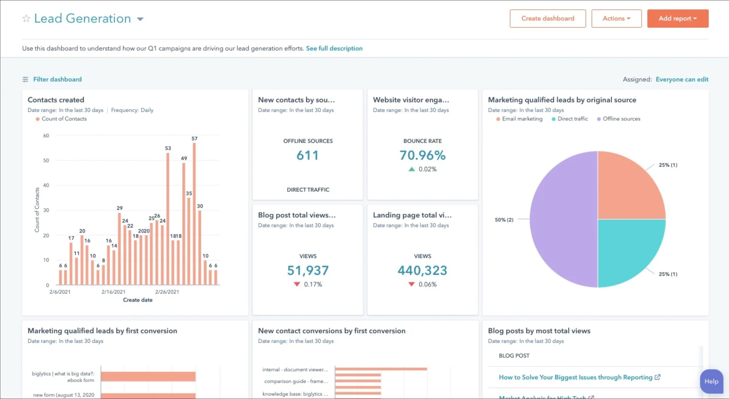
HubSpot’s dashboard offers a clear view of website performance. Users can create attribution reports using different models. It also provides customer journey analytics, showing which pages led to conversions and how prospects move through lifecycle stages.
The platform gives insights into the performance of specific marketing channels like ads, social media, and email marketing. It also tracks key metrics like landing page views and bounce rates, helping users optimize their marketing efforts efficiently.
Noteworthy features
Lead nurturing, attribution report, integrated CRM, customized reporting, advanced reporting permission, and pre-built dashboards.
Integrate VWO with HubSpot to instantly access session recordings within each contact’s timeline, giving you seamless insights into user behavior.
| Pros | Cons |
| It is user-friendly with a clean, intuitive interface. | Analytics cannot be purchased as a standalone product, which might be limiting for some users. |
| Its integrated suite of inbound marketing tools makes it easy to act on insights gained from analytics, streamlining the workflow. | Frequent updates and new features can feel overwhelming, making it difficult for users to stay up-to-date. |
| The HubSpot community is a valuable resource for troubleshooting and solving common issues, reducing reliance on customer support. | There is a steep pricing jump for businesses looking to shift to more advanced features, which can make it a costly investment as their needs grow |
Pricing
HubSpot offers straightforward and transparent pricing plans. The Marketing Hub paid plan starts at $15 per month for basic features and can go up to $3,600 per month for advanced capabilities. It also offers a free plan to start.
Customer experience based on G2 reviews:
“The ease of use in creating workflows is a significant advantage. The interface effectively guides you through a workflow from start to finish.” – Joseph Brown, Operations Strategist at Intrinsic Digital
8. Plausible Analytics
Plausible Analytics is an open-source and privacy-focused analytics platform from Estonia. It offers a robust alternative to traditional analytics tools.
Built under the GNU Affero General Public License Version 3 (AGPLv3), it ensures that user data is not exploited by ad tech platforms. With its commitment to privacy, Plausible has garnered thousands of paying customers globally, positioning itself as a trusted solution for businesses prioritizing data protection.
Dashboard overview
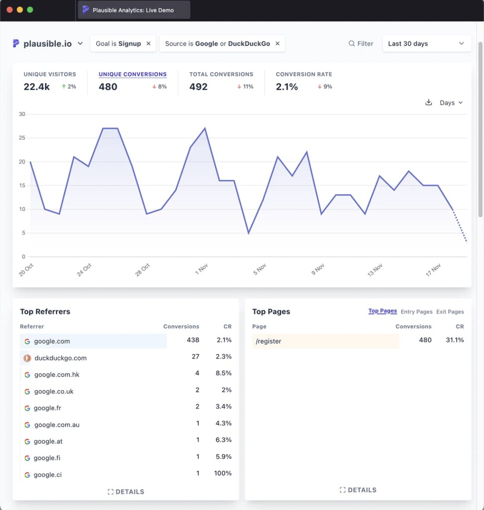
Plausible Analytics features a straightforward dashboard, free of complex navigation menus, sub-menus, or custom reports. Users can quickly assess web performance through simple dropdowns, allowing them to view and compare data over specific timeframes, track real-time visitor numbers, and filter data using various attributes. The platform also enables users to apply “include” or “exclude” to refine data analysis.
The dashboard provides insights into top pages, devices, locations, traffic sources, goals, and funnels. At the end of each report, there’s an expandable “Details” button that offers a deeper dive into granular data.
Noteworthy features
No visitor data collection or usage, audience segmentation, cookieless tracking, and lightweight analytics script.
| Pros | Cons |
| It is user-friendly and allows businesses to adapt to the platform quickly without a steep learning curve. | It lacks advanced features such as frustration signals or user effort analysis, which may limit its insights. |
| It is user-friendly and allows businesses to adapt to the platform quickly without a steep learning curve quickly. | The platform does not integrate with popular experimentation and A/B testing tools like VWO, Optimizely, and others, restricting its utility for A/B testing and optimizations. |
Pricing
Plausible Analytics offers straightforward, transparent pricing with three tiers: Growth, Business, and Enterprise. These plans are based on the number of monthly page views. The Growth plan starts at $19 per month for 100K page views, while the Business plan costs $39 per month for the same volume. For larger needs, the Enterprise plan offers custom pricing.
Customer experience based on G2 reviews:
“Plausible is a fast, lightweight, privacy-first, and GDPR-compliant analytics platform that is superior to GA4. It is easy to integrate and becomes powerful once it is running.”- Alex Lee, Founder at Skip2 Networks
9. Fathom Analytics
Launched in 2018, Fathom Analytics is a privacy-first web analytics platform designed to be both simple and fast to set up, requiring just a single line of code. It currently serves thousands of customers worldwide.
Dashboard overview
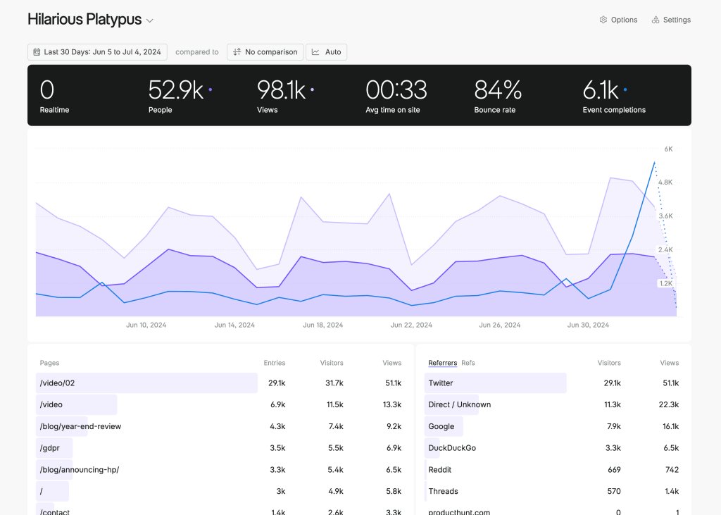
Fathom’s user-friendly dashboard provides an instant overview of key metrics, such as the number of visitors, page views, and average time spent on the site—all visible at a glance. Clicking on any of these metrics reveals a graph just below, helping users track trends over a selected date range and compare it with the past date range. Users can also monitor real-time visitor numbers and see exactly where they are on their website.
As users scroll down, additional widgets provide insights into top-performing pages, referral sources, and other valuable data points.
Noteworthy features
Google Analytics importer, 20+ CMS and framework integration, forever data retention, and multi-domain tracking.
| Pros | Cons |
| Simple to use, with prompt customer support and easy integration setup. Allows users to add up to 50 websites per account with no additional charges. | Limited features compared to some competitors. |
| A privacy-focused analytics tool that doesn’t mine visitor data for ad targeting. | Data visualizations in Fathom Analytics can be less intuitive and user-friendly for some users. |
Pricing
Fathom Analytics offers straightforward pricing. The basic plan starts at $15 per month for up to 100,000 website hits, or users can opt for an annual plan at $150, providing the same 100,000 hits at a discounted rate.
Customer experience based on G2 reviews:
“It’s a privacy-focused alternative to Google Analytics that delivers data in an easy-to-visualize format without the bloat. You can track a lot while respecting your visitors’ privacy.”- Rodrigo Mantoan, Freelance Web Developer & Marketer
10. Semrush
Semrush is a powerful search engine optimization (SEO) analytics tool offering in-depth insights into SERP rankings, website health, traffic data, and more. While it’s not a conventional web analytics platform, its wide range of features makes it highly regarded in the industry.
Dashboard overview
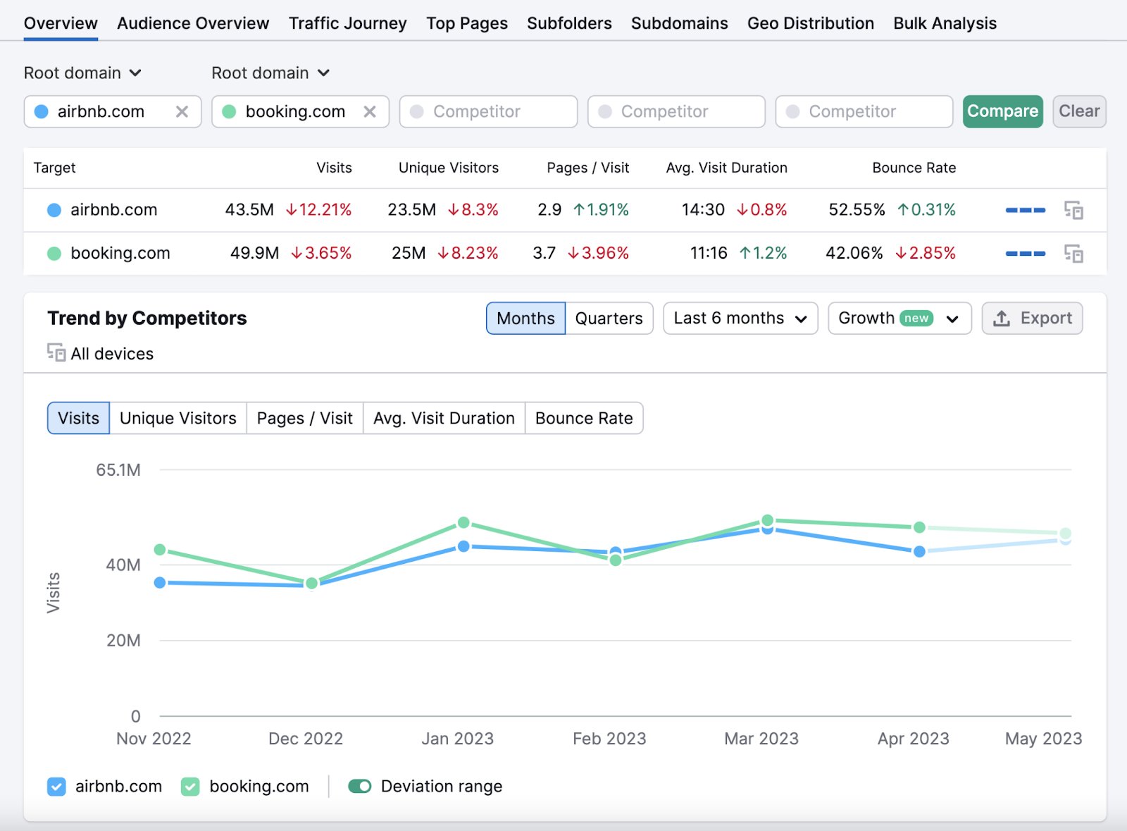
The Semrush dashboard is divided into multiple sections, including SEO, Local, Advertising, Social, Content Marketing, and Trends. Under the SEO section, users can access insights on traffic, backlinks, keyword rankings, and performance. They can also compare their rankings with competitors through various reports like keyword research reports.
The Traffic Analytics report highlights traditional web analytics metrics like bounce rate, pages per session, and purchase conversions. It offers detailed, granular data and allows users to compare their site’s performance against competitors, helping them understand their position in the market.
Noteworthy features
Competitor research, market analysis, Gen AI feature for purchase conversions, AI overview reports, seamless integration with Google suite of products, and audience insights for own and competitor’s websites.
| Pros | Cons |
| Offers a single dashboard that allows users to monitor SEO, website performance, paid campaigns, social campaigns, and content creation all in one place. | Free accounts come with significant limitations, which can hinder users from realizing the tool’s full potential. |
| It’s a comprehensive software package for SEO that comes with excellent support services. | The pricing may be steep for small businesses or freelancers operating on a tight budget. |
| Users can benefit from numerous customizable options and filters, with no extra charges for these features. | The extensive range of features and data can be overwhelming for beginners. |
Pricing
Semrush offers clear and transparent pricing with a range of plans to suit different needs. Users can start with a free version, which provides limited access to its tools. There are three paid plans: Pro, Guru, and Enterprise.
The Pro plan, priced at $139.95 per month, offers basic features. The Guru plan, at $249.95 per month, includes more advanced tools. For larger businesses requiring extensive capabilities, the Enterprise plan starts at $5,000 per month, providing the most comprehensive feature set.
Customer experience based on G2 reviews:
“Once you become familiar with it, the interface is intuitive, and the dashboards make complex data easy to digest. It integrates well with Google Analytics and Search Console, and the breadth of features means you can manage most of your SEO and marketing work in one place.”- Jonathan Farmer, Marketing Manager at Lings Group
That was it! These are the best website analytics tools we believe can best support you in tracking website activity. If you’d like to narrow down options that align closely with your business needs, the next section will guide you through selecting tools from this list tailored to general business requirements.
Choosing the right web analytics tool
We’ve our list of 10 top web analytics tools, each offering standout solutions for web analysis. Now, let’s refine the selection based on some criteria to identify which of these tools best aligns with your goals.
1. Looking for a free web analytics tool to start with?
If you’re a small business, freelancer, or simply not ready to commit a large budget to web analytics, consider these tools:
- Google Analytics: Offers a forever-free plan with a comprehensive range of features and reporting options.
- Matomo: Available as a free, on-premise solution for privacy-focused users.
- Heap: Provides a free plan with up to 10,000 monthly sessions, including essential analytics charts.
2. Searching for a tool with privacy-centric features?
Many popular web analytics tools use visitor data to fuel their ad tech services. However, privacy-focused tools are available that prioritize data security and keep all information safe from ad tech usage. If you’re searching for a privacy-centric analytics solution, consider these options:
- Matomo: Offers complete data ownership with cookieless tracking for enhanced privacy.
- Fathom Analytics: A privacy-first tool that refrains from mining visitor data.
- Plausible Analytics: Compliant with GDPR, CCPA, and PECR, making it a strong choice for privacy-conscious users.
3. Want a tool that goes beyond basic web analytics?
With the rise of personalization and experience optimization, businesses often want more than just an analytics tool. They seek solutions that provide qualitative insights and seamlessly integrate with website optimization tools. Here are some platforms that meet these diverse needs:
- Heap: Offers qualitative analysis features like heatmaps, session recordings, and user effort tracking.
- HubSpot: An extensive CRM and analytics suite that enables lead generation, nurturing, social media, and email marketing, plus much more.
- Matomo: Provides advanced analytics, including heatmaps and session recordings, with the option to integrate third-party experience optimization tools.
4. Seeking a tool with top-notch reviews and ratings?
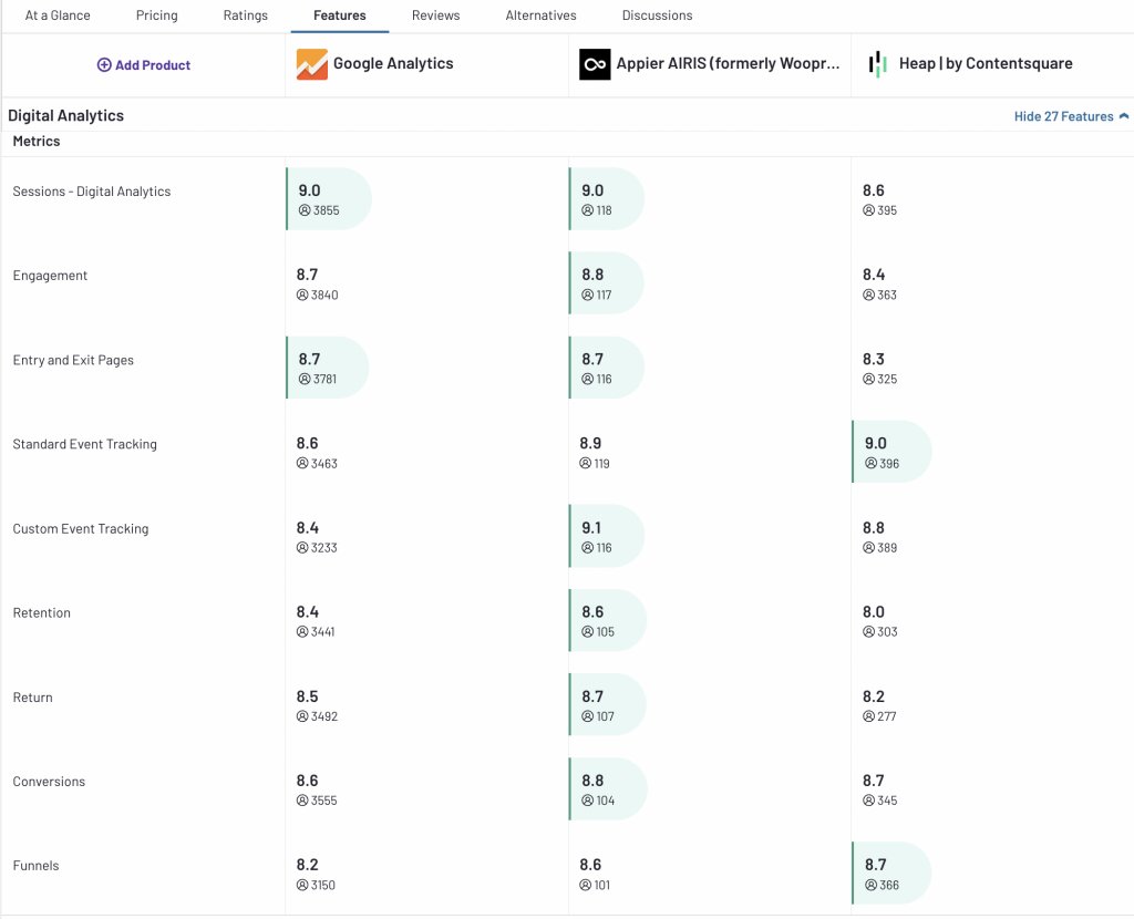
If you’re looking to shortlist tools with a proven track record and high client ratings, Google Analytics, Woopra, and Heap are top picks. These tools have consistently received strong reviews from existing users, who praise their performance and reliability. Here’s a detailed breakdown from G2.com, where each tool’s features have been rated out of 10, providing insight into how well users perceive each one. These scores can guide your decision based on user satisfaction and feature effectiveness.
The above section provides a quick guide to help you zero in on the best web analytics tool for your needs. However, traditional web analytics alone is not enough to truly capture how visitors experience your website. Adding a user behavior analytics tool can provide the missing piece for a comprehensive understanding of visitor interactions and insights into their journey.
Moving beyond basics: leveraging a behavioral analytics tool
Traditional web analytics tools track metrics like page views, bounce rates, and session durations, revealing what’s happening on your site. However, they don’t explain why. For example, a high bounce rate signals a problem, but understanding why visitors leave requires behavioral analytics.
While tools like Heap and Woopra offer features like heatmaps and session recordings, they may lack depth. A dedicated behavioral analytics tool delivers more sophisticated insights into user actions, motivations, and frustrations. It not only has heatmaps and session recordings but also has features like feedback buttons, 1:1 interviews, on-page surveys, and form analytics.
VWO Insights – Web stands out in this area. It provides a comprehensive view of visitor behavior, helping you understand not just what is happening, but why.
Finding web behavior struggles with VWO Insights – Web
VWO Insights – Web is a comprehensive user behavior analytics platform designed to uncover insights into user journeys and pinpoint overlooked conversion barriers. Key features include::
I. Heatmap
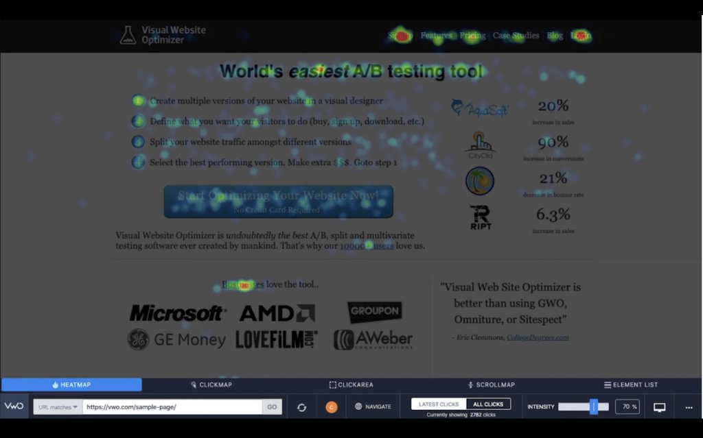
VWO Heatmaps allows users to visualize user engagement with color-coded heatmaps, click area reports, elements list, and scrollmaps to identify what captures attention and where users drop off.
Here’s how the heatmap dashboard looks:
II. Form analytics
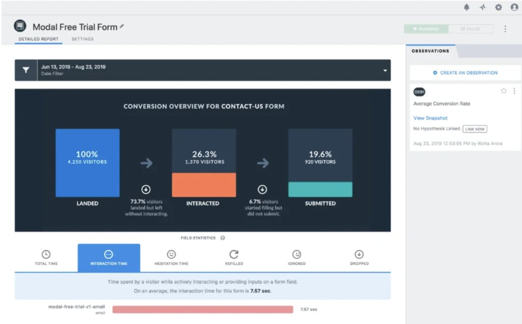
VWO Form Analytics gets insights on form completion times, hesitation points, drop-offs, and ignored fields to pinpoint and address form issues. This data allows you to identify weak spots in your forms and develop strategies for optimization. Here’s a quick look at the form analytics report:
III. Session recordings
VWO Session Recordings allows you to watch visitor sessions while accessing user attributes such as device type, browser, and location. This feature not only shows how users interact with your website but also reveals their navigation paths, and where they encounter friction.
Here’s an overview of the feature:
IV. On-page survey
The VWO Surveys feature makes it easy to deploy surveys in just a few clicks. You can trigger surveys based on various visitor activities and target specific segments of your audience.
Additionally, you can view session recordings of survey respondents to gain deeper insights into their experiences. A standout feature is the generative AI capability, which allows you to create and analyze surveys more effectively.
Here’s a quick overview of the feature:
These features and their advanced capabilities provide a comprehensive 360-degree analysis of user behavior. VWO also offers a centralized behavior dashboard called Insights Dashboard, allowing you to keep a watchful eye on the overall user experience across your website.
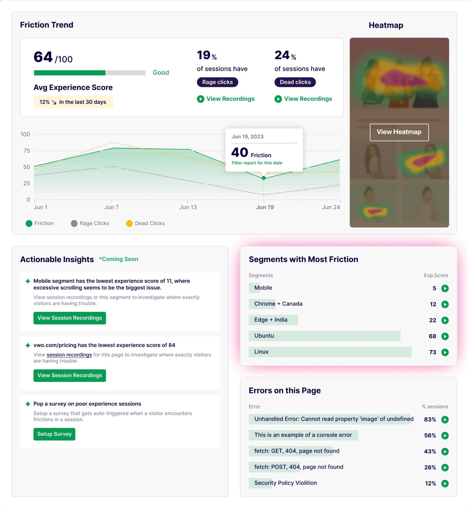
A 250-year-old brand like Encyclopedia Britannica utilized VWO Insights – Web to identify friction points in their existing user experience, ultimately optimizing it to improve their conversion rate by 10%.
Feeling intrigued? Take the leap and try it out with a full-featured 30-day free trial!
“VWO Insights has been incredibly helpful in providing quick, visual insights that are easy to understand and act upon. The heatmapping visuals, in particular, have played a crucial role in highlighting engagement areas and helping get stakeholder attention.”
– Faith Dallas,
CRO Manager at Nelson Active Holidays
Source: VWO Blog
Wrapping up
Choosing the right web analytics tools can be a time-consuming and challenging process. This blog serves as a handy reference point to streamline your research. Take your time, and if possible, take advantage of free trials and demos of the tools listed above to speed up your decision-making. Happy analyzing!
Frequently asked questions
Web analytics tools are software solutions that capture quantitative data—like pageviews and bounce rates on a website. This data helps businesses make informed decisions and shape effective digital marketing strategies.
By adding a code snippet from a third-party analytics tool to a website’s header, a site owner enables the tool to collect and display essential website activity data.
Traditional web analytics tools focus on quantitative data and don’t capture qualitative insights, such as in-depth customer behavior patterns or motivations.
Google Analytics and Adobe Analytics are the most widely used web analytics tools.
Most web analytics tools are beginner-friendly and require minimal technical expertise. They are essential for any business venturing into marketing analytics.



![7 Best Website Monitoring Tools [2026]: Expert Insights to Help You Pick the Right One](https://static.wingify.com/gcp/uploads/sites/3/2025/02/Feature-image-7-Best-Website-Monitoring-Tools-How-to-Pick-the-Right-One.jpg?tr=h-600)
