For businesses to flourish in today’s highly competitive market and hit that conversion rate figure they’ve always aimed for, they must build a scalable experimentation culture.
SEO, content marketing, and paid advertising may dramatically help drive more traffic to a website, but it’s the magic of A/B testing and the repeatability of wins brought about by a culture of experimentation that can get more conversions and high revenues on the plate.
Below mentioned are seven successful A/B testing case studies & examples showcasing how some of the world’s leading companies have leveraged A/B testing, using a/b testing software, and the culture of experimentation to their advantage.
A/B testing example 1:
Grene redesigned its mini cart and saw a 2x increase in overall purchase quantity
Grene is a highly recognized eCommerce brand headquartered in Poland that sells a comprehensive variety of agriculture-related products. Over the years, the eCommerce giant has run many successful A/B tests, one of which was revamping its mini cart page to add prominence to in-page elements.
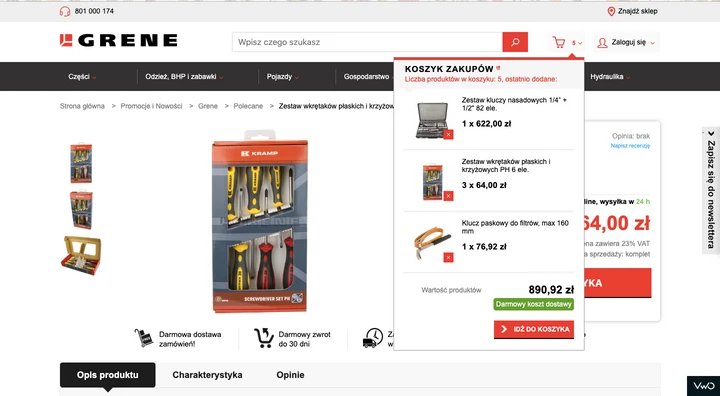
While analyzing their mini cart page, Grene’s team found that users were:
- assuming the “Free Delivery” USP to be a clickable button, hoping to find some extra details. This was creating a lot of friction.
- finding it difficult to see the total of each item in the cart.
- Scroll to the bottom of the cart page to click on the “Go To Cart” CTA button.
This is what the control looked like:
Basis the identified problems, the company decided to make the following changes to their mini cart page and A/B test their hypotheses using VWO.
Changes were:
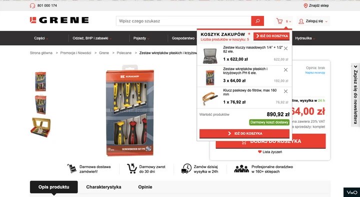
- added a CTA button at the top of the mini cart to help users quickly transit to the main cart page.
- added a ‘remove’ button on the right side of each item (to avoid any unwanted clicks) and the total value of each product.
- increased the size of the “Go To Cart” CTA button to make it prominently visible.
This is what the variation looked like:
After running the campaign for 36 days, Grene saw the following results:
- increase in cart page visits.
- increase in overall eCommerce conversion rate from 1.83% to 1.96%.
- 2X increase in total purchased quantity.
Read the complete success story here:
Grene Redesigned its Mini Cart and Saw a 2x Increase in Overall Purchase Quantity
A/B testing example 2:
WorkZone increased its leads through its testimonials page by 34%
WorkZone is a US-based software company that provides robust project management solutions and documentation collaboration tools to all types and sizes of organizations. Owing to its level of operations, WorkZone constantly needs to be upon its A-game to drive as many conversions as possible.
In order to build a good brand reputation, the company had put up a customer review section (as a social proof marketing strategy) next to the demo request form on the lead generation page. Soon, WorkZone realized that customer testimonial logos were overshadowing the form, further distracting visitors from filling it. They decided to change customer testimonial logos, from their original color to black and white, and see whether the change would help increase the number of demo requests.
Here’s what the control and variation looked like:
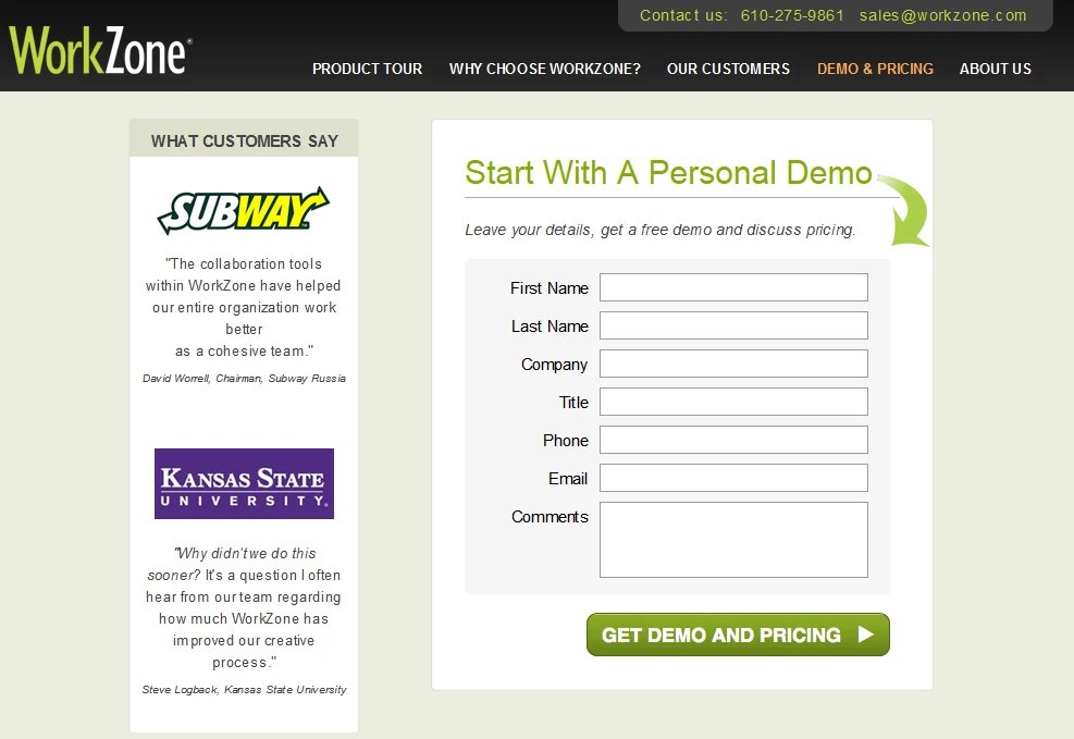
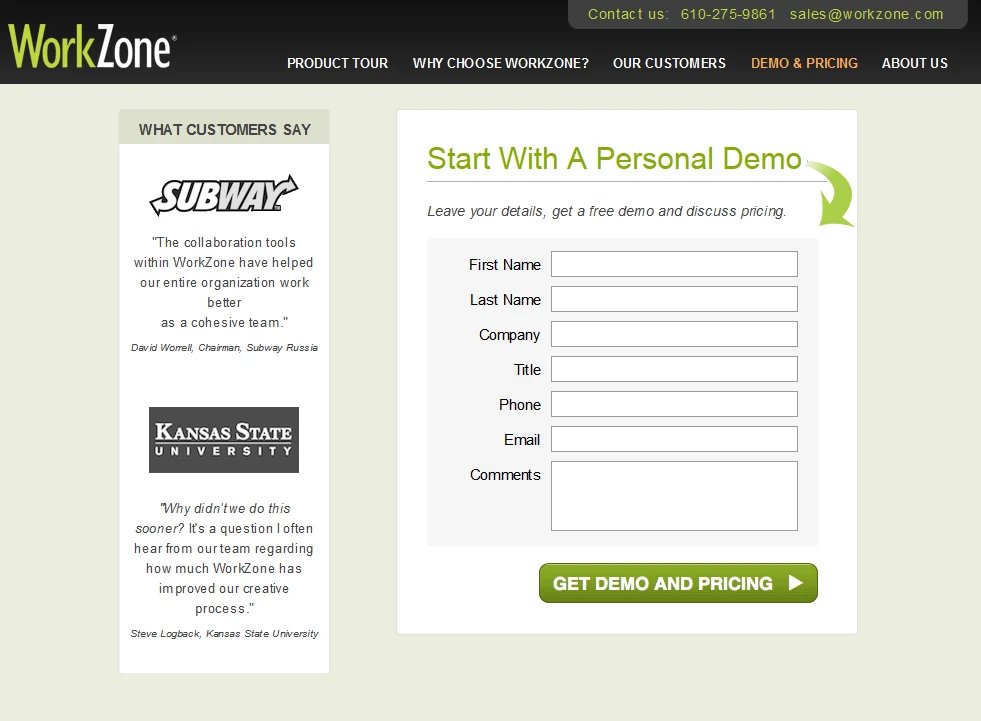
After running the test for about 22 days, WorkZone found that the variation outperformed the control. It projected a 34% increase in form submissions and marked a 99% statistical significance.
Read the complete success story here:
WorkZone Increased its Leads Through Its Testimonials Page By 34%
A/B testing example 3:
Zalora’s increased its checkout rate by 12.3% by optimizing its product pages
Zalora is one of the fastest-growing online fashion retailers in the Asia-Pacific region. The eCommerce store is most known for its chic and snazzy fashion and beauty products. Zalora is one of VWO’s esteemed customers and has been using its services day-in-day-out.
Of the many successful A/B tests that Zalora has run so far, one experiment that really stood out was optimizing the design of product pages to highlight some of the brand’s rewarding features like a free return policy and free delivery services.
The eCommerce company came up with this hypothesis basis the data collected by its customer service team. It contended that customers were unaware of Zalora’s free return policy due to poor visibility of the feature on the product pages. The team soon made necessary amendments and ran an experiment to note customer reactions.
Here’s what the control and variations looked like:
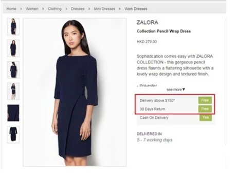
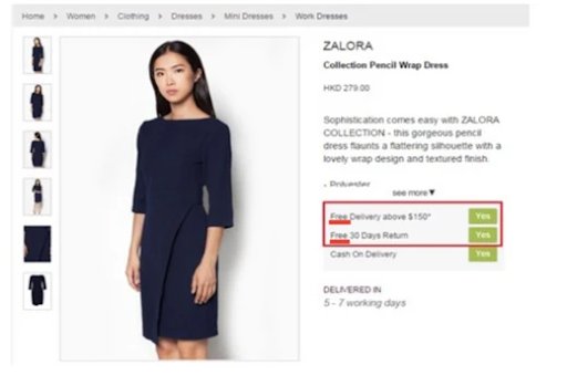
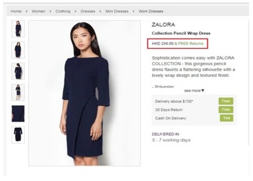
After running the test for a significant amount of time, Zalora found that Variation 1 outperformed the control and its counter variation 2. By simply bringing uniformity to Zalora’s call to action button, the eCommerce giant saw an increase of 12.3% in its checkout rate.
Read the complete success story here:
Zalora’s Increased its Checkout Rate by 12.3% by Optimizing its Product Pages
A/B testing example 4:
Ubisoft used A/B testing to increase its lead generation by 12%
Ubisoft Entertainment is one of the leading French video game companies. It’s most known for publishing games for several highly renowned video game franchises such as For Honor, Tom Clancy’s, Assassin’s Creed, Just Dance, etc., and delivering memorable gaming experiences.
For Ubisoft, lead generation and conversion rate are two key metrics to analyze its overall performance. While some of its pages were performing well in terms of lead generation and conversion rate, its ‘Buy Now’ page dedicated to the ‘For Honor’ brand wasn’t yielding the best of results.
Ubisoft’s team investigated the matter, collected visitor data using click maps, scroll maps, heatmaps, and surveys, and analyzed that their buying process was too tedious. The company decided to overhaul For Honor’s Buy Now page completely – reduce the up and down page scroll and simplify the entire buying process.
Here’s how the control and variation looked like:
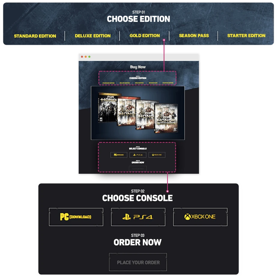
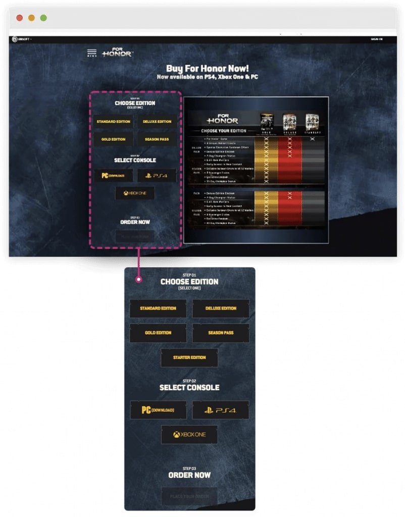
After running the test for about three months, Ubisoft saw that variation brought about more conversions to the company than the control. Conversions went up from 38% to 50%, and overall lead generation increased by 12%.
Read the complete success story here:
Ubisoft used A/B Testing to Increase its Lead Generation by 12%
Download Free: A/B Testing Guide
A/B testing example 5:
PayU increased its conversions by 5.8% using data-driven A/B testing
PayU is an Indian-origin fin-tech company that provides an exclusive range of financial solutions for local and cross-border merchants in emerging markets. As a payment facilitator, PayU finds it important to maintain a simple, intuitive, and convenient checkout process and eliminate all plausible elements that may cause drop-offs.
But, their Checkout page statistics spoke an altogether different story. The company, by using VWO Form Analytics capabilities, found that a lot of people were dropping off from the page, which was significantly impacting their sales and revenue graph.
To streamline everything, PayU decided to make minor changes to its Checkout page form basis the data gathered and run an A/B test to validate its hypothesis. While the old PayU Checkout page asked users to enter their mobile number and email address to complete the purchase process, the new Checkout page, on the other hand, only asked for a user’s mobile number.
Here’s how control and variation looked like:
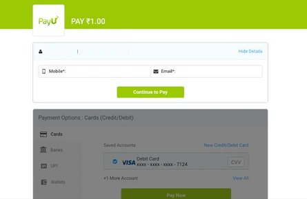
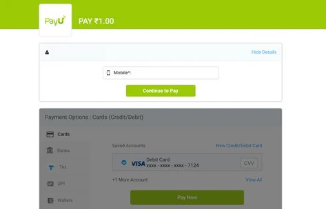
The test results showed that by simply eliminating the email address field from the form placed on their Checkout page, the company was able to register an improvement of 5.8% in conversions as compared to the control.
Read the complete success story here:
PayU Increased its Conversions by 5.8% Using Data-Driven A/B Testing
A/B testing example 6:
ShopClues increased its visits-to-order by 26% from its home page
ShopClues is a prominent eCommerce company that majorly operates in the Indian market. Although a new player in the fashion market, ShopClues gives tough competition to Flipkart, Snapdeal, and Amazon. The company strongly believes in the culture of experimentation and runs multiple tests with changes month-on-month, to improve its products and services.
Of the many A/B tests that ShopClues has run to date using VWO, one experiment that showed remarkable results was when the company increased its visits-to-order by optimizing its home page.
While planning the experiment, ShopClues carefully examined each home page element and tracked them for conversation signals. It found that the main navigation bar links on the homepage were getting a lot of clicks, especially “Wholesale,” while the others were not. ShopClues understood that it was necessary to send better-qualified traffic to the category pages rather than leaving them wandering on the home page.
So, the company decided to replace the “Wholesale” section with other marketing categories such as “super saver” bazaar, etc. It also moved the ‘Wholesale’ section to the left side of the site in the hope that the page becomes more visually aligned and help get better-qualified visitors.
This is what the home page initially looked like:

This is what the variation looked like:

As hypothesized, this repositioning enabled customers to navigate through other category pages and not just wander through the wholesale section. The change further improved click-through rate in the “wholesale” category as well.
Read the complete success story here:
ShopClues Increased its Visits-To-Order by 26% from its Home Page
A/B testing example 7:
A minor change on Ben’s product page helped get a 17.63% conversion uplift
Ben is a personal budget challenger in the Dutch telecom industry. Headquartered in The Hague, Netherlands, the company offers two kinds of subscription plans to its customers – a sim-only subscription and one that comes along with a mobile handset.
Of the many conversion rate optimization campaigns that Ben has run on its website, one of them was to make the phone color palette prominently visible on the product page. The company found out that most people exploring the site were unaware of the fact that they have the liberty of choosing a phone color along with the best data and voice plans. The data collected using VWO Insights also showcased that while people did notice the color palette, they couldn’t figure out its basic function.
Using the gathered information, Ben decided to make the necessary changes on the product page and run an A/B test to authenticate their hypothesis. Here’s what the control and variation looked like:
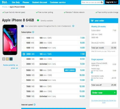
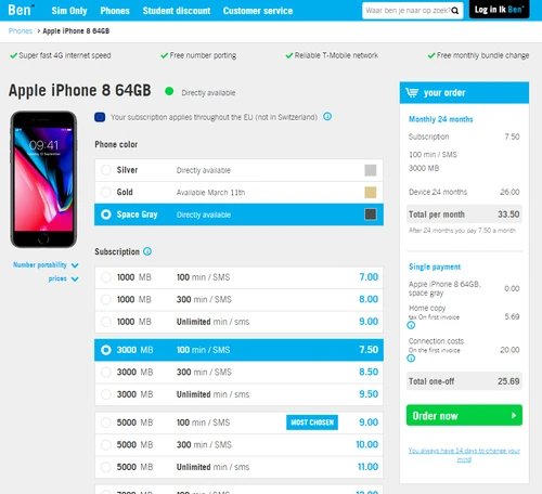
Ben ran the experiment for about two weeks and found that by simply making their color palette more prominently visible, its conversions went up by 17.63% and the number of customer calls to change device colors dropped significantly.
Read the complete success story here:
A Minor Change on Ben’s Product Page helped get a 17.63% Conversion Upliftange on Ben’s Product Page helped get a 17.63% Conversion Uplift
Way forward
As these A/B testing examples demonstrate, calibrated experimentation can help you discover powerful combinations that improve conversion rates and earn higher revenue. Irrespective of the industry you operate in, fostering an experimentation culture in your organization is a way forward to achieve significant conversions.
Look at experimentation as an integrated process and don’t treat every A/B test in silo. VWO Plan comes in handy here as it allows you to jot observations from user behavioral analysis, create hypotheses based on those observations, and manage and prioritize testing ideas.
Watch this video for some more interesting A/B testing examples as shared by Craig Smith, founder & CEO of Trinity Insight.


