Amazon, Domino’s, Zalora, Apple – What connects these eCommerce giants across diverse industries?
They’ve woven A/B testing into their DNA, thriving as hubs for innovation, embracing both success and failure for learning and growth. A/B testing empowers them to make decisions after assessing the audience’s response to changes introduced on their websites. The success of ideas is then measured based on audience reactions. It’s no wonder they attribute a significant portion of their success to A/B testing.
Now, many eCommerce companies aspire to test, but they lack a solid starting point—something these big brands have already figured out as is evident by their success.
Establishing a strong testing program requires a well-defined hypothesis-creation process. Skipping this step leads to guesswork – a ‘let’s try this and see’ approach. Successful businesses grasp the importance of understanding what they’re doing, why, and the changes they aim to bring about.
This is where building logical hypotheses plays a big role. Linking actions to expected outcomes ensures you know the direction in which your test is going.
A hypothesis should tell that if you take a certain action, you should see a specific outcome for a particular reason. Constructing hypotheses for tests isn’t rocket science once you grasp the logic behind it and understand how to do it.
In this blog, we’ve curated 63 hypotheses for eCommerce companies to get started with well-planned tests on their websites.
Drawing from our successful optimization of over 40 billion experiences through 1.1 million experiments on 450,000+ websites, we present these hypotheses using a proven template that has delivered great results for the best brands we’ve collaborated with.

A quick look at a hypothesis template
Let’s understand what this hypothesis template comprises. It consists of three parts: The action you need to take, the expected results, and the underlying rationale. Here’s a hypothesis as an example:
Providing a straightforward, action-oriented CTA copy will increase clicks on the CTA button because visitors can easily understand the next step to take in their journey on a website.
The simplicity of the instruction will reduce friction that might arise from complex wording. The anticipated outcome is that a clear CTA copy will motivate visitors to take action, ultimately improving the number of clicks on a CTA button.
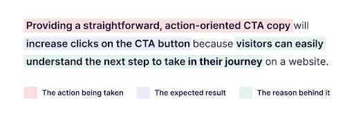
This format ensures clarity in understanding the proposed action, the expected outcomes, and the underlying logic in a test idea. By focusing on specific areas for improvement, businesses have a clear-cut plan to start with and can invest time and effort strategically for maximum results.
1. Image repositioning increases add-to-cart click rates
Action: Changing the placement of the image will
Result: Increase the add-to-cart click rate because
Reason: It enhances the visibility of the element and encourages users to click it.
2. Countdown banner increases conversions
Action: Showing a sticky countdown banner across the website during the sale period will
Result: Increase conversions because
Reason: It creates an urgency in the visitors’ minds to purchase items before the sale ends.
3. Enhanced mobile filter bar for easy navigation
Action: Positioning a sticky mobile filter bar at the top of the screen, featuring clear and consistent labels will
Result: Boost filter usage and conversions.
Reason: Users will find it more intuitive and accessible, encouraging them to navigate further and increase conversion rates.
4. Streamlined checkout creates seamless user journeys
Action: Removing extra steps and guiding customers directly to the shopping cart upon clicking the cart icon will
Result: Result in increased conversion rates.
Reason: This streamlined approach reduces friction in the user journey, facilitating a quicker and more seamless checkout experience.
5. Cross-sell section improvement boosts AOV
Action: Implementing a redesigned cross-sell section on product detail pages will
Result: Boost revenue and Average Order Value.
Reason: The enhanced presentation encourages customers to add complementary items to their cart.
Bear Mattress increased revenue by 16% through testing this hypothesis on their website. Check out their testing strategy to inspire your own testing ideas.
6. Promotional scrolling banner boosts traffic
Action: A site-wide scrolling banner for special promotions will
Result: Increase traffic to the promotional landing pages because
Reason: This prominent feature attracts attention and generates interest.
7. Homepage first-fold ensures easy navigation
Action: Adding more information about services, products, and offerings on the first fold of the homepage will
Result: Increase transactions.
Reason: This reduces visitors’ cognitive load, helping them navigate and understand the offering, leading to a smoother decision-making process.
8. Discounts on the checkout page reduce drop-offs
Action: Offering upfront discount promotions on the checkout page will
Result: Reduce drop-offs.
Reason: By minimizing uncertainties for users through a transparent pricing strategy.
9. Revamped site search experience for more conversions
Action: Improving the experience of the site search bar will
Result: Lead to higher purchases.
Reason: This is because visitors will easily find what they want, resulting in increased conversions.
10. Page revamp increases checkout rates
Action: Revamping a page design with subtle changes will
Result: Boost checkout button engagement.
Reason: Guiding more users to the checkout page and reducing drop-offs.
Canadian company Hush Blankets redesigned their mobile cart page, increasing visits to the checkout page by 10.52%, resulting in a 23% uplift in revenue.
11. Upfront information encourages more purchases
Action: Displaying the return policy and shipping cost below two main CTAs will
Result: Nudge visitors towards completing a purchase.
Reason: Strategically addressing common concerns and fostering commitment.
12. Homepage sub-categories enhance access to products
Action: Showing sub-categories on the homepage will
Result: Lead more visitors to the listing pages because
Reason: This direct navigation facilitates quicker access to specific product categories.
13. Clear CTA copies improve engagement
Action: Changing ambiguous CTA copies to clear ‘Quick Buy’ and ‘Add to Cart’ will
Result: Encourage visitors to click through to the next page.
Reason: Providing them with a clearer understanding of the subsequent action.
14. Enhancing menu improves for engaging experience
Action: Improving the menu UI will
Result: Lead more users to the product page.
Reason: Positively affecting eCommerce conversion rates. This enhanced menu design provides a more intuitive and engaging browsing experience.
15. Prominent review starts boost revenue
Action: Enhancing the review star size above the text reviews will
Result: Increase value per visitor or revenue per visitor because
Reason: Visitors will be encouraged to take action reading positive feedback.
RubberStamps, a custom stamp seller, tested a hypothesis on their website, leading to a 33.20% increase in RPV. Explore their problem statement, observations, and learnings in the case study.
16. View product button piques visitors’ interests
Action: Including an extra ‘View Product’ button beneath the main CTA on the product listing page will
Result: Motivate visitors aiming to explore the product description page.
Reason: This additional option caters to diverse visitor preferences and encourages further exploration.
Watch CRO expert Rich Page examine the live websites of some top eCommerce brands in this webinar. Learn about common mistakes and what you should be doing on your website.

17. Optimizing filters boosts interaction
Action: Enhancing filter presentation by dividing them into ‘sort’ and category-specific filters, and keeping them fixed at the top will
Result: Increase visitor interaction with the feature.
Reason: This improves accessibility and usability, leading to more visitors landing on desired product pages.
18. Improved search accessibility improves engagement
Action: Highlighting the search bar so that it opens when the user lands on the website and merges with the top navigation upon scrolling down will
Result: Encourage visitor engagement with the feature.
Reason: This enhancement improves convenience and visibility, leading to an increased ability to search and find desired products.
19. Redesigning carousels boosts engagement
Action: Redesigning an image within a carousel and incorporating a static CTA button at the bottom, which becomes visible only when the page’s CTA button is not, will
Result: Boost clicks on the image.
Reason: This, in turn, will drive more clicks on the main CTA button, as the dynamic design actively encourages interaction and engagement.
20. Prominent search enhances product discovery
Action: Making the search bar prominent and displaying popular searches made by others will
Result: Direct visitors to the desired landing pages.
Reason: Facilitating the easy discovery of relevant content.
California-based Best Choice Products tested this hypothesis of making the search bar prominent for its mobile website, leading to a 30% increase in clicks on the main CTA.
21. Colorful display of USPs attracts attention
Action: Introducing green color to the icons displaying the USPs will
Result: Create a positive impression because
Reason: This color addition attracts attention and conveys positivity.
22. Layout experimentation improves conversion rates
Action: Experimenting with page layout, different product images, and various CTAs will
Result: Yield valuable insights for improving conversion rates.
Reason: These tests provide essential data on visitor preferences and how they behave on a website.
23. Right USP placement guides visitors in their journey
Action: Showing the USPs in two parts with keywords in the first row and related important content in the second will
Result: Nudge visitors along their journey on a website.
Reason: Highlighting USPs allows visitors to easily understand the benefits offered and proceed confidently in their journey.
24. Header USP bar encourages conversions
Action: Adding a USP bar below the header will
Result: Motivate visitors to convert because
Reason: This prominent placement brings benefits to visitors’ notice.
25. Prominent CTA button placement drives checkout
Action: Adding a CTA button at the top of the mini cart will
Result: Help visitors quickly transition to the cart page because
Reason: This addition streamlines their journey, facilitating a smoother checkout process.
Grene, a Polish company, moved the CTA above the mini cart, resulting in a 2x increase in the quantity of purchases on its website. Read the case study for more details.
26. Enhanced cart layout boosts purchase completions
Action: Crafting a well-organized layout featuring a ‘remove’ button on the right and displaying the multiplied value of products on the cart page will
Result: Motivate visitors to complete the purchase.
Reason: This modification results in an enhanced layout that offers detailed information and an intuitive path to conversion.
27. Prominent CTA positioning spurs visitor interaction
Action: Implementing bigger CTA buttons will
Result: Motivate visitors to go further down the conversion funnel and complete their journey because
Reason: This prominent button encourages visitor interaction.
28. Personalized checkout elevates conversions
Action: Personalizing the checkout page for each visitor based on their country will
Result: Improve conversions because
Reason: Personalization strikes a chord with visitors, making them feel important and valued.
29. Free shipping promotes upselling
Action: Adding a free shipping strip on the product pages will
Result: Result in increased upselling, with the ultimate goal of increasing revenue.
Reason: This promotional element encourages additional purchases.
30. Improved homepage navigation boosts engagement
Action: Improving the homepage layout for better navigation will
Result: Enhance visitor engagement.
Reason: Making it easy for them to find the products they need.
Flos USA improved the homepage layout, which increased visits to the category page by 6.77%. They created and tested hypotheses for the full-funnel journey on their website, improving the checkout rate by 125%. Read the case study to learn how they did it.
31. Add CTAs for increased product page visits
Action: Adding a CTA to the product listing tiles will
Result: Prompt more visits to the product page.
Reason: Easy access to CTA enhances product findability and prompts visitors to quickly advance to the next steps in their journey.
Listen to this podcast episode where experts discuss how to design winning experiments with data-backed hypotheses.
32. Displaying swatches allows product customization
Action: Updating the ‘Choose Finish’ option to view color swatches on product pages will
Result: Remove confusion among visitors about product customization.
Reason: Clear visual cues will encourage them to use this feature.
33. Clear navigation streamlines engagement
Action: Retaining only the essential details and incorporating a header with a link to the cart page will
Result: Enhance visitor engagement.
Reason: This approach reduces information overload and improves navigation, providing a smoother and more focused visitor experience.
34. Feature highlights drives more sign-ups
Action: Improving the display of core features on the homepage, during the comparison journey, and at checkout will
Result: Motivate more visitors to sign up.
Reason: This highlighted information emphasizes the value proposition and helps prevent visitors from choosing a competitor.
35. Simplifying navigation improves visitor engagement
Action: Replacing “Wholesale” with other marketing categories (like “super saver” bazaar) and moving it to the left navigation bar will
Result: Attract better-qualified visitors to each of the category pages because
Reason: This repositioning enhances the visual appeal.
ShopClues, an eCommerce company in India, tested this hypothesis on its website and observed a 26% increase in visits-to-order. Learn about the other tests they conducted that improved conversion in this detailed success story.
36. Testimonials build trust, increase conversions
Action: Adopting eCommerce best practices like adding real customer testimonials will
Result: Lift conversions on the homepage because
Reason: These testimonials build trust and credibility.
37. Removing distractions improves visitor journeys
Action: Removing distracting videos that hinder users from clicking through to the product page will
Result: Streamline the visitor journey and boost conversions.
Reason: As users can then focus on the desired action.
38. Security affirmations increase checkout clicks
Action: Adding security affirmations to the eCommerce checkout page will
Result: Encourage visitors to click “checkout” because
Reason: This addition instills trust and reassures users about the safety of their transactions.
39. Product finder drives visitors through a sales funnel
Action: Providing a “product finder” tool on the product page will
Result: Push more visitors into the sales funnel
Result: By replicating the salesmen and fitting room experiences online.
40. Decluttering cart page reduces abandonment
Action: Removing the ‘special offer’ and ‘gift card’ code boxes from the shopping cart page will
Result: Reduce cart abandonment because simplifying the checkout process
Reason: Minimizes potential points of friction.
UK-based Bionic Gloves removed gift card/special offer code boxes from their cart page against the common belief that adding these offers increases purchases on a website. Testing this hypothesis helped them increase revenue by 24.7%.
41. Detailed descriptions aid informed decision-making
Action: Providing detailed product descriptions will
Result: Increase conversions because
Reason: Comprehensive information helps visitors make informed purchase decisions.
42. Streamlined interface reduces distractions
Action: Reducing the number of CTA buttons and the number of links will
Result: Lower the bounce rate and get more visitors into the sales funnel because
Reason: A streamlined interface minimizes distractions and improves user focus.
43. Seamless buying journey reduces bounce rates
Action: Reducing distractions in visitors’ buying journey will
Result: Decrease the bounce rate because
Reason: A focused visitor experience helps retain their attention.
44. Incentivizing encourages more visitor actions
Action: Providing customers with an incentive to make a purchase will
Result: Captivate and motivate them to take action on a website.
Reason: This strategy leverages the psychological impact of incentives, encouraging customers to make decisions that benefit both them and the business.
45. Above-fold product display boosts sales
Action: Keeping the display of products above the fold on the homepage will
Result: Encourage visitors to proceed with their purchase.
Reason: This strategic placement enhances visibility and prompts quicker decision-making.
Muc-Off, a UK-based retail company, changed the position of their product images, bringing them above the fold on the homepage. Testing this hypothesis not only reduced drop-offs but also increased purchases by 106%.
46. Promotional banners improve visitor engagement
Action: Placing commercially-focused banners on top of all the information pages of the website will
Result: Enhance visitor engagement by
Reason: Attracting attention and conveying promotional messages.
47. Showing competitive pricing increases conversions
Action: Displaying competitors’ higher prices on 5,000 product pages will
Result: Increase clicks on ‘Add To Basket’ and boost the overall website conversion rate.
Reason: This is because showcasing competitive pricing influences purchase decisions.
48. Prominent CTA buttons increase checkout clicks
Action: Enhancing the prominence of the main CTA button on the cart page will
Result: Increase click-throughs to the ‘Continue to checkout’ button, encouraging more visitors to complete their orders.
Reason: This design modification improves user navigation and prompts desired actions, reducing the likelihood of users leaving the page.
49. Clear product information boosts conversions
Action: Providing relevant, detailed product information will
Result: Increase conversions because
Reason: Visitors can comprehend the key features and benefits of different products available on a website.
50. Showing discounts increases conversion rates
Action: Emphasizing the discounted price shown on the product page will
Result: Increase conversions because
Reason: Highlighting savings gives visitors a sense of achievement that they bought something at a much lower rate than they actually would have.
Royal Discount, an online computer software seller, increased revenue by 10.21% by testing this hypothesis on its website using VWO. Take a free trial and discover how easy it is to set up a test on VWO.
51. Facebook Connect boosts checkout rates
Action: Offering checkout with Facebook Connect will
Result: Increase the checkout rate because
Reason: This convenient login option simplifies the checkout process.
52. Bulk discounts improve profit margins
Action: Offering bulk discount deals on select products will
Result: Increase the profit margin from the website because
Reason: Enticing promotions encourage larger purchases.
53. Easy product selection process boosts revenue
Action: Streamlining the initial product selection process, by replacing the drop-down with a complete product category page, will
Result: Boost revenue by
Reason: Enticing more interested visitors to buy.
54. Free shipping reduces bounce rates
Action: Displaying “Free Shipping” above the fold will
Result: Reduce the bounce rate and encourage users to continue down the conversion funnel.
Reason: This prominent positioning attracts attention and communicates a compelling offer.
55. Relevant logos and icons increase add-to-cart clicks
Action: Adding product quality certification logos and payment icons near the ‘Add to Cart’ CTA button on the product page will
Result: Increase clicks on the button, as
Reason: This visual reinforcement builds trust and credibility.
Manna, a Hungary-based online store, tested the above hypothesis, resulting in a 490% increase in clicks on the ‘add-to-cart’ button.
56. Showing review widgets increases sales
Action: Enlarging the TrustPilot widget on the website will
Result: Increasing sales from the site because
Reason: Positive reviews and trust signals build confidence and decrease buyer anxiety
57. Product badges boost trust and credibility
Action: Introducing the ‘WOW’ badge on a website will
Result: Convey a higher level of trust and credibility than just the count of followers on Twitter because
Reason: A distinctive badge enhances the perception of authenticity.
58. Optimized lead forms encourage more interactions
Action: Introducing changes to the lead enquiry form will
Result: Increase the conversion rate because
Reason: An optimized form encourages user interaction.
59. Simplifying layout leads to higher conversions
Action: Reducing distractions like too many outbound links on the webpage will
Result: Encourage more people to buy from them or submit the enquiry form because
Reason: A cleaner layout improves focus.
60. Highlighted product USPs drive more orders
Action: Articulating the product-related USPs will
Result: Encourage more people to place orders or at least submit the enquiry form because
Reason: A clear value proposition resonates with the target audience.
Cocohanee added product-related USPs to its product page, resulting in a 40% increase in transactions. Learn how they achieved this now.
61. Informative videos increase conversions
Action: Creating a video that explains a business’s products or services will
Result: Increase conversion rates because
Reason: Visual content enhances engagement and understanding.
62. Streamlined forms help improve submissions
Action: Reducing the number of form fields will
Result: Increase form submissions because
Reason: A shorter form is more user-friendly and reduces friction in the submission process.
63. Prioritizing product in visual hierarchy improves engagement
Action: Emphasizing a particular product in the visual hierarchy of a page will
Result: Drive greater visitor engagement with it because
Reason: Doing so will overshadow other elements of secondary importance.
Watch this video to learn more about generating high-quality hypotheses for higher conversion uplifts.
How Amazon Attributes a Part of Its Success to Testing
There is a reason we say successful eCommerce brands owe a part of their success to consistent testing. Amazon exemplifies this approach better than anybody else. Experimentation is key to Amazon’s incredible success. How? Through testing, they figure out which ideas resonate with their audience and which do not. This way, they fail fast, learn fast, and grow fast.
The ideas receiving positive customer feedback move forward, while those that don’t align with customer expectations are discarded, saving the company valuable time and resources. This process allows the eCommerce giant to innovate and deliver experiences ahead of their time.
If an experiment fails, Amazon learns what doesn’t work and swiftly moves on to the next one. Amazon’s website stands as a product of such continuous experimentation, setting a benchmark that any eCommerce brand aspires to follow. Further, Amazon listens to customers through data, creating great offerings by anticipating their preferences before they know it.
The combined power of listening to customers and a commitment to testing is what makes the stage for experimentation fertile for eCommerce growth.
Conclusion
Just a heads up – these hypotheses are inspired by the awesome eCommerce brands we’ve worked with. This compilation is here to spark ideas and help you build empirically testable, specific, and precise hypotheses. However, the key is to understand your visitors’ behavior and craft your unique hypotheses accordingly. If you spot any similarities with your goals, feel free to draw inspiration.
Categories: