The product page is the most crucial page on your eCommerce website. This is where users find pertinent information about the product they want to buy and then decide if they should go ahead with their decision.
Whether it’s through organic search or paid campaigns, a visitor landing on your product page means they’ve made up their mind about a purchase. If your product page fails to deliver what users are looking for, they might go to some other website or begin browsing on your website again. It’s back to square one for them, you see.
And as many eCommerce players invest in paid ads to get traffic to product pages, it’s only natural that they want to try every way to get the most out of their investment.
To guide you in the right direction so you get maximum results, we offer our two cents on product page optimization. In the third blog of our “A/B testing for eCommerce” series, we go over all the key elements you need to optimize to match users’ mental models and provide a smooth user experience that leads to more conversions. So, continue reading.
Must-try ideas to revamp your product page
Product images
Your customers simply expect to see clear and detailed pictures of your products to move ahead in their buying journey. Since online shopping doesn’t allow for the up-close examination of products as in a physical store, you can try and replicate that experience as closely as possible by displaying high-quality images only.
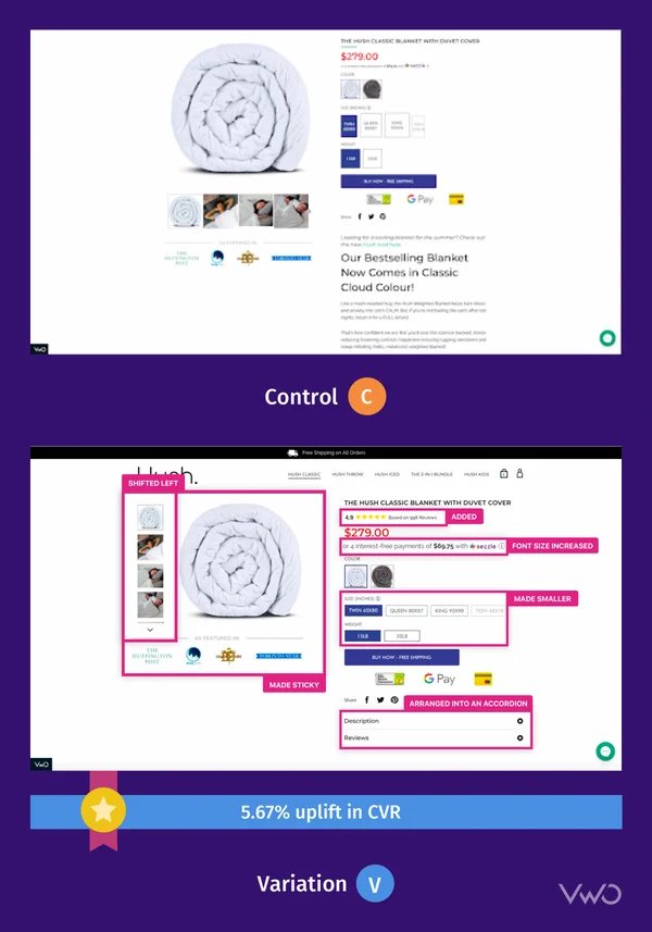
A funnel analysis showed that 70% of visitors who went to the product page of our Canadian client, Hush Blankets, left without buying anything.
To boost transactions, the team moved thumbnail images to the left of the main image. It was hypothesized that this particular change might help save space and allow users to see the images clearly, thereby impacting their buying decisions significantly.
This change led to a 5.67% rise in visits to the checkout page and a 33.1% increase in the checkout rate. Read the full case study here.
Test idea 1 – Lifestyle and branded product images
Imagine that out of all the potential reasons for high exit rates on your eCommerce product page, you believe that stock product images are the primary culprit.
Therefore, you create a variation with lifestyle imagery, a zoom-in feature on pictures, and a couple of images that have the benefits of using your mattress written on them. See if this variation improves the add-to-cart rate more than your control, and accordingly implement the winning version.
With VWO Visual Editor, it’s easy to remove, resize, and change images on your website. If you want to show product videos to your visitors, you can add YouTube, Vimeo, and self-hosted videos as well using the Editor. Take a trial and see it for yourself!
Product description
A well-written product description can help you convince customers to buy, while one that isn’t clear can cause confusion and lead to low sales. Hence, optimizing your product description is vital for improving conversions and customer satisfaction.
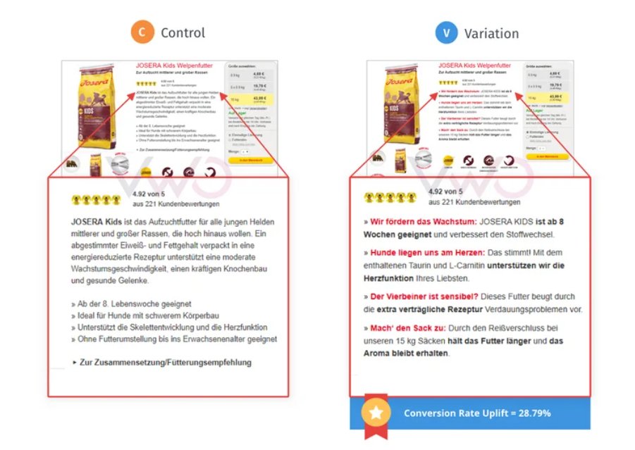
Here’s proof that it works. FoodforPlanet, the in-house agency of Josera, a premium pet food brand in Germany, identified a high bounce rate on the Josera Kids product page.
They utilized VWO to test and optimize the page by presenting a sleeker and clearer product description, resulting in a 28.79% increase in conversions.
Testing idea 2 – Information presented in an easy-to-digest style
Sometimes, important product details get lost in text-heavy paragraphs. To fix this problem, you could try putting this information into bullet points and using different colors to make it easier for users to skim.
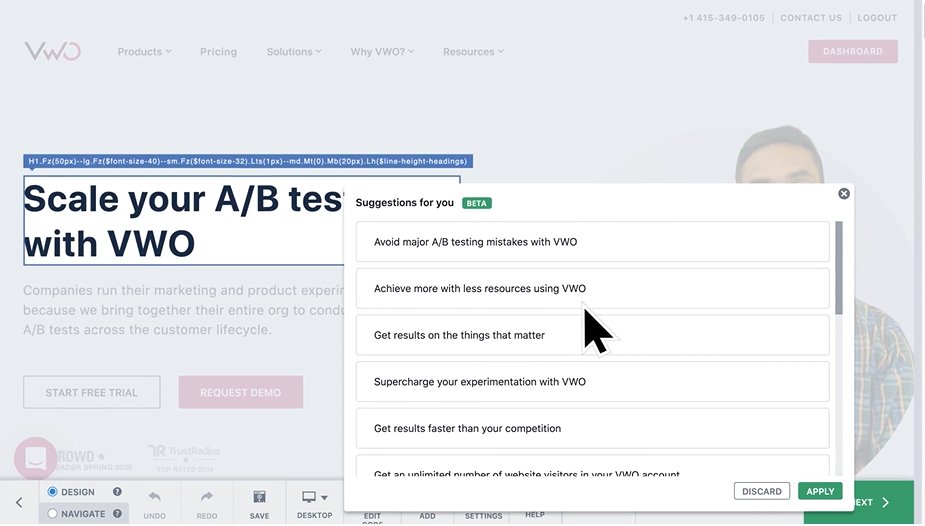
Let us tell you that the VWO Visual Editor makes AI-based copy recommendations for the existing copy on your website. In case you’re looking to create catchy product descriptions or headlines, make use of this feature.
You can load paragraphs with up to 200 words, and each text can have up to 15 suggestions at a time. While this feature is optimized for English-language websites, it also works with all major languages.
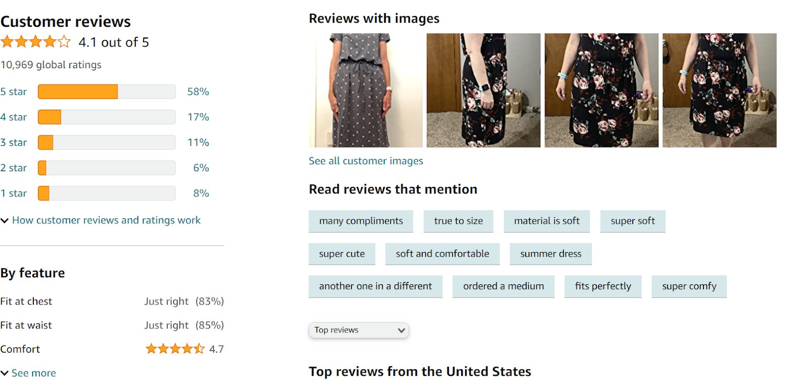
Product reviews or ratings
Around 99.9% of customers read reviews when shopping online! So make it easy for your customers to leave reviews, like by giving them the option to upload photos and videos of them unboxing and using the product. This will make them feel valued and heard.
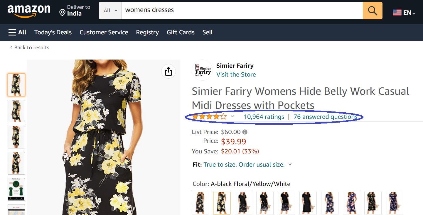
Also, make sure reviews are placed in a prominent place on your product page. Let’s take the Amazon product page for example. You can see both the product ratings and reviews toward the top.
And when you click on the link, you’ll be taken to the detailed review section located toward the bottom of the page.
Testing idea 3 – Adding review sorting options
If your product page shows a lot of reviews already, you can go a step ahead and add review sorting options. Why? It can often be challenging for customers to find the most relevant one in the sea of so many.
What if they want to view the most helpful reviews based on the number of votes the reviews have received from other customers?
Let users sort the reviews by things like when they were added, the highest rating, the lowest rating, and how helpful they were in the variation. If this experience proves effective, you can roll it out to all users.
Do you want to test both product reviews and images on your website? VWO allows you to set up mutually exclusive campaign groups to run multiple tests on the same page without overlapping visitors across tests.
This way, you can test both ideas and attribute the increase in conversion rate to the right test. Read this quick guide to learn how to go about it.
Product pricing and availability
Many websites make the mistake of not highlighting if a product is in stock or not, which leaves customers disappointed and frustrated. Disclosing product availability upfront helps customers manage their time and expectations.
If they know right away that a product is out of stock, they can start looking for alternatives without wasting their time.
In the same way, showing product pricing clearly is also crucial. Customers want to know how they’re going to spend before buying a product. This is especially important for those who have a budget and are not willing to overspend.
Are you offering discounts? Strike through the original price and bolden the discount next to it. Everyone loves free shipping, so it’s best to offer that. But if you do have to charge for shipping, let customers know upfront and avoid surprising them with additional charges at checkout.
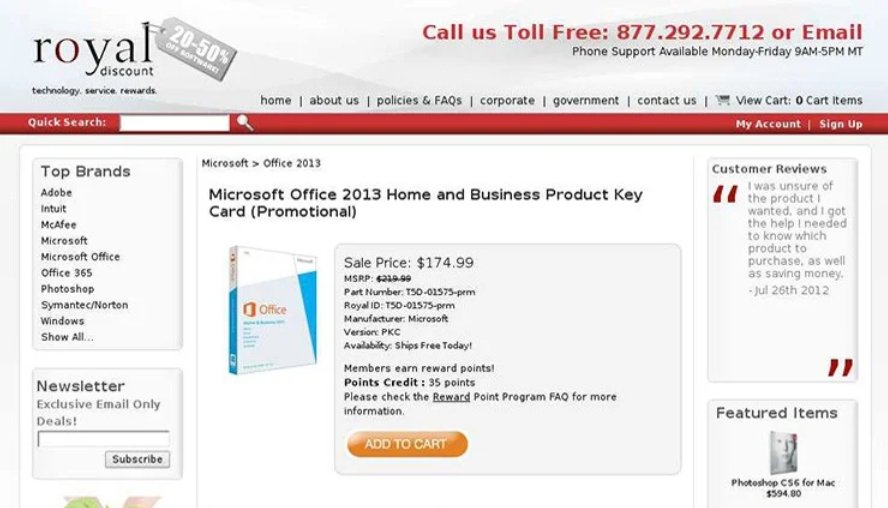
Using VWO, Fruition.net aimed to improve sales on Royal Discount’s Microsoft 2013 product page. Their hypothesis was that by emphasizing the product price, the number of visitors adding items to their carts would increase.
They made adjustments to the font size and style, resulting in a 36.54% increase in the add-to-cart and a 10.21% increase in revenue.
Test Idea 4 – Notify customers of restocked products
Inevitably, some products may become out of stock. In such cases, providing customers with the option to enter their email addresses to receive notifications when the products are restocked can create a positive impression, resulting in lower bounce rates and more browsing of other products on your website.
Test Idea 5 – Display how much users are saving
Customers find it highly satisfying when they can see the amount they save before making a purchase. Also, this is one of their ways of gauging if your brand believes in transparency and is trustworthy.
To achieve this, you can retain the strikeout original price and discount price from the control version and in the variation, add the percentage of money saved to give customers an idea of their savings.
Social proof and trust badges
Of course, people love shopping online, but they’re equally concerned about several factors like product quality, the authenticity of sellers, and the rising concern around online scams. To help visitors overcome their doubts and apprehension, it’s important to show social proof on your website, especially on product pages.
Social proof can come in many different forms, like reviews, testimonials, and data, and it can create a huge impact on visitors when they prepare to buy something.
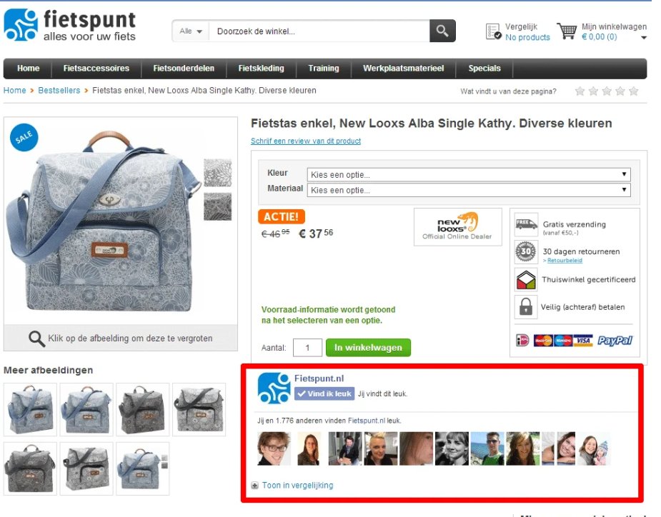
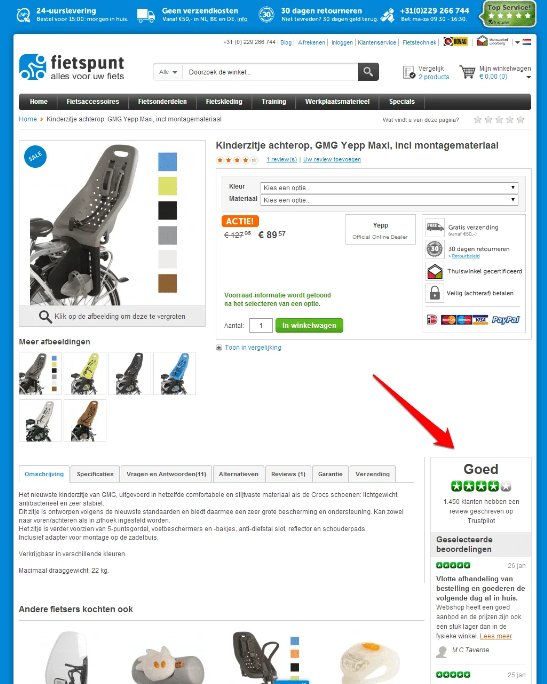
For example, one of our clients, Fietspunt, a Dutch company selling biking solutions, found that a lot of visitors left its product page, which led to low sales. Initially, they tried displaying a Facebook widget, but it didn’t yield significant results.
But when they put the Trustpilot widget in the bottom right corner of the page, they got 36.7% more orders.
Testing idea 6 – Show social proof badges
Does your product page already show customer reviews? Complement them with expert-recommended or award-winning badges. Share positive details like the number of happy customers, the total number of items sold so far, and how quickly you’ve answered user questions in the past.
Don’t hesitate to experiment with different types of social proof, as they influence purchase decisions and move your conversions in the upward direction.
Shipping and delivery information
Customers demand certainty, especially with shipping, returns, and delivery. To avoid surprising them, make it clear whether free shipping is available or not and if charges apply. Also, displaying estimated delivery dates is something that can give visitors peace of mind.
Lastly, they expect to see a clear return policy, including the deadline for returning items, in case they feel the need to return what they’ve purchased.
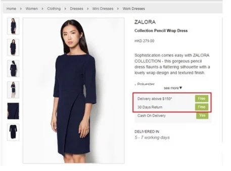
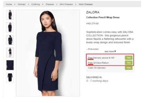
See how Zalora utilized VWO Testing to run several tests, including one that improved the CTA copy featuring delivery and return information. Their trick was to add the keywords “free” to catch the user’s attention and “yes” as an answer to reaffirm the return and delivery information.
Testing idea 7 – Show shipping, delivery, and return information
If your website currently displays only one or two of the essential pieces of information related to shipping, delivery, and returns, you can add the missing information to the new variation.
Let’s say you test a variation showing ‘30-day hassle-free returns’ with a link directing visitors to the returns policy page against the control. If the variation produces statistically significant results, go ahead and roll it out to all.
Recommended products
Showing product recommendations on an eCommerce product page is a smart move. Buyers are on your product page to purchase a specific item, but what if they change their minds or start looking for something else?
Showing product recommendations can keep their attention intact by offering more choices to explore. Sometimes customers can find an interesting or essential product that they didn’t realize they’d need.
Our Customer Success team recently helped Bear Mattress improve the cross-sell flow on its product page. This increased the revenue by 16%.
How did this happen? By making the copy more customer-focused, incorporating thumbnail images for each item in the cross-sell section, and implementing a few other modifications. You can read the detailed case study here to learn more.
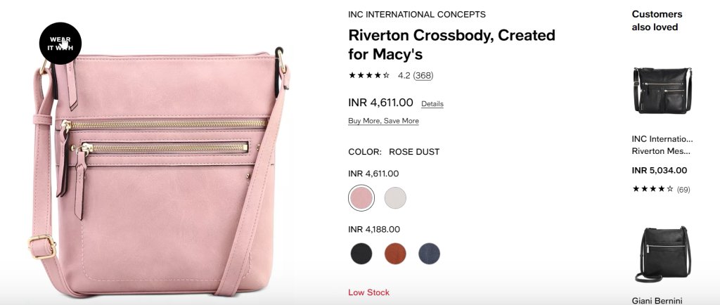
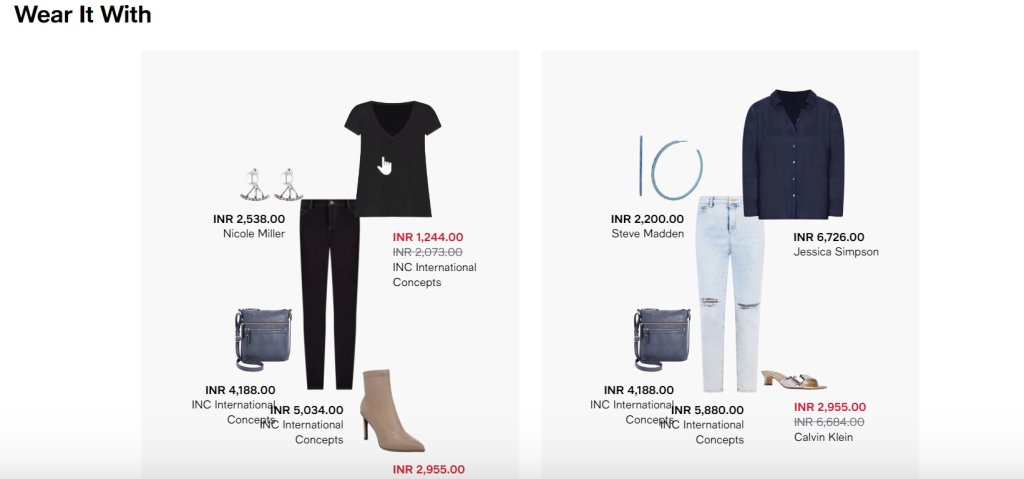
I also love what Macy’s has done on their product page. As you click on the “Wear it With” badge, you’re shown more products that you may try out along with the main item to complete your look. You can even click on these products and add them to your cart.
Test idea 8 – Show ‘More items from this brand’ category
When users see more products from their preferred brand, they may be encouraged to add additional items to their cart and eventually buy them. So, in the variation of your product page, you can show a recommendation category like “More items from this brand”.
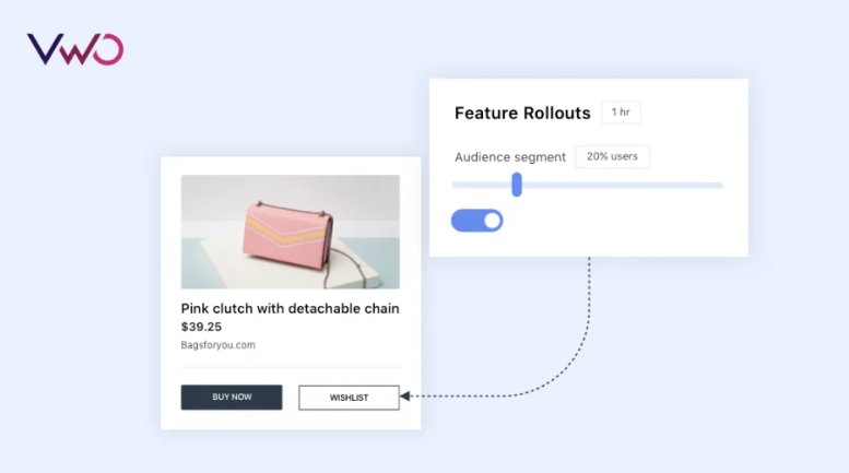
You can collaborate with your developers to conduct tests on recommendation engines using VWO Full Stack. With its server-side testing capability, you can run as many complex tests as you want without causing any flickering effects on the front end.
Thanks to feature rollouts, you can deliver a particular feature to a specific audience before releasing it to all end-users. This helps you get feedback and iterate quickly.
Size guide/comparison charts
When describing product details, we must use easily comprehensible charts, color codes, or images to help users make a buying decision without getting confused.
Imagine when you’re on a fashion website, you want to see the size guide images to select a dress of the right size. Or let’s say when you’re on a furniture website, you’d rather see swatches than read through the text to see in what different colors a particular sofa set is available.
On the other hand, customers on websites selling gadgets or electrical items will be more interested in seeing comparison charts and examining technical details in an easy format.
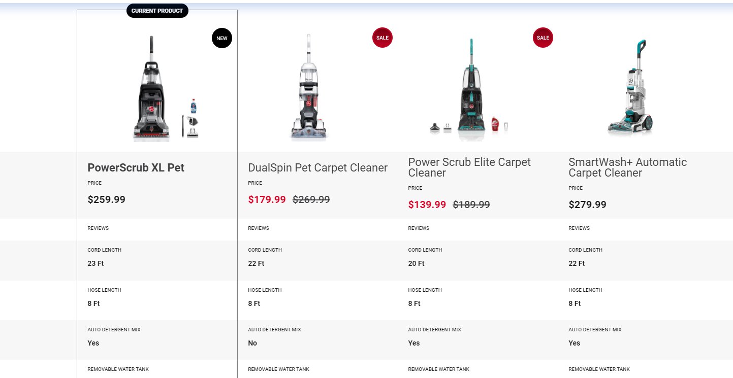
Take a look at Hoover, a classic home appliance company, that uses a comparison chart to help buyers make smart purchase choices.
Test idea 10 – Display a comparison chart to encourage more purchases
Say you own an eCommerce site that sells electronic gadgets, including Lenovo laptops. To enhance sales on that product page, you hypothesize that showing a side-by-side comparison chart of different laptops can boost purchases. Conducting an A/B test can verify if the variation based on this hypothesis leads to the desired outcome.
Call-to-action buttons
“Add to Cart” and “Buy Now” are the most important CTAs found on eCommerce product pages. The “Add to Cart” button lets visitors add something to their cart, while the “Buy Now” button takes them directly to the checkout page.
You may also include an “Add to Wishlist” button, but make sure it’s not too prominent, as it can delay the checkout by taking users to the wishlist page. We suggest that you display a wishlist icon, which users can click to save the item for later purchase.
Further, when creating a CTA button copy, use action-driven language and keep it simple and easy to understand. Make sure the color of the button stands out and is visible against the background of the page.
Test idea 9 – Fix the position of the CTA buttons
Do CTA buttons show up in the first fold of your eCommerce product page? That’s good user experience practice. But fix the display of the CTA button, preferably on the right side. This will allow users to add items to their cart while freely scrolling down the page to find more information.
With VWO’s sequentially valid Bayesian-powered SmartStats, you can always be sure that the results of your tests are accurate and reliable. Our advanced reporting mechanism gives you more than the statistically significant results – you know by what probability one variation beats another and control the statistical error rate of the test. You may even slice and dice the report and understand the impact of your test across different user segments.
Add-to-cart nudges
Your visitor has added a product to their cart. How would you nudge them to visit the cart page and prevent cart abandonment?
Often visitors add items to the cart and forget about it for the longest time. You can show a bit of animation – a fancy spark or cute bounce around the cart – when a shopper adds any product to it. But it may not be enough to nudge users to walk the path we want them toward conversions.
Showing a pop-up or side message that your product is now in the cart can help users take the necessary action at the right time. But make sure the ‘cross’ button is easily noticeable so visitors can close the overlay and continue browsing.
Testing idea 10 – Show mini add-to-cart
If your website has no add-to-cart prompt right now, try adding a mini cart showing the added product with two CTAs – View cart and Check out. This way, your visitors can choose which route they’d like to go. It’s also a great way to keep shoppers posted about whatever items they’re adding to their cart.
Maximize sales with product page optimization
The product page is where visitors decide to purchase or leave. You must do what it takes to deliver a good user experience and encourage conversions – continuous testing and optimization.
And that’s where VWO Testing comes in. You can test different elements on your product page, identify what works out, and make decisions based on data, thanks to VWO’s industry-best features.
So, don’t leave your eCommerce business’s success to chance. Start with a full-featured trial and work your way up to maximizing sales from product pages.
Categories: