Think of shopping on an eCommerce website as taking a trip to a mall. Both offer a variety of products and services at storefronts (virtual ones for online stores) and product displays that you can browse through. Just like you’d ask store personnel to help you find what you want, the search functionality on eCommerce sites does the same – you say what you want, and it points you to it. Search gives customers the power to find what they need without any irrelevant information getting in the way.
A good search function can make or break a customer’s shopping experience. If it’s fast, accurate, and intuitive, it can turn a browsing session into a purchase. On the other hand, a slow and clunky search experience can drive customers away in frustration.
For this reason, A/B testing your website search is super important. The more you test, the faster you understand what your customers want and the more conversions you can drive.
But where do you start and what do you test? Making the search bar more noticeable is just the beginning of improving your website’s search function. You’ll still have to do a lot of other things but don’t worry, we can help. So, in the second blog of the series ‘A/B testing ideas for eCommerce,’ we share the top testing ideas to enhance your site’s search experience. Let’s begin!
1. Image search results
Just imagine you have to enter the whole search query every time and you’re not even sure if it is right because there’s no correction prompt. That would be frustrating for sure! Autocorrect makes sure that typos and misspellings don’t impede the process of finding the products you want. Autocomplete helps you find what you’re looking for even faster by suggesting search terms and phrases as you type. These two search features have proven to be so effective that they’re now accepted as the standard in UX design.
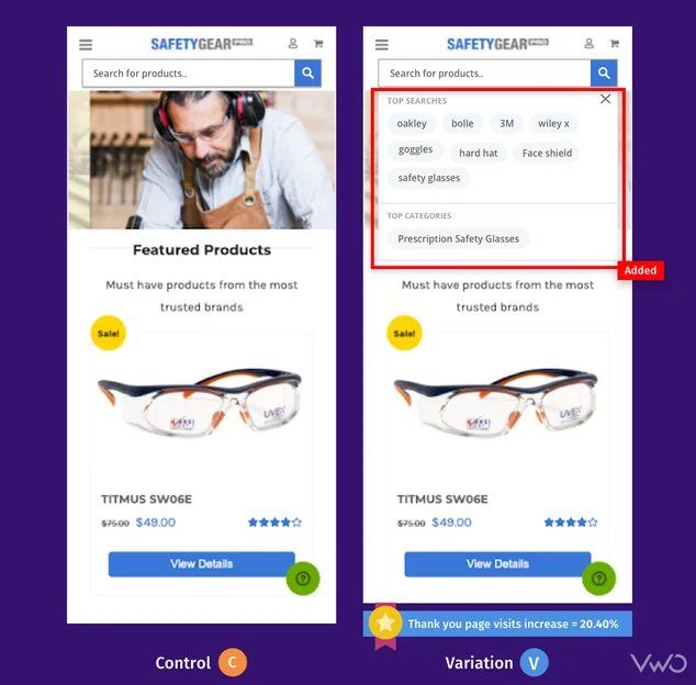
Safety Gear Pro has been collaborating with VWO for quite some time now and has run a number of tests, one of which was improving the search box design on the former’s website. The variation where the size of the search bar was increased emerged as a winner, but the team didn’t stop there and ran an iteration.
Unlike the control that only displayed suggestions once the visitor began typing, the variation showed top searches and categories as soon as the visitor tapped on the search bar. The suggestions were based on keywords frequently used by users on the website through the site search, as well as the categories with the highest traffic and page value. The variation increased the number of transactions, resulting in a 20.40% increase in Thank You page visits.
Test idea 1 – Replace text-based suggestions with image search results
Users who search on websites are 2-3 times more likely to convert. It’s really smart to capitalize on this user behavior. How? Here’s a simple solution to try: replace text-based search suggestions with image-based results. Let’s say a visitor has searched for an ‘iPhone cover’ in the search box. Instead of showing text suggestions, show different product images (iPhone covers) so users can get a quick idea of the product they want to purchase and click through to the page from the search result itself.
While you can test the UI elements of your search bar using VWO Testing, experimenting with search engine algorithms falls under the purview of our power-packed VWO FullStack. With some help from your developers, you can have these interesting ideas implemented and tested on your website. Roll out the version that improves user engagement on your website. This will give you an edge over competitors and tempt your visitors to come back for a seamless experience.
2. Filter options
Visitors who search on your website are in a purchasing mindset and eventually end up converting. But just because they know what they want to buy doesn’t mean they don’t need a bit of hand-holding. They are meticulous about what they want and want to reduce the clutter of items they are not looking for.
For example, I was looking for wedges on a shoe-selling website some days back. The search results were overwhelming, with so many options! I was trying to find something casual, not fancy party shoes. Did I go back to the search box to try again? Nah, the search results page had a filter on the side that let me narrow down my choices based on what I was looking for, like casual wear, color, and foot shape.
Test idea 2 – Side or horizontal filtering bar
Usually, the product filtering bar is seen on the left side of the website. But if you see many visitors dropping off after interacting with filtering options, you can create a variation with a horizontal filter bar featuring major product categories and see if it helps arrest the problem. This will bring every category within the sight of visitors without them having to scroll down and look for filtering options.
Test idea 3 – Add more filter options
A mere 16% of eCommerce sites have effective product filtering. You too can belong to that 16% by boosting your filter options and gauging its impact on user engagement. If visitors are grumbling about too many “out of stock” items in search results, consider adding an availability filter where they can easily exclude those items and only see what’s available now.
To implement any sort of client-side tests including this one, VWO Visual Editor is the best thing that there can be to help you through this. Whether you want to rearrange, move, replace, or copy-paste any element, all of that can be easily done using this editor. Plus, you can use the code editor if you have to make any changes to the HTML code of your website.
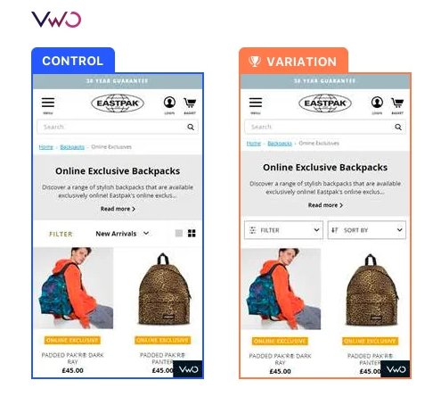
Here’s how Eastpak, one of the leading backpacking companies in the world utilized VWO to improve product filtering. First, by using VWO Heatmaps, they noticed that only a few mobile customers interacted with the filter bar on their product category page. So, they ran a test where they redesigned the mobile filter bar with clear and consistent labeling and made it stay at the top of the screen which would lead to enhanced filter usage and conversions.
And as expected, the interaction with filters improved by 106% compared to the Control. There was a 7% increase in the click-through rate because customers were now able to find relevant products more easily. Want to replicate these wins on your website? Sign up for a free trial with VWO and get a reliable tool by your side on your experimentation adventure.
3. Sorting
Don’t assume that optimizing product filtering means you’re all set – optimizing sort options is crucial too. Both serve different purposes and optimizing one doesn’t excuse neglecting the other.
By arranging products based on important factors like price, popularity, or customer ratings, shoppers can compare and simplify their choices by saving time and enhancing their shopping experience.
Additionally, well-designed sorting features can also help eCommerce websites improve their search engine optimization, as they can use sorting options to create a more organized and user-friendly website structure.
Test idea 4 – Display more sorting options
Going with the same old sorting options of price low to high, price high to low, and A to Z is a common sight in most eCommerce stores. If you find that visitors are using the sorting options but not getting the best out of them, try experimenting with adding more relevant options, like sorting by highest ratings, review count, and in-stock items.
When you’re using VWO Visual Editor, you can not only make changes to the element but also add a goal which can be “click on element’ in this case. Consider making it available to all visitors if heatmaps and other qualitative analysis tools show that users are using the sorting options more. Catch a glimpse of these features in action by signing up for VWO free trial.
4. Product information
How product information is displayed on the search results page will decide if users click through and visit product pages as the next step. First thing first, product images should be high-quality because this is what visitors rely on entirely since they can’t touch and feel the product they want to buy. Next comes important product information that can sway audiences to make a purchase.
Test idea 5 – Enable quick view of product images
Run a test where you create a variation that allows visitors to click ‘Quick view’ and see the product picture in full-screen length. Clicking outside the picture can bring it back to the default size. Have this variation compete against the control and see which one helps improve user engagement.
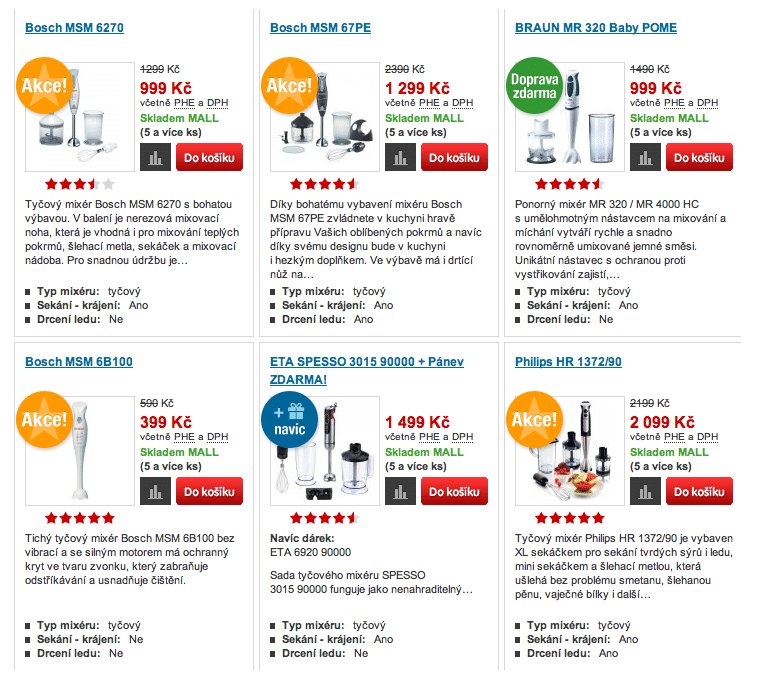
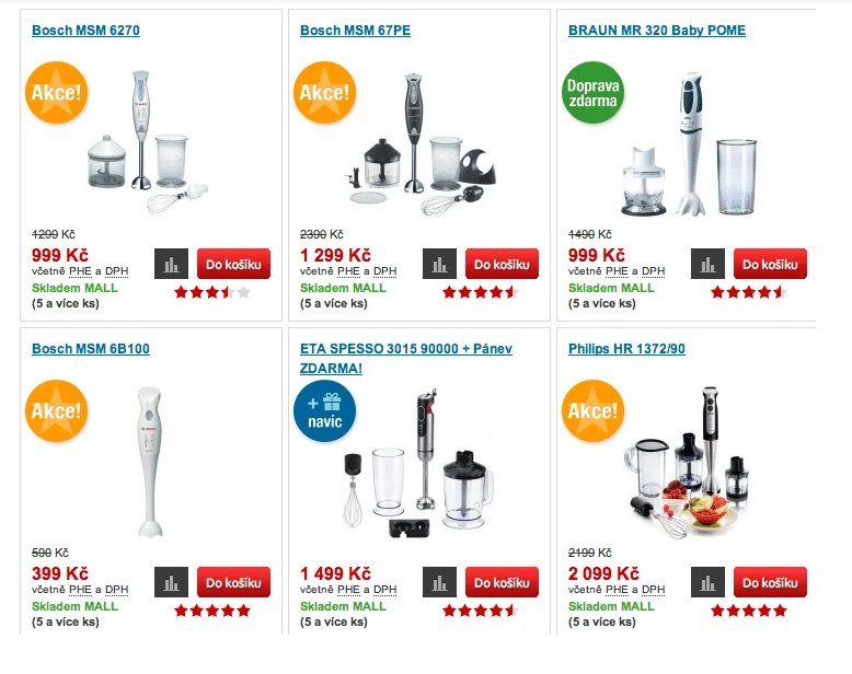
Here’s another inspiration for you. So, Optimics, a conversion rate optimization agency, used VWO to run tests for one of its retail clients called Mall.cz. In one of the tests, the agency wanted to see if showing larger product images would have a favorable impact on revenue. Two variations were created: the first showed larger product images with a text description, while the second had larger images with a description viewable upon mouse-over. The second variation was a winner with an increase in revenue by 9.46%.
Test idea 6 – Show ratings and review
One piece of information that can totally make visitors flock to your product is a rating or review. Instead of just keeping them on the product page, display them on the search result page as well. This will catch visitors’ eyeballs when looking for a product they wish to buy. Plus, you can show not only the ratings of the product but also the number of reviews those ratings are based on. A rating of 5 stars and just 3 reviews is not as reliable as a rating of 4.5 with over 60 reviews. Run an experiment to determine if this change leads to increased user interaction and directs more visits to product pages.
5. More product recommendations
Having organic search results appear in response to visitors’ search queries is considered sufficient to meet their needs. But why not provide them with even more options? So, here’s what you can do –
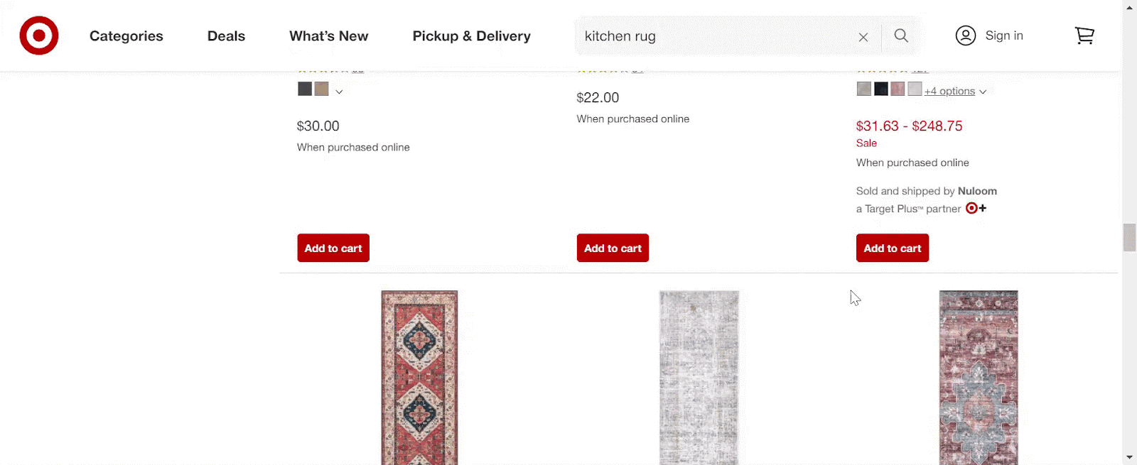
Test idea 7 – Display a section highlighting top choices or expert recommendations
Create a variation that showcases a carousel, banner, or recommendation tile featuring top choices or expert-recommended products related to a visitor’s search. Compare this to the control and observe its performance. If it helps increase transactions for your brand, implement the change right away. Look at how Target showed me a tile of recommended products along with hundreds of products in organic search results as I searched for kitchen rugs.
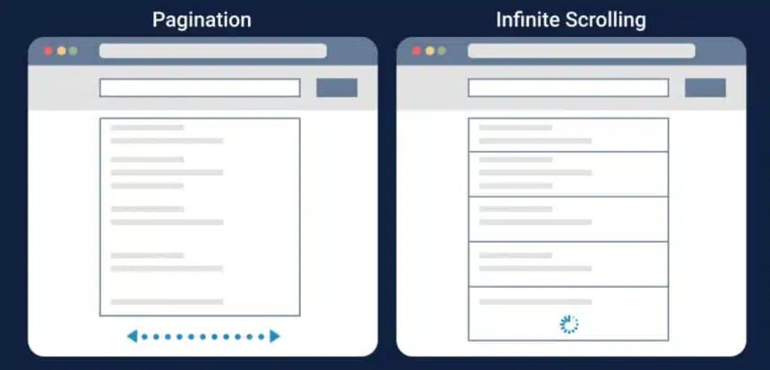
6. Pagination/scrolling/load more button
Pagination works great for users who want to have control over the number of items they see on each page and then jump to specific pages. This is especially beneficial for websites having a large product inventory, as it helps reduce loading time and simplifies navigation.
On the other hand, infinite scrolling offers a seamless browsing experience by automatically loading more items when visitors scroll down the page. This is a good option for websites with a smaller number of products and for those that want visitors to browse more items. An amazing cross between the two results is restricted scrolling with a “load more” button. It allows users to see a limited number of items at first and then choose to see more items if they want by clicking on “load more”. It provides visitors with control over the amount of content they see while still allowing for an easy browsing experience.
Test idea 8 – Pagination/infinite scrolling vs restricted scrolling with load more option
Based on the visitor behavior on your website, you can create a new variation of restricted scrolling with a load more button and run it against your control, be it pagination or infinite scrolling. Next, you can see which one is keeping visitors for a longer period on your website.
7. Breadcrumb navigation
Breadcrumb navigation gives a proper understanding of where users are on your website and how they got there. It also makes it easy for users to return to a previous page without using the back button or go to the homepage.
Further, breadcrumb navigation can improve a website’s SEO by ensuring a proper organization of the website architecture. This helps search engines crawl and index pages and rank them more effectively – all of which leads to increased online visibility.
Test idea 9 – Incorporate breadcrumb navigation
As a business grows and expands its product offerings, it’s important to keep the website user experience up to pace. One way to do this is by incorporating breadcrumb navigation. This navigation is crucial for larger websites with many pages, but may not be necessary for smaller sites with fewer pages. Based on all these factors, you can run a test with a variation showing breadcrumb navigation. If it’s helping improve user engagement, click-throughs, or cart value, you can roll this out to all visitors.
Let’s clarify something for you. Some may question the best placement for breadcrumb navigation. Unlike most eCommerce sites, Apple’s website has placed this navigation towards the bottom of the page. Therefore, decide its placement based on how visitors behave on your website and what they expect from it.
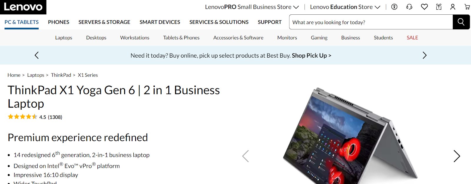
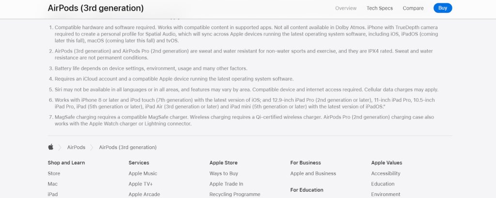
Breadcrumb navigation is at the top for Lenovo, while it is at the bottom on Apple’s website.
8. Call-to-action buttons
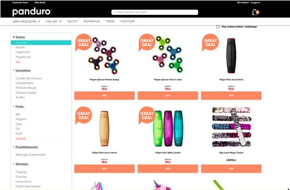
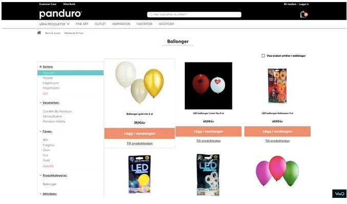
CTA buttons nudge customers in the right direction to make a purchase. Don’t underestimate the importance of CTA buttons by assuming that customers already know to click a product image to access the product page. Panduro, a Swedish jewelry store, found this to be true after conducting a CTA test.
In collaboration with VWO experts, they found that in the control the call to action (CTA) button was labeled “KÖP” (Buy), which confused users as to whether it would take them to the product page or add the product to their cart. It was, therefore, hypothesized that renaming the CTA copy to “Snabbköp” (Quick Buy) in variation 1 and “Lägg i varukorgen” (Add to Cart) in variation 2 would provide a clearer indication of the intended action when clicked. Adding a secondary “View Product” button below the main CTA would also serve as a visual cue for users who wish to navigate to the product description page.
And yes indeed, variation 2 saw a 6% improvement in the conversion rate for clicks on the main call to action (CTA) button. This was accompanied by a 10% increase in visits to the revenue page.
Test idea 10 – Show CTA buttons on the category page
Some eCommerce websites don’t show CTA buttons on search results/product category pages at all, thinking they take up a lot of space and users already know where they have to go from here. If your website belongs to this category, we say that you take the middle road – create a variation where you show CTA buttons only when users hover over the product image on the desktop. If it shows an improvement in click-through for products, go ahead and roll it out for all visitors. But remember, CTA buttons should be all-time visible for mobile visitors on your website because hover doesn’t work on small devices.
Wondering if you can create variations for both mobile and desktop using VWO Testing? Stay assured that there’s nothing to worry about. The Visual Editor doesn’t just let you create or edit but preview variations on different screens in different resolutions before shipping them. Sounds great? It’s time that you tried the feature out.
The way forward
To summarize, A/B testing is crucial for providing your customers with the best search experience and making their shopping journey super easy. The ideas we discussed here will give you a solid foundation to start from. Taking a cue from this, you can further tailor your experimentation program based on your visitor behavior and business needs to achieve search success on your eCommerce store.
VWO can be a valuable ally in your optimization journey. Its extensive capabilities, from testing and analytical tools to a customer data platform and personalization, make it an exceptional optimization platform. Sign up, try it out, and see for yourself why it’s a game-changer. You won’t regret it. Good luck!
Categories: