What is a heatmap?
A heatmap (or heat map) is a graphical representation of numerical data, where individual data points contained in the data set are represented using different colors. The key benefit of heatmaps is that they simplify complex numerical data into visualizations that can be understood at a glance. For example, on website heatmaps ‘hot’ colors depict high user engagement, while ‘cold’ colors depict low engagement.
Download Free: Website Heatmap Guide
Heatmaps are powerful tools to understand data, with a wide array of use cases and applications across many industries. In this guide, we’ll look at how heatmaps are used across a number of different industries to give powerful insights from data – from stock market analysis to website analysis with our VWO’s heatmap tool.
The history and evolution of heatmaps
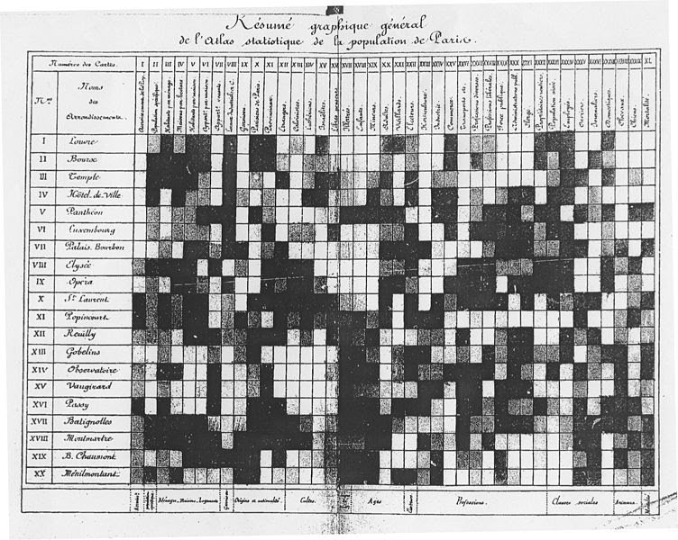
Heatmaps were first developed in the 1800s, originating in the 2D display of data in a matrix. The first known usage of heatmaps is credited to Loua in 1873 for presenting various social statistics in Paris using colors. Loua’s heatmap used dark grey and black to denote higher value metrics and light colors like white and light grey to denote lower value metrics. Heatmaps continued to grow in popularity as a method for presenting data throughout the 20th century.
The term heatmap was first trademarked in the early 1990s when software designer Cormac Kinney created a tool to graphically display real-time financial market information.
Today, heatmaps have become so versatile that they have become the go-to tool for data visualization and analysis not only for statisticians but marketers, business owners, biologists, geographers, and the like. There are many powerful examples across industries, of heatmaps being used to turn raw data into powerful insights and intelligence.
Heatmaps in different industries
Due to their versatility, heatmaps have a wide range of application possibilities. And because they simplify data analysis by visually representing it, people from many industries prefer them over manual data visualization tools such as graphs, pie charts, Excel sheets, etc.
Let’s look at some examples to understand how heatmaps are used in the market.
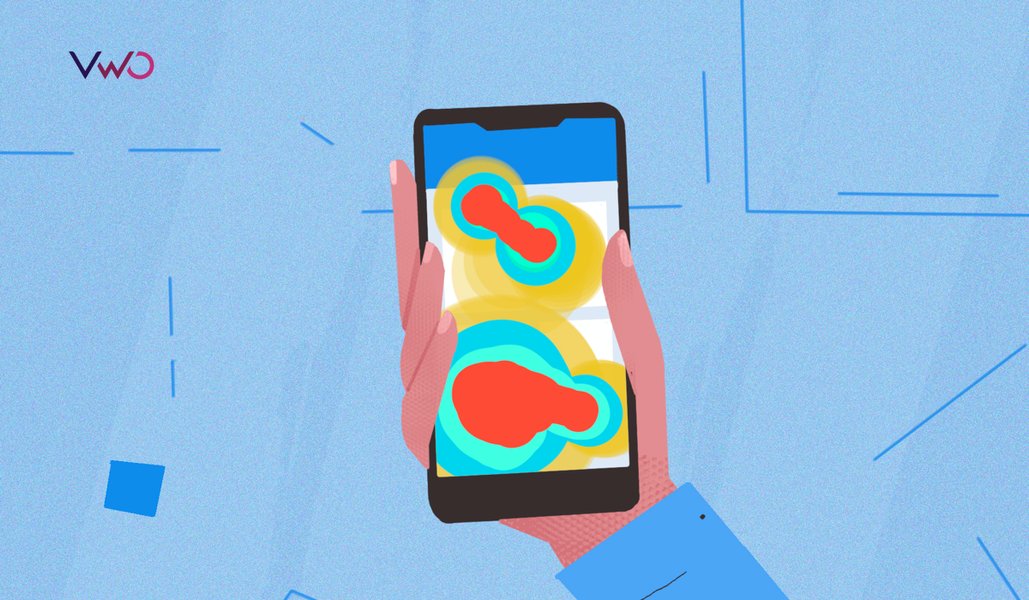
1. Website heatmaps
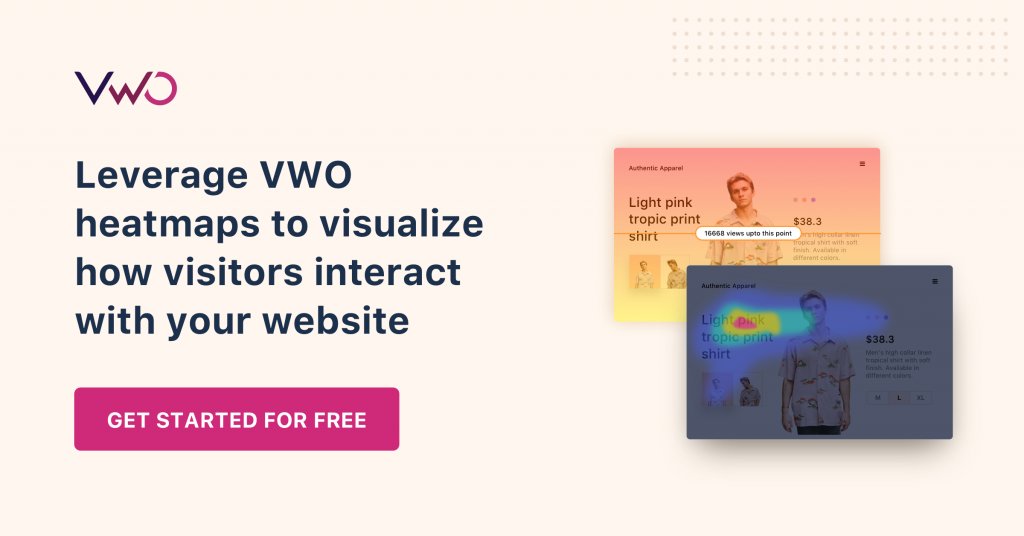
Using website heatmaps, businesses can track user behavior and discover actionable insights that help them improve the website. Website heatmaps are of great value to organizations with an online presence or use the internet as their main revenue channel, such as eCommerce stores, travel and hospitality websites, media services, B2B SaaS companies, etc.
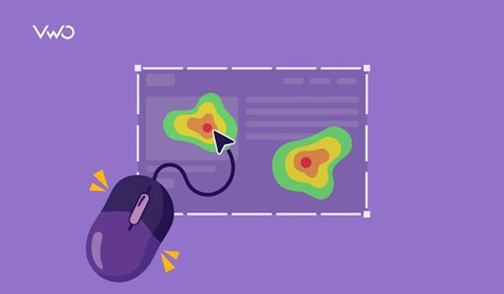
Website heatmaps represent the hottest (most popular) and coldest (least popular) areas of your web pages using a hot-to-cold color scheme with warm-toned colors depicting the most popular sections and cool-toned colors depicting the unpopular ones.
Heatmaps help measure a website’s performance, simplify numerical data, understand visitors’ thinking, identify friction areas by identifying dead clicks and redundant links, and ultimately make changes that positively impact conversion rates.

OTT platforms are great examples of businesses using behavioral analytics tools like heatmaps to gain insights into user behavior and improve user experiences.
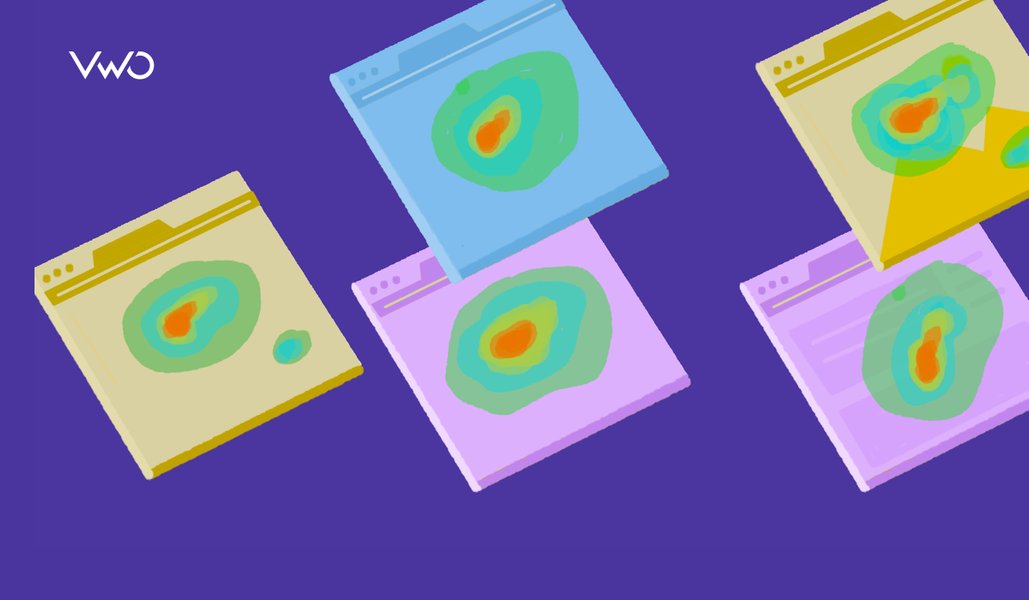
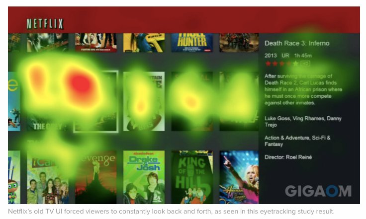
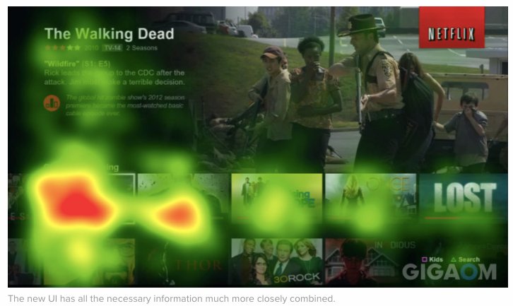
For instance, the folks at Netflix took it upon themselves to identify their target audience’s streaming interests, the kind of shows and movies they watched, the various genres they identified with, and so on, and then used the gathered data to deliver personalized experiences to each viewer. Below are two of the earliest website heatmaps plotted by Netflix during UX research conducted to optimize their TV experience:
It’s not just Netflix that can optimize website experiences with heatmaps – anyone can do it. Businesses across the globe use VWO heatmaps to understand users and improve conversions. Bear Mattresses used heatmaps as part of a conversion optimization project to create a 24% uplift in successful purchases and a 16% increase in revenue in just 19 days. Learn more about heatmaps for UX, creating heatmaps without code, and dynamic heatmaps.
2. Geographical heatmaps
A geographical heatmap or geo heatmap represents areas of high and low density of a certain parameter (for instance, population density, network density, etc.) by displaying data points on a map in a visually interactive manner. Industries like real estate, travel, and food greatly benefit from geographical heat maps.
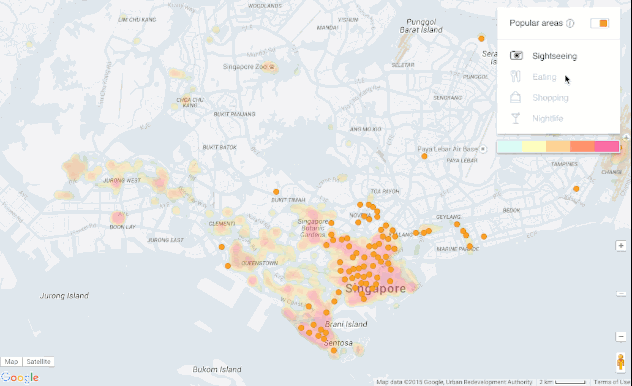
For example, travel websites can make use of geo heatmaps to represent the busiest and most popular spots in a selected destination to help travelers make an informed itinerary according to the kind of vacation they are planning.
Geo heatmaps in the travel and hospitality industry
Destination Falkenberg, a company owned by the municipality of Falkenberg, decided to use data that was already available in the country’s tourism departments and branches so they could make the most out of their marketing and promotions efforts. The team collected information on the guests’ postal addresses to be able to identify where the most number of tourists came from.
They gathered data from over 50,000 individual bookings that were made, segmented the data based on the type of accommodation booked, and then projected that data onto a heatmap. This is what the heatmap looked like:
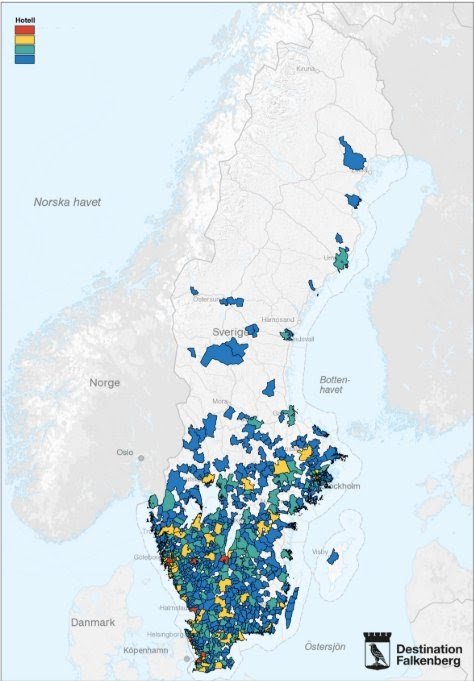
Using heatmaps to visualize and analyze data helped Destination Falkenberg simplify strategic decision-making, enabling them to run more targeted marketing campaigns in specific geographic areas.
Download Free: Website Heatmap Guide
Use of geo heatmaps in the QSR industry
Food entrepreneurs, on the other hand, can create geo heatmaps to identify markets where there is the least amount of competition or areas that have not already been swamped by rival food chains.
Geo heatmaps are especially useful for businesses that have brick-and-mortar store networks. They can represent areas of high and low density in terms of population, sectors, high and low-selling areas, and more.
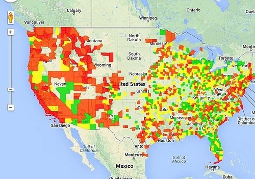
Carl’s Jr, a multinational fast-food chain, used geo heatmaps to represent their restaurant locations in the United States:
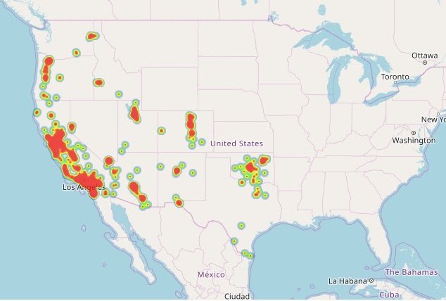
The red areas indicate a high volume of Carl’s Jr restaurants in closer proximity, whereas, the green spots indicate regions with fewer Carl’s Jr restaurants. Combining this with competitor locations, population data, demographic data, transportation, and other data sources would give Carl’s Jr insight into where to expand their store network with likely success.
3. Heatmaps for the gaming industry
When it comes to the gaming industry, website heatmaps can play an invaluable role in enhancing the user experience, identifying potential friction points, and optimizing the entire flow of gamers.
By visualizing user interactions and behaviors on gaming interfaces, developers, designers, and even marketers can gain insights that go beyond traditional analytics.
This data-driven approach allows for informed decision-making, leading to targeted improvements in game design, navigation, and overall user engagement. Let’s take a look at some real-world scenarios to understand the use of heat maps in the gaming industry.
a. Using heatmaps to optimize the gameplay of an open-world game
Let’s consider that you are managing an open-world single-player game where users have to complete missions, collect rewards, and defeat enemies. However, you notice that a large number of players are unable to complete a certain mission and proceed to the next level.
This results in high drop-offs at that point in the game. Although, your analytics tool does show an increase in drop-offs, but fails to reveal why users are abandoning the game at this level.
In this scenario, you can use heatmaps by VWO Insights – Web to try and analyze user behavior at this stage. While observing the heatmap, you notice specific areas that are receiving a high number of clicks.
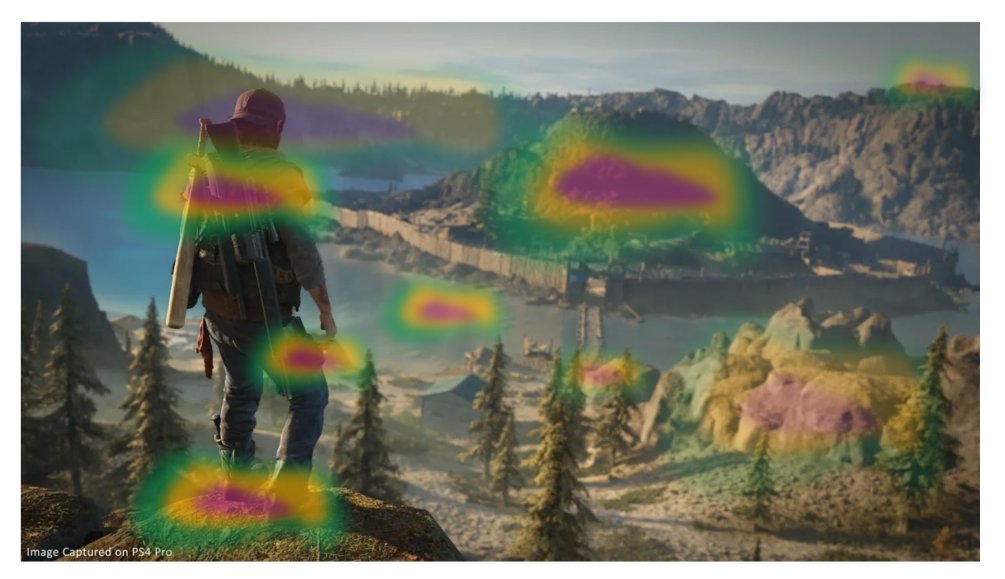
Upon further analysis, you understand that this area of the gaming environment requires the users to collect an energy bar and make a jump. However, it seems like users are not aware of this fact and are trying to jump without the energy bar.
This is probably why they are not able to proceed further, leading to frustration, rage clicks, and eventually abandonment. To overcome this challenge, you can either prompt some hints or introduce an optional tutorial for that specific section, which can improve the overall player experience and reduce drop-offs too.
b. Using heatmaps to improve user engagement in a quiz game
Suppose that players in a desktop quiz game are showing signs of frustration, with a noticeable decrease in the number of quizzes completed.
Even though your analytics tool indicates a drop in user participation, it does not provide insights into the specific reasons behind the disengagement.
Here, you implement a heatmap to analyze user interactions and observe relatively low activity on specific questions and elements. This is probably leading to frequent abandonments as the players may not be finding those questions or categories interesting enough.
With the help of these crucial insights, you can either revise the question format in this category or reduce the difficulty level.
By addressing these specific pain points identified through the heatmap, you can improve user engagement in the quiz game and boost user retention as well.
c. Using heatmaps to fix the navigation of a tactical game
Suppose you are handling a tactical game that requires players to manage an entire town. Before the players begin any level, they are asked to create a budget for various expenses related to their digital town such as food, electricity, development, security, and so on.
After a recent update to the game, you notice that players are spending a lot more time navigating through the budget section instead of proceeding to the next stage.
Your analytics tool highlights an increase in the time spent on this section, however, you fail to understand the exact reason for this behavior. To get to the bottom of this issue, you decide to analyze the heatmap of this particular section.
While analyzing the heatmaps, you observe high activity around the drop-down menu. This menu contains the different expenses of the town such as food, electricity, and so on. Users are required to select the expense first and then allocate the budget accordingly.
However, users are now spending a lot of time on this section and it is also receiving a higher number of clicks. This indicates that users might be confused or frustrated due to a glitch or bug in this section.
Based on these heatmap insights, you can either restructure the layout of the dropdown menu or replace it with pre-filled boxes for each expense that users can then edit according to their strategy.
Not only does this create a more intuitive layout but it also streamlines an important part of the tactical game, thus boosting the overall user experience.
d. Using heatmaps to improve the combat mechanics in a first-person shooter (FPS) game
Imagine you are managing an FPS game where players have to battle enemies and complete relevant missions. Recently, you’ve started noticing quite a few negative reviews, especially from the desktop players, who are complaining about the combat mechanics in certain missions.
However, these reviews do not explain the issue clearly and you are unsure about what exactly is causing this problem.
In this case, you can use heatmaps to analyze specific parts of the game where players have to perform combat sequences. Upon analyzing the heatmap for the most popular combat sequences, you notice frequent rage clicks when players are prompted to change their weapons.
This indicates frustration among players as they struggle with the weapon-switching mechanism during some intense combat scenarios.
Here, you can use these data-backed insights to redesign this interface or add some keyboard shortcuts to make it easier for players to switch weapons. These changes will give the players more control over their actions and can also reduce the number of drop-offs from important in-game missions.
Whether it’s optimizing the gameplay in an open-world adventure, or improving user engagement in a much simpler game, heatmaps can be an integral part of your overall optimization strategy.
The ability to visualize player interactions and identify patterns beyond conventional analytics empowers developers, designers, and marketers to make informed decisions that directly impact user satisfaction and game performance.
By addressing key pain points, you can not only meet player expectations but also continuously improve the gaming mechanics to ensure a seamless user experience.
4. Heatmaps in the stock market
A stock index heatmap helps identify prevailing trends in the market at a glance. It uses a cold-to-hot color scheme to indicate which stock options are bullish and which are bearish. The former is represented using the color green, whilst the latter is highlighted in red.
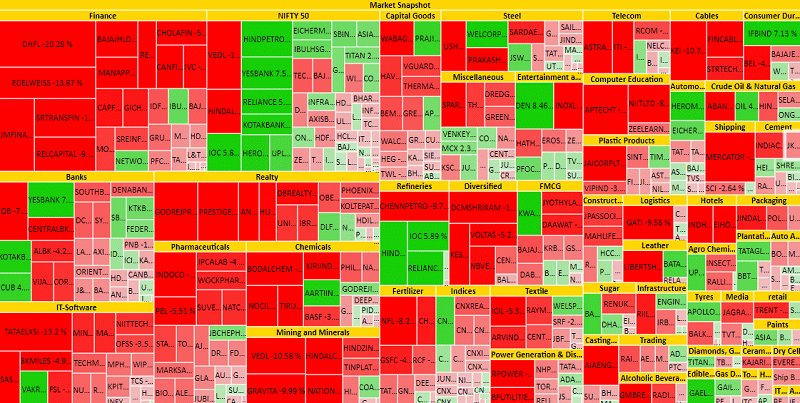
Financial services industry using heatmaps
In the realm of finance, the market value of assets, products, etc., continually fluctuates. Manually logging changes into a document, drawing inferences and patterns, revisiting numerical data, and so on can take many hours. Heatmaps remove multiple steps from the process, enabling users to quickly visualize complex data points and easily compare the performance of companies.
For example, Stocktwits offers a free heatmap of trends in eight key sectors, namely basic materials, utilities, industrial goods, health care, technology, financials, consumer goods, and services. The heatmap looks like this:
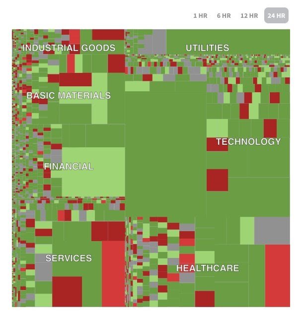
Filters can be set based on the duration for which you want to see the heatmap, industry, and so on. Using heatmaps, brokers and investors can more easily understand stock performance and make better investment decisions.
5. Heatmaps in sports
Sports heatmaps are a very fascinating use case for heatmaps. By plotting heatmaps of players’ on-field performance, coaches and managers can identify patterns within and across games, identify performance areas that need improvement, study rival’s possible game plans and strategies, as well as make data-informed decisions that benefit players, the team, and ultimately business and turnover.
Let’s look at the heatmap below:
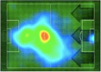
This heatmap depicts the on-field movement pattern of a player in terms of where he spent the most amount of time. Such data visualization can help teams build game-changing strategies that are data-backed and more effective.
Another heatmap example in sports is the comparison of the performance of teams by creating heatmaps of them playing home games as well as playing games away. Given below are heatmaps of one single football team playing matches at home and away:
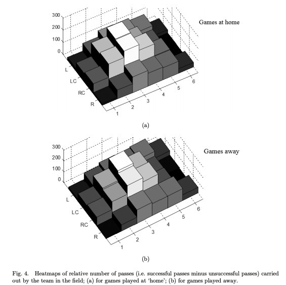
By accessing such data, coaches can understand what enhances the team’s performance on home turf, identify factors that negatively impact the team’s performance on the opponent’s turf, and so on, and then use these insights to plan and strategize for better results.
Heatmap examples for different user personas using VWO
Our industry-best VWO Heatmaps help you closely examine user behavior on websites to draw insights and introduce research-backed changes. Different personas leverage them to improve digital experiences in various ways. Let’s now explore some examples of heatmaps for different user personas.
UX researchers
Identify usability issues: UX researchers can use heatmaps to discover issues that users experience on a website and improve the design based on their preferences and dislikes.
For instance, if users are clicking repeatedly on a non-clickable area or an unresponsive button, it will show in the heatmap and will reflect usability problems. Having this information, UX researchers are able to detect issues and fix these design flows, enhance button functionality, or explain navigation paths. This will help to improve the overall user experience and make the website more intuitive.
Product managers
Feature adoption: Product managers can measure the adoption of features by implementing heatmaps to see how visitors are using a new feature.
A product manager might be trying to use a heatmap to assess the adoption of a new “Custom Dashboard” feature on a SaaS website. They can know which elements are used the most or least by tracking users’ clicks on dashboard customization options such as widgets or layout settings. This gives insight into user preference and friction points, and it enables interface optimization for better discoverability of features and overall adoption.
Growth marketers
Boost conversions: Marketers can increase help conversion rates by creating a friction-free conversion funnel, gaining insights into user behavior through heatmaps.
Let’s say you see that the bounce rate for your website is pretty high. You can create heatmaps to find out what the problem is. Maybe users aren’t clicking on the search functionality or scrolling down to your promotional offers. In such cases, one can reposition the key elements, resolve the issues, and increase conversions.
Watch how to fuel more experiments with heatmap data for a digital business:
Conclusion
Statisticians and analysts employ a plethora of tools and methods to sort the collected data and present them in a more user-friendly manner. To this end, heatmaps help professionals from every industry. To sum up, the reason why heatmaps have gained the impetus they have in the past few decades as a statistical and analytical tool is that:
- It is a visual and accessible method of data representation
- It is readily and easily consumable as it simplifies numeric data and depicts it using a color scale
- One can easily compare various data points plotted on different heatmaps
- It is versatile and adaptable as it can record and present both absolute and derived values
- It removes multiple steps from the traditional data analysis and interpretation process by laying down all the values in one single heatmap
These are only some of the examples of where heatmaps have helped businesses across industries visualize data better and make data-backed decisions. The possibilities are endless.
VWO’s free AI-powered heatmap generator allows you to understand how users interact with your website. It enables you to find bottlenecks, follow your visitors’ trails, and analyze how they interact with each static or dynamic element.
To know more about how you can leverage VWO heatmaps to draw valuable insights, sign up for a free demo session from one of VWO’s optimization experts or opt-in for a free trial.
FAQs on Heatmap Examples
Practically any online business can use heatmaps. Industries such as finance, QSR, software, OTT media, and travel & hospitality are just a few that rely on heatmaps for data visualization.
Here are a few different types of heatmap examples: Geo heatmaps, website heatmaps, stock heatmaps, and field heatmaps (used in sports). Get to know more about these examples in this post.
Categories:


![Top 10 Shopify Heatmap Apps [With Features – 2026]](https://static.wingify.com/gcp/uploads/sites/3/2020/04/Feature-image_Shopify-Heatmaps-All-you-need-to-know.png?tr=h-600)