Scroll-Depth Tracking: What, Why, and How of Monitoring Visitor Engagement
Sometimes the most important piece of information on your webpage is similar to undiscovered treasure at the bottom of the sea. Often hidden, waiting to be explored.
How?
Let me explain.
You’ve carefully crafted and arranged the content of your webpage but tucked away some golden nuggets of value at the bottom.
The idea is that visitors will effortlessly glide down the page, soaking in every detail. But in reality, visitors don’t always follow this script.
Are visitors even diving deep enough to find them? Why would they care to scroll down your webpage? Do they wish they found information at their first few glances?
Finding answers to these questions makes tracking scroll-depth in your webpage so important.
In this blog, we’ll explore how tracking scroll-depth can improve visitor experiences and boost conversion rates, helping you make informed decisions about your website’s layout and content.
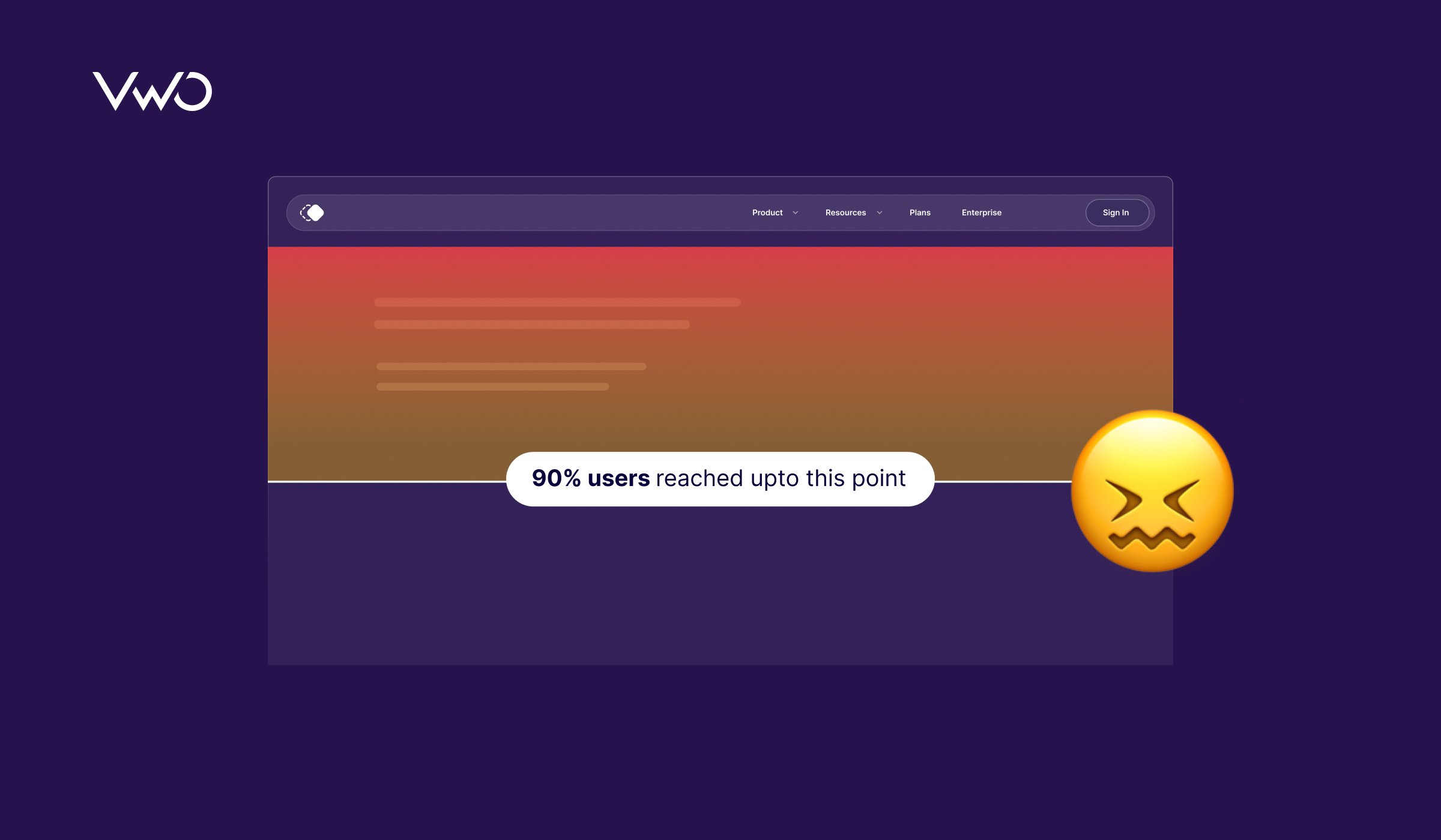
What is scroll-depth?
Scroll depth tells you how far down a webpage a visitor scrolls before they bounce off or take some other action, like clicking a button or visiting the next page. It is usually measured as a percentage of the page length or in pixels.
Interpreting scroll depth as a percentage of the page length means that we’re measuring how far down the page a visitor has scrolled relative to the entire page length. For example, if a visitor scrolls three-fourth down a page, then it is 75%.
We can measure scroll depth in pixels, which directly refers to the distance a visitor has scrolled down the page in terms of the number of pixels from the top of the page. For example, if a visitor scrolls 512 pixels down a page, the scroll depth would be 500 pixels as these values are rounded.
What is a good scroll-depth?
Determining what identifies as a good scroll-depth depends on a couple of factors. Let’s try to understand them:
Set clear objectives
Ask yourself what you want visitors to accomplish when they visit your site. Your web page’s scroll-depth should complement these objectives.
Consider a SaaS homepage featuring a lead-gen form above the fold. In this case, a lower scroll depth may suffice, especially if the rate of form submissions meets your satisfaction and the page’s drop-off rate remains manageable.
Now imagine you’re managing an eCommerce website selling sporting goods. If your primary objective is to drive conversions, you’ll want visitors to scroll far enough to view essential product details and ultimately add products to the cart. To encourage visitors to act promptly, you might want to reduce the need for extensive scrolling and enable quick access to CTAs. Hence, a low scroll-depth is desirable.
On the other hand, if your objective is to increase engagement, you’d rather visitors scroll through the entire product description, browse through customer reviews, and interact with multimedia content like product videos or image galleries. In this case, a higher scroll depth would indicate deeper engagement with the content.
This holds true when your page is delivering information or insight through the content. For example, if your blog page features lengthy articles, you’d want visitors to scroll down enough to engage with valuable information. In this scenario, a scroll depth above 50% is considered good, while exceeding 75% is fantastic.
Analyze industry benchmarks
Achieving a 100% scroll depth would be the gold standard, but let’s be realistic. Visitors often don’t scroll all the way down the page due to distractions or shifting priorities. They might get sidetracked by social media, notifications, or simply lose interest. Instead of fixating on pushing visitors to the bottom of the page, it’s more practical to understand the average scroll-depth in your industry.
Knowing where you stand compared to industry norms is key. By benchmarking your own scroll-depth against industry averages, you can gain valuable insights. This understanding helps you develop strategies to improve if your scroll-depth is below or at par. These strategies could include tweaking content placement, refining navigation, or crafting better CTAs to encourage deeper engagement with your webpage.
How do you measure scroll-depth?
By now, you’ve likely recognized that scroll depth is a valuable indicator of visitor engagement on your website.
But how exactly do you analyze or determine scroll-depth?
Studying scroll maps provides invaluable insights into visitor behavior, helping you understand how far visitors scroll down your webpages.
Many folks confuse heatmaps with scrollmaps, but here’s the lowdown: while all scrollmaps are a type of heatmap, not all heatmaps are scroll maps.
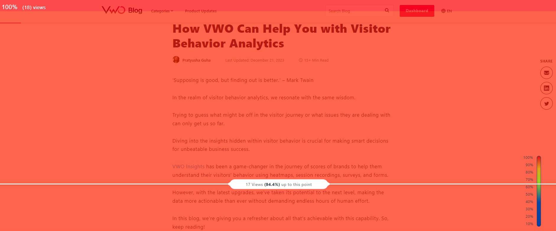
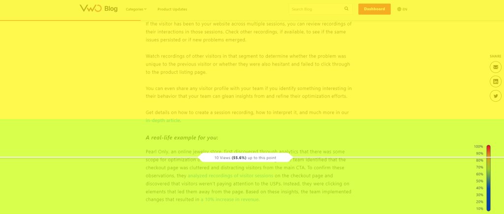
Scroll maps highlight the most viewed sections of a page using colors, creating a vertical rainbow effect. It’s a bit different from traditional heatmaps, which typically focus on clicked or tapped elements through a similar color scheme.
While Google Tag Manager and Google Analytics can help track scroll-depth, for an in-depth analysis, they may need integration with other tools. To get the complete picture of your visitor behavior, count on VWO that assists you with its comprehensive robust features.
Heatmaps of VWO Insights – Web lets you track scroll levels on your webpage as well. The scrollmap report highlights the most scrolled sections of your webpage with brighter colors. It shows the number of views and the percentage of visitors scrolling down your webpage.
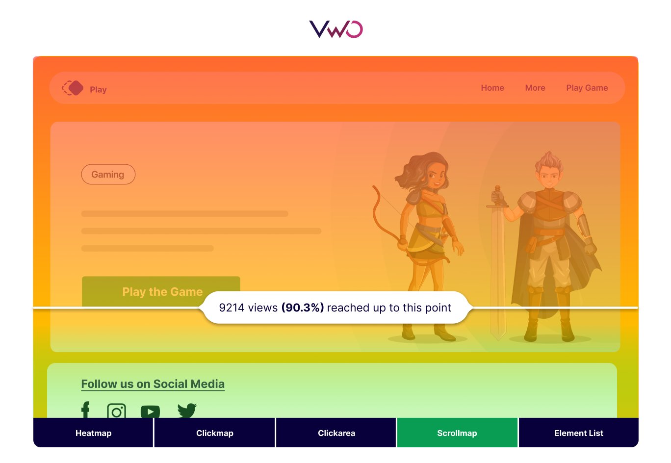
And what’s even more advantageous? VWO provides a plethora of other behavior analytics tools, enabling you to get a comprehensive view of visitor behavior. With this approach, there’s no need to hop from one tool to another, piecing together insights. You can seamlessly obtain a complete picture in one platform. To watch them in action, take a free trial now.
How do scrollmaps meet the needs of different user personas?
Given their importance in understanding visitor behavior, scrollmaps are becoming a must-have in most companies’ martech stack. Let’s understand how different professionals may find scrollmaps helpful in the context of respective use cases.
CRO marketers
Imagine you work as a marketer for a travel website. You check your analytics and see that bookings haven’t increased lately, and more people are leaving the site from the checkout page. You want to address the issue, so you turn to behavior analytics to understand what’s wrong.
You focus on scrollmaps to confirm a hypothesis: the checkout button’s placement below the fold, coupled with additional information, might be hindering easy access to the button, affecting bookings. The scrollmap confirms this suspicion as it shows less scrolling below the fold, indicated by cool colors, unlike hotter ones above it.
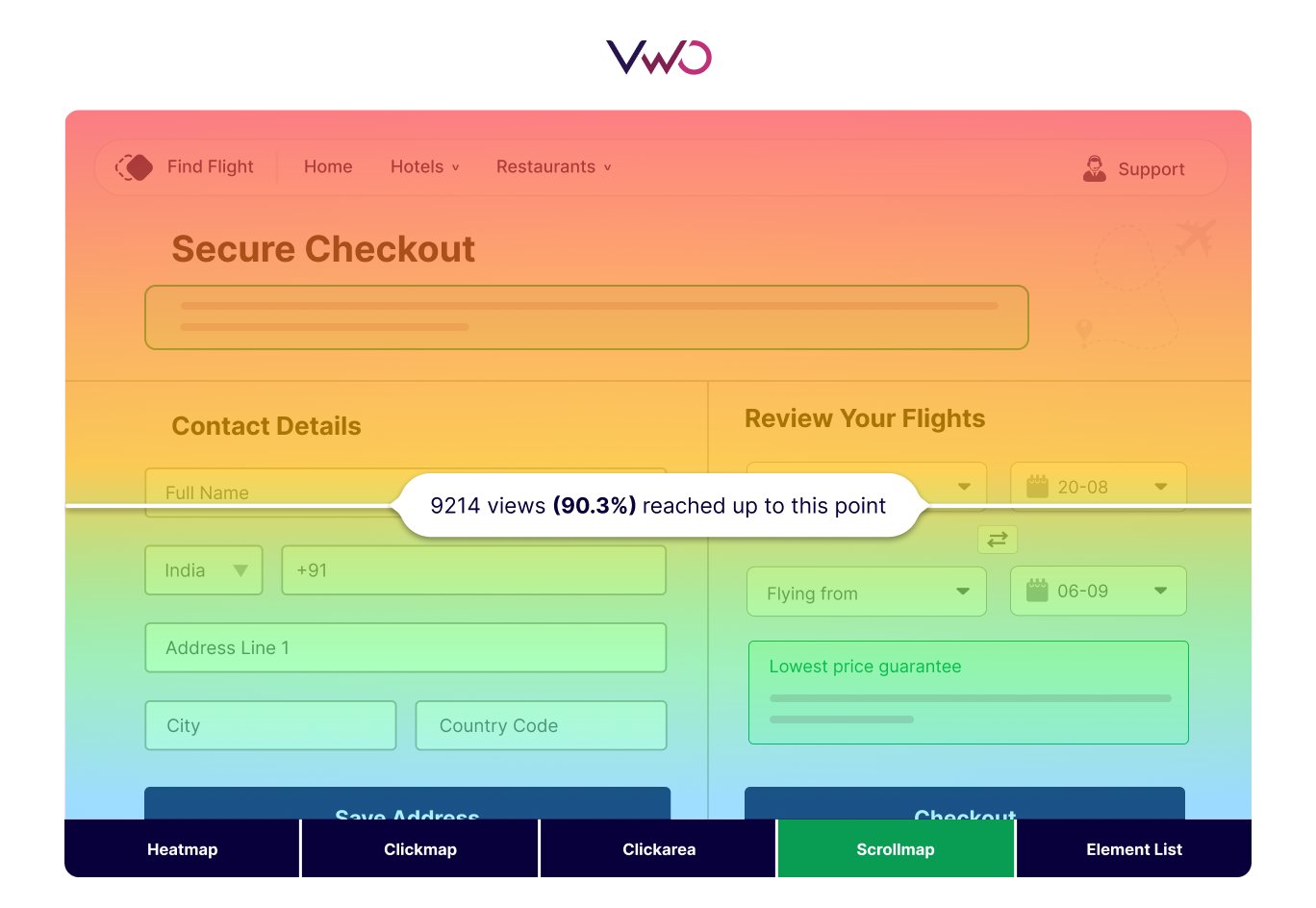
You realize that bringing the checkout button above the fold is the first low-hanging fruit you must catch. Next, you can make other changes, such as making the button more prominent and removing unnecessary information. This way, even if the scroll-depth isn’t great, tweaking the CTA button placement can still help increase sales and prevent high bounce rates.
Product managers
Suppose you’re a product manager at a B2B consulting company. You recently introduced a feature to allow visitors to create custom bundle service plans and receive personalized prices on the pricing plans page.
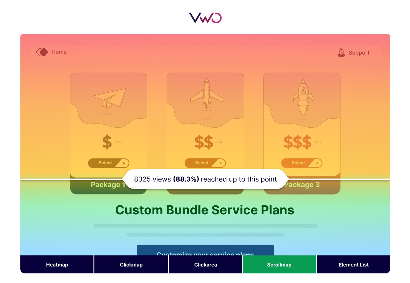
However, your analytics tool indicates that the exit rate on that page remains high, as it was before. This is surprising because you anticipated that giving more power to visitors to customize their services would make the page more engaging and conversion-friendly.
With the help of a scrollmap, you observe that visitors are not scrolling past the typical pricing plans with set offerings. The bundling option is buried deep within the page, so they may not realize it’s there. Now, you understand that it’s important to change the position of the bundling services feature to get more visitors to interact with it.
UX researchers
Consider you’re a UX researcher at a gaming company that has just launched an online gaming website. At present, your company’s main objective is to grow a community around this game. They aim to organically spread awareness far and wide, prioritizing audience engagement without resorting to overly aggressive tactics to drive revenue right now. This is why researching visitor experience plays a monumental role for the company.
It gives you a chance to comprehensively understand how visitors navigate the interface and interact with different elements. This will help you resolve UX issues proactively.
During your regular analysis of visitor behavior, you notice in the scrollmaps that visitors aren’t scrolling down enough on the home page. The cool blue colors toward the bottom of the page suggest they’re not reaching the area where social media share buttons are located.

You realize that it’s crucial to make these social media share buttons more visible to visitors, as sharing these games on social media can significantly contribute to building a community. Based on these insights, you might want to bring up the placement of the social media icons and improve visitor flow to them.
Top ways you can use VWO for scroll-depth tracking
Visitors often miss out on valuable content and experiences when they stick to the surface of a webpage. No matter how much we encourage them to explore further, they tend to follow their own instincts rather than our prescribed navigation paths.
The key realization? Visitors bring their own mental models of navigation to the table. Our task isn’t to force them into our navigation schemes but to adapt our designs to match their existing expectations. Now let’s understand how VWO Insights – Web helps you in this journey.
Leverage the collective power of behavior analytics
Yes, scrollmaps help you see how far visitors scroll on your website. But you should also use other tools to get a comprehensive view of visitor behavior.
Let’s consider another type of heatmap – Clickmaps. They provide clear insights into which areas of your website receive how many clicks. Moreover, you can compare the clicks on two different areas. Unlike full-screen scrollmaps, typical heatmaps offer a detailed view of visitor interactions with different elements.
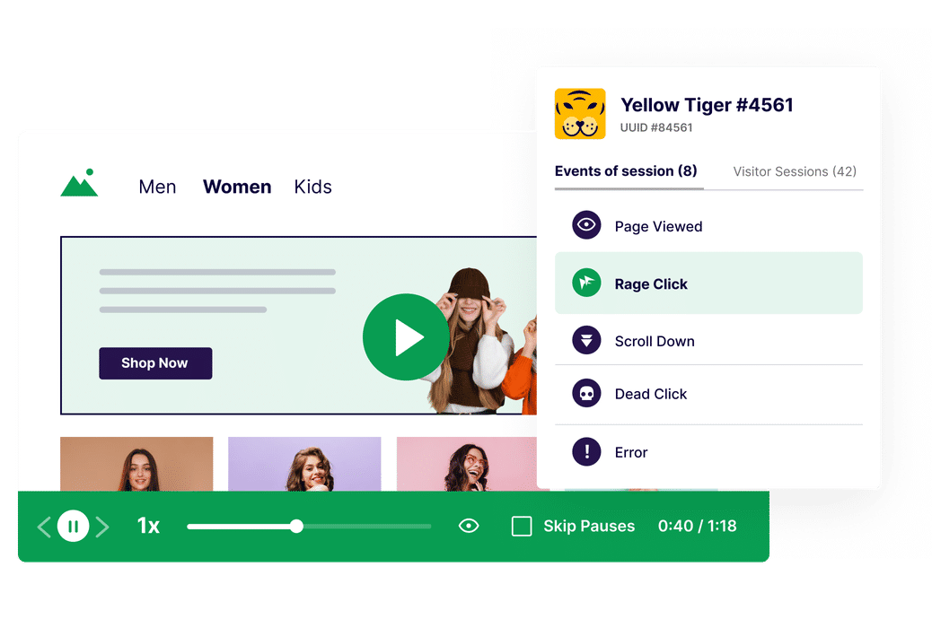
Additionally, session recordings show you exactly where visitors click and move around the page. Which element are they clicking the most? Are they clicking any non-clickable elements? They help you find these nitty-gritties.
Let’s say you observe that visitors aren’t scrolling down and hence can’t see a form at the bottom of your page. Just moving it up might not be enough if there are usability issues within the form itself. This is where form analytics becomes valuable for field-level analysis.
Further, surveys allow you to directly gather feedback from visitors on how to improve their experience. Using these insights, you can make more holistically informed decisions about content arrangement on your web pages.
And you guessed it right, VWO has all these features that simply make your visitor behavior research a well-connected exercise, saving you a lot of time and giving you ample insights.
Decide a strategic placement of key information
When armed with a reliable scrollmap report from VWO, you can strategically organize your page content based on its importance and the desired visitor actions.
For instance, if scrollmap reports reveal that visitors are not engaging with sign-up buttons below the fold, consider placing these CTAs prominently at the top of the page. Alternatively, arrange the content in a logical sequence that addresses visitors’ primary needs and inquiries first, with supplementary details presented further down the page.
Similarly, if a poor scrolling pattern is observed on your product page, prioritize showcasing product details and images above the fold, followed by testimonials. Visitors often seek reviews after examining the product closely. By placing testimonials within immediate view, you can ensure visitor engagement without the need for scrolling. Adopting such strategies across all your webpages can enhance visitor experience and drive desired actions.
Ensure content quality and relevance
Every piece of content on your website should add value for visitors. If scrollmaps show visitors scrolling past content you thought was valuable, it’s a sign your copy needs to deliver more value. This is especially important if you notice more visitors bouncing from that page.
Do you know what copies are turn-offs? Talking about your company instead of focusing on solving visitors’ problems. For instance, if you run a family-owned agency and have a home page with self-centered details like ‘We’ve been in business for over 50 years’ – save that for your ‘About Us’ page maybe. On the homepage, you should focus on addressing how you’ve been meeting visitors’ needs and highlight the benefits they’ll gain from your services.
Quality content and relevance are paramount in keeping visitors engaged and interested in exploring further, encouraging them to continue scrolling and discover more about your offerings. Scrollmaps help you understand the pulse of your visitors by revealing whether they are connecting with your content through colored patterns.
Understand the placement of visual cues
Visitors often think they’ve reached the end of a webpage and leave, missing out on more content—a ‘false bottom’ effect. VWO can help spot these tricky areas with cooler colors.
Based on the insights gathered, you can place visual cues to encourage visitors to keep scrolling. You can do this by adding subtle animations or arrow icons to indicate more content below. Parallax scrolling effects can also create an engaging experience.
Break up your content with appealing section dividers or progress indicators to show visitors their progress. Use vibrant images and graphics to capture curiosity and keep visitors exploring. Consider scroll-triggered animations or pop-ups to maintain engagement.
For instance, on a fashion website, scrolling is preferable to switching pages for browsing apparel. To encourage prolonged scrolling, you could add a “load more” button after visitors have scrolled and viewed numerous products.
Additionally, ensure swift page load speed to prevent visitors from prematurely leaving due to slow loading times, mistakenly believing there’s no content left to explore.
Brands that have benefited from using scrollmaps
Scrollmaps benefit brands across various industries. We have selected three brands that utilized our scrollmaps to delve into behavior insights for shaping their optimization plans.
Elegant Steps improved conversions by 200%
Elegant Steps, a UK-based shoe retailer, observed low conversion rates on its mobile website. To address this issue, its digital marketing agency conducted a thorough investigation using data from Google Analytics, along with heuristics and VWO’s scrollmaps and heatmaps solutions, to uncover key insights. They found:
- Limited engagement with the “Shop by Brand” section on the homepage suggested low visibility or interest.
- Key USPs, like free shipping, were not prominently featured above the fold on mobile, along with text readability issues due to image overlay.
Based on these findings, adjustments were made, increasing conversions by 200%.
Therefore, we see that scrollmap analysis provided insights into visitor behavior, indicating areas of limited engagement and visibility on Elegant Steps’ mobile website. Accordingly, the team made adjustments that improved experiences and ultimately resulted in a significant increase in conversions.
Ubisoft increased sign-ups by 12%
Ubisoft Entertainment, a prominent French video game publisher, is known for managing successful franchises like Assassin’s Creed, Just Dance, Far Cry, and For Honor. To improve lead generation and conversions on the Buy Now page of their website, they started with an in-depth analysis of visitor behavior.
By leveraging insights from scrollmaps, they hypothesized that streamlining the purchasing process and minimizing vertical scrolling would enhance visitor engagement, addressing a current issue identified in scrollmap analysis. Subsequently, a test aligning with this hypothesis yielded a notable 12% increase in sign-ups.
Sometimes, we think that to increase lead flow, we need to make significant changes, such as redesigning the entire website, launching a new marketing campaign, or offering substantial discounts. Yet, just by enhancing the scrolling experience based on scrollmap insights, along with a few other tweaks, they managed to increase sign-ups.
Bandwidth increased visit-to-lead conversion rate by 12%
Bandwidth, a company based in North Carolina, is a leader in Communications Platform as a Service (CPaaS). They noticed that the SMS API page on their website wasn’t performing well in turning visitors into leads. This insight came from studying heatmaps and scrollmaps provided by VWO, showing low engagement and scrolling on the page.
Their hypothesis centered on enhancing the above-the-fold experience, optimizing information architecture, and refining value proposition messaging to drive overall conversion rate improvement. Implementing these changes resulted in a noteworthy 12% increase in visit-to-lead conversion rate for the product page.
As you can understand, leveraging insights gleaned from scrollmaps, the company strategically tailored their web content to better meet the needs and preferences of their audience, ultimately driving higher engagement and conversion rates.
Conclusion
Businesses sometimes use the ‘Guess and Check’ method to validate visitor problems they believe exist, but it may not always be effective.
They keep delaying research thinking they need to start perfect, with all the tools and expertise at their disposal. Well, you may start with something simple yet effective, like analyzing scrollmaps. If needed, you can complement them with more advanced behavior analytics tools later.
VWO offers a range of behavior analytics tools to assist you. The key is to get started and tap into these valuable reservoirs of visitor behavior insights. Because if you don’t do it now, your competitors will get miles ahead of you.
If you’re interested in exploring all the features of VWO Insights – Web, you can take a free trial and prepare to uncover intriguing details in your site’s scrollmaps.



![10 Best Enterprise Analytics Platforms [2026]: Expert Picks with Reviews and Comparisons](https://static.wingify.com/gcp/uploads/sites/3/2025/08/Feature-image-10-Best-Enterprise-Analytics-Platforms_-In-Depth-Reviews-and-Comparisons.jpg?tr=h-600)


