

I really couldn’t understand this at first.
After all, we live in the modern age of social media, content marketing, and all that good new web stuff, so why do we still need to worry about collecting emails?
I mean, email was invented in 1978, and it’s as far from modern technology as the original Dodge Magnum (introduced in the same year).
Download Free: Landing Page Optimization Guide
So What gives? Why is eMail Still a Thing?
Well, the answer’s actually pretty simple…
No matter if we like it or not, no matter how much spam there is out there, no matter how unimpressed we are looking at our inboxes, email still works. And not just “kind of works.” It works better than any other channel.
According to eMarketer, for example, email marketing was cited as the most effective digital marketing channel of 2014 for customer retention in the United States. Although that was one year ago, we have every reason to believe that the situation hasn’t changed much since.
So today, we’re taking the lazy marketer’s approach and discussing how to improve your newsletter subscription conversions on pages that you already have on your site. No new content is needed. Particularly:
- What’s great about homepages and how to improve conversions on them.
- How to utilize your About page.
- Your Contact page – the hidden opportunities.
- Your main Blog page.
- Putting blog comments to work.
- Clients page – how to use other people’s words.
- Product pages – why you don’t want to do anything here.
- Services/Speaking/Consulting page – kill two birds with one stone.
- Deals and Coupons page – how to give people more of what they already want.
- 404s – why those provide seemingly unlimited opportunities.
- FAQ page – how to give your audience even more answers.
General Assumptions and Setting Things Straight
Before we get into the individual pages, let’s first discuss some general assumptions.
With specific opt-in form placements and optimizing their performance being one side of the coin, there’s also the other side that we need to address.
By far, the most impactful factor that contributes to your overall conversion rates for email signups is how good your actual email offer is.
In other words, if you don’t have anything of value to give away in exchange for subscribing, very few visitors will ever take you up on that offer.
For instance, just displaying a subscription form with no incentive and expecting people to start signing up enthusiastically isn’t a viable strategy in 2015. The modern visitor always asks what’s in it for them (albeit subconsciously). And if they can’t see a straightforward answer, they won’t subscribe.
Visitors won’t subscribe unless you clearly show ‘what’s in it for me?’
Offering the right thing in exchange for the sign-up can really mean the difference between success and failure. Something we shared in a case study at CodeinWP, for example, is that matching email offers with specific blog posts resulted in 831%-1613% better conversion rates (other factors were at play too).
At the end of the day, no amount of optimization will provide you with worthwhile results if your main email offer is lacking. So start there. Create an awesome incentive for your audience. Make it something that they desperately want.
1. Optimizing Your Homepage
Many websites get their homepages quite wrong.
But I guess it’s leftover of the old above-the-fold mindset.
These days, homepages are no longer about providing every possible bit of info in one very limited space.
Instead, homepages should have their specific purpose – a specific business goal assigned to them.
So the question to ask here is whether that business goal plays in well with the concept of collecting emails.
Here’s what I mean. Obviously, if someone subscribes to your email list then they won’t take any other action on the page. So for instance, if your main goal is to convince someone to click the buy button then optimizing for email conversions will negatively impact that goal.
No problem like that? Okay. Then try experimenting with these tactics:
Tactic #1: Use a two-step opt-in instead of a single-step opt-in.
A single-step opt-in is when you use an opt-in form on the homepage in its standard form. Whoever wants to subscribe, can do so right away.
A two-step opt-in is when, instead of the form, you display a button or a link. Then, once someone clicks it, a form appears and asks for the contact data.
Here’s an example:
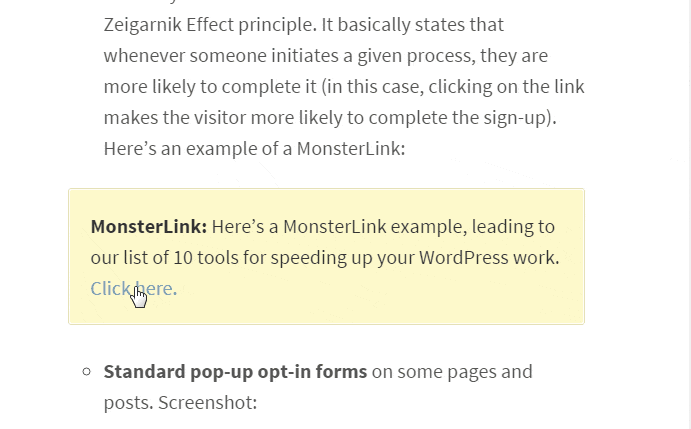
I believe the whole concept was first mentioned by the guys over at LeadPages (they reported that the technique increased their newsletter subscriptions by 60%)
The reason why this works is due to something called the Zeigarnik Effect. Whenever someone initiates a given action, they are more likely to follow through with it.
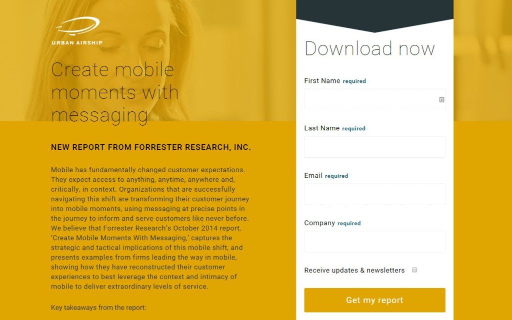
Tactic #2: Experiment with the number of required fields.
Common advice is that you should always try minimizing the number of fields you’re using in your subscription forms. For instance, by doing things like:
- not asking for a name if you don’t have to,
- not using a captcha field, and so on.
Basically, when possible, asking only for the email.
However, going the other way is also a strategy worth exploring.
Maybe increasing the fields you’re asking for can indeed work in your specific scenario. Maybe people in your niche have already grown quite suspicious of all the free resources that only ask for an email.
For instance, MarketingProfs.com sometimes uses more elaborate forms when giving away their free reports. They tend to ask for things like, the First Name, Last Name, email address, and company name. That’s a lot of info! And since it is MarketingProfs we’re talking about here, it’s hard to believe that they don’t know what they’re doing.
Example:
Tactic #3: Add social proof.
The harsh truth about doing business on the web is that not everyone will trust you right out the gate. And it’s hard to blame them, honestly.
Therefore, try improving your authority by displaying various social proof elements next to your forms. For instance:
- client logos,
- testimonials,
- logos of media sites that wrote about you.
Tactic #4: Experiment with the placement of the form itself.
I’m assuming that you’re probably using a custom homepage template rather than a standard blog listing. If you’re not, it’s high time to consider making the switch.
The great thing about custom homepages is that they’re … well, custom. This means that you can put anything you want on them, and then switch the order of things to see what works best.
Unfortunately, I can’t give you any specific how-to advice here. This all depends on your current theme and what it allows you to do.
If you want to test out a quality free solution, try going with something like Parallax One or Zerif Lite- One of the top 10 most popular themes in the WordPress.org directory. They are both geared at providing extensive homepage customizability.
And if you plan to A/B test the WordPress themes as well, then you can rely on VWO Testing.
2. About Page
Your About page is a great place to try getting additional email subscriptions, regardless of what your main offer on the site might be.
About pages are quite unique when it comes to the type of visitor they attract. Mainly, someone coming to your About page isn’t quite sure if they can trust you yet. They just want to find out something more about the site and what it has to offer.
At this point, the visitor is probably not ready to pay you, but they can be interested in getting something for free (via email, for example).
Tactic #1: Add opt-in forms throughout the text of the page.
This can be done with every email service provider. Just take the HTML code for the subscription form, and place it:
- after the second or third paragraph,
- at the very end,
- one more time somewhere in the middle of the page, provided that the copy is long enough (you don’t want to be pushing it too much if the page doesn’t have enough text).
(I don’t advise using any plugins here. Most of them only allow you to display the form once.)
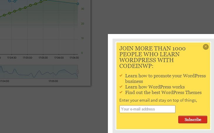
Tactic #2: Include an on-exit pop-up.
Not everybody is crazy about pop-ups, but in some miraculous way they still work. Some stats even claim that pop-ups drive 1375% more subscribers than standard forms.
One of the possible uses for pop-ups is reaching out to someone who is just about to leave the page. Hovering the mouse cursor near the back button triggers the subscription form to appear.
Example full-screen pop-up:
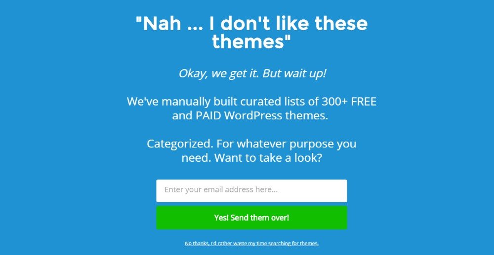
You can use various free plugins to achieve this effect.
Download Free: Landing Page Optimization Guide
3. Use Your Contact Page
Your Contact page presents one very interesting (hidden) opportunity.
Simply speaking, why use a standard contact form, when you can use a custom opt-in form in its place?
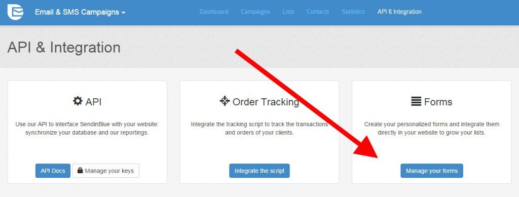
So in short, instead of using a plugin like Contact Form 7 or Jetpack, create a new embeddable form with your email provider, and then put it where the contact form used to sit.
To achieve this, just go to your current email service provider, create a new email list (you’re going to use it specifically for your “contact list”), and create a new sign-up form for it. Include all the standard fields (like Name, email, message). Also, add a disclaimer to let people know that by contacting you, they get subscribed to a dedicated list.
This is possible with all popular email companies, like MailChimp, or SendinBlue. I prefer the latter because they provide a more affordable solution if you want to run more than one list simultaneously and use autoresponders. They also let you create whatever number of subscription forms you need (even multiple ones for a single list).
About autoresponders. You’ll need them to send automated messages to whoever contacts you through the new contact form. Use this opportunity to ask follow up questions right away. This makes the communication more streamlined.
4. Your Main Blog Page
Your main Blog listing is a unique piece of real estate on the site. That’s because it caters to a particular kind of visitor. This visitor isn’t interested in any specific piece of content yet, but rather gives the blog a chance and looks for something that would grab their attention.
It’s therefore a good opportunity to show that visitor additional subscription options depending on their actions on the page.
Tactic #1: Use a slide-in form.
This type of form appears when the user scrolls down the page (usually when they’re around 50-70% in).
This can be achieved with a plugin simply called the Scroll Triggered Box. The plugin can handle any subscription form (any embed code), so it works with every email service provider out there.
Tactic #2: Use an on-click offer or a form in between the posts.
This is something we discussed when talking about the homepage – using a two-step opt-in. The principles are the same here.
However, if you don’t have the tools to use a two-step opt-in mechanism then at least have a standard form in between the posts.
Here’s an example by Quick Sprout:
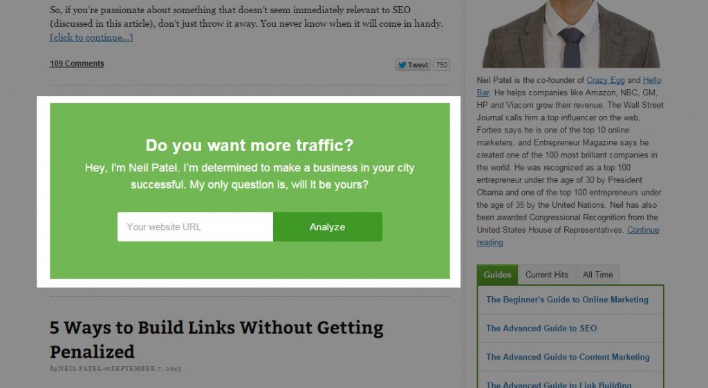
You can put your form in between posts 1 and 2, or 2 and 3.
5. Blog Comments
Okay, I know that blog comments aren’t necessarily separate pages, but they can still be used for accelerating your email list growth. After all, when people comment, they’re actively becoming part of a community. Taking an additional step to join your list isn’t that tough for them at that point. Here’s what I mean:
For instance, a plugin like Newsletter Sign-Up adds a subscription checkbox to your comment form (among other features). Whenever someone comments, they also get the opportunity to join your list. Quick and simple.
6. Clients page
A separate page listing your clients and their testimonials can be a great method to further grow your social proof. That being said, it’s also a great way to catch the reader right when they’re building trust with you.
To capitalize on that, don’t forget to include a subscription form right after the list of your clients and their testimonials. In fact, having testimonials along your lead generation elements can result in growing your conversions by even 50%.
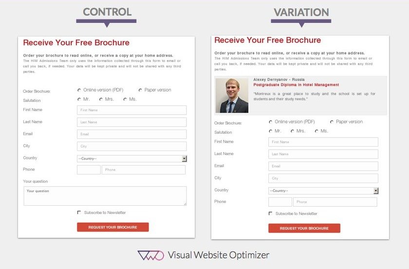
This works similarly to the opt-in form on the About page – you’re inviting the visitor to subscribe and learn more about your stuff right when they’re beginning to show interest.
7. Product pages
I’m including product pages on this list only to actually discourage you from trying to optimize them for email conversions.
Sometimes it’s easy to lose yourself in the trenches and forget that product pages shouldn’t be about anything else other than selling the actual products.
Here’s what I mean. Depending on the theme you’re on, and the store solution you’re using (like WooCommerce), some parts of the product page’s template might include various sidebar widgets automatically. So you might end up with opt-in forms on those pages even though you didn’t put them there.
In short, go through your product pages and product category pages, and remove all opt-in forms from them. You don’t need them there. Not even pop-ups.
Here’s an interesting discussion we had with the Founder of Frictionless Commerce, Rishi Rawat, where he shares how you can increase sales by optimizing your product pages in the right way.
8. Services/Speaking/Consulting page
Here, we’re doing something similar we did with the Contact page, which is switching your contact form to an opt-in form.
The Services/Speaking/Consulting page is another place where the reader is highly interested in you and wants to reach you directly. Putting them through an opt-in form is therefore an opportunity worth exploring.
Again, an opt-in form allows you to set an automated response right away. You can ask a range of follow up questions, and effectively start talking with the client right away.
9. Deals and Coupons page
People love free stuff. And exclusive Deals and Coupons can be especially interesting to your audience, provided that you’re in a niche where they make sense.
The great thing about deals is that people never have enough of them. Therefore, offer them additional deals and coupons via email, as part of your newsletter.
Use a custom form for this, and put everybody who subscribes on a separate list.
10. 404 pages
I really think that 404 pages are a source of seemingly unlimited opportunities. Whoever comes across your 404 page is going to be a little confused, and hastily looking for an answer.
This is a great moment to offer them your best content, case studies, or some other perks if they subscribe to your email list.
Quite frankly, if you really want to go extreme here, your 404 page doesn’t need to feature anything else other than the opt-in form.
The guys over at LeadPages demonstrate the principles behind this in one of their videos.
11. FAQ page
A FAQ page is meant to provide answers to the most commonly asked questions by your audience.
So why not take it even further and offer them a set of tutorials or additional how-to guides that have been pre-formatted for readability and easier overall access. In other words, give them answers that are easier to digest and can be used in a more handy form.
To achieve this, again, you need to segment your list and use a custom opt-in form with its own automated response.
12. ?
The FAQ page concludes my list, but maybe you have some ideas of your own? What other pages can be used to optimize email conversions? Feel free to let us know by sending us an email at marketing@vwo.com!
Categories:


![7 Best Website Monitoring Tools [2026]: Expert Insights to Help You Pick the Right One](https://static.wingify.com/gcp/uploads/sites/3/2025/02/Feature-image-7-Best-Website-Monitoring-Tools-How-to-Pick-the-Right-One.jpg?tr=w-300,h-150)


