Over the past decade, the entire shopping ecosystem has undergone a massive change. Where people once enjoyed shopping at local brick-and-mortar stores for all their needs, today they’re happy browsing through wide varieties of commodities online and making purchases as per their comfort and convenience. The shift has brought much good to the eCommerce companies in terms of incremental revenue growth, global customer base, and faster business expansion. However, it has also put them in a critical position of keeping pace with the ever-increasing, ever-evolving needs, and demands of the people.
Download Free: A/B Testing Guide

Experience optimizers across the globe suggest that the best way eCommerce businesses can survive today’s market heat, maintain their customer base, and ensure revenue growth is by investing much into modern marketing activities and focusing their energies on testing and optimization. These have the prowess to provide seamless and frictionless customer experiences and help businesses succeed.
Assuming you’re already familiar with modern marketing activities and their importance in today’s time, we’d like to jump directly to the benefits of eCommerce testing and optimization, key challenges, and website areas and elements that you must test.
Analyze your eCommerce website for free
What is eCommerce testing? Why is it important?
eCommerce testing can be defined as the process of testing various eCommerce website elements, such as design, specifications, functionalities, pages, and features, to check their sanity and ensure they’re not harming the performance of the site in any manner possible.
When done correctly and continuously, testing can not only improve your site visitors’ overall experience but also significantly increase conversions. Mentioned below are some reasons explaining the importance of testing and optimization.
1. Improve user engagement
As stated above, testing helps check the hygiene of a page element. It tells us which page element or process affects a user’s onsite journey and helps us rectify the issues faster. The better the user experience, the more shall be the onsite engagement.
2. Generate marketing strategies
Testing and optimization allow you to make effective plans for your website. By reiterating your site’s problematic areas, you can engage more people and also increase their stay.
3. Reduce risks
Many times, making major and considerable changes to your site can cause notable strategic changes or even trigger significant losses. However, testing these changes in a planned manner can help eliminate the chances of these uncertain losses.
4. Increase conversion rates
Since you’re testing almost every aspect of your website and ensuring a smooth visitor experience through site optimization, your conversion rate is bound to increase.
5. Better understanding of visitor behavior
It’s often difficult to map your website visitors’ needs and preferences and optimize your site accordingly. But with testing, everything is possible. It’s one of the best and quickest ways to confirm what your visitors like.
What should you know before you run an eCommerce test?
From the source code to product pages, you can test the viability of every element of your website using an extensive range of testing methods. Some of the most common methods are as follows:
- Functional testing
- Usability testing
- Security testing
- Performance testing
- Database testing
- Mobile application testing
While each of these methods has its own rules and regulations, running multiple tests using multiple testing methods at the same time can cause chaos as well as disrupt test results. Hence, it’s always advised to run one test at a time or use a good testing tool like VWO that enables you to run multiple tests simultaneously without one overlapping the other.
Given this fact, you must prioritize the order in which you want to run tests based on the test’s impact on your brand’s overall conversion rate. Theories like agile testing, which is used by teams conducting software testing, can help you find the balance.
Logically, focus on significant bugs and software flaws that impact everyone through mobile app testing and website testing first. Once you’ve addressed these issues, then look at the minor bugs.
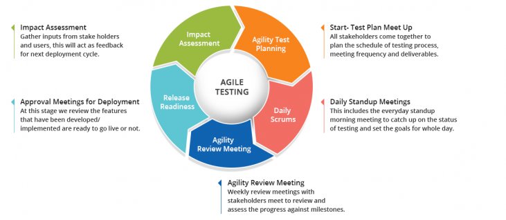
Furthermore, it’s always a good idea to evaluate your test ideas and testing techniques on a regular basis because a poor website testing strategy can lead to loss of customers, revenue, and even jeopardize your brand’s reputation in the market. You must always carefully outline the testing scope, set the objectives, check it’s viability or chances of success, and estimate efforts in a time frame.
What are some key issues related to eCommerce testing?
The underlying principle behind a good user experience (UX) is to make life easy for your visitors. Every task on your website should be intuitive. You want people to be able to navigate around your website or application with minimum fuss.
While these principles are straightforward, it’s their implementation where things get tricky. A lot of factors play into the user experience. Think of all the stages of a user’s journey and test them from the first click on a product to the shopping cart.
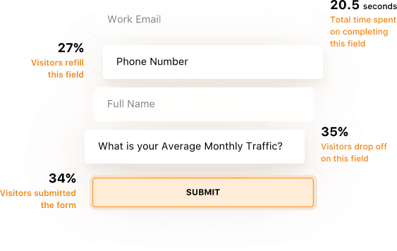
For example, through form analysis, you can track how people are interacting with various input fields. This information provides you with insights on where users are experiencing problems. You can use this data to develop a hypothesis and run a test to check whether your assumptions or assertions are correct.
1. Testing for bugs
Regardless of how well you develop your website, there shall always remain some bugs in your wireframe that may disrupt your site’s functionality or hinder the visitor’s journey. While developers once couldn’t do anything about these bugs, today, they can use testing to fix these issues and create seamless UI/UX designs.
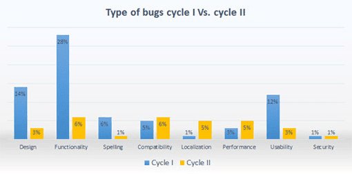
Some of the most common bugs that you may find on your eCommerce website are as follows:
- Browser compatibility problems
- Broken links
- Inconsistencies in the catalog
- Shopping cart issues
- Checkout bugs
According to a study by QualiTest, most of the bugs that sites encounter are of medium severity. These do not impair the usability of the site. However, they do have the potential to impact the eCommerce conversion rate and overall business sales.
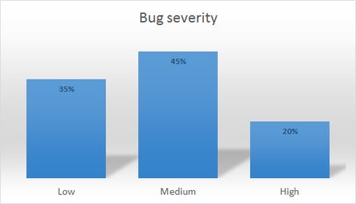
When managing an eCommerce store, it’s essential to put a system to identify bugs and eliminate them as soon as possible. It is especially important to have a quality assurance strategy in place when undertaking any sustained eCommerce testing.
2. Testing conversion rates
Your eCommerce conversion rate ultimately defines the success of your business. The higher the conversion rate, the higher shall be your business’ revenue. Understandably, given the importance of sales to any business, conversion rates focus on extensive eCommerce testing.
There are various stages to any conversion rate optimization test. The first stage is to set objectives and determine the most suitable type of test. Your choice must always be based on data, rather than pure intuitions. For example, if you decide to review your brand’s purchase cycle, ensure to data back all your decisions.
The next step is to test and gather available data and form a hypothesis. Tools like heatmaps, form analytics, scrollmaps, session recordings etc. can help analyze user behavior and provide useful information. Always gather enough information before running a test to ensure you’re moving in the right direction.
Standard statistical testing methods include A/B testing, split testing, and multivariate testing. You can use this A/B duration calculator to determine how long a test on your site will take.
Which site areas and elements should you test?
The ultimate goal of every test is to increase the conversions and revenue of your eCommerce business. You want to focus on running conversion optimization tests that provide the maximum return on investment. There are certain areas of your eCommerce website that you will naturally target to ensure a seamless visitor experience. Some of these are as follows:
1. Search and navigation
Site search and navigation are two of your website’s primary elements extensively used by your visitors to explore your website or mobile app. Ensuring they’re free of bugs and promise a frictionless experience must always be your top priority.
Best Choice Products, an eCommerce website selling garden, music, children, and fitness products, illustrates the importance of testing your navigation. As part of a round of eCommerce A/B testing, they ran a test on their mobile navigation and search bar. They hypothesised that by improving the visibility of the search bar on the header will improve user penetration into the website. The control and variation version of the test are as follows
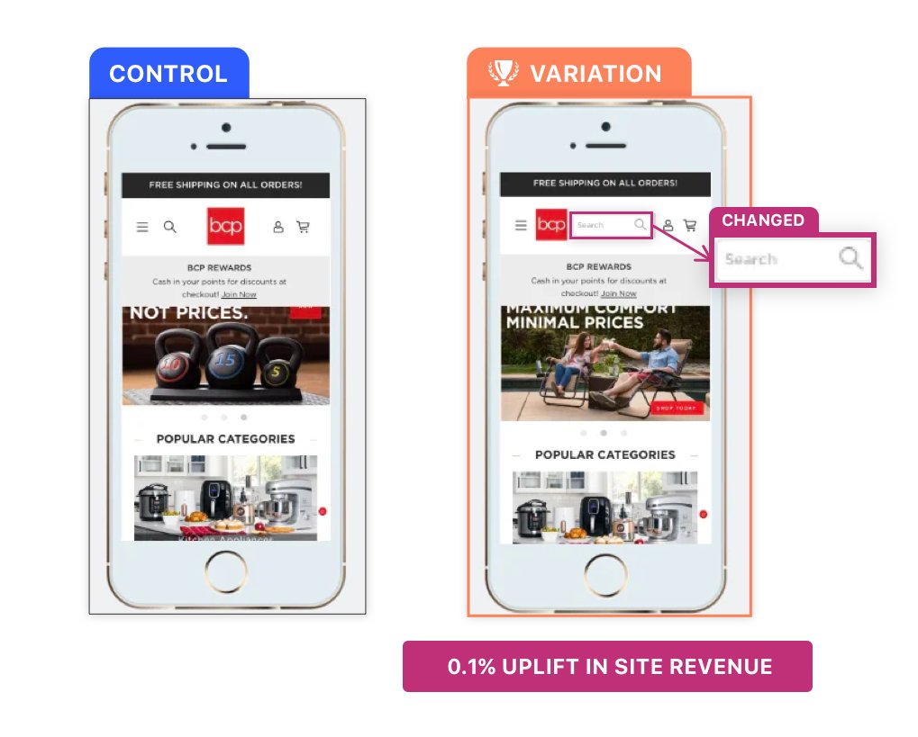
Running the test for about 7 days, the execs at Best Choice Products witnessed that visitors were engaging more with the search functionality. A minor change on the header resulted in a 0.1% increase in site revenue. It may not have been a game changer, but it did help the company get more revenue than before.
2. Homepage design and features
The homepage is one of the most important pages of any website, for it represents the face of your brand. Even if it’s not your primary landing page, it still deserves to be one of the most intricately designed pages. You need to offer great user experience and ensure that everything works as it should.
There are numerous forms of eCommerce testing you can run on your homepage. One thing which is becoming increasingly accessible to sites across content management systems is website personalization. The Very Group’s website is a perfect example to quote here.
Based on a visitor’s geographic and demographic information, the site shows personalized homepages to each of its visitors. For instance, and as visible in the image below, if a customer lands on Very’s homepage during the winters, it displays a collection accordingly. Meanwhile, if the customer belongs to a country experiencing summers, the website personalizes user experience accordingly.

Personalized homepage and landing pages open new and exciting avenues for eCommerce testing.
3. Product pages
A visitor to your eCommerce store will either land directly on a product page or eventually navigate to one. Once there, you want them to purchase the product. Ask yourself, what does your potential client need to know about this product or service to get them to my payment gateway? What can I do to increase the likelihood of a person adding a product to the shopping basket?
Unfortunately, there is no one answer to these questions.
You will need to run tests to see what changes you make to the product details page that get your business the best results. For example, you can test if adding elements that emphasize on scarcity or urgency would boost sales.

(Image source: Neilpatel)
Other elements on a product page you can test include your CTA, social proof, images, videos, recommended products, featured products, etc. Changes to any of these elements have the potential to increase conversion rates to the shopping cart and onto your payment gateway.
Download Free: A/B Testing Guide
4. Shopping cart and checkout process
It is a well-known fact that cart abandonment rates are high. According to BigCommerce, the average cart abandonment rate is 69.23%. This is the number of people who put a product into their cart and leave without making a purchase.
There is a large body of information on why people abandon a shopping cart during an online purchase. The graph below illustrates some common findings.
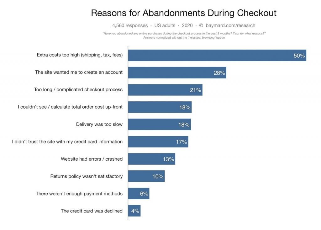
Improving your checkout and payment system revolves around addressing some or all of these issues. The eCommerce website Zalora offers an insight into how eCommerce testing on checkout pages can improve conversion rates.
They ran an A/B test on their checkout page, testing how they could emphasize the free returns policy for some products. The control is on the left, and the variant is on the right.

The variant outperformed the control by 12%. This small change to the design of the checkout page caused an uplift in the checkout rate.
There are, of course, other elements to test. Adding more credit card payment options, security logos, social proof, and more can all lift your conversion rate. The important thing is to instill a culture of testing into your company, and experiment to discover what works.
Optimizing your shopping cart experience for conversions is one of the quickest ways to increase sales. Running these tests is a lot easier than you might imagine. Try VWO now to see for yourself.
5. Site performance across devices
As mentioned earlier, people are accessing your website through an increasing range of devices. A study by Statcounter shows that 52.03% of the world population accesses the internet through mobile.[5] At a basic level, it’s essential to have responsive websites. This allows you to adapt your site to different devices and screen sizes.
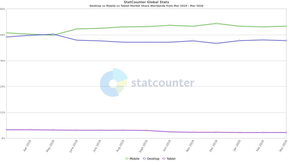
However, even if your site is responsive, you can still encounter problems. Cross-browser compatibility issues are common. To further complicate matters, the OS a website is accessed on, the screen’s size, and the internet speed all impact user experience.
As you are no doubt aware, there is a clear correlation between the amount of time a page on your site takes to load and the likelihood of someone making a purchase. The graph below illustrates this point.
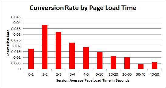
There is a high probability that your website’s page load time is optimized for desktop because for most sites it is. However, mobile load time can vary tremendously. You must implement technical solutions that address problems like this alongside optimizing your eCommerce website copy and design elements. Every step a user takes through your website is part of their user experience.
Watch how to build a customer-centric e-commerce business with experimentation
Summing up – eCommerce testing
A culture of testing will play an important role in the success of your company. Ensuring a smooth user experience is essential to customer retention. Meanwhile, updates to a site design through conversion rate optimization can have a significant impact on profits.
In this guide, we looked at the importance of eCommerce testing. We covered the types of tests you can run on your site and discussed some of the practicalities of running these tests. Finally, we discussed some of your eCommerce store’s most important elements to test, backing up each point with data and case studies that illustrate why it matters to your business.
Note: The author owns screenshots used in the blog.


