

A visitor lands on your website wanders about the various category pages, and then clicks on a product. It’s the moment of truth, and you ought to have well-designed eCommerce product pages to increase the stickiness factor. You need to make sure that the page is neither too simple nor stuffed with too much information. Since visitors cannot touch, feel, or even wear your products before purchasing, it is your product page’s design and content that determines whether or not a visitor turns into a buyer.
Download Free: Website Redesign Guide
Many eCommerce marketers swear by CRO as the most effective means to increase their online store’s conversion rates.
To figure out which design works best for them, marketers use heatmaps, A/B testing, form analysis, and so on to gather visitor behavior data and make changes to pages accordingly.
To help you begin, here is a checklist of industry best practices that can help you master your eCommerce product page designs, and ultimately increase conversions:
List of 14 eCommerce product page best practices
1. Use big and clear images:
One research indicates that 49% of marketers rate visual marketing as very important to their marketing strategy, and 19% say that their strategy is nothing without visual content.
This figure holds even greater significance when it comes to eCommerce product pages.
- The image on your product pages visually communicates the details of your product to visitors. Therefore, one of the main eCommerce product page best practices is to use an image that is high-resolution and zoomable and place it above the fold. Plus, using multiple photos clicked from different angles to give visitors the overall look of products added an extra edge.
- Images have a huge impact on the usability and overall UX of the website as well as increasing conversions and sales. For product page photos, you should be mindful of download time. You need to keep in mind that not everyone has a super-fast. An Internet connection and high load time can negatively affect the bottom line.
- Leverage visual commerce – connect closely with your customers by asking them to share photos of them clad in your products, on your website. This would help both as social proof as well as will influence and inspire others to buy.
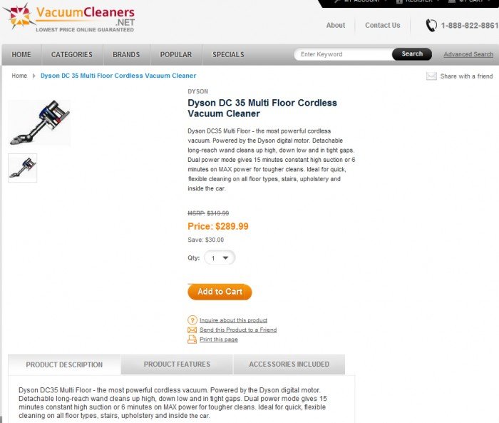
- Larger product photos have worked for brands like Hyundai, who used VWO to run a multivariate test and increased requests for test drives by 62%. Small product photos, on the other hand, can repel the user off. For example, this vacuum cleaner image only makes the page, and the website as a whole, look unprofessional and non-credible.
2. Add a prominent call to action:
If you make a list of the most important elements in eCommerce product pages, the call-to-action (CTA) button would be right up there:
- A CTA could be an add-to-cart button or a buy-now button, or anything else. It has to be easily recognizable and should compel the visitor to act.
- Different colors denote different things across different cultures. When deciding on color, keep in mind two things. Firstly, whether that color triggers the emotion in your target audience that you are hoping for. And secondly, how does it contrast with the color scheme of the rest of the page? Ideally, you want the CTA to stand out so that it grabs customer attention.
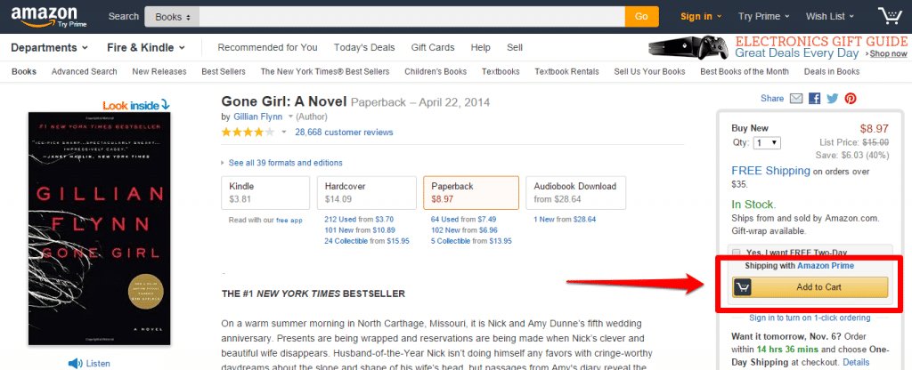
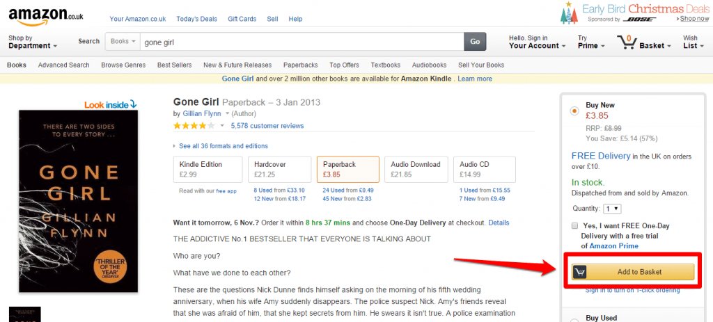
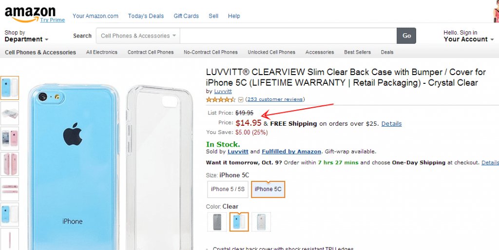
- When deciding on the text, keep in mind that certain words mean different things in different countries. For example, see how Amazon changes the CTA text on its US and UK websites to adhere to the local flavor:
3. Ease navigation between pages:
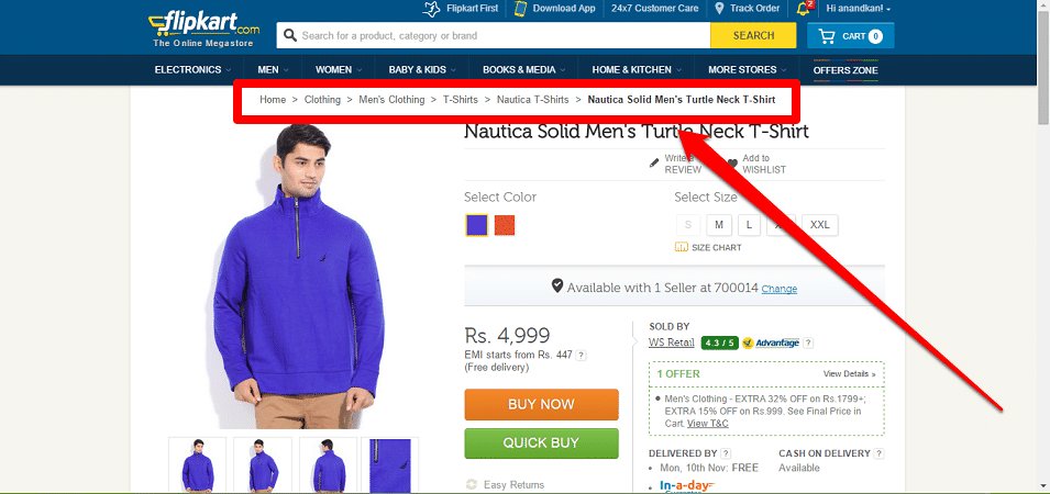
Use breadcrumb navigation to let users know where they are. Breadcrumb navigation helps visitors understand the product hierarchy as well as navigate to other areas of interest. They are also known to reduce bounce rates.
4. Create urgency:
Another eCommerce product page best practice is to enforce the scarcity/urgency principle – products that are selling out fast can make users convert quicker. Here is why scarcity is one of the most effective conversion strategies: Airlines often follow the scarcity principle to sell their last few tickets. The takeaway? Don’t give your customers unnecessary time to mull over the purchase. Create a sense of urgency to make them act instantly.
Your scarcity/urgency weapon could be the last day of an offer, the last 2 hours of free shipping, or the last 3 items in stock. Create your own arsenal.
Analyze your eCommerce website for free
5. Jazz it up with videos:
Remember that customers can’t touch or feel your product, and a demo video is one of your best bets at displaying it in all its glory. A nicely done video can have a huge recall value, and instructional videos assume even greater importance when you are trying to sell something rather complicated.
Stacks and Stacks found that those shoppers who saw videos on its product pages were 144% more likely to add a product to their cart. For the number-hungry, here are some interesting stats on why product videos can no longer be ignored by eCommerce stores that want to keep going strong in the existing market situation.
6. Compare prices:
If you are offering awesome discounts, show them the numbers. If you are not offering awesome discounts, still show them how much they will end up saving on a purchase from your site. Always, give a comparison of the actual price and the discounted price. Show both the percentage savings as well as the actual savings made on the purchase. Different customers are induced by different messages.
Don’t give your customers even the slightest chance to leave your site to check out prices at other stores. Position the pricing details as well as other information that can trigger the buying decision close to your CTA. Trinity Insight understood this and increased sales for its client Taylor Gifts by arranging all relevant information in one section on the product page.
Download Free: Website Redesign Guide
7. Add trust badges and customer reviews:
Online fraud is on the rise. It is therefore imperative for ecommerce websites to establish credibility and trust with their customers. Adding a small message of guarantee, highlighting social media mentions, or displaying safety logos or trust seals can boost conversions and customers’ confidence in your online business.
Take Express Watches (a UK-based online watch retailer) for example, which ran a simple A/B test, changing the message on the image from ‘Never Beaten on Price‘ to ‘Seiko Authorized Dealer Site‘. And, do you know what happened? It registered a whopping 107% increase in sales! You will find more interesting facts and figures on online security in that post.
Apart from the trust seal, customer testimonials and reviews also play an important part in the purchase decision:
- According to YOTPO’s report titled ‘The State of eCommerce: Yotpo Benchmark Report’, conversion rates of reviews shared by consumers on social media are as follows: 5.3 times higher for LinkedIn, 40% higher for Facebook, and 8.4 times higher for Twitter.
- As per Brightlocal’s research, 69% of consumers feel positive about using a business with reviews describing a positive experience.
Ask people to rate reviews. This ensures that the most helpful reviews rise to the top.
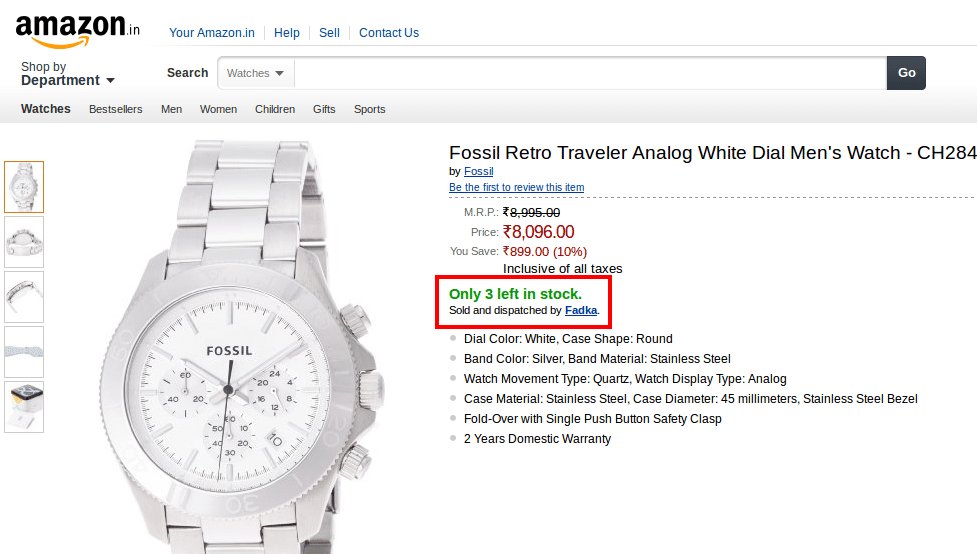
8. Keep the stock meter updated and prominent:
If you are running low on stock, don’t wait till the checkout page to break this news to the customer. That’s a sure-shot way of being at the receiving end of expletives that never find verbal expression.
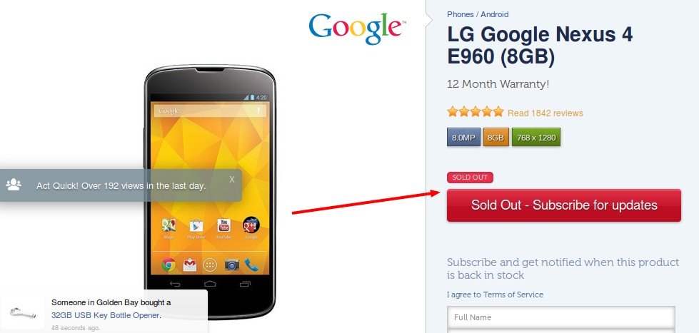
Your product page should correctly inform the visitor if the product is available or not. When the “Not-in-stock” information is out there in the open, visitors have the choice to move on and look for alternatives. But if you wait to inform them while they’re filling in the credit card information, it’s almost certain they’ll abandon the cart and move elsewhere, and possibly never return.
9. Write crisp and informative product descriptions:
The best eCommerce product descriptions create an impression at once. They communicate value, get people excited, and make them switch from visitors to customers instantly. Keep product descriptions short and make sure to include important keywords so that the page ranks well in search engine rankings. A high-converting description is not just appealing but also offers complete information and answers the following:
- Who is the product for?
- What is the product used for?
- How does the product work?
- What sets it apart?
- Why should visitors purchase the product?
- Why should visitors purchase the product?
Apart from answering these questions, your product descriptions should also be written keeping in mind the following tips for it to be conversion-worthy:
a. Speak to your target audience
Should your voice be serious and formal, or casual and funky? Should you emphasize the technical aspects of the products in your descriptions or concentrate more on their aesthetics? Understanding the main considerations of your customers is most crucial to make them relate to your descriptions, and buy your products.
b. Bridge the gap between features and benefits
A feature is essentially a fact about your product or offer. The benefit mainly answers how a feature is useful for your customer. Tell them exactly “how” a particular feature is useful for them, and “why” they should make this purchase.
Product descriptions that bridge the gap between features and benefits can lessen buyers’ guilt and ease the buying decision. For example, mentioning that a certain 100% organic cotton shirt is sweat-free and anti-allergy justifies its high price.
c. Rely more on verbs
Verbs are much more compelling than adjectives when trying to convince a person of something. Consider these:
This cute, little sleeping bag is perfect for your one-year-old baby.
Or,
This bright sleeping bag gives your baby plenty of room to kick and wriggle without the worry of getting tangled in layers of bedding. He will never wake up cold having kicked his bedding off. Your baby will feel safe even in unfamiliar surroundings.
Which one sounds more compelling? Decide for yourself!
d. Use jargon only when talking to sophisticated buyers
Excessive jargon that your customers do not completely understand can lead to confusion. It is best that you avoid it because if they don’t understand it, they won’t buy it.
But probably, you want to include the jargon because you think that it makes you come across as an expert. And you’re right. Using jargon adds to your credibility. This is especially true when you want to cater to sophisticated audiences.
e. Borrow from your ideal customer’s vocabulary
Joanna Wiebe, the Founder of Copy Hackers, mentions in one of her articles: “Don’t write copy. Swipe copy from your testimonials.”
In the article, she explains how she swiped the exact words from a customer testimonial for the headline, which increased conversions (click-through to the pricing page) by 103%. Here’s the testimonial that she used:
And, this is the winning headline that swiped words from the above testimonial:
Conversion experts swear by this technique and you can easily use it to write high-converting descriptions. It’s all about matching the conversation in the minds of your prospects.
f. Check for readability
- Use short or broken sentences: Yes, you got me right! Your English teacher in school probably didn’t approve of broken sentences. But this is no academic writing. Your sales copy or description should be about what is easier to read. If reading feels like a task to your customers, they will ignore your descriptions, eventually plummeting your conversions.
- Use bullet points: Most users scan pages on the Internet. They do not read word-by-word. Get them to notice the important points by listing them in bullets.
- Use larger and well-contrasted font: It’s annoying to read gray text on a white background, especially if it’s written in a smaller font size. Make sure that your font color easily stands out on the page, and that your font size and type are easily readable for your target audience.
- Don’t make your visitors squint their eyes to read your text and they will happily read more – provided your words make sense to them. Otherwise, they might just say “Chuck it!” and move on to some other website.
Don’t restrict the product copy to cold facts and standalone impersonal sentences. Of course, you need to tell your potential customers everything they need to know about the product being sold on your website. But since you are addressing real people and not aliens, do it in a manner they speak and understand.
10. Make the size selector user-friendly:
Size is one of the major deciding factors for anyone who comes to your website to make a purchase:
- For people across the globe, the definition of small, large, and extra large varies. Give them a size selector along with a size guide that will tell them the measurements in inches and centimeters.
- The placement of the size selector also matters. The best placement is right below the product and description. Use a pop-up size selector that appears while a user is hovering over a product image.
11. Help users explore and purchase related products:
As a business owner, you want the user to purchase add-ons, related products, and accessories of the products they buy. One way to achieve this is to provide good options for up-selling and cross-selling on the product pages. Good suggestions for similar products not only improve the browsing experience but also aid in product exploration.
12. Clearly enumerate shipping and return policies:
Don’t keep your customers in the dark when it comes to shipping charges. In an ideal world, a customer won’t want to shell out any money on shipping. But if you must charge them, be honest about it, and don’t try to sneak in the expenses in the checkout stage. Your customers will be mighty annoyed, and abandon the cart as well as your hopes of optimizing the checkout. Be clear on the return policy as well. Do they have 10 days to return the product, an entire luxurious month, or no such privilege at all? Spell it out clearly and leave no room for confusion.
13. Enable live chat:
You might think you have made your product page as user-friendly as possible with all FAQs answered, and have left nothing to the imagination of your users. But you never know. There’s no harm in investing in a live chat feature to enhance the customer experience. Here’s an infographic that gives some interesting statistics about the usage of live chat by online consumers.
14. Keep a check on your website’s speed:
So you are inspired and are thinking of embedding that high-resolution video, including multiple shots of your products, and introducing a live chat feature. Great going, but so much fancied-up information might leave your product page overwhelmed. Don’t ignore the loading time of your page in the pursuit of new goals.
Any eCommerce business worth its salt knows that being customer-centric is the secret ingredient to success and profitability. Watch the webinar to learn how to build a customer-centric eCommerce business.
Conclusion
People love eCommerce websites that speak directly to them. To be a successful eCommerce website, you need to understand what your visitors’ expectations are and then mold your website according to their needs.
All the pointers above have been tried and tested by thousands of eCommerce stores. But that does not mean you implement each of these ideas without testing them first on your own website. Every eCommerce store is different with a different set of target audiences, products, specializations, etc. And if you just replicate what another store did without testing, your conversion rates are bound to suffer.
Frequently asked questions (FAQs)
Product pages are a set of pages present on an eCommerce store that give visitors all the details about the product on offer.
In order to create a good product page, an eCommerce store needs to have a big and clear image, prominent call-to-action buttons, ease of navigation, and customer reviews.
Categories:


![[Gifographic] Better Website Testing – A Simple Guide to Knowing What to Test](https://static.wingify.com/gcp/uploads/sites/3/2021/01/Feature-image_Gifographic-Better-Website-Testing-–-A-Simple-Guide-to-Knowing-What-to-Test.png?tr=w-300,h-150)
![[Infographic] Why a Website Redesign Doesn’t Always Work](https://static.wingify.com/gcp/uploads/sites/3/2016/06/Feature-image_Infographic-Why-a-Website-Redesign-Doesnt-Always-Work.png?tr=w-300,h-150)


