

According to Harry Levi Hollingworth, the man who brought psychology into the world of advertising, an ad should accomplish 4 things in order to be effective:
- Attract the attention of the customer
- Focus that attention on the ad message
- Make that message memorable
- Cause the customer to take action
For a landing page to convert (step 4), we need to make sure that the first 3 steps are successfully completed.
Download Free: Conversion Rate Optimization Guide
To do that we need to first delve into the psyche of our customers to learn what motivates people to buy. We need to understand the three psychological triggers that can help us craft a landing page that will excite the minds of our audience, captivate their attention, and persuade them to take the desired action.
1. Relevancy
Before earning a conversion, marketers have to form a relationship with their customers. The catalyst that helps speed up that process is relevancy.
Many studies in the field of cognitive psychology have shown that prior experiences affect how we process new information. Most times, we do not approach a situation (in this case a landing page) with pristinely clean minds; rather, thanks to mental models, new situations automatically arouse prior feelings, associations, and knowledge that influence how we perceive the new task at hand.
A little more on Mental Models
Mental Models are ideas, images, and beliefs that we form from our past experiences. These models help us make predictions, allow us to take shortcuts, and guide our decisions.
This is exactly why social proof is so effective. The moment you see familiar names or images on a landing page, you become more comfortable because people or brands you already know about are linked here.
People react to different triggers and if the landing page does not “speak to them,” it holds no value or meaning, giving them no motivation to buy. If the visitors feel like the landing page is made for them, they will be more motivated to take the desired action.
Relevancy plays a crucial role in making a landing page more comprehensible. A landing page that is highly relevant to the target audience will mimic the exact experience of the user that the copywriter had intended while constructing the copy.
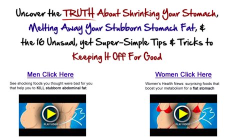
For example, take the sales page of a high-converting fitness product, Truth About Abs. To keep the page relevant to their target demographic, they offer two sales videos that are specifically targeted at each gender.
How Does Relevancy Make a Landing Page Memorable?
Before looking at this question, let’s first learn about one key part of the brain that plays an important role in long-term memory.
The hippocampus is part of the medial temporal lobe structure that plays a major role in the consolidation process where information from short-term memory is transferred into long-term memory to be retrieved at will.
It is also intimately involved in the process of both acquiring new memories and the retrieval of old ones. It is not a storage hub of memories, but a transit point between the working and long-term memory.
While users read through your copy, they are consciously and unconsciously being triggered by the different elements of the copy- page, headline, copy text, color, especially typography etc. Each of those elements acts as a cue for recollection of old memories, meanings and associations.
For people to connect and engage with your copy, it needs to be relevant to them. Dr. Michael Rosenbloom, a behavioral neurologist with HealthPartners Center for Memory and Aging, states that people retain knowledge that is “relevant to their own careers and interests”. For your landing page to convert successfully, it needs to be personalized so that your target audience can relate and associate with it. The landing page should “speak their language”. Doing this will help break the barrier so that the actual message of your copy can smoothly coalesce with your real-life experience. This can be done through personalization. Take a look at the example mentioned below:
Here is a quote that perfectly summarizes what makes something memorable:
“We remember what we understand; we understand only what we pay attention to; we pay attention to what we want.”
– Edward Bolles
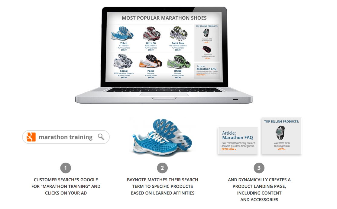
Using behavioral targeting and visitor segments to create relevant copy and landing pages
A surefire way to increase conversions with a relevant landing page is through behavioral targeting and segmentation. Factors such as a user’s browser, how they landed on your page, and even their screen resolution can tell you a lot about the user and this information can be used to customize their experience.
Targeting based on factors like geography, and demographics can also be used in conjunction with Behavioral Targeting.
Using this information, you can then laser focus your copy to target a common group of visitors that share similar interests and likes. You can even orient your copy to successfully satisfy the needs and wants, regardless of the customer’s position in the buying cycle.
Landing pages can be personalized using many variables such as the visitors’ location, age, device, search keywords, referring URL, and purchasing history.
By having your sales copy laser targeted for a specific group, you can increase conversions while minimizing outliers. A recent report from Verve Mobile shows that location targeting can more than double the performance of mobile ads.
Google, Twitter, and Facebook are some of the biggest players in this field by allowing advertisers to target their audience based on several variables like age, gender, location, education level, etc.
Case studies
- An online retailer of bed and bath goods, BedBathStore.com wanted to increase their conversions while decreasing ad spending through segmenting their traffic. They saw a 10% increase in conversion rates by implementing personalization and showcasing banners on their web pages that closely resembled the visitors’ needs and interests. The banners were customized based on a variety of variables such as the number of times the user visited the site, the number of pages visited in one session, and their location.
“Now, if a person is searching for bedding, we can do a targeted banner for the bedding category. The offer can appear in the bedding category on our site and can say anything from ‘Shop our Luxury Bedding and Save 10 Percent,’ to ‘Free Shipping on All Bedding Orders Over $75”, says Mike Reichman, the Co-founder and COO of the retail store.
Why This Works
Let’s pick up from Reichman’s illustration. When a customer searches for a home accessory, that’s considered a targeted search. But when a customer searches for a bedding, that’s even better because it’s more targeted. In short, the customer already has a specific product in mind. That’s a good thing and the BedBath store recognizes that. They act on the opportunity by providing offers like discounts and free shipping on their bedding products. Even more important is that these banners aren’t posted just about anywhere on the site. Rather, they’re posted on the exact pages of interest to the customer, in this case the bedding section.
Imagine if these banners were posted on the home page or perhaps the sidebar. Would it excite customers and compel them to purchase? For those who are precisely looking for beddings, yes very likely. But for the rest (like visitors looking for rugs or wine racks), the banners would be less efficient or even a waste of space. In short, placing a banner at the right place is better than putting it in the wrong place or having no targeted banner at all.
- The VWO team was looking for engineers and designers to join their office in Delhi. To get more qualified people to sign up from their own homepage, they ran several targeted ad campaigns focused on their visitors from India. Half of the users were shown their normal page, and the other half were shown a tiny banner ad with a little additional text that said: “ We’re hiring in Delhi :)”.The results showed a 149% increase in clicks to their careers page.
2. Incentives
Every landing page contains friction – which refers to psychological resistance to take an action or do something such as filling out a signup form or sharing your content on a social network. So, friction is what stands between your visitor and them completing your goal. It increases when you have a poorly designed landing page. An increased amount of friction can cause the visitors to bounce instead of engaging with your landing page.
Unfortunately, we cannot completely eliminate friction. That said, we can definitely lower the resistance that your visitors face when you ask them to take action with the right incentive.
An incentive reduces the intensity of friction by acting as a motivator.
Understanding the needs of your visitors to create the ideal incentive.
Finding the right incentive is much harder now than it was a few years ago. Before, the term “free gift” would make tons of people give up their email, name, and even money. Now, people have become desensitized, guarded, and more choosy when it comes to what they view as valuable.
To create the right incentive, you need to analyze the commitment you are asking from your visitors and the needs of your visitors. While analyzing your landing page’s goal and the CTA (Call-to-action), you want to look at how much of time, motivation, action, or even money you are asking for.
The larger the commitment you seek from your visitors, the higher the friction it’ll create. So, asking someone to subscribe and pay on your landing page creates much more friction than asking them to sign up for a trial account. So understanding the commitment, that you are asking for, tells you how strong an incentive you need to reduce the friction.
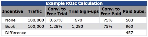
MarketingExperiements conducted a 37-day experiment for a major online news website where their goal was to increase opt-ins for their financial newsletter. They conducted an A/B test where one version of the opt-in offered a book on investing that was a NY Times bestseller as an incentive, for free. The other version offered a company-produced 12-page investment kit for free, as an incentive.
Result:
Conversion rate without an Incentive: 0.67%
Conversion rate with Incentive (Book): 1.28%
Conversion rate with Incentive (Investment Kit): 0.71%
The free book produced an 80% higher conversion than the 12-page investment kit. With this data, we can easily conclude that the book is a better incentive than the investment kit. However, what’s important is to calculate the total return on Incentive (ROIc) by factoring in the impact of the incentive on net profits and the cost of delivering the incentive.
Let’s say if the net cost of delivering the book is $17.50 and the subscription is priced at $37.50, this is what we get:
ROIc = (profit impact X additional units) – (Delivered cost X all units)
ROIc = ($37.50 X 457) – ($17.50 X 1,280)
ROIc = -$5,262
Similarly, let’s calculate the ROIc for the Investment kit (delivery cost valued at $1.40):
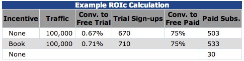
ROIc = (profit impact X additional units) – (Delivered cost X all units)
ROIc = ($37.50 X 30) – ($1.40 X 710)
ROIc = $131
So, with this new data, we see a different picture. The book seems to give a negative ROI (at least in the short term).
Classic incentives often include discounts, free trial,s or “automatically enter to win” type of contests. There is, however, a much more powerful element that you can use as an incentive, and that is knowledge.
Sharing knowledge-based incentives (such as a relevant eBook or a free consultation session with a domain expert) shifts the focus of conversion from the price of the product to its value.
If your goal is to get people to buy your product, sharing free knowledge-based incentives on the landing page (such as a relevant eBook or a free consultation session) warms them up to the value you bring on the table. If your paid product is pricey, your free incentive can even shift your audience’s attention from the price of your product to its value.
By creating a landing page where the users can learn something that will help them for a long time, you will be able to engrave your mark in their short-term and long-term memory.
For example, Quick Sprout Traffic University’s Landing Page (PRO Access) offers three amazing guides for free. The guides are insightful and in-depth. There is something for everyone to learn here and anyone who reads them will definitely remember QSTU for this!
Also, it’s worth taking note that this is where effective landing page copy comes in. With the right mix of information, credibility, trigger factors, and calls to action in the copy, customers will be able to see the value of the product and bypass resistance whether it’s giving their emails or buying a highly-priced product.
Check out the VWO Podcast to learn all about the top 10 psychological principles of CRO.
3. Instilling Urgency for conversions
Using gimmicks like “Hurry! This offer will close within the next 24 hours”, may not work anymore. Primarily, because users have become immune to marketing gimmicks. Rather, it is more optimal to construe a natural sense of urgency by using limits that make sense for the product.
For example, if you are selling tickets for a networking event, showcasing the number of seats left automatically produces a sense of urgency, because it is relevant in this context.
How Dropbox got 3 million users using Incentives
Here is an example of how identifying the needs of their target audience and using that as an incentive for conversions, helped DropBox improve signups by 60% and reach more than 200 million users. When they realized that most of their users came from referrals, they encouraged it through a two-way incentive program where both the referrer and the referral got free extra storage space.
Download Free: Conversion Rate Optimization Guide
Perception: What Does Your Visual Perception Say?
Perception affects consumer behavior. It is important because people’s behavior is based on their perceived reality instead of the actual reality.
Perception starts right when the user first clicks the link to your page. The loading speed, ease of use, background, and appearance of your landing page at a quick glance can affect the user’s perception of your product. Here are some of the factors that influence perception:
Take for example this body cream, called “My Silhouette” by Nivea that claimed to reduce the purchaser’s body size. (Image source: Time)
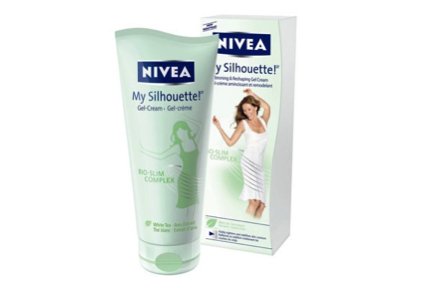
The company had to pay $900,000 in penalty when they failed to substantiate their claims. (Image source: Time)
Here is another product, Dr. Clarke’s Zapper, that claimed to be effective in treating diseases like cancer and AIDS by killing bacteria using electricity. They were made to provide refunds to all their US customers.
Presentation– The way you decide to introduce the product to your target audience can affect its perception. The medium you choose to present it should highlight its benefits and features perfectly. The color and font should match the tone of your product and brand. Take the sales page of a weight loss product called The Foxy Bod. Right when you land on the page, the vibrant pink entices you. The color is perfect for women, who are their target audience. There is a small video and a long sales letter that starts by taking you on the product creator’s own personal journey of weight loss struggle, followed by the ‘what you get’ section where all its features are clearly highlighted. The page is hype-free and very well done. The images inspire confidence and are very easy to relate to.
Usability – Your landing page should be welcoming and should function smoothly. The fact is that your visitor will be impatient, so making sure your landing page loads fast is a good usability tip. Having the right amount of negative space on your page can make it seem uncluttered and organized. Another tip would be to minimize the learning time the visitor will need to use the page properly. Use a lot of bullets and subheadings, because people love to scroll and scan. Benefits should be grouped together. Your website should be professional and comfortable at the same time. It should exude credibility. The font should be legible and readable. Contrast and highlight should be used to bring focus to important points. For example, here is the landing page for Salesforce.
Conclusion
If a visitor feels that the landing page is relevant to their problem, it will definitely attract their attention. Once you have their attention, you have to lay out the information in such a way that it is easy for them to understand and relate. Relevancy is the key to making your message memorable. Don’t underestimate the power of incentives. Give them a reason to stay, to keep reading, and to take that action. But remember that if your users can’t perceive quality through your landing page’s tone, offer, presentation, and usability, chances are that they will “x” out.
If you do it right, with these three psychologically important essentials you will not just produce one-time buyers but loyalists.
Note: Screenshots used in the blog belong to the author.
Categories:


