Looking to get the most value out of your web traffic? You must consider becoming friends with push notifications to drive engagement with audiences. If you’re making use of paid marketing channels, don’t neglect the value of options that are right at your fingertips.
Chrome now allows the use of large-sized images in push notifications. Previously, images were displayed as thumbnails or icons in web push notifications. But now, with the Big Image feature, marketers are able to send richer notifications that go beyond just clever copywriting. This feature is currently supported from Chrome 56 onward on both Desktop and Android.
Download Free: Push Notifications Guide
Yo! Free Samples, used push notifications to content fresh and timely, driving a 39% increase in conversion rates. Founder John Clark said, “Notifications featuring photos of actual samples always drive up click rates.” The images not only grab attention but also give a teaser of what is on offer.
So, how can you use rich push notifications? Read on as we take a look at how rich push notifications can be used for results across eCommerce, publishing, and media industries.
1) Coupons and free samples
Freeflys is a website that offers coupons and samples from leading brands. Push Notifications perform well in this domain because the offers run out fast and content has to be real-time, always. Here’s a notification that worked back in the time when notifications had to rely on only catchy titles and tempting body copy.
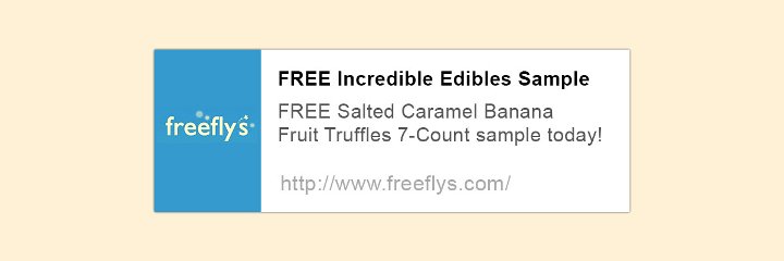
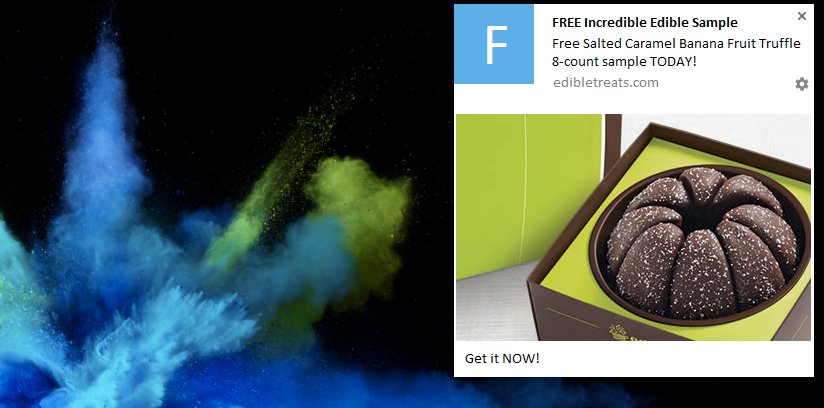
Now, imagine this notification coupled with an image of Salted Caramel Banana Fruit Truffles. That’s the power of the Big Image feature. You don’t have to leave anything to the imagination anymore. Subscribers can immediately get a taste of what’s in store and are more likely to click on it.
In this case, the CTA button is also used to emphasize your message. Clicking on ‘Get it NOW!’ leads to the same landing page with the Banana Fruit Truffle on offer. You can also link your CTA button to any other page of your choice, as long as it is relevant to the notification or meets an objective like driving traffic to other offers on your site.
The dos and don’ts
– Don’t go for notification overkill by sending too many notifications. Look into your data and find out a frequency that works best with your audience.
– Use both visual and text-based notifications. There are notifications that work well even without visuals. Understand how your audience responds to both, and then decide how many you’ll be sending out with the rich features, and how often.
– Don’t forget to use the Notification Expiry feature to make sure that your subscribers don’t click through after the offer has expired.
2) eCommerce
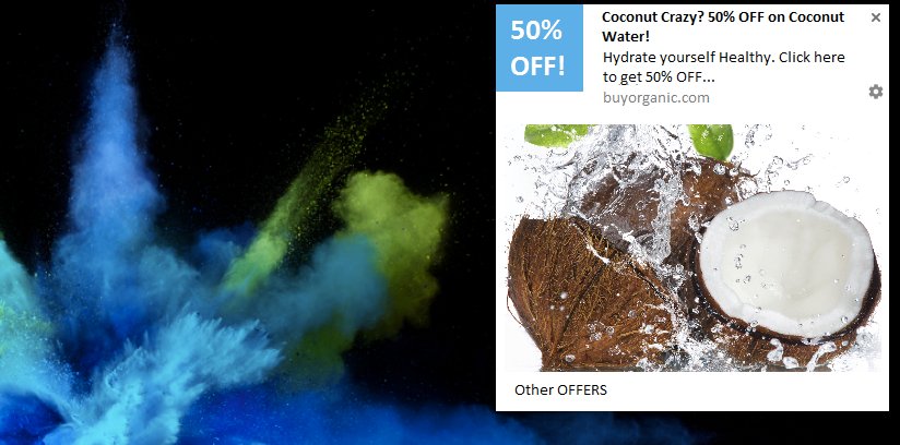
Buy Whole Foods Online is an online retail store that specializes in organic produce and whole foods. What you see here is one of their best-performing notifications. It received a click rate of 15.2%. Out of the 97 people who reached the product page after clicking on the notification, 71 actually made a purchase. They were able to generate a 3-figure revenue from this notification alone.
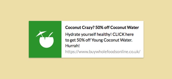
Now, what can you do to get an even better click rate from this notification? Think about being in the midst of an unforgiving summer. Refreshing imagery and a well-timed discount are probably what consumers need to beat the heat. Also, see how the icon image is used to highlight the discount while the Big Image takes care of communicating the product.
Along with it, the CTA button gives the additional option of viewing ‘Other OFFERS’ on your website, to encourage exploration and add value.
The dos and don’ts
– Use the combined power of icon image and Big Image to reinforce your message and complement one another.
– Use images that do not clutter your notifications to ensure the viewer is not confused by it.
– Use the Scheduling feature to send notifications according to the time zones of your users. No one wants to wake up in the middle of the night and buy coconut water.
Watch the webinar to know how an e-commerce company achieved a 33% conversion rate with on its cart abandonment campaigns:

3) Blogging and publishing
If you have a company blog or are a blogger, you probably already understand the importance of visuals in communicating your message. What better way to tell your subscribers about a new recipe or a new product than to use visually engaging push notifications?
However, the use cases aren’t limited to these. Any content publisher site can use it to:
– Promote new posts
– Share well-performing content from the past to both your new and old readers
– Promote content related to what they’re reading right now on your website
The best thing is, this feature is available on Android as well. Unlike email, web push notifications do not require any personal information or even an email address from the subscriber. Once they opt in, you can send them a notification whenever something new is published on your blog. See below how SEO Hacker used push notifications to promote their latest posts and increase return visits.

Download Free: Push Notifications Guide
4) News and media
Notifications have become a very common way for readers to interact with brands. It carries your content directly to your audience, as Sam Dolnick of NYTimes puts it. Be it breaking news or an editorial piece, notifications deliver them to your subscribers instantly.
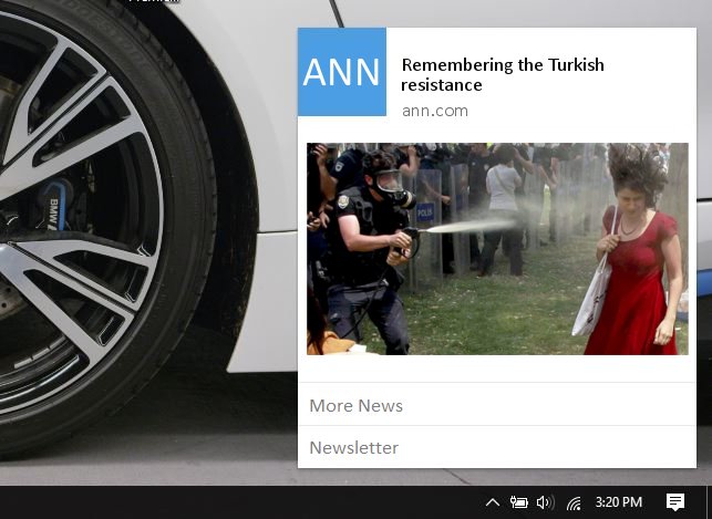
Photojournalism has given us many powerful images that have moved the world. This is particularly why news websites should use the Big Image feature.
In this instance, the big image powerfully supports and communicates the article that’s being shared. Clicking on the notification will lead directly to the article on the Turkish resistance. The CTA buttons below let the subscriber explore ‘More News’ as well as provide an option to see and subscribe to an email newsletter.
The dos and don’ts
– Make sure that the images you share do not make anyone uncomfortable and hit unsubscribe.
– Be careful not to share NSFW content in the Big Image. Web Push Notifications are accessed frequently on desktops or laptops. In Chrome Notifications for web browsers, the notification is fully displayed even when there are multiple notifications in the tray. You do not want to catch your subscribers off guard.
– Keep within the formatting requirements. The recommended dimensions of the image are 600 px by 400 px. It shouldn’t exceed a size of 5MB. If the dimensions aren’t exactly 600×400, Chrome automatically provides a white margin for the image.
Together with CTA buttons, the Big Image feature is the next step in the evolution of Chrome Notifications. If you are a VWO Engage user on a Business or Enterprise plan, this feature is already at your disposal. If not, you can sign up for a Free Trial right here.
