Conversion Rate Optimization Solutions for Revenue Growth
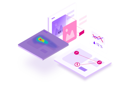
VWO’s end-to-end CRO platform helps brands understand visitor behavior, make observations, build a testing pipeline, execute the tests for statistical results, and engage through new-age channels.
If your store isn’t designed to guide visitors smoothly from entry to checkout, every campaign, SEO effort, or influencer push ends up leaking value. Shoppers browse, hesitate, and disappear, not because they aren’t interested, but because friction shows up at the wrong moment.
This guide introduces a practical eCommerce CRO checklist to help you remove that friction. The goal isn’t quick hacks; it’s building a store that converts more consistently by design, so you can scale revenue without relying on ever-increasing ad spend.
Ecommerce CRO Checklist Boost Conversions With Proven Tactics
Why you need this eCommerce CRO checklist
This checklist is designed to help you evaluate, prioritize, and improve the parts of your eCommerce store that directly influence conversions.
Rather than focusing on isolated optimizations, it helps you review your store as a complete customer journey where performance, clarity, trust, and reassurance work together to influence buying decisions.
What this checklist helps you do:
Identify hidden friction across the customer journey: From slow load times and confusing navigation to weak product pages and checkout drop-offs, this checklist helps surface the issues that quietly suppress conversions.
Prioritize changes that actually move revenue: Not all optimizations are equal. The checklist helps you focus on high-impact areas—like product pages, checkout flow, and pricing cues—before cosmetic tweaks.
Reduce cart abandonment without increasing ad spend: By fixing usability, clarity, and trust gaps, you convert more of the traffic you already have, often the fastest path to growth.
Create consistency across devices and entry points: Whether visitors arrive via ads, search engines, or returning sessions, this checklist ensures the experience feels intentional and cohesive.
Build a repeatable CRO system, not one-off fixes: Each section feeds into testing and learning, helping you turn insights into ongoing improvement rather than reactive changes.
Who this checklist is for:
eCommerce founders looking to grow revenue without burning cash on ads
Growth and performance marketers who are responsible for conversion rates and ROI
Product and UX teams optimizing customer experience
CRO and experimentation teams building structured optimization programs
eCommerce CRO checklist: Key areas & checkpoints
1.Website performance & technical health
Website performance is the foundation of every successful eCommerce CRO strategy. If the foundation is shaky, shoppers will bounce before they even see your products. Speed isn’t just a technical metric; it is a vital part of the customer experience and a major signal for search engines.
Here is your technical health checklist to ensure a seamless experience for every visitor:
Load speed optimization
Speed is more than just a convenience; it’s a major factor in how search engines rank your online store and how site visitors perceive your brand.
Analyze with Google PageSpeed Insights: Use it as a regular performance health check to uncover speed issues that quietly increase bounce rates and hurt conversions.
Enable Compression: Use tools (like Gzip) to “shrink” your website data before it’s sent to a user’s browser, making the transfer much faster.
Minify Code: Clean up your HTML, CSS, and JavaScript by removing unnecessary characters and spaces. This makes your files smaller and easier for browsers to read.
Minimize Redirects: Keep the path from click to content as direct as possible to avoid unnecessary load delays.
Minimize Request Size: Keep your website “light” by reducing the amount of data (like cookies) sent back and forth between the user and your server.
Image & asset management
Visuals are essential for online shopping, but they are often the biggest cause of slow web pages.
Optimize & compress images: Use modern formats like WebP to keep your high-quality images looking sharp without the heavy file size.
Serve scaled images: Don’t upload a massive 4000-pixel photo if it only displays as a small 400-pixel thumbnail. Match the image size to its actual container.
Use CSS sprites: Combine several small images (like icons or social media logos) into one single file to reduce the number of requests your server has to handle.
Implement lazy loading: Tell your site to only load images as the user scrolls down to them. This ensures the “above the fold” content appears instantly.
Advanced efficiency tactics
Once the basics are covered, these tweaks provide a significant boost to your eCommerce conversion rate optimization efforts.
Leverage browser caching: This allows a visitor’s device to “remember” your site’s logo, fonts, and styling. On repeat purchases or return visits, the site will load almost instantly.
Defer JavaScript: Tell the browser to load the text and layout first, and defer loading the “heavy” scripts until the visual part of the page is ready.
Use a content delivery network (CDN): A CDN stores copies of your site on servers all over the world. This ensures that a customer in London and a customer in New York both experience the same lightning-fast speeds.
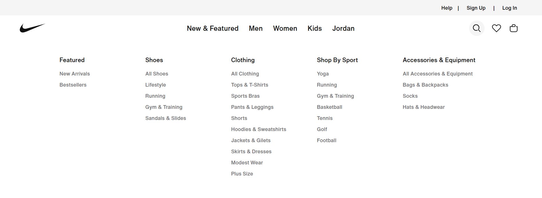
2. Navigation & user experience (UX)
Intuitive navigation is about anticipating your customer’s needs. If users can’t quickly find what they’re looking for, they won’t explore, compare, or buy. The easier it is to find a product, the more likely they are to buy.
Smart category structure
Don’t guess how to label your menus; let your real user data do the talking.
Think like your customer: Use keyword research to label menus according to terms people actually use. If they search for “Cocktail Dresses,” don’t hide them under a generic “Clothing” tab.
Sort by popularity: Place your most-clicked categories at the beginning of your menu. This makes it easier for the majority of site visitors to find what they want instantly.
Logical hierarchy: Broad categories should lead naturally to specific subcategories. For large stores, use Mega Menus to show these levels in an organized dropdown.
Avoid vague labels: Use clear, descriptive names. Instead of “Women’s Wear,” try specific labels like “Dresses,” “Tops,” or “Shoes” to reduce confusion.
Use a business tagline: A simple, clear tagline near your logo helps reinforce your value proposition the moment a user arrives.
A great search function acts as an “express lane” for potential customers who already know what they want.
Prominent search bar: Make it easy to find on every page. It should handle keywords, categories, and even common typos.
Search-driven categories: Create categories based on what customers actively search for (for example, “Eco-friendly”). Let your customers’ behavior shape your navigation.
“What’s hot” sections: Create dedicated links for “New Arrivals” or “Bestsellers.” Highlighting trending items helps shoppers make decisions faster.
Meaningful selling points: Avoid vague claims like “High Quality.” Use specific, searchable terms like “Handmade Leather” or “Waterproof” to help users filter their options.
Effortless experience
Your navigation should feel invisible and helpful, never like a chore.
Breadcrumbs: Use these small links (e.g., Home > Shoes > Sneakers) so users always know where they are and can easily jump back a step.
Mobile optimization: Ensure your menu is “thumb-friendly” on mobile devices. A clunky mobile menu is a fast way to increase bounce rates.
Continuous tweaking: Use heatmaps (like VWO) to see which links people ignore. If a category isn’t getting clicks, move it or rename it.
3.Homepage optimization
Your homepage is your digital storefront window. For visitors arriving from ads, search engines, or direct traffic, it often determines whether they explore or bounce. A high-converting homepage builds trust quickly and guides users to action through a clear value proposition, a clean design, and social proof.
Design & visual impact
First impressions are formed in milliseconds. Use design to build immediate authority.
Above-the-fold value prop: Use a crisp, high-quality hero image and a headline that clearly states what you offer and why it matters.
Balance white space: Use enough negative space to keep your essential elements in focus and increase legibility.
Strategic color palette: Ensure high contrast between backgrounds and text. Use color psychology to make your CTA buttons “pop” against the page.
Clean & scannable layout: Don’t guess; survey your team or friends to see if they can absorb your key message in under five seconds.
Guide your potential customers to the right products using real user data.
Feature bestsellers: Use analytics to identify your most-viewed products and prominently display them on the homepage to boost conversions.
Curated collections: Move beyond generic labels like “Clothing.” Create urgency and relevance with sections like “Seasonal Essentials,” “Trending Now,” or “Best of [Month].”
Dynamic (but concise) displays: Use sliders or carousels to show multiple products, but keep them fast-loading and easy to navigate.
Short-form video: Feature a concise, engaging video below the fold to demonstrate products or share your brand story.
Copy & Calls to action (CTA)
Your words should act as a roadmap for the customer journey.
Persuasive headlines: Avoid boilerplate text. Audit your headlines for clarity, typos, and impact. (Tip: Avoid generic AI-sounding copy to keep things relatable).
Creative CTAs: Move beyond “Shop Now.” Test engaging phrases like “Discover the Collection” or “Find Your Perfect Fit.”
Emotional connection: Use a small “About Us” section or video to share your mission. People connect with the faces behind the brand.
Trust & localization
Lower the barrier to entry by removing “buyer’s remorse” before it happens.
Visible trust cues: Place secure checkout badges and free shipping info where they are impossible to miss.
Prominent payment logos: Don’t hide these in the footer. Show supported payment methods (and financing options) near your main shop sections.
Go local: Localize your store by showing relevant currencies or shipping details for specific countries, if selling globally.
Offer multiple order ways: Whether it’s “Buy Now, Pay Later” or “Click and Collect,” show that you accommodate customer preferences.
Pro Tip!
Use VWO’s segmentation capabilities to adapt experiences based on location, traffic sources, and other attributes, aligning user context and intent so interactions feel relevant and reassuring, reducing uncertainty and building trust at critical moments in the buying journey.
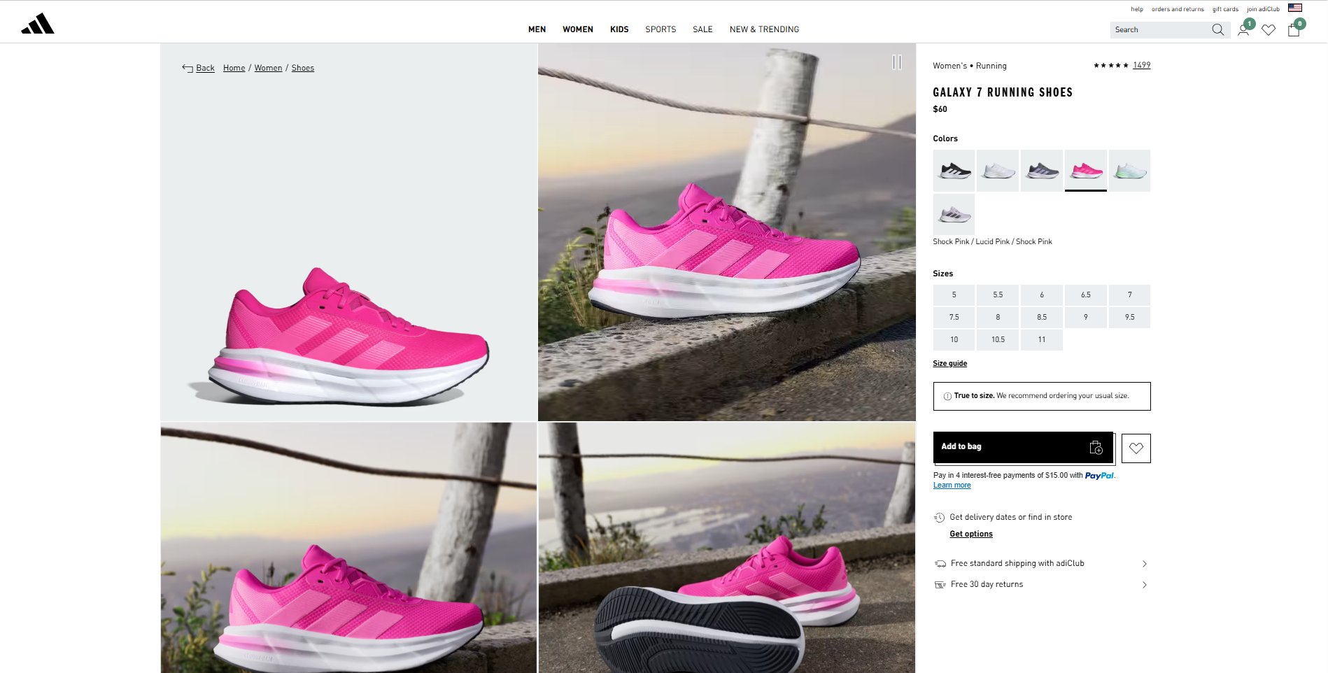
4.Product page essentials
Product pages are where products are evaluated, trust is strengthened, engagement deepens, and conversions happen. Think of them as your silent salespeople. They don’t just display information; they persuade, reassure, and guide shoppers toward that all-important “Add to Cart” click.
Visual appeal that builds desire
Shoppers can’t touch or try your product. Your visuals must do the heavy lifting to bridge that gap.
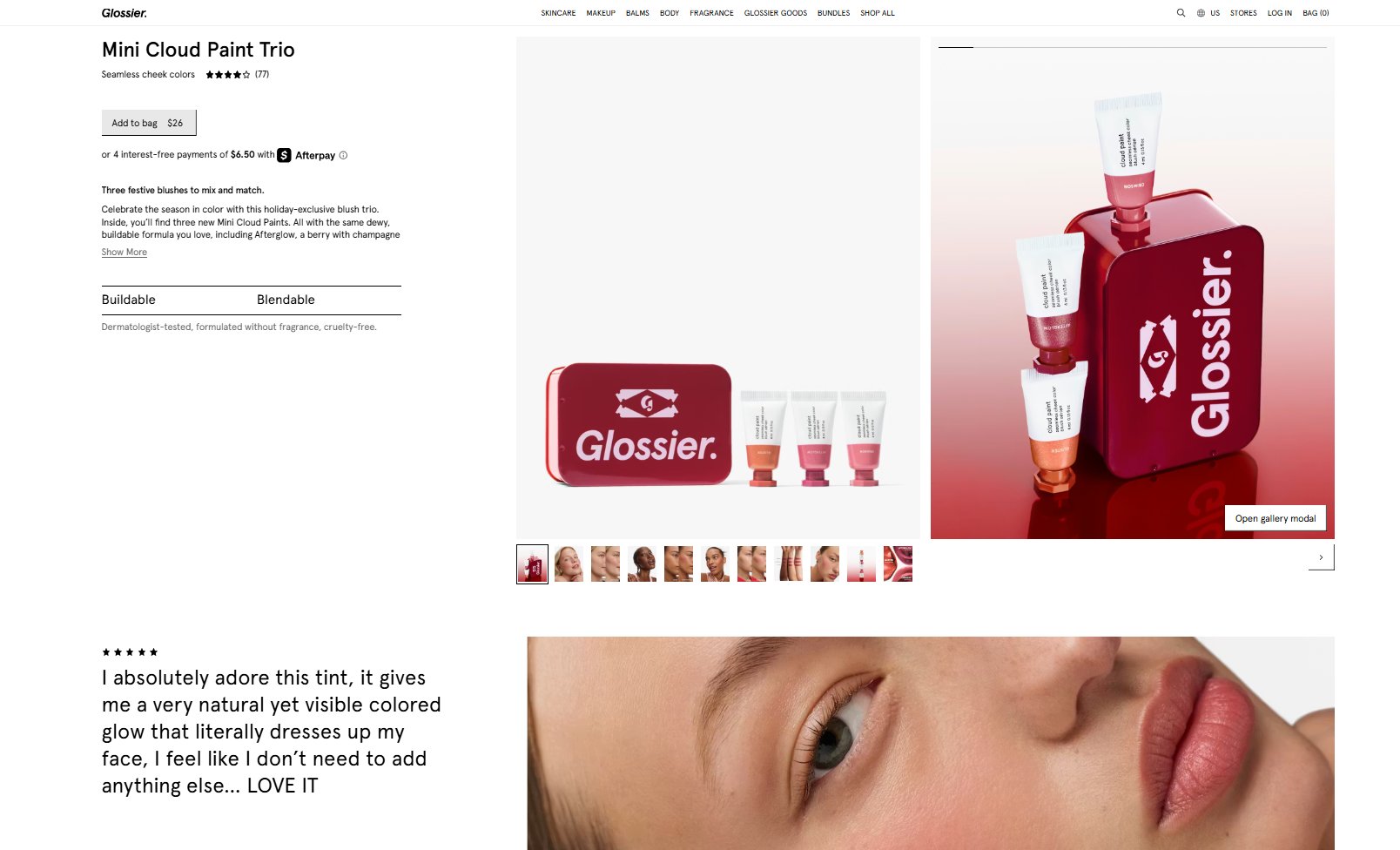
High-quality imagery: Use professional photos that clearly show texture, finish, and fine details.
Comprehensive views: Provide multiple angles and a zoom-enabled gallery to reduce uncertainty.
Contextual lifestyle shots: Show the product in real-world use to help customers visualize it in their own lives.
Video demonstration: Use short videos (especially for top-sellers) to demonstrate value and movement that static images can’t capture.
Your product description shouldn’t read like a dry spec sheet. It should speak directly to the shopper’s needs.
Benefits over features: Address customer pain points and outcomes. Instead of “Waterproof material,” try “Stay dry in any weather.”
Scannable information hierarchy: Lead with a concise summary, then use bullet points, icons, or visual feature cards to break up long blocks of text.
Targeted tone: Use language that resonates with your specific audience, making the brand feel relatable and expert.
Key information without surprises
Uncertainty kills conversions. Transparency builds the confidence needed to finalize a purchase.
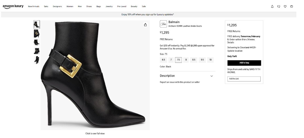
Upfront pricing: Ensure the price (and any discounted price) is visible immediately.
Stock & shipping clarity: Clearly state stock availability (“Low stock” is a great urgency driver) and provide estimated delivery dates to set clear expectations before the user reaches the checkout.
If you could run one test to improve the add-to-cart rate, try the inventory test threshold. This involves using custom code to display a message like “only 7 in stock, order now” when inventory drops below a certain level. This has been proven to work time and time again.
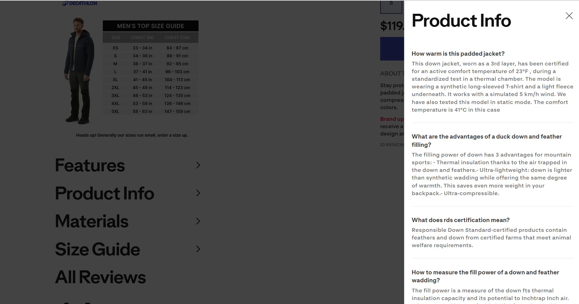
Empowerment tools: Provide size guides, comparison charts, or creative calculators (like “how long this bottle will last”) to help users make a definitive choice.
Prominent CTAs: Make your “Add to Cart” button the most visually dominant element on the page, ideally placed above the fold.
Educate to Build Trust: Offer “how-to” videos or buying guides to position yourself as an expert and reduce the likelihood of returns.
Conversion boosters & trust
Small additions here can deliver outsized gains in average order value (AOV) and long-term trust.
Authentic social proof: Display customer reviews and ratings prominently. Encourage post-purchase reviews to keep content fresh.
Strategic upsells: Use “Complete the Look” or cross-sell sections to guide users toward complementary products.
Mobile-first refinement: Constantly review mobile vs. desktop engagement data. If mobile shoppers are dropping off, it’s a signal that the page layout needs a tighter, more vertical-friendly focus.
5. Checkout Flow
By the time a shopper reaches your cart or checkout page, you’ve already won half the battle. The remaining challenge is not getting in their way. A slow, confusing, or demanding checkout flow is one of the biggest reasons for cart abandonment.
Simplify the checkout journey
Every extra step introduces friction. The goal is simple: fewer steps, fewer doubts, and faster decisions.
One-page goal: Reduce the checkout to a single page where possible. Avoid multi-page flows unless necessary.
Remove distractions: Strip away unnecessary navigation menus and exit links to keep the focus on the purchase.
Progress indicators: Use a clear progress bar to show the user where they are in case multiple steps are required.
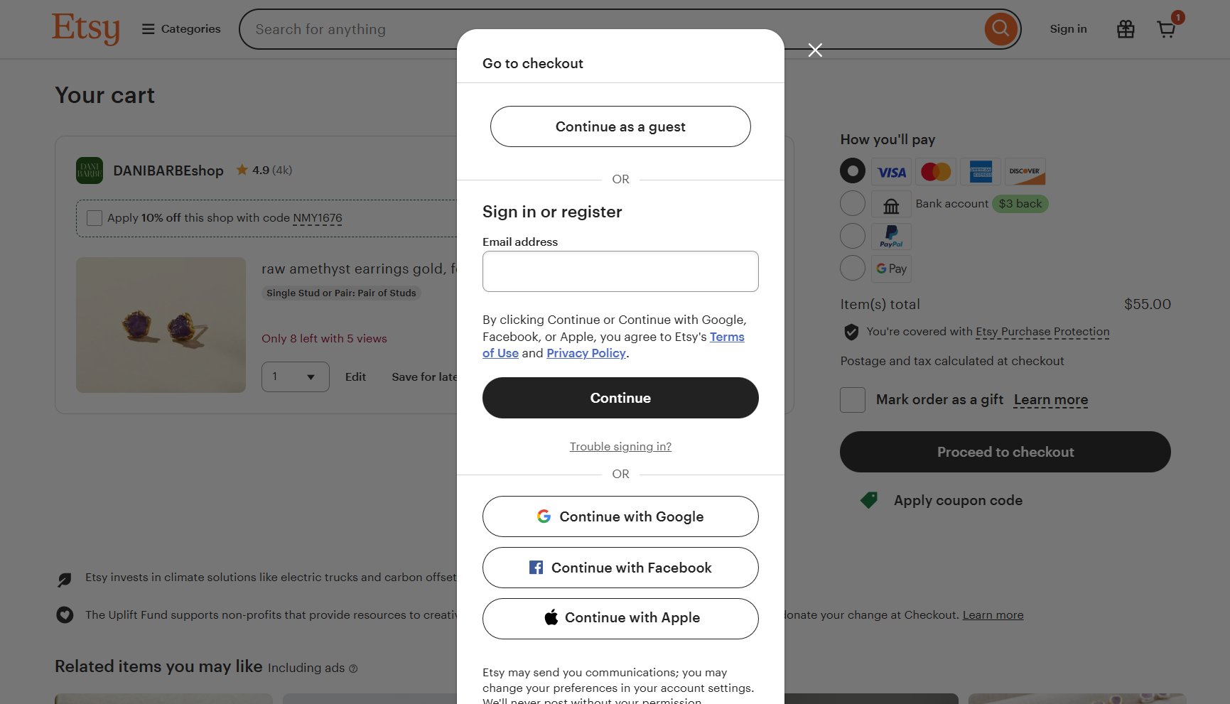
Guest checkout & fast access
Forced registration is a silent conversion killer. Sometimes customers just want to buy and leave.
Prominent guest checkout: Make the guest option easy to find. Don’t force password creation during checkout.
Optional registration: Keep account creation as an optional step, not a requirement.
Single sign-in: Allow social logins (eg, social logins) so returning users can skip the forms.
Respect the inbox: Keep newsletter sign-ups as an “opt-in” choice. Forcing a subscription can hurt long-term customer satisfaction.
Typing is work. Your forms should do most of the heavy lifting for the user.
Data persistence: Pre-fill information where possible and never make users enter the same information twice.
Address intelligence: Use auto-fill tools to predict addresses and automatically populate city and state fields based on the ZIP code.
Unified fields: Use a single “Full Name” field instead of splitting it into first and last names.
Visual clarity: Keep form labels visible at all times and match the field length to the expected input (e.g., a short box for a CVV).
Error handling & validation
Errors shouldn’t feel like punishment. Clear, friendly feedback/guidance keeps users moving instead of quitting.
In-line validation: Display errors in proximity to the input field so they are easy to fix.
Preserve data: Preserve all correctly entered information so the user doesn’t have to start over if a submission fails.
Input examples: Provide clear examples (like MM/YY) against each field to prevent mistakes before they happen.
CTA focus & button strategy
Checkout pages should have one obvious next step.
Dominant primary button: Make the “Add to Cart” or “Purchase” button the most prominent element on the page.
Specific copy: Use clear text like “Complete My Purchase” rather than a vague “Continue” so users know exactly what happens next.
Consistent placement: Keep your primary button in a predictable spot across all steps.
Transparency, trust & risk reversal
Unexpected costs or unclear data usage destroy trust instantly. Reassurance is what finally closes the sale.
The “No-Surprises” policy: Communicate taxes, delivery timelines, and shipping costs upfront. Never add a fee at the final step of the checkout flow.
Persistent carts: Offer a persistent shopping cart that “remembers” items across different devices, allowing users to start on mobile and finish on desktop.
Brave guarantees: Display your return, refund, and security promises prominently. Reaffirming a “Secure Payment” or “30-Day Returns” reduces final-moment anxiety.
Data transparency: Be clear about why you are collecting data (GDPR compliance) to build long-term trust.
Learn how top eCommerce teams optimize checkout for maximum revenue: watch the webinar now.
6. Pricing & Incentives
The thrill of online shopping is fueled by anticipation. However, that excitement quickly fades if the “deal” feels hidden or the shipping terms are vague. Beyond the price tag, your logistics strategy is a major conversion rate optimization tool that builds long-term loyalty.
Free shipping as a value multiplier
For many shoppers, free shipping isn’t just a perk; it’s an expectation.
Offer free shipping where possible: It is often the deciding factor in whether a customer completes a purchase.
Strategic thresholds: Use a free shipping threshold (e.g., “Free over $50″/time frame) to increase your average order value (AOV).
Prominent messaging: Feature your shipping offer clearly on the homepage, product pages, and in the cart.
Hidden costs at the final step are the leading cause of abandoned online purchases.
Simple math: Ensure the discounted price and total savings are immediately obvious.
Zero hidden fees: Avoid adding “handling” or “service” fees at the very end of the checkout.
Clear discounts: Make a discount code easy to find, if needed. If it’s automatic, show the “Money Saved” in the cart.
Returns
A customer-friendly return policy doesn’t just manage returns; it actively encourages purchases by lowering psychological risk.
Simple language: Use clear, non-legalistic terms to explain how to return or exchange items. Frame it as a confidence signal (“Easy 30-day returns”) rather than a list of rules.
Identify non-returnables: If an item is non-returnable (like personalized goods), flag it clearly on the product page to avoid surprises.
Offer alternatives: Offset non-refundable items with exchanges or store credit to reduce post-purchase friction and keep the customer happy.
Guarantees
Sometimes, a simple reassurance is all it takes to close the sale.
Highlight trust badges: Display “Money-Back” or “Quality Satisfaction” guarantees prominently near your purchase buttons.
Reassurance copy: Use micro-copy like “Risk-free trial” or “Try it for 30 days” to decrease hesitation and increase the perceived value of the product.
7. SEO & search intent alignment
SEO is more than just ranking; it is about expectation management. If your search result promises one thing and your landing page delivers another, users will bounce instantly.
Match intent to the landing page
Don’t just drive traffic; drive the right traffic to the right place.
Confirm relevance: Your page headline should mirror the search query so users know they are in the right spot.
Land precisely: Send users searching for a specific item to the product page, and route broad category searches to the relevant category page.
Intent check: Ensure your content matches the user’s goal (e.g., a “How-to” guide for research vs. a “Buy Now” page for shoppers).
Set expectations in search results
The conversion journey starts on the Google results page.
Honest metadata: Use Page Titles and Meta Descriptions that accurately preview the page. Avoid clickbait that leads to high bounce rates.
Pre-qualify with snippets: Use schema markup to show prices and star ratings in search results. This builds trust before the click.
Optimize for first-time visitors
Organic traffic often brings in “cold” leads who don’t know your brand.
The 5-second rule: Ensure a new visitor understands exactly what you sell/offer within seconds of landing.
Visible benefits: Show your “Unique Selling Points” (like “Free Shipping” or “Sustainable Materials”) immediately without making users scroll.
Use internal links to guide the journey
Internal links are “express lanes” that prevent users from hitting the “Back” button.
No dead ends: When a product is out of stock, link to “Similar Items” to keep the session alive. Discover how AI can be used to show alternatives for out-of-stock products, along with other practical optimization ideas in this eBook.
Final thoughts: Turning the checklist into a growth engine
This checklist is more than a list of “best practices”; it is a roadmap for building a high-performance eCommerce business. Conversion Rate Optimization (CRO) is not a one-time project; it is a continuous, disciplined cycle of listening to your users and responding to their behavior.
To turn these points into actual revenue, you need to move beyond guessing and embrace a structured CRO process:
Observe real user behavior
Identify friction and opportunities
Test changes in controlled experiments
Learn from results
Apply insights across the journey
Scaling conversion success with VWO
Implementing a full-scale CRO strategy can feel overwhelming, but the VWO platform is built to simplify this journey. It provides a unified suite of tools designed to turn visitor data into winning business strategies:
VWO Testing: Validate changes-> Whether it’s a simple headline change or a a layout adjustment, VWO’s A/B, multivariate, and split testing capabilities allow you to validate every idea. Its powerful visual editor means you can often launch tests without needing a developer.
VWO Feature Experimentation: Test and roll out features → Whether it’s a checkout overhaul or changes to search bar logic, run server-side experiments and control feature releases using feature flags. This allows teams to validate impact before full release, experiment safely in production, and measure outcomes accurately.
VWO Personalize: Deliver relevance-> Deliver tailor-made experiences to different segments, such as showing a “Welcome Back” discount to returning visitors or localized offers based on a shopper’s city.
VWO Copilot: Integrate AI throughout the workflow->
Automate heatmap and session recording analysis to reveal key behavior insights and deliver targeted optimization recommendations.
Generate goal-driven survey questions and summarize responses into clear, actionable CRO insights.
Produce personalized A/B testing ideas by page or goal to maintain a high-impact test pipeline.
Enter simple prompts to instantly generate test variations such as new copy, images, or color palettes for your eCommerce pages without waiting on the design team.
Read more: How AI-powered CRO helps teams uncover insights, test smarter, and scale conversion growth.
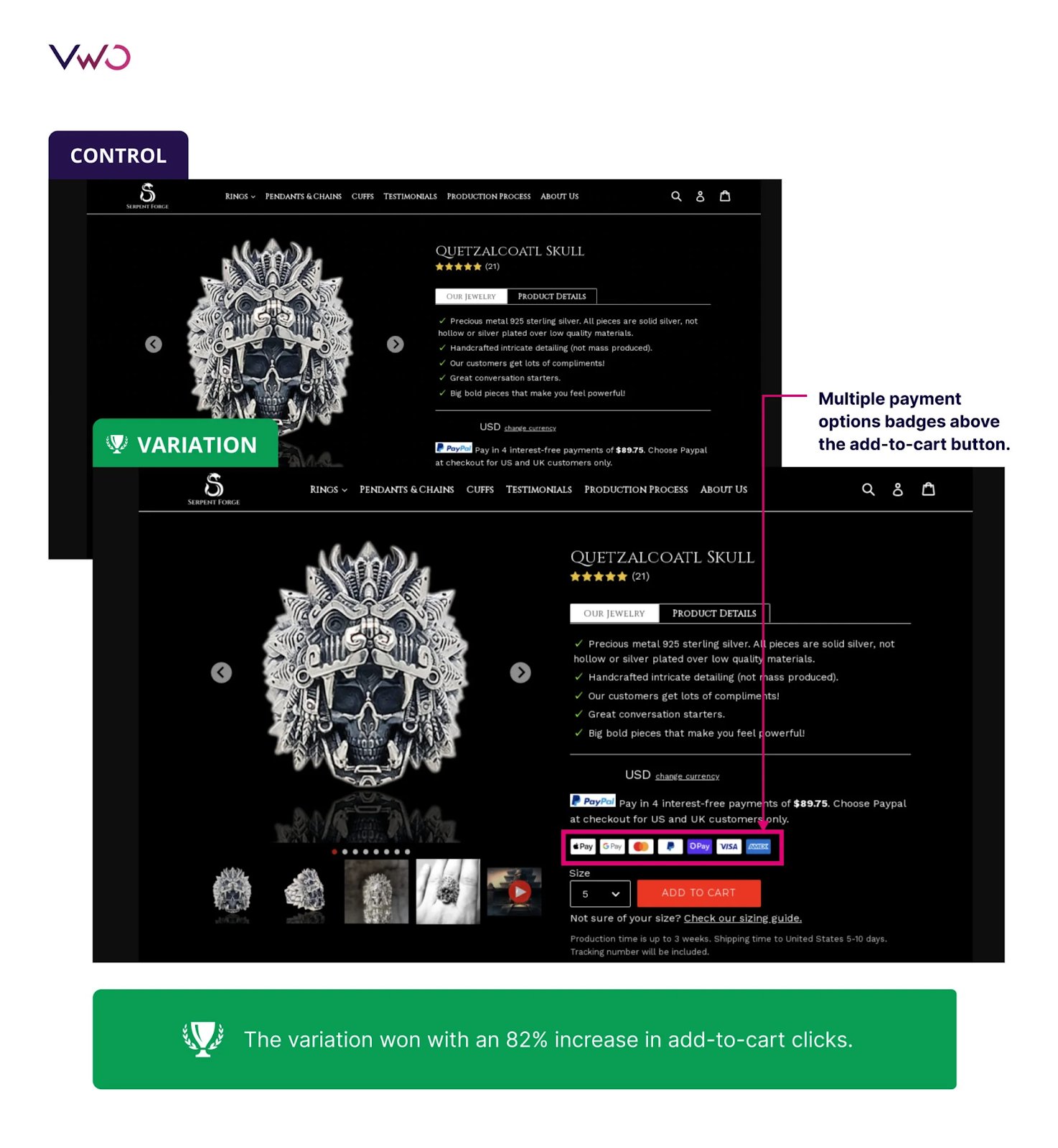
See how Serpent Forge achieved an 82% lift in add-to-cart clicks by using VWO to replace a single payment badge with multiple payment options on the product page, removing confusion and boosting checkout engagement.
What is an eCommerce conversion optimization checklist?
It is a strategic audit tool used to identify and fix friction points in the customer journey. It covers everything from site speed and navigation to product page clarity and checkout efficiency to ensure more visitors become buyers.
What is CRO and why is it important for eCommerce?
Conversion Rate Optimization (CRO) is the process of increasing the percentage of visitors who take a desired action (like making a purchase). It is vital because it allows you to grow revenue by maximizing the value of your existing traffic without increasing your ad spend.
How do I use the CRO checklist?
Start by auditing your site against the checklist, beginning with high-impact areas like the Checkout Flow and Product Pages. Identify “leaks,” form a hypothesis for improvement, and then use a platform like VWO to test those changes.
Is this checklist suitable for all types of eCommerce stores?
Yes. While specific tactics might vary slightly between B2B, B2C, or niche boutiques, the core principles of performance, trust, and clarity are universal requirements for any successful online transaction.
How often should I review and implement items from the checklist?
CRO is an ongoing process. Review the checklist quarterly for major audits and continuously apply insights as part of your testing and optimization cycle.
Do I need technical skills to implement the checklist items?
Many items (like copy changes and layout tweaks) can be done via your eCommerce platform or VWO’s visual editor. However, some “Technical Health” items, like minifying code or advanced caching, may require a developer’s assistance.
Will I receive updates to the checklist?
Best practices evolve. Treat this checklist as a living document and update it based on user behavior, testing results, and changes in customer expectations.
Can I share this checklist with my team?
Absolutely. In fact, CRO is most effective when it is a collaborative effort between marketing, design, and development teams. Sharing this ensures everyone is aligned on the same user-centric goals.
Hi, I’m Pratyusha Guha, manager - content marketing at VWO. For the past 6 years, I’ve written B2B content for various brands, but my journey into the world of experimentation began with writing about eCommerce optimization. Since then, I’ve dived deep into A/B testing and conversion rate optimization, translating complex concepts into content that’s clear, actionable, and human. At VWO, I now write extensively about building a culture of experimentation, using data to drive UX decisions, and optimizing digital experiences across industries like SaaS, travel, and e-learning.
Uncover hidden visitor insights to improve their website journey
One of our representatives will get in touch with you shortly.
Awesome! Your meeting is confirmed for at
Thank you, for sharing your details.
, you're all set to experience the VWO demo.
I can't wait to meet you on at
Account Executive
, thank you for sharing the details. Your dedicated VWO representative, will be in touch shortly to set up a time for this demo.
We're satisfied and glad we picked VWO. We're getting the ROI from our experiments.
Christoffer Kjellberg
CRO Manager
VWO has been so helpful in our optimization efforts. Testing opportunities are endless and it has allowed us to easily identify, set up, and run multiple tests at a time.
Elizabeth Levitan
Digital Optimization Specialist
As the project manager for our experimentation process, I love how the functionality of VWO allows us to get up and going quickly but also gives us the flexibility to be more complex with our testing.
Tara Rowe
Marketing Technology Manager
You don't need a website development background to make VWO work for you. The VWO support team is amazing
Elizabeth Romanski
Consumer Marketing & Analytics Manager