8 Tips for Optimizing Your eCommerce Homepage for Success
In 2020, the pandemic forced consumers to shift from making offline purchases to making online purchases. As consumers continue to avoid making in-store purchases, the eCommerce market will see additional growth in the coming years. In the long run, the global eCommerce market size was estimated at USD 25.93 trillion in 2023 and is projected to grow at a CAGR of 18.9% from 2024 to 2030.
But now that more consumers are turning to eCommerce, competition on the business side is stiff. You’ve got to stand out from the crowd and capture a visitor’s attention within seconds of them coming to your website — this is where the homepage comes in. You need to make sure your homepage is drawing in and converting visitors.
Download Free: Landing Page Optimization Guide
How do you know what will attract and convert your target audience? Continuous experimentation. You can perform A/B testing on your website copy, navigation, design, forms, and calls-to-action to make your homepage the best version of itself.

Why focus on optimizing your homepage?
It only takes 10 seconds for someone to form an opinion about your website. In that short amount of time, they’ll decide if they’re going to stay and look around or leave. Websites are swiftly judged, so making a good impression right off the bat is important.
Also, your eCommerce homepage affects all aspects of your marketing strategy: website traffic, search engine rankings, conversions, sales numbers and so much more.
So if you’re ready to do it right and make a homepage that no one will navigate away from, we’ve got you covered. In this blog post, we’ll show you how to optimize your homepage for success, and cover how and why to A/B test to make sure what you’re trying is working.

8 Steps for optimizing your online store’s homepage
Let’s take a look at eight steps you can take to create a homepage that converts.
1. Employ an SEO homepage strategy.
Get a headstart on your SEO efforts by working on your homepage. You want your homepage to be optimized for search engines and users.
When a visitor comes to your site, they should be able to see who you are, why they should buy from you, what you sell and how to find the products — all at a glance.
When a search engine crawler comes to your homepage, they need to pull information about your business, its products, and its address.
Here’s how you can satisfy both of these needs:
Include the most important information above the fold
The content on your homepage that’s “above-the-fold” is visible before any scrolling occurs. The content at the top of the webpage will be the basis of a user’s first impression, so it’s got to be good. Putting the wrong content above the fold may result in a high bounce rate and a loss of customers and revenue.
Here’s what you should have above the fold: Branding and logo, contact information, navigation and search bar, current promotions, shopping cart, and calls-to-action.
Take a look at Ice Jewellery, for example.

At a glance, you can see they have branding and a logo, contact information, navigation and search bar, current promotions, shopping cart and calls-to-action — all above the fold.
Optimize your homepage title tag, meta description and images
Taking the time to optimize your homepage title tag and meta description does two good things for your website. It updates your snippet on the search engine results page (SERP), and it communicates to search engines what your website is promoting.
The title tag should be approximately 60 characters and include your brand name and location (if necessary). Consider using words that will get attention, such as free shipping, sale, money-back guarantee and free returns.
Let’s take a look at the SERP snippet for the Woodland Hills Wine Company:

They have the business’s full name, plus a little bit about their products and why you should purchase from them.
Also, don’t forget about optimizing your images. Images are vital to an ecommerce website because potential customers want to see what they’re buying. But images on your homepage can slow down your website speed, which turns customers away. On top of that, images that aren’t optimized don’t help your SEO efforts.
You can prevent these issues by resizing your images; make them the actual size you want them to be. Resizing your images will reduce the file size and help your web page load speed.
Next, add ALT text. ALT text should describe what’s in the image, which helps search engine crawlers. You can also add a caption below the image that contains a description of what’s in it and any additional information helpful for users.
Let’s take a look at B-WEAR Sportswear’s homepage images:
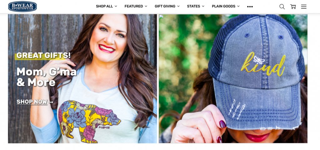
The images have been appropriately resized, so the page loads quickly, plus they have ALT text and descriptions.
Unfortunately, you can’t perform traditional split tests on SEO efforts. Several factors go into a website’s ranking, and it would be impossible to have two identical websites for an A/B test. However, you can still test and measure your homepage SEO.
For example, measure your site traffic and page conversions for some time. Then, make the change you want to test, such as updating your meta content. Next, measure your site traffic and page conversions for the same amount of time as before. Was there a difference? Run this test twice and compare the data.
You can measure your ROI on SEO efforts by tracking your branded and non-branded keywords and connecting them to revenue.
Testing SEO efforts is more complicated than traditional split testing, but it can be done. It’s all about testing one item at a time and creating as stable an environment as possible.
2. Include primary calls-to-actions.
Believe it or not, people want — and sometimes they need — to be told what to do. Use calls to action (CTAs) to direct visitors where to go next. Effective CTAs can help users navigate your website better and increase conversions.
What types of CTAs are adequate for your target audience? A/B testing can narrow your options. Some common CTAs include “Schedule a Demo,” “Begin Free Trial,” “Learn More” or “Buy Now.”
In general, CTAs should contain verbs to encourage the visitor to make a move. Keeping it simple is a good rule of thumb, but you can try adding and removing words in a split test to see which performs better.
The CTA button color also makes a difference. Hubspot ran an A/B test to compare a red button with a green button, and the red converted more users by 21%. Many companies use a color that stands out from their brand’s color palette and includes white space around the button to draw the eye to the CTA.
The location of the CTA is also something to consider. Many CTAs are at the bottom of a section of text. Perhaps it would perform better in the middle of the text or above-the-fold. You can also test what works better — having one CTA or multiple?
Take a full-featured free trial with VWO to try this out yourself!
Your homepage should have primary and secondary CTAs, so visitors know what to do next. These CTAs should be guiding users through the buyer’s funnel, step-by-step.
Let’s take a look at the homepage for SOG Specialty Knives:
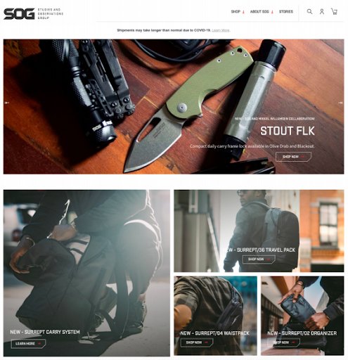
All of the homepage images are linked and have CTAs such as “Shop Now” and “Learn More.”
3. Think about the mobile experience.
More shoppers are interacting with brands from mobile devices, including smartphones and tablets. For instance, in 2020, U.S. mobile retail revenues are expected to amount to $339.03 billion, up from $207.15 billion in 2018.
To reach customers on mobile, you have to prioritize the mobile experience. Prioritizing the mobile experience means that it should be easy to see and navigate when a visitor is looking at your homepage from a mobile device. Avoid any flashy, complicated design that will only get in the way.
As many as 85% of adults believe a website, when viewed on a mobile device, should be just as good or even better than its desktop website.
Although using a mobile device to look at websites and make purchases is on the rise, it’s still relatively new compared to the internet’s lifetime. As a result, practices that convert mobile users aren’t as widely known as they are for desktop efforts.
For mobile sites, A/B testing is that much more critical. But A/B testing for mobile isn’t as clear-cut as for desktop because shoppers may use mobile as a touchpoint in their shopping journey. For example, customers may see something they want to buy on mobile, but they go to their desktop to complete the purchase. You’d see the conversion on the desktop when the mobile site converted the customer.
Before you begin any split testing on your mobile site, make sure you understand how your customers use mobile. From there, you can test individual elements of your mobile site or app, just as you would on the desktop version.

Plain Jane has a mobile homepage that’s clean in design and easy to navigate:

The hamburger menu on the upper right side is a classic mobile optimization tactic. It allows users to see the entire homepage and see the full navigation when exploring the site. Plus, the CTA buttons are large and easy to tap.
4. Provide contact information.
Users are becoming more aware of false websites and phishing attempts, which has them on the lookout for suspicious sites and shops. One thing that can assure visitors is displaying your contact information.
As many as 44% of website visitors will leave a company’s website if there’s no contact information or phone number.
Not only does displaying your contact information help build trust, but it can also create a better user experience when someone needs to contact you. Different customers prefer specific contact methods, so leave as many options as possible, including social media channels, phone numbers, email addresses, etc.
Solo Stove displays a contact button right within their website navigation:

When a user clicks “Contact us,” a message box pops up within the site and has room for text and any necessary attachments.
5. Offer a personalized experience.
Today’s customer expects personalized shopping recommendations from ecommerce sites. Utilize a customer’s purchase and browsing history to show them items that may be of interest.
You can also remind customers of items from their abandoned carts and upsell products from items they’ve purchased in the past. You can also show related items to things they’ve looked at.
As many as 34% of consumers are more likely to make an unplanned purchase after receiving personalized content.
A personalized shopping experience can lead to additional purchases, but it can also increase a customer’s lifetime value and customer engagement. Customers satisfied with their experience at your store means there’s a higher chance they’ll return.
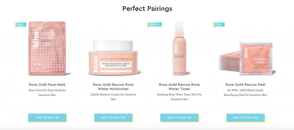
Bliss World makes shopping easy when they show related products as you browse.
Also, do not forget about personalizing customer experience by using a live chat. Many of your customers want to get specific information about the products they consider buying.
Research indicates that eCommerce sites with live chat report up to a 40% boost in conversion rates. Talk to your site visitors in real-time to recommend the best products, up sell, increase average order value and make them fall in love with your customer service so that they keep coming back!
Download Free: Landing Page Optimization Guide
6. Feature your best products.
Even though most of your products will live on internal product pages, you can show off your best products right on the homepage. Featuring your best products gives customers an immediate idea of what to buy.
Over time, you can test which products do best on the homepage. You can also try displaying bestsellers, seasonal items, or new products on the homepage.
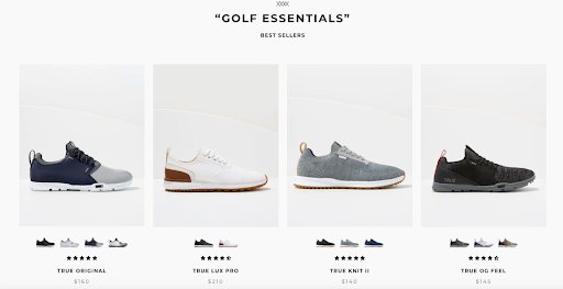
TRUE Linkswear displays its bestselling golf shoes on its homepage. The photos link right to its bestsellers page.
7. Demonstrate site security.
Hacking and identity theft are becoming more common, and online shoppers want assurance that you’ll keep their information safe and secure. If you can show visitors that your website is secure, you’ll be more likely to convert customers.
Display widely-recognized trust seals and badges on your homepage. You can link these symbols to your security provider, so they can research as they wish. These can go in your footer.
If you don’t already have one, you’ll need to get a Secure Socket Layer (SSL) certificate. Otherwise, the browser will flag your website as “not secure,” and often, it won’t even display your site.
Any sign of an insecure website makes a poor first impression that will likely turn someone away for good. No one wants to turn over payment information to an unsecured website. Get an SSL certificate and reassure customers that their data is safe on your site.
The Kettlebell Kings have their trust badges displayed in the footer of their site:

Their homepage also displays its Google Reviews, which would reflect any issues regarding site security. Plus, they list the experts and publications that have tested and approved their products, which adds credibility.
8. Highlight sales.
Everyone loves a sale, and it’s wise to display any current promotions on your homepage. You can also have a clearly marked and easily accessible sale section on your website.
For example, you can promote seasonal sales on your homepage and have a standing sale section within your site’s navigation.

Yumi is using their homepage — above the fold — to entice buyers with an end-of-year sale.
Getting started with optimizing your homepage
Now that you’ve got several to-dos for optimizing your eCommerce homepage, you can begin making the updates. Here’s how to get started:
1. Conduct an audit.
No matter what the project is, it’s always best to take a look at the current situation and evaluate it from there. In website terms, an audit is an excellent place to begin.
An audit helps you see things from the customer’s perspective. It’s a methodical way to objectively look at your site and make improvements to grow your business.
An audit can cover several different areas of your business, including content, SEO, conversion rate optimization, site performance and eCommerce platform analysis, among other things.
The more topics you decide to examine in your audit, the more findings you’re likely to discover. You may choose to do the entire audit at once, break it up into chunks, and create an audit schedule.
Make a checklist for your audit. Here are some of the items you should put on it:
- Are all of the pages and images loading correctly?
- What is the page load speed?
- Do all of the links go to the correct destination?
- Does the navigation work across all devices?
- Does the site load and work on different browsers?
- Are there any grammatical or spelling errors?
- Is all of the content up-to-date?
- What does your 404 error page look like?
- Have 301 redirects been appropriately implemented?
- Are the search results for in-site queries correct?
- Do the product pages have thin content?
- Is there a robust system of internal linking?
- Are the right related products showing up during browsing?
- Are the product images high-quality?
- Are your abandoned cart triggers working correctly?
- How much time does your team take to reply to a customer question?
- Is the customer service team effective at resolving the issue?
Once you complete the audit and note your findings, you can prioritize what to fix and update.
It would be best if you made audits a regular part of your marketing strategy. It’s easy to stop updating your website outside of adding new products or adding new content to your blog, but customers will notice when things break or go stale. If you get into an auditing routine, you’ll likely fix problems before they become too severe and stop sales.

2. Identify strategies you can implement.
There will always be recent trends and strategies on the horizon in an ever-changing industry, such as ecommerce. When these new ideas come around, you’ll have to decide if they’re suitable for your business.
Not every idea is worth jumping on because it won’t fit with your audience. Other ideas may be great but too expensive to implement correctly.
Here’s how you can evaluate strategies that come your way:
- Keep an eye on industry influencers and trusted publications.
Keep up-to-date on industry news in your particular market segment. Staying up-to-date on relevant information will help you see the bigger picture and how a strategy works for another business.
- Look at the numbers.
Pay attention to industry research and reports. What are the numbers showing?
- Continue to collect and analyze data.
You know your customers best. Keeping a close eye on the data from customer interactions with your brand will help you assess whether or not a strategy is right for your business.
- Follow search engine trends.
Are you staying abreast of Google’s search engine algorithms and what you can do to increase your organic traffic? Remember, blog posts generate the most traffic and bring users to your product pages. You need to learn how to start a blog the right way with effective content marketing and link-building tactics.
- Get customer feedback.
Collecting feedback and customer service interactions can give you another set of insights that data cannot.
- Look at your competitors.
If your competition has tried a new strategy lately, is it working for them? How would you implement the idea differently?
3. Test. Test. Test.
Once you evaluate a strategy and decide to implement it, you’ll want to run tests to see if it was your business’s right choice. The type of tests or measurements you conduct will depend on the strategy you implemented.
Types of tests to run

Let’s take a look at some of the tests you might consider performing:
- A/B Testing: Also called “split-testing” or “bucket testing,” this type of experiment looks at two versions of something containing one variable. By isolating the variable and comparing otherwise identical items, the data shows which variable meets the goal.
- Split URL Testing: You can test different versions of your website by using two different URLs. A website visitor unknowingly is shown one of the versions of your site to see which one performs better. VWO recommends performing split URL testing when considering a significant change such as a new checkout flow or a diverse menu.
- Multivariate Testing: This type of experimentation looks at several changed elements at once — instead of individual parts — and determines the better option as a whole piece. VWO recommends using multivariate testing when you want to change several items at once, such as a headline, body copy, and a CTA, instead of just a single thing.
Tools for testing
As you may have gathered, testing parts of your website can be cumbersome. Performing tests should be a regular part of your marketing strategy because eCommerce is continuously changing. Customer expectations and shopping habits evolve, as do search engine algorithms. Using a tool to manage your testing and experimentation can be helpful. Here are some trusted tools to consider:
- VWO: An all-in-one, cloud-based A/B testing and experimentation platform that enables you to run multiple tests on campaigns, products, features, apps, and websites.
- Adobe Target: An enterprise-level tool that integrates with Google Analytics for A/B testing, UX testing, and marketing campaign comparison.
- Optimizely: A popular A/B testing tool and CRO platform made for enterprise clients. Run experiments across websites, messaging services, and apps.
- Google Optimize: Run A/B tests, multivariate tests, and split URL tests with Google Analytics data. Google Optimize is suitable for testing beginners, while Optimize 360 is more robust.
However, Google has decided to sunset Google Optimize and Google Optimize 360 in September 2023. If you are a user, you can move to VWO with just one click.
There are several testing tools with various features and pricing models. To see additional options, take a look at this post on the VWO blog.
How to run a test
Once you’re ready to run a test, the right tool can help you along the way. Start by doing your research. Understand how your website or a specific page, such as the homepage, is currently performing.
Next, use the research to form a hypothesis. For example, if the investigation shows your website visitors are not scrolling on your homepage, your hypothesis might be: Placing a CTA above-the-fold will lead to more conversions.
You can utilize key performance indicators (KPIs) and metrics to ensure your hypothesis is measurable. KPIs you might consider include website traffic, time spent on site, social media followers and average click-thru-rate (CTR).
Once you have a hypothesis, you’ll create variations based on it. For this example, you could place your CTA above-the-fold in one version. If an A/B test doesn’t work for your needs, consider multivariate testing.
After you run the test for a set period, look at the results with an open mind. If there is an evident variation that did better, you can launch the latest version. If the numbers don’t show an obvious winner, you can perform additional tests.
Watch the webinar to learn what it takes to become a customer-centric eCommerce business
Wrapping up
It’s easy to see how an ecommerce homepage affects every angle of your marketing strategy. It impacts website traffic, is a factor in search engine rankings, makes or breaks conversions, and affects sales numbers.
Focus on the areas that make sense for your business, have patience, get in a routine of auditing your site, testing individual elements, analyzing the results, and updating as needed. Once you do, there’s no doubt that your homepage can stand out from the crowd.
