Buyers are curious. If they don’t find the information on your website that helps them make a decision, there is a 0% chance they will convert!
Writing an engaging copy to influence your prospects and eventually convert them into customers is a challenging but rewarding task. ADT, a Tyco International company, experienced this when it saw a 60% increase in conversion rate by changing the copy of its CTA.
If you observe your visitors dropping off as soon as they land on your website, chances are your content is not helping them. It could be a poorly worded copy or could be lacking detailed information.
Download Free: Website Optimization Guide
As a business, you must strive not only to write engaging and palatable content for your website but also to consistently optimize it for better conversions.
Before we look at how to arm a website with a truly readable copy that converts, let’s look at the concept in more detail.
What is readability really?
Website readability is the measure of the ease with which your website visitors interact with your site’s content. According to a study, the three key barriers to writing effective web copy are:
- Legibility: Clarity of visual design and typography.
- Readability: Complexity of words and sentence structure.
- Comprehension: Ease of understanding the text and drawing valid conclusions.
It’s safe to say that readability, as understood by most, assumes the roles of legibility as well as comprehension. To avoid ambiguity, we’ll be using the term ‘website readability’ when we talk about this overarching meaning and simply ‘readability’ when we refer to ‘complexity of words and sentence structure’ in the copy.
Read on for seven ways to improve the readability of your copy for conversions:
#1 Be quick in making your point
As scanners begin to read your copy, they do a quick cost and benefit analysis in their heads:
Cost: How much time and effort would it take to read this web page?
Benefit: What useful information/solution will I extract from this web page?
If the perceived benefit outweighs the perceived cost, they will read. How do you ensure that happens really quickly?
Identify your target audience
You love your writing style! But that does not mean that your audience is going to get that well-curated content piece right and would love it too. Understanding the readability level of your target audience is the primary exercise that you must do before putting your pen to paper.
You can utilize tools like VWO insights to understand your visitors’ behavior and figure out the target audience, who could be your prospective customers.
APP method – agree, problem, preview
For business blogs and other content-heavy pages, a tried and tested method of copywriting is using the APP method. The beginning of a post is dedicated to getting users to ‘agree’ on a common worldview. Once the reader agrees with it, the handshake is made. Then, go on to state the problem and make a promise to solve it. This is where the user is assured of the value of the post. Once you’ve roped the user in, present a preview of the solution and how it will change things for the better. Brian Dean admits to using this style extensively for Backlinko for a super four minutes and four seconds average time on page.
Although this method is widely popular among copywriters, the best practice is to write a copy that is aligned with a business goal, which could be engagement on the page, subscriptions, driving MQLs, etc., and then A/B test it to measure the success of your efforts.
For example, VWO’s Visual Editor generates copy recommendations that are integrated with Open AI’s GPT-3.5 Turbo API. It enables you to save time on thinking to create a copy while you run an A/B test or deploy a change in your variation.

Inverted pyramid copywriting
One way is to make your point right up to explain the specifics and why users should believe you. This way of copywriting is called the inverted pyramid style. It helps users easily scan the main points and decide if they want to go into the details. Further, use contextual headings, subheadings, and keywords in bold so that the user can scan what you are offering. Here’s an example from Apple.

#2 Assess readability quantitatively
Let’s face it. It’s not easy to objectively judge how ‘readable’ a text is. But there are standardized tools that help you objectively compare versions of a copy. They calculate the complexity of words and sentence structure. Most tests provide you with either a numerical score or a grade level that determines how easy/difficult it is to read your copy.
For tests that provide a numerical score, the tests themselves recommend an optimum score. For tests that provide a grade level, the optimum grade level is the average reading grade level of the audience you are targeting.
In the US, the average is seventh to eighth-grade level. This means that most people are comfortable reading text that is understood by 11 to 13-year-olds.
#3 Use words that your users understand
Users get comfortable with your writing when you filter out jargon and trim down on fancy vocabulary. Using words that users can relate to is the key. Readability tests such as Dale-Chall use a list of familiar words to gauge readability.
However, in order to use words that your user is familiar with, you have to be familiar with your reader first. Give a little thought to the audience you are writing for, and try to keep your copy in sync with their cultural and educational background. You can get some understanding of interaction with some words by looking at clickmaps.
#4 Measure users’ comprehension
Consider the following sentences:
- He waved his hands
- He waived his rights
Both sentences score well on readability tests. Both are short sentences employing short words. While everyone might understand the first sentence, the second sentence has bigger implications that might require a law degree to fully comprehend!
This is why it is important to make sure that your copy is readable and understandable.
You can test how familiar and comprehensible your copy is to the reader using a Cloze Test.
In the Cloze test, readers are provided with a block of text with every fifth or sixth word blanked out. Users are then asked to fill those blanks as best as they can. The number of blanks they are able to fill with the right words is their score. If users get 60% or more right you can be fairly certain the text is comprehensible. For instance, consider this example below taken from BBC’s terms of use for its online services.
3.2.2 If you do not 1)____ a valid television licence you may not watch 2) __________ programmes using BBC Online 3)________ on any device (including 4) ______ phones, “smart” phones or 5) _______, laptops, tablets and personal 6) _________) at the same time ( 7) __ virtually the same time) 8) __ the programmes are being 9) _________, simulcast or otherwise made 10) _________ (by the BBC on 11) __________, unless you have a 12) _____ television licence. For more 13) ___________ on this requirement please 14) ___ the Frequently Asked Questions 15) __ you can contact TV 16) _________ by calling 0870 241 5590 or by visiting www.tvlicensing.co.uk.
It is important to understand that the Cloze Test is not an alternative to the readability test. Instead, it involves feedback and participation from the readers and measures their reading comprehension, not just how ‘readable’ a block of text is.
Download Free: Website Optimization Guide
#5 Pay attention to typography for better legibility
Copywriters and content specialists cannot do much about visual design. The C.R.A.P design principle can help you consistently deliver effective design to improve the legibility of your copy.
Use contrasting texts and text hierarchy. The text color should appear distinct from the background. Use headings and subheadings and bullet points to make the copy structured and organized. Shorter sentences and new paragraphs every 3-4 lines would also give your readers some breathing space—it might hook them till the end.
Smashing Magazine recommends either 16 pixels or more for users to read from a comfortable distance of 28 inches from the screen.
Choosing the right typeface is important. Sans Serif fonts are relatively cleaner than Serif fonts. The primary goal is legibility. If you are using Serif fonts, don’t use them simply for aesthetics; use the ones that don’t challenge website readability.

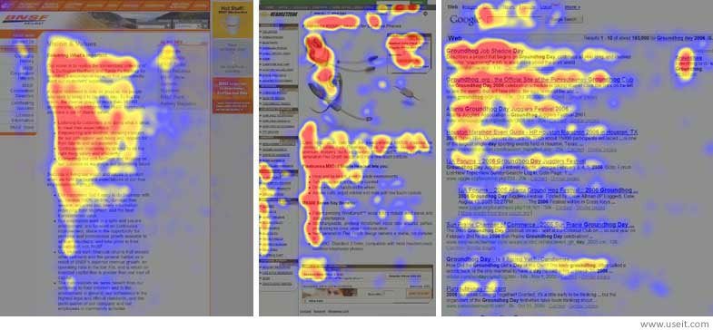
Image source: UX Planet
While eye tracking is an expensive technology typically employed through specialist agencies, click data is a promising, cost-effective arelevantive to understand visitor behavior. You can observe patterns in click data similar to eye-tracking data. The volume of data available of clicks will be, however, less than that of eye tracking.
Readable sentence length goes on decreasing as we go down the page. In addition to mental fatigue and short attention spans, it is physical fatigue as well. The optimum range for sentence length is about 45 to 75 characters. If the sentence is too wide, the user may not be able to focus from beginning to end. If it is too short, the user may read the same words twice (doubling).
Scanning through text becomes easy with optimum sentence length and height. It also makes reading less strenuous for the human eye.
Responsive web design takes care of adapting sentence length to different device screens. You need not worry about fixing sentence length with different screen sizes.
Also, you must avoid smaller fonts as larger fonts are easier to read. Font size should ideally be between 14 px and 16 px.
#6 Make your copy and concept stick to the reader
Tap the power of copy to influence your visitors to convert. You can only do so if your visitor can comprehend your copy and you are able to make a lasting impression. An impression helps in recall and conclusion of the desired action. That’s the intended consequence of copy.
Dan and Chip Heath summarise conveying impressionable ideas in six principles in their book ‘Made to Stick’.
The six principles are (SUCCES) :
- Simplicity: Avoid complexity in the language and structure.
- Unexpectedness: Make your copy interesting by making it surprising. Surprises could be interesting bits of information or surprising data, relevant fun facts, and examples to illustrate.
- Concreteness: Be specific with numbers. Use stats and figures. Don’t use vague adjectives and long paragraphs. Listicles are popular for the same reason.
- Credibility: Data points and numbers are instinctive to grasp on, says Dan Heath. The user remembers them more. They also make your copy more credible.
- Emotion: Using emotion in your copy is to make it relatable – if readers relate, they remember. But be aware of the dangers of overstating a point.
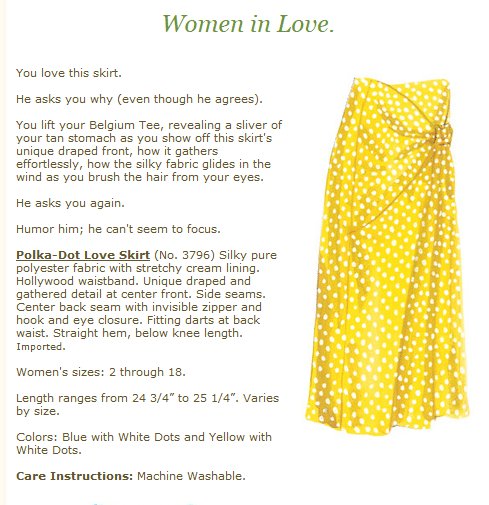
- Story: Do you remember what happened to Peter Pan? Thumbelina? Pinnochio? Because they are stories. Stories stick to users. See how J. Peterman weaves a story into their product descriptions. Go ahead, swoon.

Adding emotion and stories is subjective from copy to copy. Emotional copies may not go down well when a rational approach is needed. Use these elements with caution.

#7 Use images to drive attention to copy
It is no secret that relevant images serve the purpose of storytelling and emotional appeal. We discussed both these elements in the six principles that make users stick to your copy.
But did you know that images can be used effectively to shift the user’s attention to the copy on web pages? Here’s an example everyone’s seen:

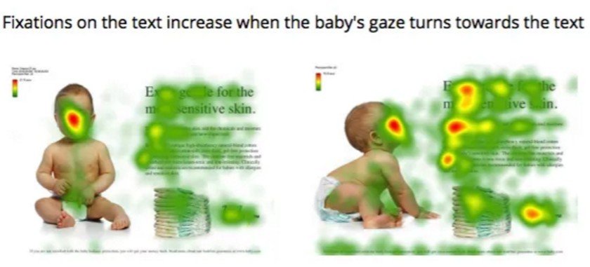
Image source: Neurosciencemarketing
The baby’s gaze in the image got more attention to the copy
Users follow the baby’s gaze and their attention shifts to the copy, as the red spots on the heatmaps indicate.
Not just images, image captions are scannable elements as well. They are read 50% more than the rest of the copy and have a recall rate of almost 100%. Write your captions to capture interest just as you write headlines to woo the reader.
Conclusion
A readable copy helps the reader extract its purpose easily and effectively. You can also leverage the power of GPT-3.5 Turbo in copy-driven optimization to run better and faster experiments for improved conversions.
On the bright side, not all copies go unread.

FAQs on Website Readability
Readability is the ease with which a reader can understand a written text. The readability of a particular text depends on content (for example, the complexity of its vocabulary and syntax) and typography (for example, its font size, line height, and line length).
Some of the ways that you can improve the readibility of your website are being quick in making your point, using words that your users understand, and using images to drive attention to copy.


![7 Best Website Monitoring Tools [2026]: Expert Insights to Help You Pick the Right One](https://static.wingify.com/gcp/uploads/sites/3/2025/02/Feature-image-7-Best-Website-Monitoring-Tools-How-to-Pick-the-Right-One.jpg?tr=h-600)


