How to Use Your Brand to Boost Website Conversion Rate?
In today’s highly competitive market, every brand wants to excel in their field and become the #1 choice of their target audience. But the major question is how to know whether people appreciate your products or services and are willing to become your brand’s advocates? It’s simple. Map your conversions. The higher your conversion rate, the better will be your brand’s position in the market.
Download Free: Conversion Rate Optimization Guide

Before diving deep into how to measure your brand’s conversion rate, what are the benchmarks, and how to increase conversions, let’s start with the basics and understand what is a conversion and a conversion rate.
What is a conversion and conversion rate?
Digital marketers are typically dawned with two major tasks. One, building brand awareness in the online marketplace, and growing website traffic using techniques like search engine optimization, pay per click advertising, and social media marketing. The second being, nurturing these website visitors with optimization and personalization to convert them into paying customers. This phenomenon of turning a potential visitor into a brand customer counts as a conversion.
The conversion rate, on the other hand, is the percentage of people who take the desired action on your website. This can be anything, from making a purchase to subscribing to your services, downloading an eBook, and more.
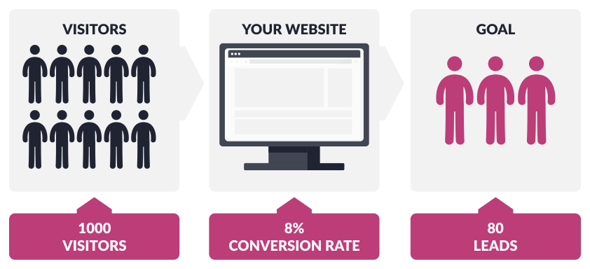
Tracking conversion rates helps assess many aspects of your business. You get an idea of your messaging’s potency, the persuasiveness of any product pages, the effectiveness of your CTA buttons, and more. A higher conversion rate also means your marketing strategies are proving effective and helping your brand stand out.
How to find your brand’s current website conversion rate?
Calculating your brand’s conversion rate is quite simple and straightforward. All you need to do is divide the total number of conversions recorded during a specific time frame by your site or landing page’s total traffic and multiply it by 100.
Conversion rate = (conversions / total visitors) * 100%
For example, if your site was visited by 10,000 in July and recorded 2,000 conversions, your conversion rate will be 20%. Besides manually calculating the percentage, you can also view/track your conversion rate through an analytics platform (Google Analytics) or online advertising platform (Google Ads and Facebook Ads).
Another great thing about the conversion rate is that you can be as broad or as specific as possible. Meaning, in addition to mapping the conversion rate of your website, you can also measure the conversion rate of various marketing channels, different pages, campaigns, individual ads, keywords, and so on.
It’s an excellent metric to evaluate the performance of almost every aspect of your website and online marketing efforts. Getting clicks on your CTAs is great, but ensuring these clicks end up benefiting your brand is what matters the most.
Where does your brand stand? What is a good website conversion rate?
If you’ve been following so far, we’re anticipating you must have calculated your website’s conversion rate out of eagerness. But what does that figure speak about your brand and its performance in the online marketplace? For that, it’s essential to know your industry’s average conversion rate.
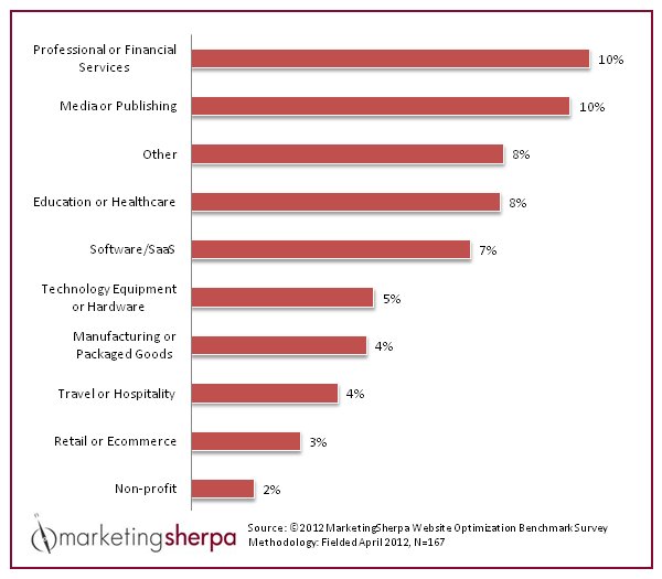
As per MarketingSherpa’s analysis (represented in the graph displayed above), the conversion rate of the B2B industry ranges between 2% and 10%, with the average mark hovering around 2.55%. eCommerce, on the other hand, registers an average conversion rate of about 2.63%.
If your calculated conversion rate percentage stands anything near or instead, is more than these averages, your brand is certainly performing well. Meanwhile, if your percentage is way lesser than the average benchmark, it’s time to revamp your optimization and marketing strategies, and A/B test your changes.
Simple tips to boost your brand’s conversion rate
Boosting conversions is the central premise of conversion rate optimization (CRO). CRO is a nuanced and complicated process. But when done right, it can significantly improve your brand image and pave the way for higher revenue gains. Mentioned below are three simple tips to help you boost your website’s conversion rate.
1. Audit and improve
When you find content with a low conversion rate, there’s a danger of throwing out the baby with the bathwater. Inexperienced marketers get tempted to scrap the page entirely and start over again. That’s not the best way to do things. Instead, perform proper audits and discover why your site’s content isn’t working in your favor.
Auditing various metrics such as bounce rate, visitor time spent, total and unique visitors, etc. is one of the activities you should perform. Using this quantitative data along with qualitative data (gathered through heatmaps, scrollmaps, session recordings, funnels, etc.) to create hypotheses and conducting A/B tests is the other thing you must do to identify potential loopholes or leaks.
A/B testing is arguably one of the best ways to find faulty page elements and fix them to uplift conversions.
Let’s take Locations Hawaii, for example. It’s a website that helps find a property that best suits their needs and demands using innovative technology solutions. For Locations Hawaii, property inquiries generated through their real estate search website were what drove the business. However, their conversions were below average, giving a hard time to the company in terms of overall revenue generation. After a thorough analysis of their lead-gen page and stepping into a user’s shoes, the Location Hawaii execs decided to A/B test whether they could generate inquiries through their property details page.
They created two variations based on two ideas:
- Change the CTA from “Inquire” to “Contact Agent” displayed in a bigger font size.
- Moving the new CTA (“Contact Agent”) above “Inquire.”
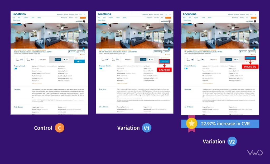
Running the test with three variations, the company noticed that Variation 2 increased their overall conversion rate by 22.97% over the control.
2. Make offers clear & unique
At a basic level, your lead magnet is what you’re offering in exchange for conversion. For example, allowing visitors to download an eBook in exchange for an email address, providing a 10% on new signups, or posting an original story that convinces visitors to rally to buy your product. The action you want is for visitors to provide valuable information such as their email address, phone number, etc. that help you build a vast base of potential leads.
However, for a lead magnet to work in your favor, it ought to ooze clarity, uniqueness, and conveys an offer that’s hard to resist. Using appropriate CTAs and optimizing related page elements is equally important.
For example, The Vineyard, a hotel located in Berkshire, United Kingdom, decided to run an A/B test on the text CTA, “Book Online,” embedded on their room booking page. They noted that the CTA was almost invisible to the naked eyes, especially owing to its positioning and being a running text call to action. The Vineyard decided to make the CTA more prominently visible to their visitors and hoped to see an increase in the over click-through rate. They created a CTA button with the same text “Book Online” and placed it just below the banner image on the right side.
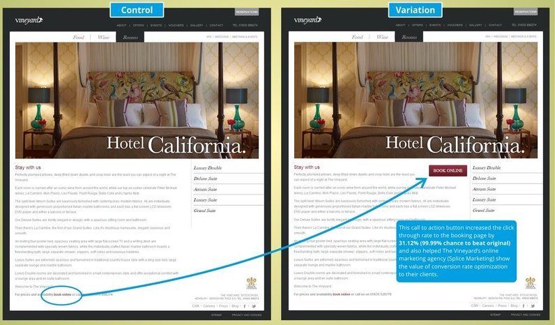
The Vineyard saw a 32.12% increase in their click-through rate (CTR) beating the control by a near perfect score of 99.99%.
Download Free: Conversion Rate Optimization Guide
3. Remove unintentional barriers
User experience is another factor that’s critical to CRO. The better the user experience, the higher will be the conversion rate. Create a website that has a clean design, clearly displays your brand’s offerings, is easy to navigate, and has a good load speed. Cluttering it with unnecessary data and page elements will only disrupt a customer’s experience and hamper your conversion rate.
Take a product page, for example. Rather than loading it with any and every information about the product in the form of long paragraphs, convert it into easily digestible bullet points. Leave some white space for the website to breathe. Place your CTA right in front of the visitors’ eyes or in a place where visitors are most likely not to miss noticing it. Remove unintentional barriers and let customers enjoy their visit to your virtual store or office.
To explain the concept in-depth, let’s take Flying Scot as an example. A 24-hour airport security parking provider in Edinburgh and Glasgow, Flying Scot, noticed it’s conversion rate was the same for a long time. By diving deep into data and doing a thorough analysis of the behavior of its visitor, Flying Scot noted that most visitors were bouncing off from its booking page without completing and submitting the booking form. The execs at the organization hypothesized that they might witness an increase if they simplified their booking form. They ran an A/B test to verify their hypothesis. Below are the control and variation variants of the test.
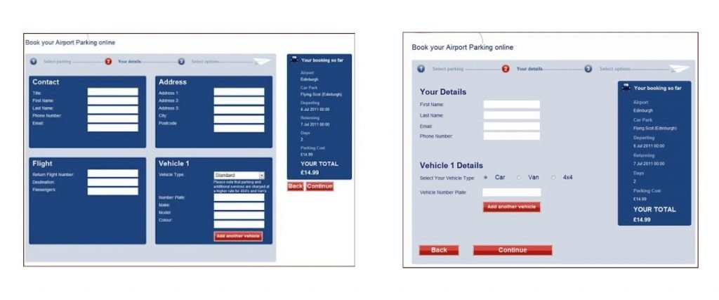
To their surprise, the company saw a 35% increase in form submission and a 45.45% increase in their overall conversion rate.
Just by decluttering an important website page, you can pave the way for higher conversions.
Time to start improving the conversion rate for your brand
Understanding the importance of optimization to increase conversions is very important. The better optimized your site is, the more conversions it will attract. If you’re someone who was still not paying much attention to the very concept of conversion rate optimization, now is the time to rethink.

