

Whether you are a seasoned marketer or a newbie owning an online store, you are consuming content every moment on the web to step your game up.
The Internet is littered with posts that simply ask you to go ahead and test this CTA or that headline! However, it’s important to bear in mind that the best-performing A/B tests are ones that are planned and executed well.
In this post, we will walk you through the 20 elements that you must A/B test for your eCommerce store for increased conversions.
Download Free: A/B Testing Guide
A/B Testing
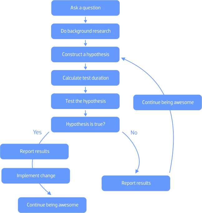
A/B testing or split testing is the scientific way of arriving at the truth, or at least the best option in a given set of conditions.
Website A/B testing broadly means testing two versions of a webpage to see which fares better with your visitors and earns you more sales or conversions.
It is nothing short of a laboratory experiment. To get significant results, you must follow the Scientific Method.
A/B Testing in eCommerce
You might be running a reasonably successful company and making decent revenue out of it.
However, you are still skeptical about your conversion funnel, mediocre return on Ad spend and conversions.
But skeptics are of no help; giving a shot to A/B testing could be!
The chances are high that although you know where you are messing up, you can’t decide where to start the ecommerce testing from.
Remember, A/B testing is no magic!
It is like going to the gym regularly to get the results. You ought to be consistent enough to get the desired results while performing A/B tests for conversion optimization of your website.
You must consistently hypothesize, test, experiment, and repeat!
Analyze your eCommerce website for free
Where Do You Use A/B Testing in eCommerce?
The number of elements you can test is endless, but here are 20 testing ideas that you should give a try for your eCommerce site to fix the mess:
1. Free Shipping
The secret is that you should never be charging your customers for shipping.
Do a test to compare conversions by testing your product with free shipping and without it. You can include the shipping amount in your product base price for the free shipping variant, whereas keeping the control as without free shipping.
Similarly, you can run another test by creating a threshold value for free shipping, and so on to gauge what works best for your conversion goals.
Also, do not forget to display this in BOLD on your website!
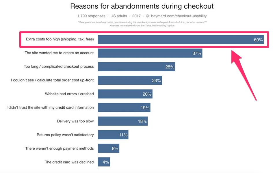
Image source: Baymard
Extra cost at checkout, including shipping charges, tops the list of the reasons accountable for maximum cart abandonment rate.
2. Hero Images Over Carousels
They say, a customer today can smell an ad a mile away! The typical web-user behavior has trained the human subconscious to overlook anything which looks like an ad.
Carousels, though not ads, seem like ads that are non-engaging and end up frustrating users.
Better alternatives are high-resolution hero images that are in-line with your business.
A hero image or a hero header is nothing but a website design term that is extensively used for banner-sized images that let your user see and background videos that made them experience your story. They are positioned upfront on the landing page.
Interestingly, now you have another option to test a hero background video against an image too.
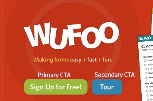
3. Call to Action (CTA)
Size:
CTA button should be prominent, bold, easy to find, besides having a smart placement on your website.
How big it should be for driving desired conversions can be figured out by experimenting with different sizes.
Also, there might be circumstances when you’re talking about two call-to-actions on the same page. In such cases, reducing the button size of your secondary call-to-action makes sense. Here is an example taken from Wufoo.com:
Phrasing:
Similarly, you can test the CTA button for phrasing. Besides writing SEO-optimized product descriptions and copy, your CTA button calls out to the understanding of the human psyche. Surely, it depends upon your business goal, such as buy now, try now, free trial, etc.
Here is an instance from a landing page where the target group is people needing a loan.
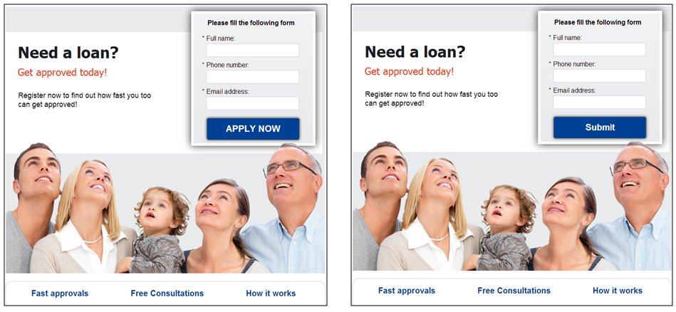
They checked the effectiveness of phrases in their two variations as ‘Apply,’ which implied in the hypothesis that the prospect could be rejected versus ‘Submit,’ which sounded more reliable and welcoming.
Color:
Your CTA needs to stand out. Period.
Visual appeal, aesthetics, design of your website–everything goes in vain if you are not able to achieve your business goals through them.
The last thing you should aim to achieve is to blend your CTA with the theme of the website and your bias towards one favorite color.
Confused? Never mind.
Keep aside your biases and run a test to find out which color would work for your CTA.
Here is an example where a red color button was tested against a green one.
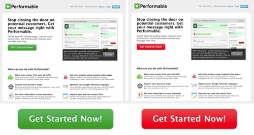
Green invariably is associated with go, and red implies danger or avoid. But the results of this test were surprising.
The red-colored variation of CTA got 21% more clicks than the green one.
Placement:
Usually, CTA is placed above the fold on your website. But as said, do not assume and go only after best practices.
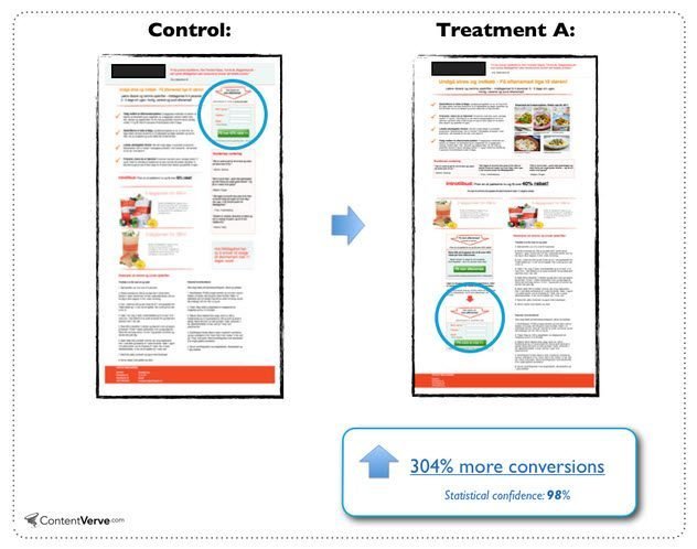
A study by ContentVerve found that moving the call to action below the fold increased the conversion by 304%.
Also, do take note that these CTA buttons make sense for long-form landing pages. Since most businesses are now shifting to mobile-optimized websites, this would apply only to the desktop versions.
Test your CTA button based on the natural flow of your landing page–above the fold, middle, left, right, try everywhere.
Run a test for two until you find the winner.
4. Human Photographs
To increase your sales, you must appear real to your customers.
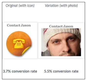
Using high-quality human visuals on your website as a design element can be transformational for your eCommerce business. For instance, Jason Thompson conducted an A/B test to see if replacing a contact icon with his own photo on his page would lead to more people contacting him.
The control and variation looked like this:
However, human photos are not a panacea for all websites.
The best way around is to A/B test photos against the control with no photos on your eCommerce website.
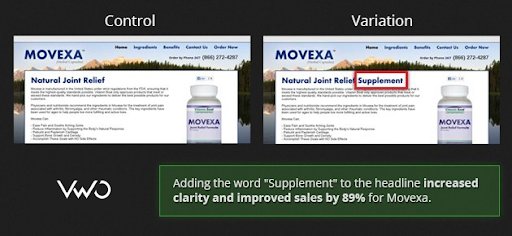
5. Headline Wording
The landing page of your eCommerce website is suggestive of the actions you would want your visitors to perform.
Based on the business goals you have set, wording can prompt them to take action.
A/B test your headline wording to figure out the most effective phrase that yields high conversion rates.
For example, Movexa, a pharmaceutical company, increased their sales by 89% after adding the word “supplement” to the headline on this landing page.
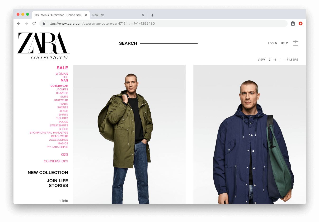
6. Product Page
The design of your product page plays a crucial role in your eCommerce business as it directly translates into dollars.
Any mistake would cost you money, which obviously, you would never want.
You must use high-quality images to make your products look super on your category pages! You can experiment with how you display your product images, such as showing a lifestyle on a product category page against an isolated picture of the product against a white background.
For example, Zara takes this to the extreme by using extra-large images on their product category pages.
You can test the mosaic view against the list view.
Mosaic view:
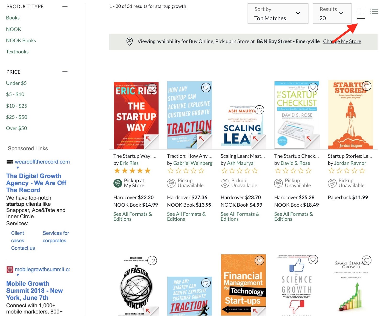
Image source: Sumo
List view:
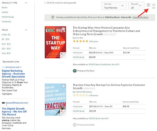
Image Source: Sumo
It is entirely dependent on what your customers prefer to see. So, test and find the winner!
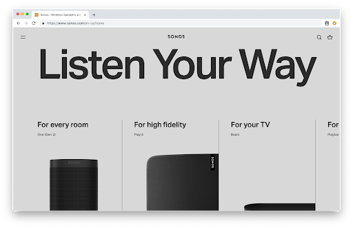
7. Font Size and Line Height
Experiment with different font sizes and line heights to improve the readability of your content. If the text on your homepage is clumsy and small, none of your customers are going to take the time to read it.
For example, Sonos opted for an ultra-minimal design and layout for its website, but it doesn’t detract from the user experience.
8. Personalization
A user left your page while browsing for a table lamp. You can cookie such visitors and offer them to pick from your new collection of table lamps when they revisit your page.
Every aspect of personalization to better the user experience, can help you increase conversions.
Here is an example of ASOS that uses personalization for recommendations basis previous shopping behavior of their customers:
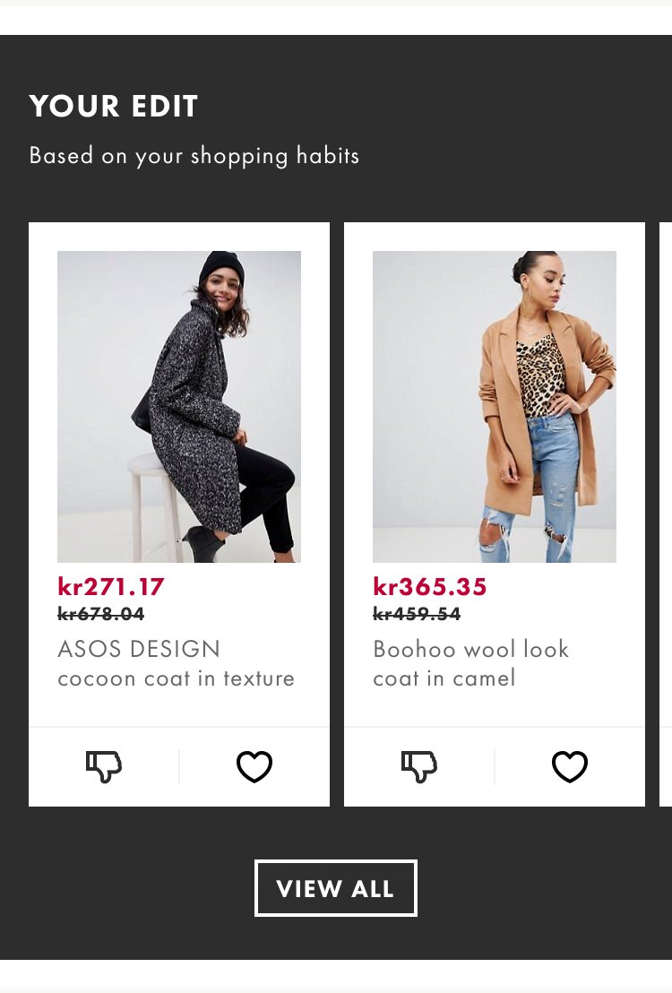
Image source: ASOS
You must test your page with and without personalization to see how it affects your conversions.
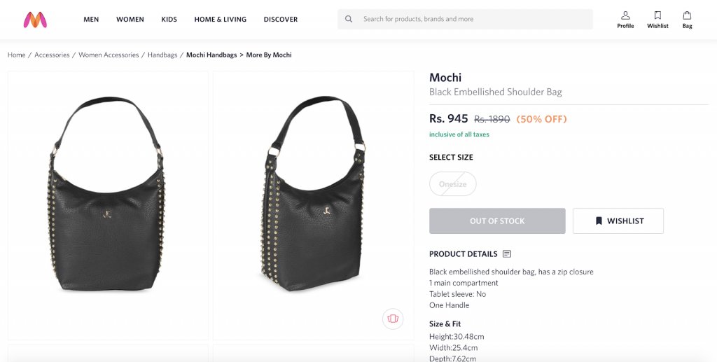
9. Notify for Back-in-Stock Products
When your product goes high-on demand, look at it as an opportunity. Provide your visitors with an option of back-in-stock notification, which means that you will notify them when the product they intend to buy gets replenished in the inventory.
This will not only help you with their email addresses but also won’t let your customers go away empty-handed.
For example, an Indian lifestyle brand Myntra asks their visitors to ‘wishlist’ the sold-out items they intend to buy in the future.
As soon as the visitors wishlist it, they are redirected to Myntra’s sign up page that essentially asks for the email address as shown below:
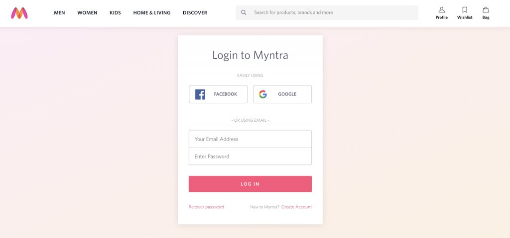
You can test the impact of putting sold out options on your sales by testing it against your control that does not provide any actionable cue to your prospects when any commodity goes out of stock on your online store.
10. Help People, Don’t Sell Them
You don’t always have to sell to the people to make money. It always helps when you start a conversation around helping them. Such prospects are more likely to convert into customers.
For example, ActiveNetwork made a decision to change how they use emails for promoting their product. Instead of using the usual sales tone, they created a new email template copy, using a supportive tone.
Have a look at the difference.
Sales version:
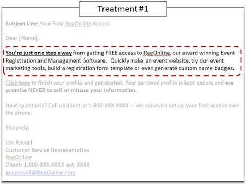
Image Source: MarketingExperiments
Supportive version:
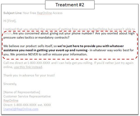
Image Source: MarketingExperiments
The latter increased the leads by a whopping 349%.
Download Free: A/B Testing Guide
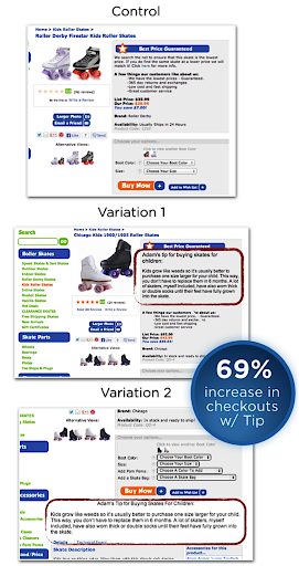
11. Expert Tip on an Item
Adding warmth to your customer experience is something that eCommerce stores often struggle with. An expert tip at the product page has huge potential to boost your sales.
This not only builds a genuine emotional connection with your target group but ensures the customer that it is worth investing in your product.
For example, while running an A/B test for Roller Skate Nation’s product page, an expert review boosted their sales by 69%.
12. Promotional Content
Practically, everybody loves discounts. However, you must not make assumptions, falling for the theory that promotional content always drives conversions.
Let us have a look at this case study on the SimCity website:
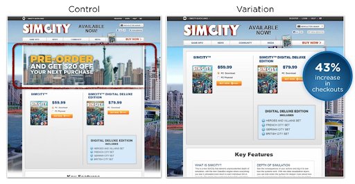
Image Source:SimCity
The control was the original landing page, having promotional information at the top of the screen, below the menu bar.
It was pretty simple, right?
If you go by assumption, an incentive like this must be good enough for conversion.
However, when it was eliminated from the landing page, they saw a 43% increase in checkouts.
This is an implication of the success of simple website designs that drive conversions. Visitors did not get perplexed to figure out the CTA button in the variation, which ironically the control did with the promotional content under the menu bar.
However, you need to see by testing whether adding promotional content is worth including for your eCommerce business.
13. One-Page Against Multi-Page Layout
When it comes to cart abandonments, providing checkout on a single page versus multiple pages can have a significant impact.
You can see on the screenshot below how Walmart creates a convenient checkout flow on one page.
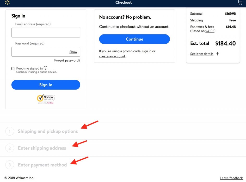
Image Source: Designforfounders
But you should know what the easiest way possible for your customers is. Ensure that they never struggle or feel lost in the middle of the sales cycle ever.
14. Customer Support During Shopping
Lack of support is one of the detrimental factors for shopping cart abandonment rates.
Your visitors have some expectations from you in terms of convenience and service.
Now, how can you provide that kind of support?
If you do not offer live chat, try experimenting with it.
You can surely invest in technology for a month or two, in let’s say, a 30-day free shipping period and test it against the control, without live chat to measure hike in sales.
15. Navigation Menu
Keeping things simple is your best bet, whether it is for design, page layout, or navigation menu.
Your visitor is bound to get frustrated, looking at the complex navigation menu of your website, which is supposed to show him the way.
Here is an example of Yeppiechef. They removed the navigation menu on their landing page and tested it against the control version.
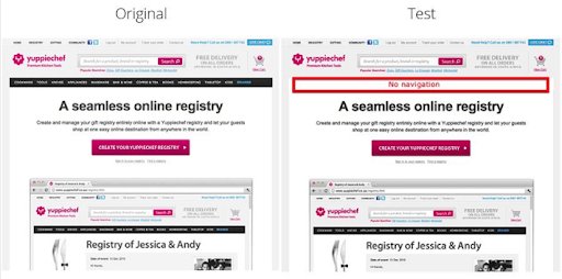
Image Source: YeppieChef
This design change resulted in an increased conversions rate by 100%. If it worked for them, it could work for you too.
16. Quick Product View
To eliminate your prospects’ struggle in finding the additional product description, you must test your site with a quick product view.
This enables them to compare the products in an instant overview and helps them out in making buying decisions faster.
Here is an example that shows the page on the left without a Quick view, while on the right, it shows the details of the product as the visitor hovers the cursor on a specific product.
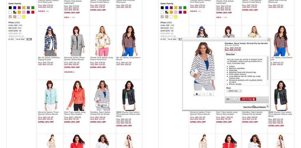
Image Source: Baymard
17. Product Videos and 360° videos
We are living in the age of videos. Product videos are also quickly becoming an absolute necessity to include on your product page for a better user experience.
For example, ASOS was one of the first companies to capitalize on 360° product videos. Many eCommerce companies dealing with apparel and footwear have adopted the video feature.
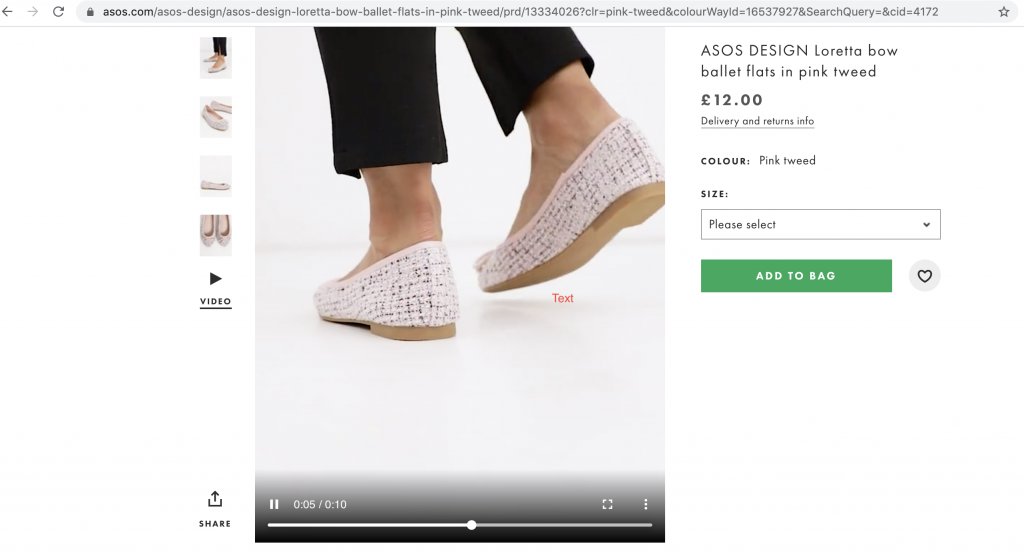
Image Source: ASOS
However, as said, don’t follow the herd mentality. Before making any decision, you must test whether that works for your target audience.
18. Test Upselling Against Cross-Selling
You must test your website for selling complementary products against higher-priced products. For example, Apple are experts at upselling their products by enabling customers to upgrade.
Test what works for your site.
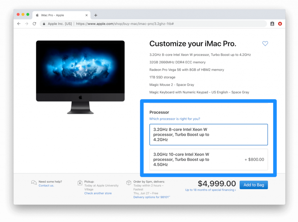
Image Source: Apple.com
19. Including Tags on Preview Images
Emphasizing “Best Seller” or “New” for added guidance can be a sales booster for your website. Add such callouts on items that might be on sale.
Visitors are motivated to purchase when they see callouts to the existing products that interest them.
Here is an example of Wayfair, which uses bright red tags heavily on their site. This way, they indicate price drops and discounts on selected items.
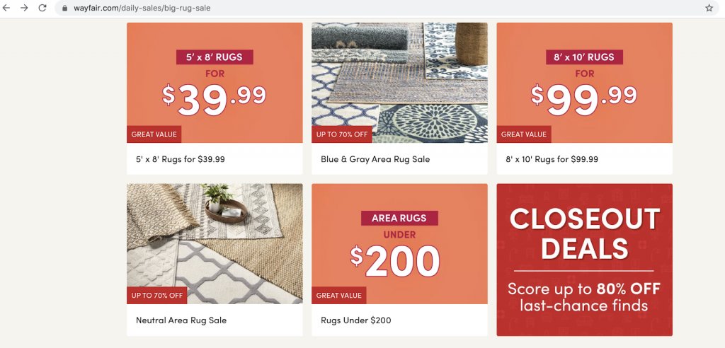
Image Source: Wayfair
This method is not only quick but effective for increasing the success of your product page.
20. Social Proof by User-Generated Content
In the last leg of the sales cycle, just before making a purchase, customers look for validation, ensuring they are doing the right thing.
The best way to go about it is to enable your site with testimonials and product reviews by your previous buyers.
By showing your potential customers how satisfied your customers are with that particular product increases their motivation to make a purchase.
For instance, Tarte leverages this feature on their product pages by showing Instagram posts that hashtag the product.
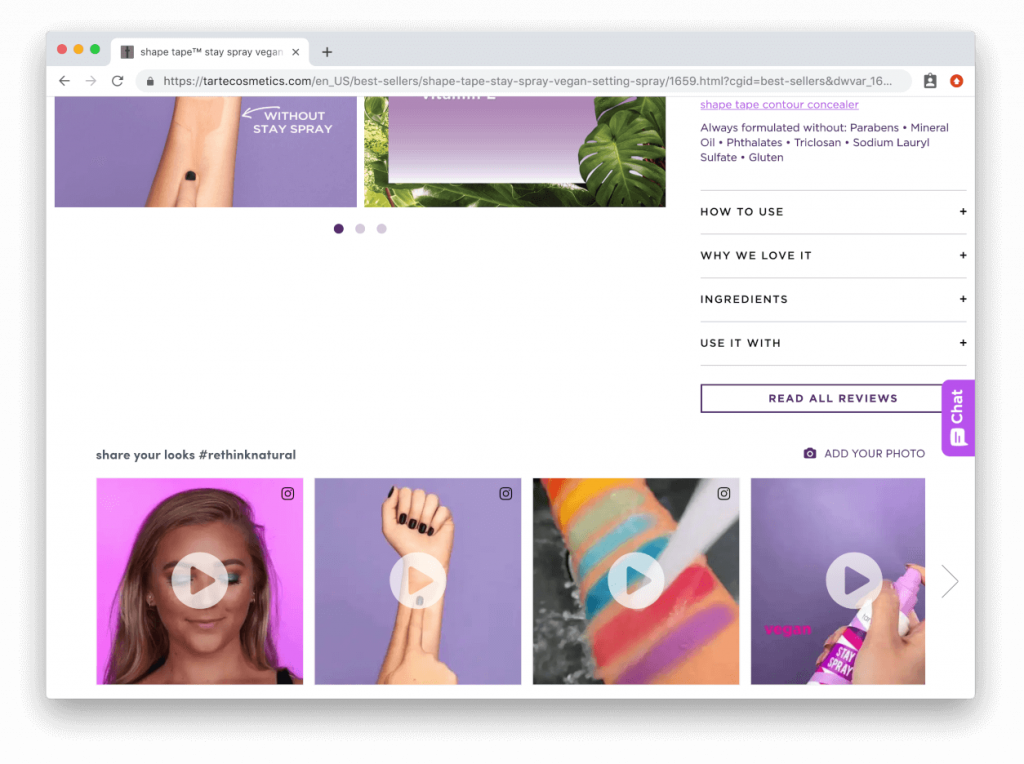
You are getting a free promotion with your superb product that customers happily flaunt on social media.
You can, for example, test reviews against user-generated videos and see which one is the winner.
But which idea should you test first? Watch the webinar to get practical techniques and strategies for hypothesis prioritization.
Conclusion
It will certainly be a learning experience to test all these elements and determine which one converts better on your landing page.
Be ingenious and creative when A/B testing. Following the herd mentality or best practices can only take you so far.
Go ahead and do your first A/B test. Conduct tests with your users in mind and with a definite idea of what you are trying to accomplish.
Think long, think big. Start A/B testing right away.
Categories:


