Most teams running A/B tests rely heavily on metrics like conversion rates, bounce rates, and customer engagement to evaluate performance.
While these numbers tell you what changed, they often fall short of answering key questions like:
- Why did this promising variation not outperform the control?
- Can visitors even see the critical call-to-action we moved?
- If the test had no impact on conversions, what did visitors do on the page?
These questions can create even more confusion for a team, and they might end up relying on guesswork, or probably discard ideas that had good potential.
This gap between data and decision-making is often overlooked or goes unnoticed.
But with the right tools, you can bridge this gap and move from tracking test outcomes to learning from them.
From numbers to behavior: Adding heatmaps to your campaign
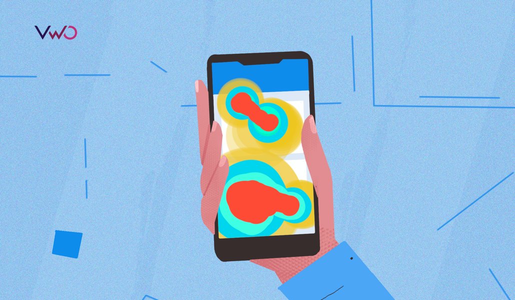
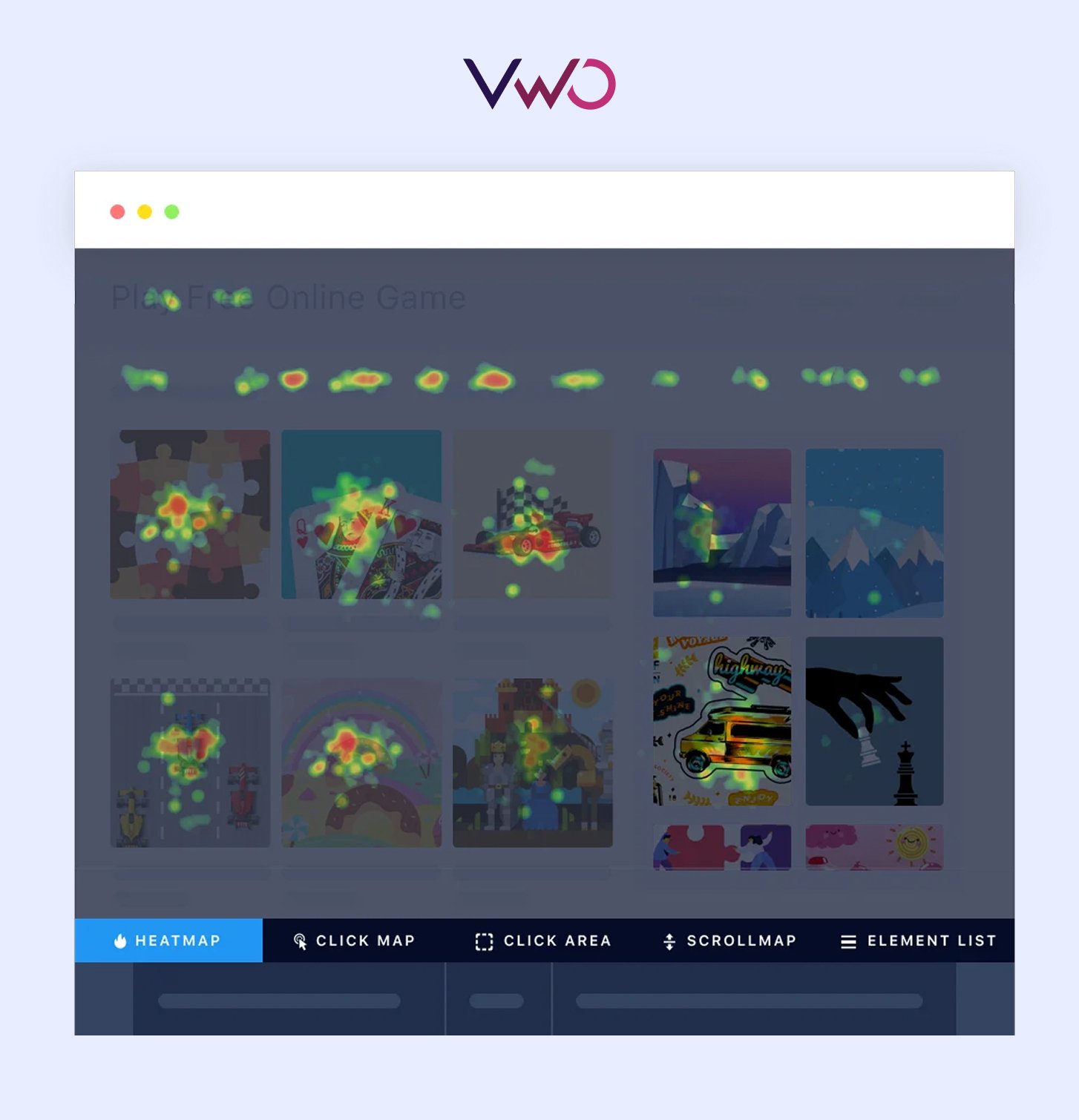
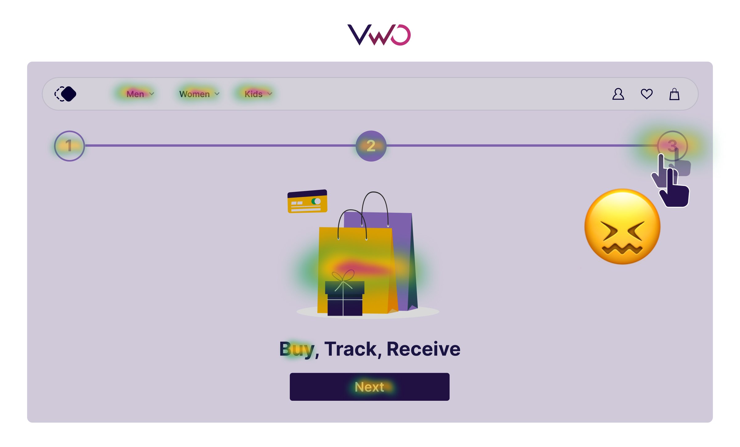
In the context of web analytics and user research, website heatmaps are visual tools that represent how visitors interact or engage with a page.
They show areas of high and low engagement by using various color gradients, typically ranging from cool (low activity) to warm (high activity).
These visuals and activity patterns help you quickly identify where users click, how far they scroll, where they move their cursor, and so on.
Moreover, heatmaps also help you identify which parts of your design or content are drawing attention and which parts are being ignored or missed altogether.
For instance, let’s say your variation underperformed, resulting in a failed test.
Now what?
Instead of stopping here, heatmaps enable you to go a layer deeper and look for the possible causes.
- Were visitors clicking on some other element?
- Did their scroll behavior change?
- Were important elements being overlooked?
By incorporating this type of qualitative analysis into your review process, you can bridge the gap between what the results say vs. what visitors actually do.
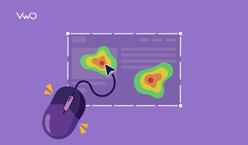
Using heatmaps to gather insights from A/B test data
You can use various heatmaps to identify key trends and hidden patterns in visitor behavior. Here are a few examples.
Are visitors interacting with key elements?
You already know how many visitors land on your page and how many end up clicking your primary CTA. But what about everything in between?
Where else are users clicking? Are they getting distracted by other elements?
Or worse, are they ignoring key sections altogether?
This is a common blind spot in most A/B test analysis. Traditional metrics show outcomes, but not interaction patterns.
Without knowing what users are engaging with or what’s pulling their attention away, you’re only seeing part of the picture.
Heatmaps help bridge this gap.
They visually show you where users are clicking across the page, revealing whether high-priority elements are drawing attention and which areas are causing distraction.
This added layer of insight gives you a more complete understanding of visitor behavior, so you can optimize based on what’s really happening, not just what the numbers suggest.
Insights for your A/B tests
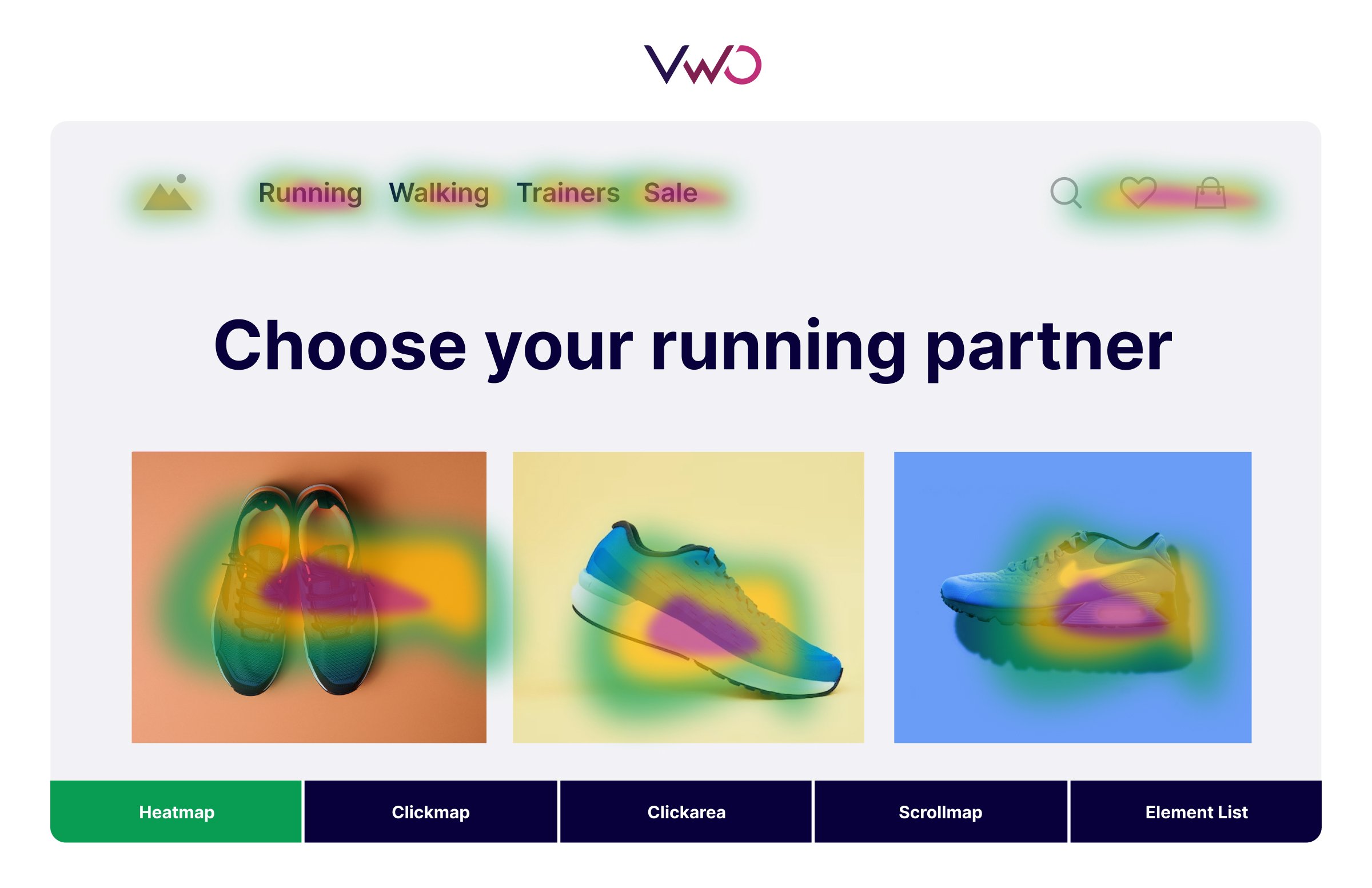
Let’s say you made some changes to the first fold of a landing page and ran an A/B test to compare it against the original version.
However, the report shows that both versions registered similar conversions, indicating that your change did not have the desired impact on visitors.
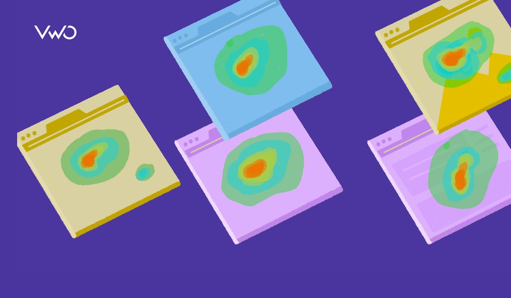
This is where you can dig deeper into this roadblock and compare the heatmaps of the control and the variation.
Here, the heatmap of the control shows expected behavior, with most clicks focused on the primary CTA in the first fold.
For the variation, the first fold again sees a lot of click activity, but interestingly, very few users actually interact with the CTA, indicating that the new design is probably a little too distracting.
So, even though conversions were flat on both versions, heatmaps revealed that the reasons behind them were probably different.
How far do visitors go on a page?
A common assumption among teams is that visitors see all the content placed on a page.
But in reality, many of them never even make it past the first few sections, especially on longer pages.
You might be optimizing content that users aren’t even reaching, or misreading results because you don’t have visibility into how deep visitors scroll on a page.
Scrollmaps expose this blind spot.
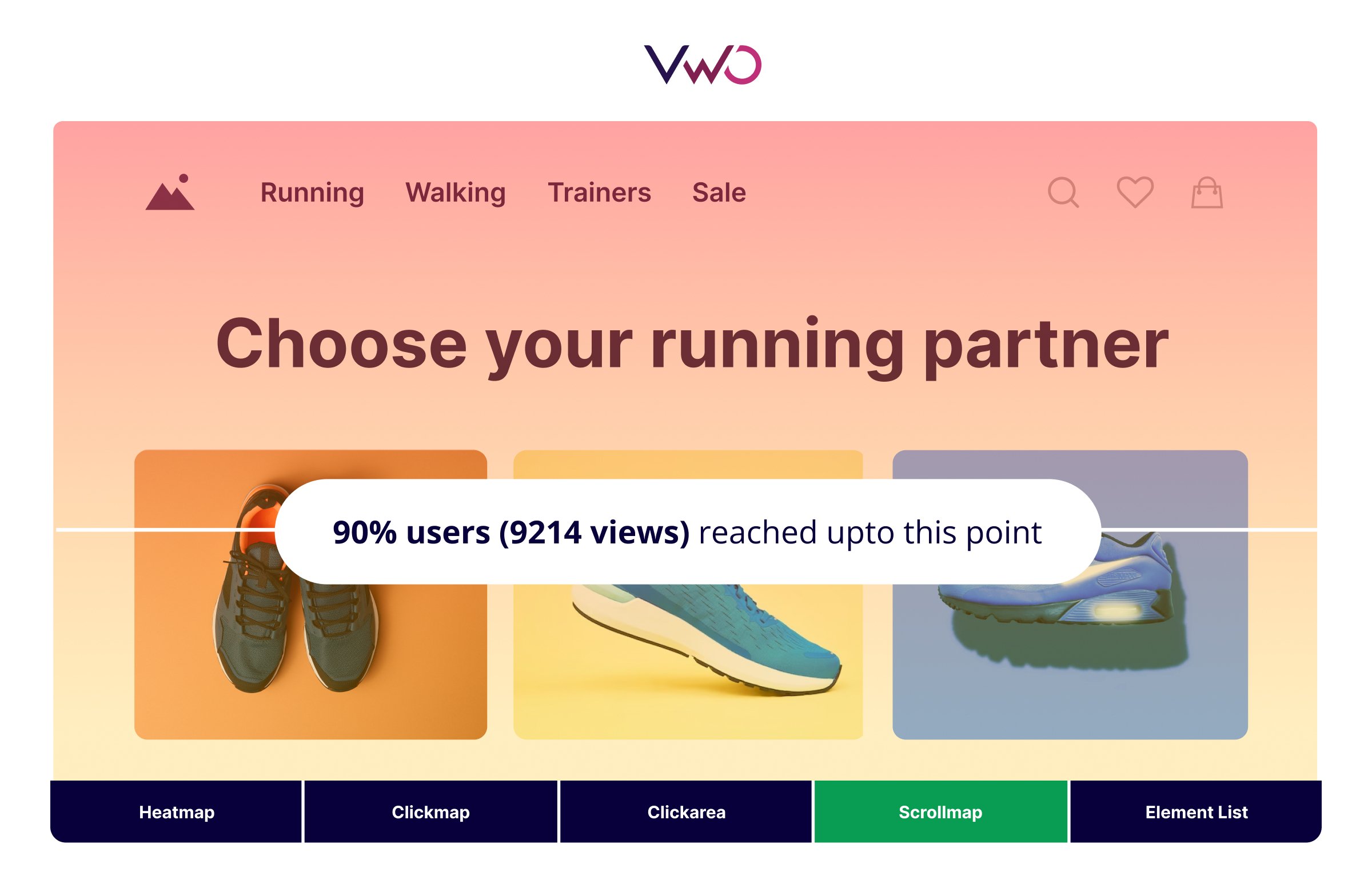
They show you the exact scroll depth across your page, revealing how far visitors reach on a page.
This helps you identify content that’s being missed, spot hidden drop-off points, and understand whether low performance is really about messaging or just placement.
Based on these insights, you can make smarter decisions about layout and ensure your most important elements aren’t buried or overlooked.
Insights for your A/B tests
Suppose you’ve tested a new layout for a product page where the primary CTA is placed further down, while some critical supporting content is added above.
However, after running the A/B test, you find that conversions haven’t improved compared to the control.
Here, you can choose to analyze the scrollmap of both versions to better understand the reason for this behavior.
In the variation, you notice a clear drop in engagement past the midpoint of the page, right before the new CTA placement.
In contrast, the control shows stronger scroll depth, with a larger portion of users reaching the original, higher-placed CTA.
This suggests that the change reduced visibility of your main conversion point, which means your hypothesis needs to be refined a little more.
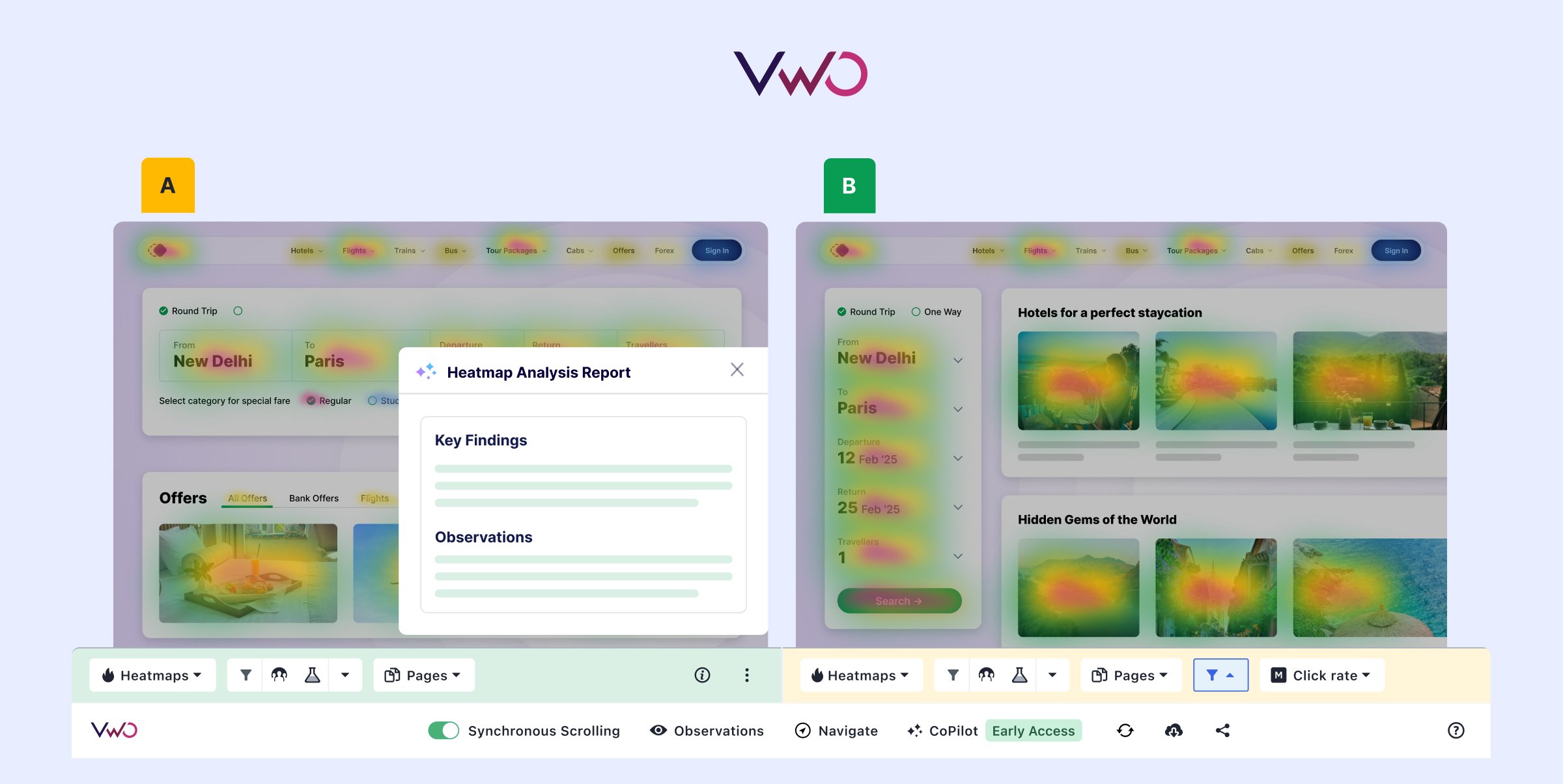
Use VWO Copilot to instantly uncover what your test report isn’t showing. It combines quantitative results with heatmap signals to automatically highlight friction points and missed opportunities. This helps you analyze variations faster, refine your hypotheses, and make smarter optimization decisions.
Are visitors feeling confused?
Not all friction shows up in form drop-offs or bounce rates.
Sometimes, it reveals itself through acts of frustration, like repeatedly clicking on an element that doesn’t respond or work as expected.
These are known as rage clicks, and they’re usually a signal that something’s gone wrong, either a broken link, a slow-loading element, or just an element that looks clickable.
A typical A/B test report would not capture this kind of behavioral feedback.
It might show lower conversions or high drop-offs, but not the frustration that led to the action.
Heatmaps that capture rage clicks make this visible.
They highlight where users are clicking multiple times in quick succession, helping you identify where expectations aren’t being met.
By catching these patterns early, you can reduce friction, fix broken interactions faster, and ensure your test is not influenced by avoidable UX roadblocks.
Insights for your A/B tests
Let’s say you run an A/B test with a refreshed hero section that includes new icons, images, and headings meant to better explain your product.
While the test report shows a slight drop in conversions for the variation, it does not reveal any further insights that can help you understand why.
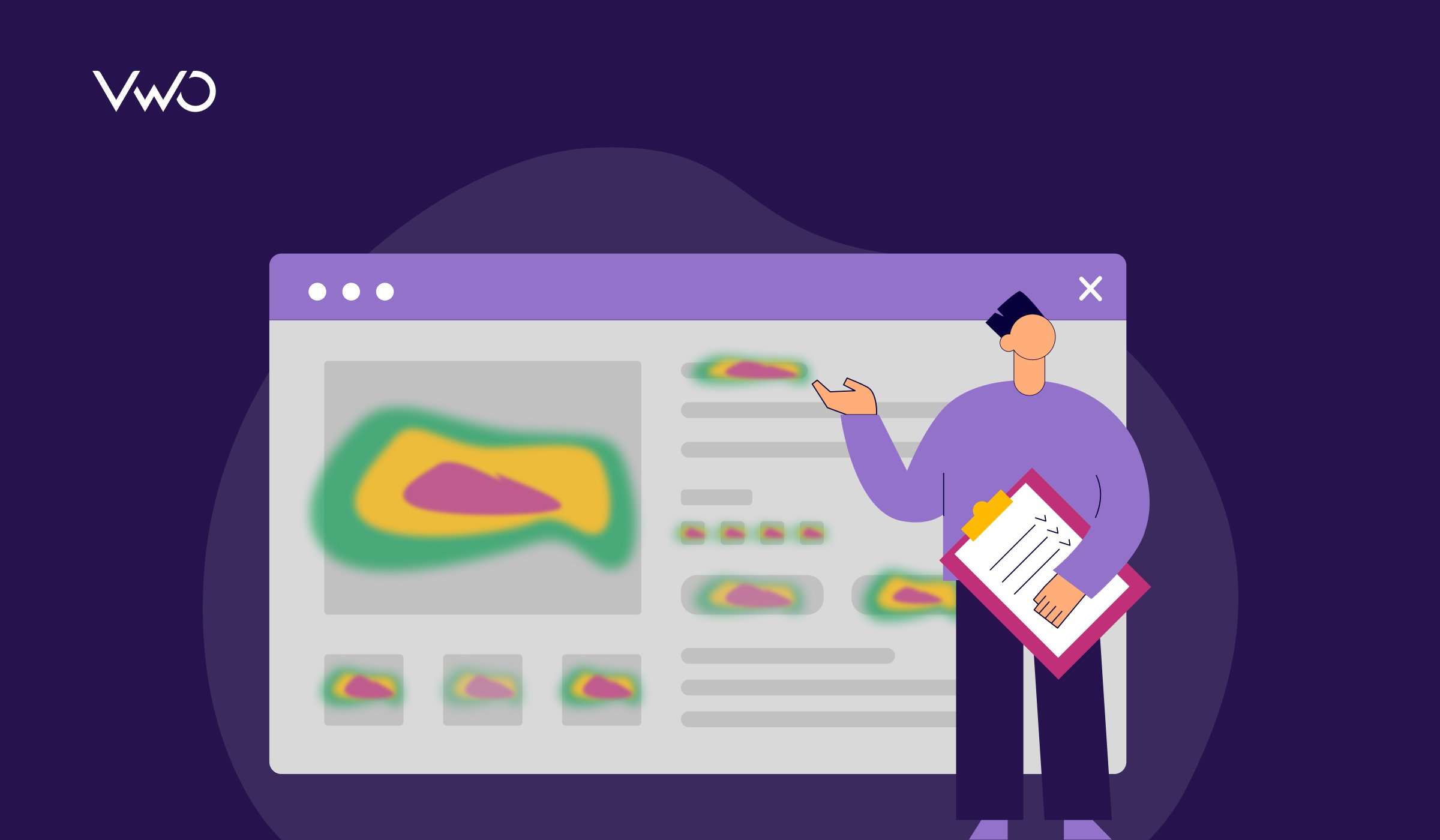
When you review the dead clickmap for the variation, you notice a cluster of clicks on a product image and an icon next to the headline, both of which aren’t interactive.
The control version, however, shows fewer dead clicks in that area, with most interactions directed toward the functional CTA.
This difference suggests that the new design elements may be drawing attention away from the intended action and creating friction through unmet expectations.
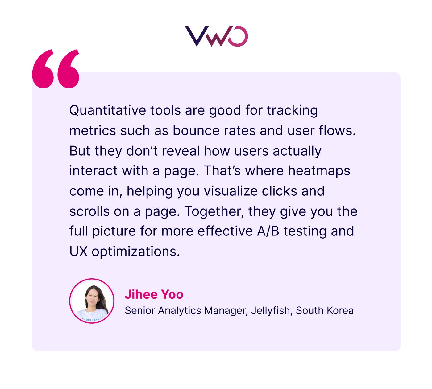
Jihee Yoo, a seasoned voice in data analytics, spoke about the importance of balancing quantitative data with qualitative analysis in an insightful interview with VWO.
Eliminating guesswork with heatmap analysis
Once you start supporting your test reports with heatmap analysis, you can better understand the ‘why’ behind each outcome and solve specific challenges, such as:
- Digging deeper into underperforming variations
- Identifying ‘hidden’ issues that impact visitor experience
- Building stronger, data-backed hypotheses for future tests
While A/B tests are crucial, the data from test reports does not always reveal the complete story.
And, as we’ve seen so far, heatmaps provide a unique visual narrative, which is often missing in test reports and common analytics tools.

When you closely analyze these narratives and compare them against each other, it helps you identify the behaviors and actions that truly impact test outcomes.
Are you prepared to find the insights ‘hidden’ in your test reports?
Request a demo now to explore VWO’s wide range of behavioral analytics capabilities like heatmaps, session recordings, website surveys, and more.
Categories:


![Top 10 Shopify Heatmap Apps [With Features – 2026]](https://static.wingify.com/gcp/uploads/sites/3/2020/04/Feature-image_Shopify-Heatmaps-All-you-need-to-know.png?tr=h-600)