Experimenting without a hypothesis is akin to getting lost in a labyrinth—it may appear that it’s leading you somewhere, but such pointless wandering can seldom lead you to your desired destination.
Whether it’s reaching your destination or hitting a conversion goal on your website, the process involves numerous baby steps that you take in the form of iterative testing and hypothecation. Along with the process, they keep evolving to find an optimal route to desired conversions.
Download Free: A/B Testing Guide
In this post, you will learn about constructing strong A/B testing hypotheses, which will ensure you are moving in the right direction to reach your destination in time.
What is a hypothesis?
A hypothesis is a proposed explanation or solution to a problem. Think of it as a glue that ties the problem to a solution. For instance, you could hypothesize that adding trust badges to your payment page could cater to the problem of low conversion rates on that page. As you’d notice, the hypothesis is made up of two variables, namely the cause (the action we want to test) and effect (the outcome we expect).
One day you wake up and want to run a test for the color of the CTA button on your website. You rush and achieve conversion lifts with this change, but you do not know exactly what you wanted from this test?
You did not pay any heed to your conversion funnel. That is, you did not analyze the test fully before executing it!

There is a difference between running a test scientifically to prove something and generating random results.Now, this something is your hypothesis.
Components of a hypothesis
As you would notice here, in the world of user experience optimization, a strong hypothesis is made up of three components: defining a problem, describing a proposed solution, and measuring results.
For instance, you could hypothesize that adding trust badges to your payment page could fix low conversion rates on that page. You can find out why that happens by identifying the right metrics for success.
But how does one begin to start formulating a hypothesis?
How to formulate a winning hypothesis?
It is not wise to blindly follow best practices crafted by someone else for your business. Every business is unique, so are its strategies. It is always recommended to construct your own best practices.
Below are some essential elements that make a solid hypothesis:
1. They aim to alter customer behavior, either positively or negatively.
A psychological principle often forms the basis of a hypothesis that triggers a reaction from prospects.
It changes the way they perceive your offer/brand, which alters their behavior during the test. Like in the headline example below, the urgency of the new message is why the variation headline is expected to perform better than the original headline.
Changing the headline from ‘Grab your tickets now!’ to
‘Tickets filling out soon – only last 50 left!’ could increase ticket sales online.
Only because you follow the above syntax to formulate a hypothesis doesn’t mean that you’ve got the winning hypothesis.
2. They focus on deriving customer learning from tests.
When pros develop a hypothesis, their focus is on the big picture.
So your test might give you any result. What’s important is for you to analyze ‘why’ your visitors behaved in a certain way?
As data-driven marketers, it might seem difficult sometimes to make your peace with negative lifts.
But if the test reveals significant customer learning, it can pave the way for colossal conversion lifts in the future.
For example, when Michael Aagaard, the conversion copywriter of Content Verve, conducted a CTA copy test on his client’s website. He learned that changing the CTA copy from ‘Start your 30 day free trial’ to ‘Start my 30-day free trial’ resulted in a 90% increase in sign-ups.
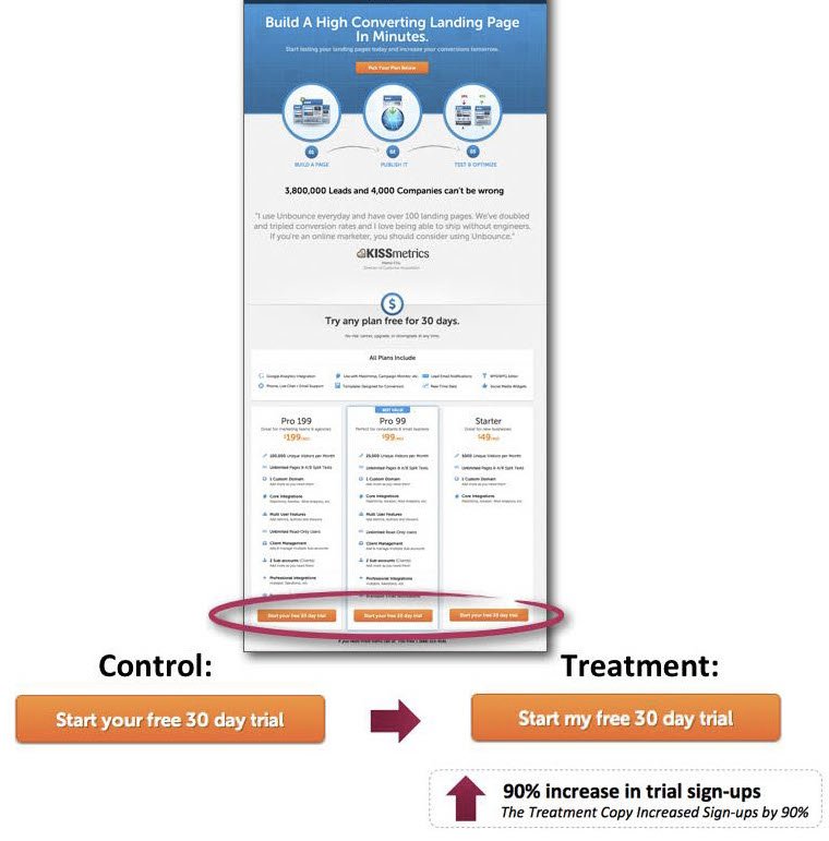
However, he cautioned that applying this technique would not work across the linguistic globe though.
3. They are derived from at least some evidence.
You can explore many avenues to construct good hypotheses.
The image below by the popular Conversion Expert, Craig Sullivan, shows several ways to collect meaningful insights.
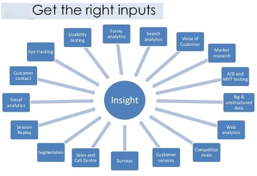
a. Usability testing
In simple words, you can sit and observe how your test participants use your website.
Make notes where they get stuck or confused. Form your hypotheses to improve these situations and let A/B tests decide if they work for you.
This method gives you exceptional insights into your customers’ workarounds and struggles in using your website.
Write down the exact questions you would like to ask during your research. Asking questions related to the homepage, checkout, pricing page, and navigation reveal great insights.
Some sample questions you can ask are:
- Was it easy to find what you were looking for?
- Were the words/vocab used to define categories/sub-categories clear to you?
- Do you have any suggestions to improve our website navigation?
- Does our website look credible to you?
- Is our pricing transparent?
- Is there anything else you’d like to know before signing up with us?
- Will you shop with us again? Why/why not?
- Do you think the form has any confusing/unnecessary input fields?
b. Customer surveys
Surveys are an effective tool for understanding your customer hesitations and knowing their intent/pain points or concerns. They help you identify the optimization opportunities on your websites.
Here are some sample questions to use for on-site surveys:
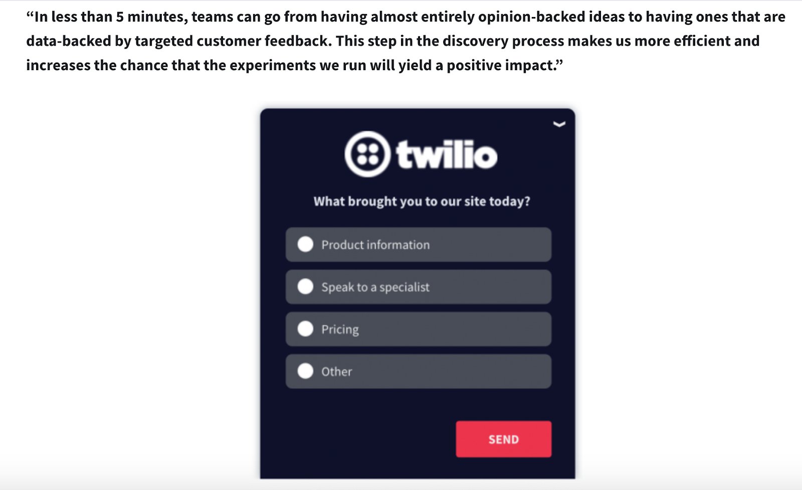
Visiting the pricing page shows the intent of buying. See how Qualaroo leverages targeted traffic on their pricing page to understand customer pain points:
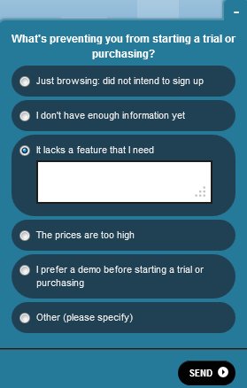
Ask these survey questions during cancellation of a subscription:
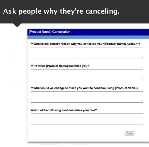
To existing customers, you can ask:
Have you ever criticized/praised us to someone in the past few months?
What did you say?
If you are made the owner of [insert your company name], what would you change?
For those who have just signed up with you, you can send an auto-generated mail asking:
Did you have any doubts or concerns about our product/service before you signed up?
What made you overcome those doubts? How did you hear about us?
Too many questions can be annoying, especially in on-site surveys. Make sure you respect your prospects’ choice if they choose not to answer your questions.
Similarly, off-site surveys also serve the same purpose of gathering feedback via email or third-party survey websites.
Apart from SurveyMonkey, you could also use Fluid Surveys and Confirmit for designing off-site feedback surveys.
Download Free: A/B Testing Guide
c. Heatmaps
The data in your testing tool can tell you what your visitors are doing but not why they are doing it.
Heatmaps can help you identify interest areas of your prospects as well as what areas they choose to ignore. Sometimes this can help you identify great insights when a vital page element goes unnoticed by visitors because some other element on the page is stealing its thunder.
The heatmap below shows how a non-clickable element in the image takes away all the attention from the CTA on the page:

Later, when this element was removed, the heatmap shows a clear emphasis on the call-to-action of the page (as it should be):
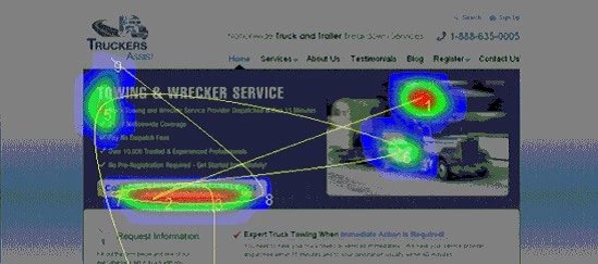
Without referring to their heatmap, TechWyse had never understood the reason for their dropping conversion numbers.
If not this, heatmaps can sometimes also help you figure out a page element/navigation item that may be taking too much of important online real estate while being completely ignored by users.
You can consider replacing it with something more relevant to your conversion goal and conduct an A/B test to see how it performs.
d. Website analytics
You might know this already, but exploring data in your website analytics can give you some great insights to get started.
For instance, the hypothesis of “adding trust badges on payment page” we formed earlier, could have originated from a “high exit rate of the page.” The exit rate of the page — along with other metrics — can be found within your website analytics.
Website analytics tools like Google Analytics can show you quantitative data on how visitors navigate your website on a site architecture level.
Some of the important metrics that you could track to validate an idea and build a hypothesis are:
- Traffic report: Metrics like total traffic, the total number of visitors (overall and on individual pages) could help you track how many people the test will impact and how long it would take to finish it.
- Acquisition report: This could help you determine where your visitors are coming from (your best traffic sources) and how the performance differs between different channels.
- Landing page report: Your top landing and exit pages show how visitors enter and leave the site.
- Funnel report: This would give you insights into questions like where your visitors enter into or exit from your marketing funnel and how they navigate between the different pages.
- Device type: This will help you decide whether you should focus on optimizing the user experience on a particular device on priority.
For any observation that you come across from analyzing these, ask yourself enough ‘why’s to form a solid hypothesis.
Watch this video to understand the hypothesis workflow in VWO.
Test with confidence
Quality of your insights and knowledge of how you can use them is what sets solid hypotheses apart from random testing. Now since the grunt work has been done, nothing should stop you. Forming a well-structured hypothesis is a critical piece in the conversion optimization puzzle. It helps you identify and remove the friction along your conversion funnel.
Document every outcome of your test. Remember that each test you conduct is an opportunity to learn. You might find that you have multiple hypotheses to try. But instead of running in all directions, prioritize your tests and monitor them for conversions and insights, which lay the foundation to create solid hypotheses for your subsequent experiments.
